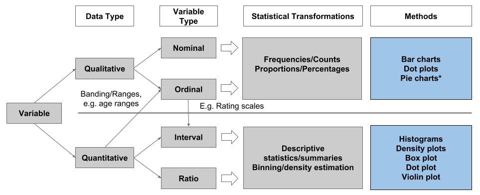
Data Visualisation
Chapter 5: Grammar and Vocabulary
Dr James Baglin
Layers
- Any graphic can be thought of as a series of layers…
- Put them together and we create a graph…
Layers Cont.
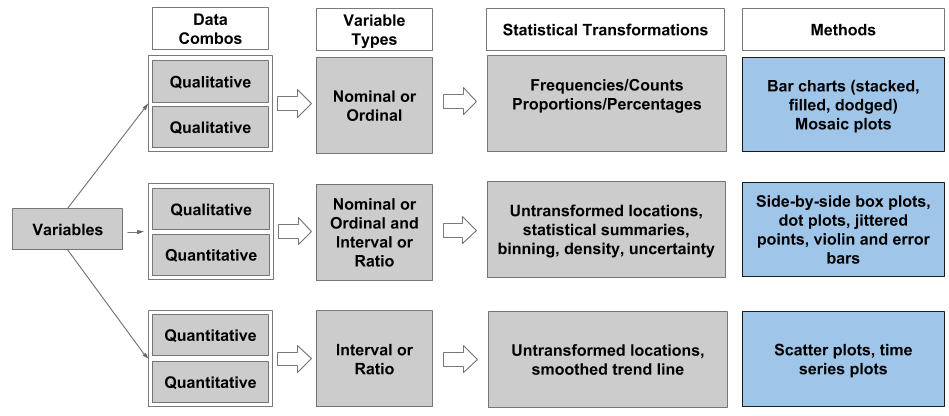
Geometric Objects
- Geometric objects are use to represent data or statistical transformations of the data.
- We are already familiar with many common geometric objects.
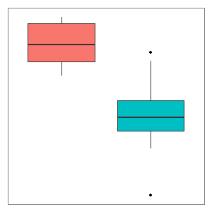
- Boxes used in boxplots
- Bins used in histograms
- Bars used in barchart
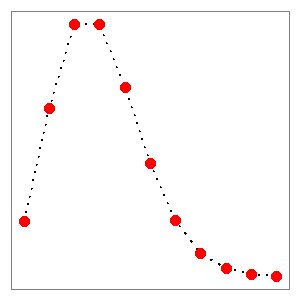
- Points in a scatter plot
- Lines in a line chart
Statistical Transformations Cont.
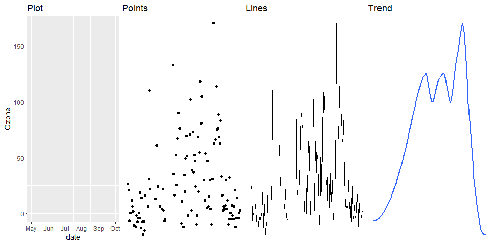
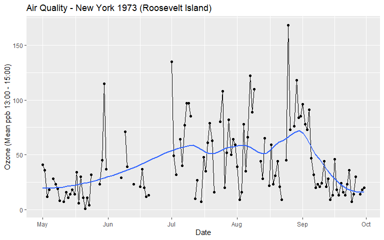
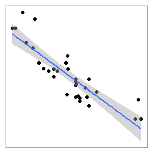
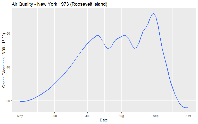
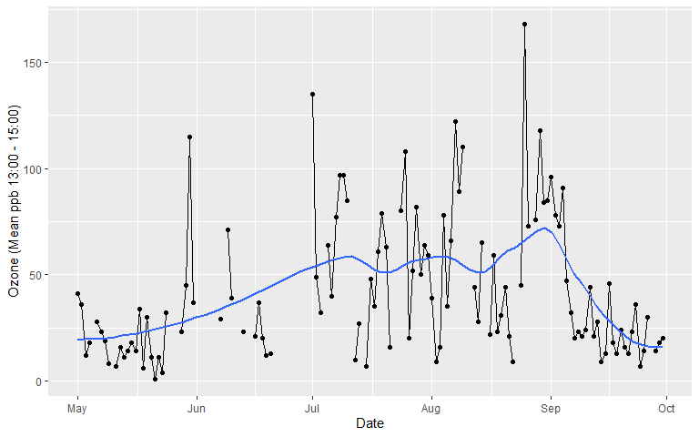
- The smoothed trend line in the Air Quality visualisation was estimated using a non-parametric, locally weighted regression model
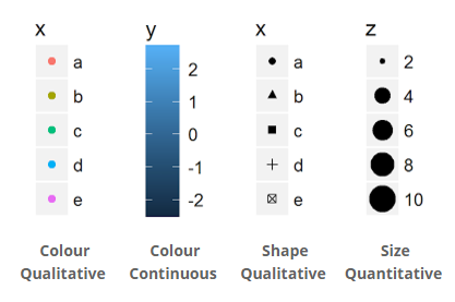
Scales
- Scales are used to control the mapping between a variable and an aesthetic.
- For example, changing the range of the x axis, or changing the colour of a colour scale.
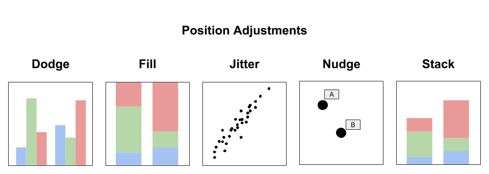
Position Adjustment
- Position adjustments aim to avoid overlapping elements by either dodging, filling, jittering, nudging or stacking. Layers can incorporate multiple position adjustments.
Coordinate System
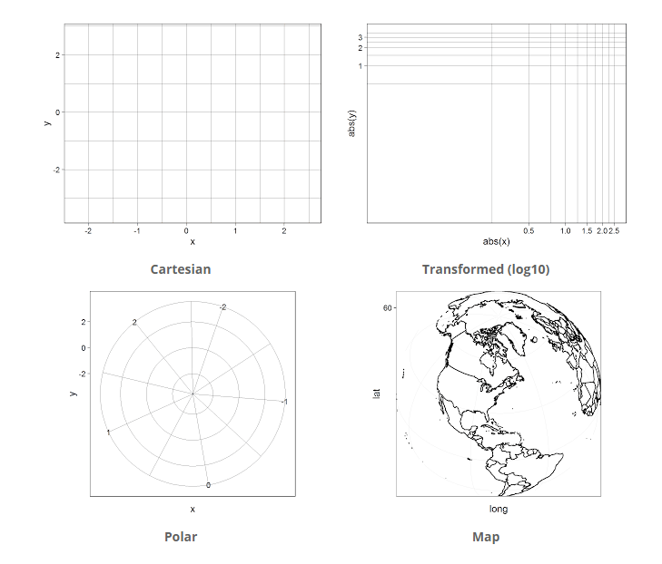
Coordinate systems are used to determine the placement of geometric objects within a plot:
- Cartesian
- Transformed
- Polar
- Map
Faceting
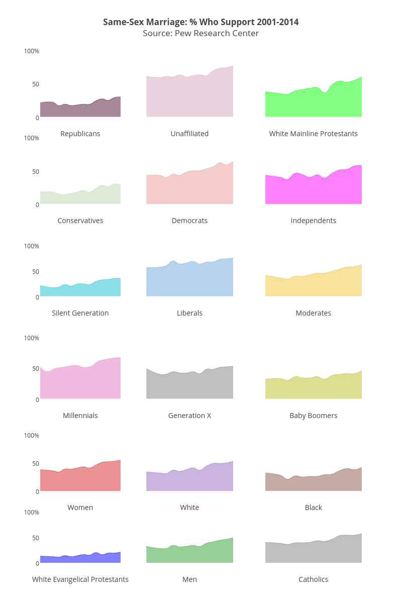
- Faceting is a powerful way to break a data visualisation into small multiples. This process is also known as latticing or trellising.
gglot2 - A Verbose Example Cont.
- Nothing because we have not defined any layers.
gglot2 - A Verbose Example Cont. 3
- Now we are getting somewhere…
gglot2 - A Verbose Example Cont. 5
gglot2 - A Verbose Example Cont. 7
Demo Data - Student Alcohol Survey
- A survey of 649 Portuguese students aged 15 to 22.
- Questions related to alcohol consumption, demographics, family background, academic and social factors.
- A clean copy of the data can be downloaded here.
- The original data was downloaded from the UCI Machine Learning Repository
student <- read.csv("../data/Student_alcohol_survey.csv")qplot()
- The
qplot()function inggplot2is a quick method to develop basic data visualisations with sensible defaults.
qplot(x = Fjob, data = student, geom = "bar")
qplot() cont.
- Box plot:
qplot(x = Fjob, y = G3, data = student, geom = "boxplot")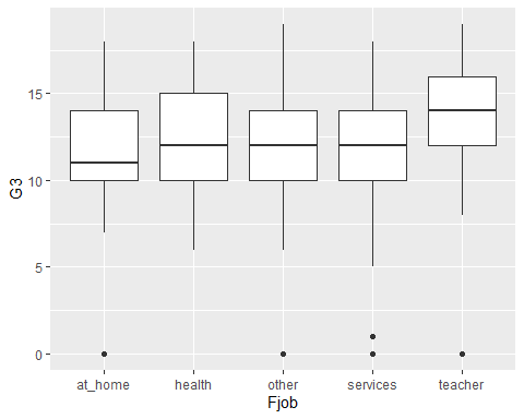
qplot() cont. 2
- Add some markers for the mean:
qplot(x = Fjob, y = G3, data = student ,geom = "boxplot") +
  stat_summary(fun.y = mean, colour = "red", geom = "point")
qplot() cont. 3
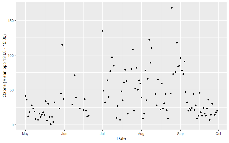
- A basic scatter plot:
qplot(x = G1, y = G3, data = student, geom = "point")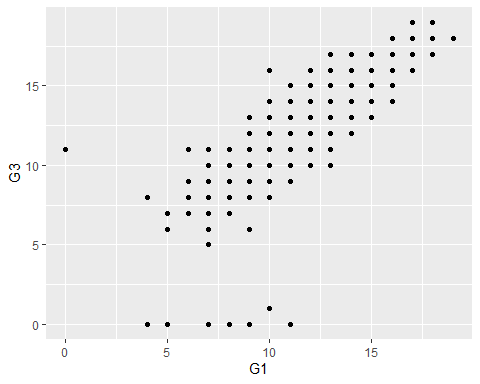
qplot() cont. 4
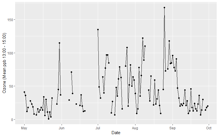
- Add a line of best fit based on a linear model:
qplot(x = G1, y = G3, data = student, geom = "point") +
  geom_smooth(method = "lm")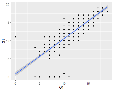
qplot() cont. 5
- A scatter plot with a colour mapped to sex:
qplot(x = G1, y = G3, data = student, colour = sex, geom = "point")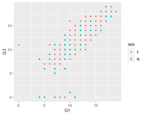
qplot() cont. 6
- Add individual lines of best fit for each factor level mapped to the colour aesthetic:
qplot(x = G1, y = G3, data = student, colour = sex, geom = "point") +
  geom_smooth(method = "lm")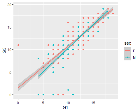
qplot() cont. 7
- Facet scatter plots by mother’s job:
qplot(x = G1,y = G3, data = student, geom = "point") +
  geom_smooth(method="lm") + facet_wrap(~ Mjob)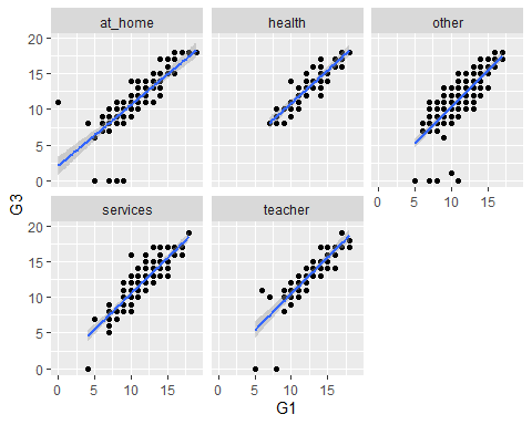
ggplot() cont.
p1 + geom_boxplot()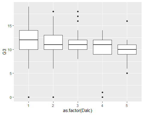
- Now we can continue to use
p1to add more layers or change the visualisation completely.
ggplot() cont. 2
- We can map additional variables to other scales…
- Note how we mapped a
fillaesthetic tosex.
p2 <- ggplot(student, aes(x = as.factor(Dalc), y = G3, fill = sex))
p2 + geom_boxplot()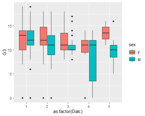
ggplot() cont. 4
- Note
colourrefers to the outline or solid colour of an object.fillrefers to the inside colour of a large object, e.g. bar or box.
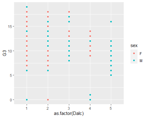
ggplot() Jitter
- Points and categories overlap!
- Use position adjustments to avoid over-plotting
p3 + geom_jitter(position = position_jitterdodge())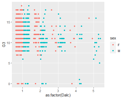
ggplot() Adding Layers
- Overlaying additional
geomsis easy… - Note how we use
outlier.shape = NAto suppress the outliers plotted for the boxplot
p3 + geom_jitter(position = position_jitterdodge()) +
  geom_boxplot(fill = NA, outlier.shape = NA)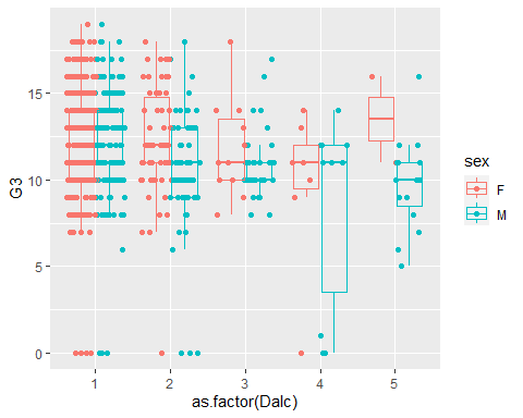
ggplot() Themes
- You can change default themes:
p3 + geom_jitter(position = position_jitterdodge()) +
  geom_boxplot(fill = NA, outlier.shape = NA) + theme_bw()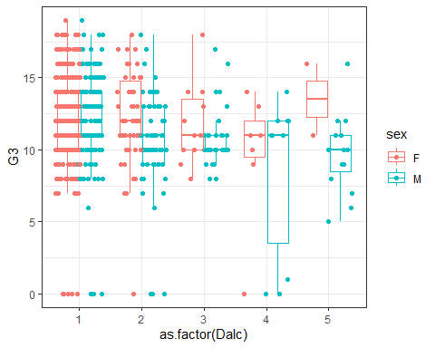
ggplot() Adding Titles and Labels
- You can define descriptive labels:
p3 + geom_jitter(position = position_jitterdodge()) +
  geom_boxplot(fill = NA, outlier.shape = NA) +
  labs(title = "Final Grades by Gender and Alcohol Consumption Ratings",
       x = "Weekday Alcohol Consumption Rating (1 = low - 5 = high)",
       y = "Final Grade - Portuguese")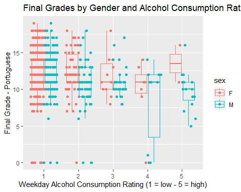
Basic Colour Assignment
- Produce a histogram showing the distribution of pizza diameter.
Pizza <- read.csv("../data/Pizza.csv")
p1 <- ggplot(data = Pizza, aes(x = Diameter))
p1 + geom_histogram()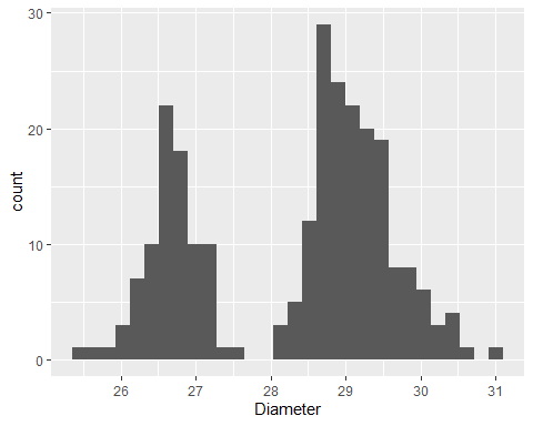
Basic Colour Assignment Cont.
- Change colour using R colour names
p1 + geom_histogram(fill = "dodgerblue", colour = "black")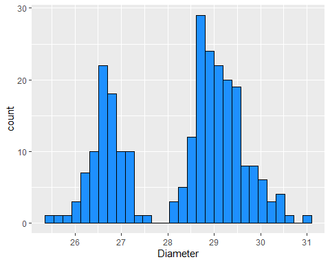
Basic Colour Assignment Cont. 2
- Change colour using hex codes
p1 + geom_histogram(fill = "#ff0066", colour = "#000000")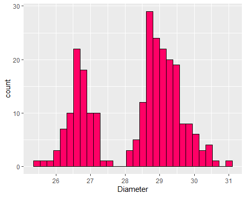
Colour Scales
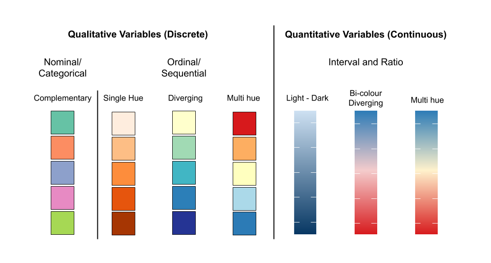
Nominal Colour Scale Example
- Side-by-side box plot comparing pizza diameter by Store and Topping
p2 <-ggplot(data = Pizza, aes(x = Store, y = Diameter, fill = Topping))
p2 + geom_boxplot()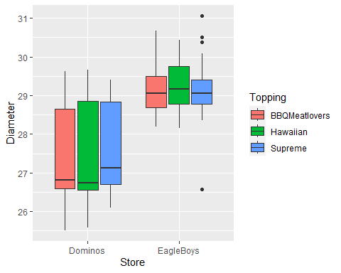
Nominal Colour Scale Example Cont.
- Change ColourBrewer palette…
p2 + geom_boxplot() + scale_fill_brewer(palette = "Accent")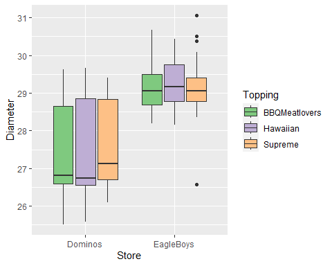
Nominal Colour Scale Example Cont. 2
- Set manual colour scale…
p2 + geom_boxplot() + scale_fill_manual(
  values = c("burlywood3","yellow3","red3"))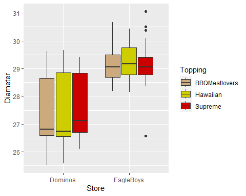
Ordinal Colour Scale Example
- Boxplot comparing pizza diameter by Store and Crust.
Pizza$Crust<-factor(Pizza$Crust, levels = c("Thin","Mid","DeepPan"),
                    ordered = T)
p3 <-ggplot(data = Pizza, aes(x = Store, y = Diameter, fill = Crust))
p3 + geom_boxplot()
Ordinal Colour Scale Example Cont.
- Change
palette()…
p3 + geom_boxplot() + scale_fill_brewer(palette = "YlOrRd")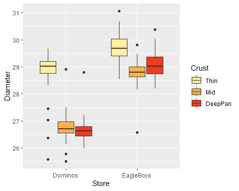
Continuous Colour Scale
- Explore the relationship between diamond carat and price
Diamonds <- read.csv("../data/Diamonds.csv")
p4 <- ggplot(data = Diamonds, aes(x = carat, y = price))
p4 + geom_point()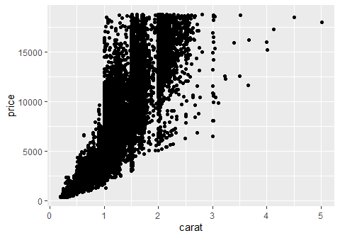
- Hard to see data density as \(n = 53940\).
Continuous Colour Scale Cont.
- Use a continuous colour scale to represent data density in a 2d histogram
p4 + geom_bin2d(binwidth = c(0.05, 500))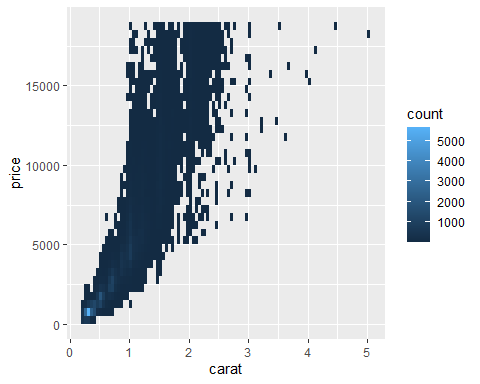
Continuous Colour Scale Cont. 2
- Change colour gradient…
p4 + geom_bin2d(binwidth = c(0.05, 500)) +
  scale_fill_gradient(low="blue", high="red")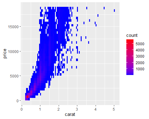
Overview - Common Univariate Methods
Overview - Common Bivariate Methods