Chapter 8 Adding Interactivity
8.1 Summary

Thanks to open source tools and the web, creating interactive and dynamic data visualisations has never been easier. This chapter will explore the reasons and tools behind adding useful web-based interactivity to data visualisations including animation.
8.1.1 Learning Objectives
The learning objectives associated with this chapter are:
- Explain and justify the inclusion of different interactive features for data visualisation.
- List and identify common and effective interactive features that can be added to your data visualisations.
- Understand the different technological requirements for adding interactive features to your data visualisation.
- Use Plotly and the
plotlyR package to create, customise and shareD3.jsenabled interactive data visualisations on the web. - Use
plotlyand theggplotlyfunction to convertggplotobjects intoD3.jsenabled interactive data visualisations.
8.2 Why Interactive?
Static plots are the foundation of data visualisation, but nowadays, the viewer will expect more from their viewing experience. Interactive data visualisations allow us to dig deeper into our static plots. Instead of treating the viewer as a visitor to a museum, we can grant the viewer the ability to explore and drill down on areas of data that they find interesting (Ware 2013). In this way, we can increase a viewer’s engagement and attract more viewers, even some who might not otherwise be interested. Allowing viewers to interact with our data appeals to their inquisitive nature and desire to play (Murray 2013). For example, Feng et al. (2018) found that the inclusion search functionality in data visualisations significantly increased participants’ time spent viewing and exploring a data visualisation.
Interactive data visualisations also allow us to reduce visual overload often associated with attempts to visualise multivariate datasets (Buja et al. 1991). Interactivity allows us to dynamically change the visualisation to focus attention on specific variables as needed (Murray 2013). However, keep in mind that the goal of adding interactivity to a data visualisation should always be to enhance its immersive properties and grant the viewer a more intimate experience with the data. It should not distract from, dominate or cheapen the purpose of the data visualisation.
Web technologies and open source tools have made adding interactive features to data visualisations very accessible. But what types of interactivity is useful? Yi, Kang, and Stasko (2007) proposed seven categories of interaction commonly used in information visualisation that are helpful starting point for data visualisation. These included the following:
- Select: The audience can select and track a point of interest, usually by highlighting or labeling. This makes it easier for the audience to track a data point among other points and track a point when the display changes. For example, highlighting a data point in an animation can track the data point across frames.
- Explore: The audience can direct their attention to aspects of the data visualisation that they find interesting. This includes zooming, panning or scrolling a data visualisation to explore trends in greater detail or areas of the visualisation that were not the initial focus. Exploring can also include clickable features that reconfigure data visualisation in a way that allows the audience to choose their focus. An animated data visualisation with a play bar is an example of exploring as the audience can play, stop, rewind, and fast forward to explore the animated data visualisation across time.
- Reconfigure: The audience can reconfigure the arrangement of data and variables to suit their purpose. An example might be to change the order of the factor levels in a bar chart from highest to lowest. It might include the ability to select specific groups for side-by-side comparison, or whether to facet a visualisation by row or columns. Data visualisations can also include interactive elements that reconfigure a data visualisation to reduce overlap, for example, by turning jittered data points on or off.
- Encode: The audience can change the visual representation of the data visualisation including aesthetics and geometric objects. For example, the audience might be able to change a continuous colour scale into a size scale, or convert a histogram into a density plot. Allowing the audience to consider different encodings can overcome the limitations of a single representation. For example, boxplots present useful statistics (quartiles) but hide sample size. Changing the representation to a jittered point plot provides a sense of sample size, but does not summarise the data. Having the ability to switch between a boxplot or a point plot provides the best of both worlds.
- Abstract/Elaborate: The audience can drill down into the detail of the data. An example of this type of interaction includes details on demand. The audience can click a data point and detailed information about the data point appears. This type of interaction might also include the ability to select or zoom in on a data point or series of data points for a more detailed analysis.
- Filter: The audience can filter the data used in a data visualisation based on specific criteria. This might include filtering data based on time or subgroups or searching for a specific criteria.
- Connect: The audience can select data points to be connected across different representations of the data already displayed. This is also referred to as brushing. Connecting is useful for tracking data points across connected displays. Network diagrams also use a connect interaction when a user selects a node an other related nodes are highlighted.
Despite all the promises of getting interactive, this in no way takes away from the power and beauty of a well-designed static data visualisation. Some believe static plots remain the most pure forms of data visualisation (Kirk 2012). Static plots will be around for many years to come, but when we can, we should take the best of what we know about designing static plots and add the best of the interactive features in order to design the most immersive data visualisations that we can.
Adding interactivity also comes with its own considerations and challenges. It’s important to keep the following in mind:
- The interactivity should always enhance and never detract from or interfere with the data visualisation.
- Even modest interactivity usually requires extra coding. Advanced interactivity can mean having to learn a new language!
- Interactivity adds many technological requirements such as web browsers, access to the web and maybe even dedicated software (but this should always be avoided if you can)
In the following sections, we will explore tools and approaches for adding the most common forms of interactivity to datasets and visualisations we have explored in previous chapters.
8.3 Adding Interactive Features
In terms of adding interactive features to static visualisations, there are heaps of tools. However, in keeping true to the open source and R-based nature of the course, we will focus on one very powerful tool that bridges the gap between R and D3.js. If you have ever experienced interactive data visualisation in a web page recently, odds are it was based on D3.js.
8.3.1 Plotly
Plotly was founded in 2012 as an online data analysis and visualization tool. It was built to translate graphics built using the best scientific libraries, including Python, R, MATLAB, Perl, Julia, Arduino, REST and IPython, into online, interactive visualizations using Data Drive Documents, or D3.js, which is a Java Script front-end library. Plotly offers a host of enterprise and educational data visualisation tools to individuals, researchers, governments, businesses and students. Free Plotly Cloud Studio community accounts are available that provide you with 100 plots. The plotly R package can be used to create and send visualisations from R to host publicly on the Plotly cloud server. This is a great way to showcase your work.
8.3.2 Getting Started
We have already encountered Plotly back in Chapter 7 when we created a 3D scatter plot. If you haven’t already done so, sign up for a free Cloud Studio account.
Once you have signed in, you will have access to My Files. This is where you can store plots and data on the Plotly server. This is also where you will access your plots that you send from R. You can also access the Workspace which provides some really powerful web-based data visualisation tools. This allows you to upload data and quickly generate and customise a wide range of data visualisations using a web interface. You can read all about it here. However, the Plotly Cloud Studio isn’t the focus of this demonstration. We will take a close look at Plotly’s R Package.
8.3.3 plot_ly
Similar to ggplot2, Plotly has its own dedicated set of data visualisation functions. You can download a great cheatsheet here. Let’s create a simple scatter plot and explore the basic interactive features that plotly provides. We will look at the relationship between males’ abdomen circumference and their body fat percentage using the Body dataset. We will also add a linear trend line.
The Body dataset contains the percentage of body fat, age, weight, height, and 10 body circumference measurements (e.g., abdomen) for a sample of 252 men. Variables include the following:
- Case [Integer]: Case Number
- BFP_Brozek [Numeric]: Percent body fat using Brozek’s equation, 457/Density - 414.2
- BFP_Siri [Numeric]: Percent body fat using Siri’s equation, 495/Density - 450
- Density [Numeric]: Density (gm/cm3)
- Age [Integer]: Age (yrs)
- Weight [Numeric]: Weight (lbs)
- Height [Numeric]: Height (inches)
- Adiposity_index [Numeric]: Adiposity index = Weight/Height2 (kg/m2)
- Fat_free [Numeric]: Fat Free Weight = (1 - fraction of body fat) * Weight, using Brozek’s formula (lbs)
- Neck [Numeric]: Neck circumference (cm)
- Chest [Numeric]: Chest circumference (cm)
- Abdomen [Numeric]: Abdomen circumference (cm) “at the umbilicus and level with the iliac crest”
- Hip [Numeric]: Hip circumference (cm)
- Thigh [Numeric]: Thigh circumference (cm)
- Knee [Numeric]: Knee circumference (cm)
- Ankle [Numeric]: Ankle circumference (cm)
- Biceps [Numeric]: Extended biceps circumference (cm)
- Forearm [Numeric]: Forearm circumference (cm)
- Wrist [Numeric]: Wrist circumference (cm) “distal to the styloid processes”
First, we clean up the outliers:
library(dplyr)
Body_clean <- Body %>% filter(Weight < 300)
Then we load Plotly and use the plot_ly function to generate the plot. We use add_trace to add a layer showing the linear regression trend line. Notice how this line is fitted by calling the lm, linear model, function from R. We also define some layout() options.
library(plotly)

p1 <- plot_ly(data = Body_clean, x = ~Abdomen, y = ~BFP_Siri,
              type = "scatter", mode = "markers", name = "Data") %>%

  layout(yaxis = list(zeroline = FALSE, title = "Body Fat % (Siri Method)"),
         xaxis = list(zeroline = FALSE, title = "Abdomen Circumference (in)")) %>%

  add_trace(mode = 'lines',x = ~Abdomen,
            y = fitted(lm(Body_clean$BFP_Siri ~ Body_clean$Abdomen)),
            name = "Linear Trend")

p1
Even with this very simple code, we have added heaps of interactivity. Have a play and see if you can do the following:
- Hover over individual data points to see the actual data values.
- Zoom in and out by clicking the zoom buttons.
- Zoom in and out by clicking and dragging a grid on the plot to inspect closer.
- Shift the x and y axes, left and right, up and down, respectively.
- Make elements of the plot invisible and visible by selecting them in the legend.
- You can also select a range for the x and y axis to view. If you click and hold a point on an axis, and drag left or right, or up and down, a range on the x and y axis will be filtered.
- Ensure you hit the reset axes or Auto-scale button to reset to the original visualisation.
There are also other useful tools to export the plot, to change the appearance of the hover values, auto-scale, etc. I think you get the idea…there is a lot of useful interactivity, with minimal coding.
plotly shares a range of aesthetics similar to ggplot. For example, we can add a size aesthetic for Height and a colour aesthetic for Weight.
p2 <- plot_ly(data = Body_clean, x = ~Abdomen, y = ~BFP_Siri,
              size = ~Age, color = ~Weight, type = "scatter", mode = "markers",
              colors = "RdYlBu") %>%

  layout(yaxis = list(zeroline = FALSE, title = "Body Fat % (Siri Method)"),
         xaxis = list(zeroline = FALSE, title = "Abdomen Circumference (in)"))

p2
Note how there is no legend or indication of what the size aesthetic represents. We can put this in the title:
p2 <- plot_ly(data = Body_clean, x = ~Abdomen, y = ~BFP_Siri,
              size = ~Age, color = ~Weight, type = "scatter", mode = "markers",
              colors = "RdYlBu") %>%

  layout(title ="Body Fat Percentage by Abdomen, Weight and Age (point size)",
         yaxis = list(zeroline = FALSE, title = "Body Fat % (Siri Method)"),
         xaxis = list(zeroline = FALSE, title = "Abdomen Circumference (in)"))
p2
Hover-over information can also be customised. For example, when a person hovers over a data point, we can append a list of values as follows:
- Abdomen = …
- BFP = …
- Age = …
- Weight = …
We can also use HTML tags such as <br> and <b> to add breaks and bold font.
p3 <- plot_ly(data = Body_clean, x = ~Abdomen, y = ~BFP_Siri,
              size = ~Age, color = ~Weight, type = "scatter", mode = "markers",
              colors = "RdYlBu", hoverinfo = "text",
              text = paste("<b>Abdomen</b> = ", Body_clean$Abdomen,
                           "<br><b>BFP</b> = ", Body_clean$BFP_Siri,
                           "<br><b>Age</b> = ", Body_clean$Age,
                           "<br><b>Weight</b> = ", Body_clean$Weight)) %>%

  layout(title ="Body Fat Percentage by Abdomen, Weight and Age (point size)",
         yaxis = list(zeroline = FALSE, title = "Body Fat % (Siri Method)"),
         xaxis = list(zeroline = FALSE, title = "Abdomen Circumference (in)"))

p3
plotly supports a full range of plot types. Let’s shift our attention to the FEV dataset.
The FEV dataset contains the forced expiratory volume (FEV, 1 second), smoking status, age, height and sex of a sample of 654 children and adolescents aged between 3 and 19. Reference to the original data source can be found here.
- FEV [Numeric]: litres
- smoking [Factor]: Nonsmoker, Smoker
- age [Integer]: Years
- height [Numeric]: Inches
- sex [Factor]: Male or Female
We can create a bar chart based on the count of male and female smokers in the sample. The trick is to summarise the data first using a table function.
FEV_sum <- table(FEV$smoking,
                 FEV$sex,
                 dnn = c("smoking","sex")) %>%
  data.frame()

p4 <- plot_ly(data = FEV_sum, x = ~smoking, y = ~Freq, type = "bar", color = ~sex,
              colors = c("#67a9cf","#ef8a62")) %>%

  layout(yaxis = list(zeroline = FALSE, title = "Count"),
         xaxis = list(zeroline = FALSE, title = "Smoking Status"))

p4
Note how we assigned custom colours. We can also compare smokers and nonsmokers on FEV using a box plot.
p5 <- plot_ly(data = FEV, x = ~smoking, y = ~FEV, type = "box") %>%

  layout(yaxis = list(zeroline = FALSE, title = "FEV"),
         xaxis = list(zeroline = FALSE, title = "Smoking Status"))
p5
Hmmm, that can’t be right. Smokers have higher FEV! Maybe the smokers are older and therefore, have bigger lungs…
smokers <- FEV %>% filter(smoking == "Smoker")
nonsmokers <- FEV %>% filter(smoking == "Nonsmoker")

p6 <- plot_ly(data = FEV, x = ~age,
              color = ~smoking, colors = c("#67a9cf","#ef8a62")) %>%

  add_markers(y = ~FEV) %>%

  add_lines(data = smokers, x = ~age,y = ~fitted(lm(FEV ~ age)), name = "Linear") %>%

  add_lines(data = nonsmokers, x = ~age,y = ~fitted(lm(FEV ~ age)), name = "Linear") %>%

  layout(yaxis = list(zeroline = FALSE, title = "FEV"),
         xaxis = list(zeroline = FALSE, title = "Age"))

p6
As you can see, the code to add trend lines isn’t as elegant as ggplot, but you can still get the job done.
This was only a small sample of what plotly offers. A full range of the plotly plot types supported includes the following:
8.3.4 Sharing
You can send and host your plotly data visualisation publicly on the Plotly cloud. This is a great way to share your interactive visualisations with the world. It’s very easy to do. You just need your plotly user name and API Key.
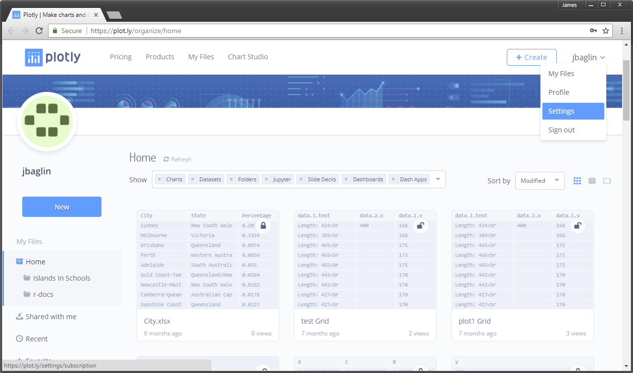
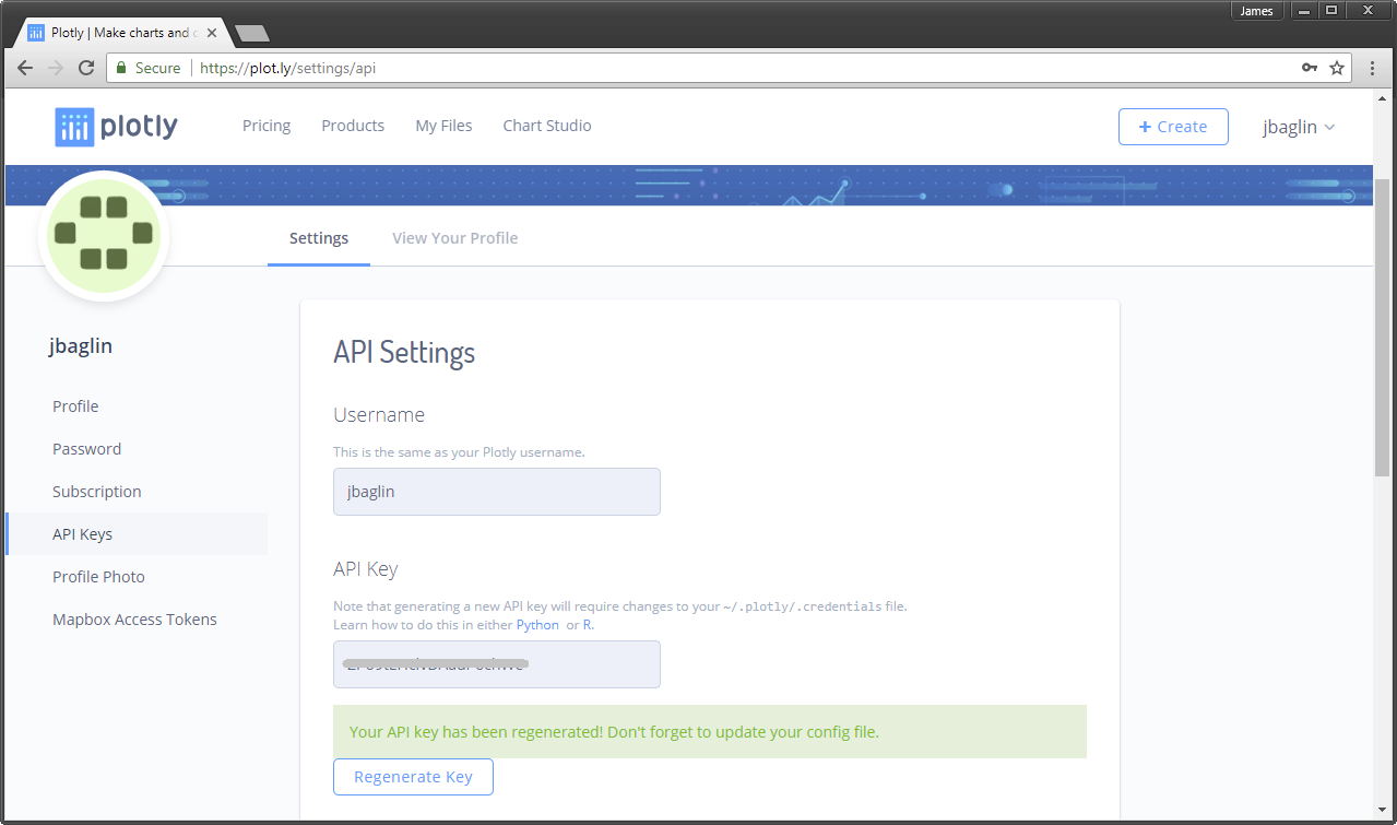
Navigate to your Settings on the Plotly website.
Select API KEYS. Select the button to generate a key (you may be asked for your password). Take note of your username and API KEY listed (blanked out in the screenshot). You will need these to send your plots from R to the Plotly server.
We can assign these to the R environment so we can use them later.
username <- "jbaglin"
apikey <- "4lddfzc69lx" # Replace this with your API
Now we can save these credentials to the environment so the plotly library can access the server when it needs to.
Sys.setenv("plotly_username"= username)
Sys.setenv("plotly_api_key"= apikey)
Let’s host p3 on my plotly account. We use the api_create function to send it to our online account and set sharing = "public" because we have a free account. Be careful here. If your visualisation must be kept private, you will need to pay for an account.
api_create(p3, filename = "body-fat-percent", sharing = "public")Once completed, the plot will load in a browser.
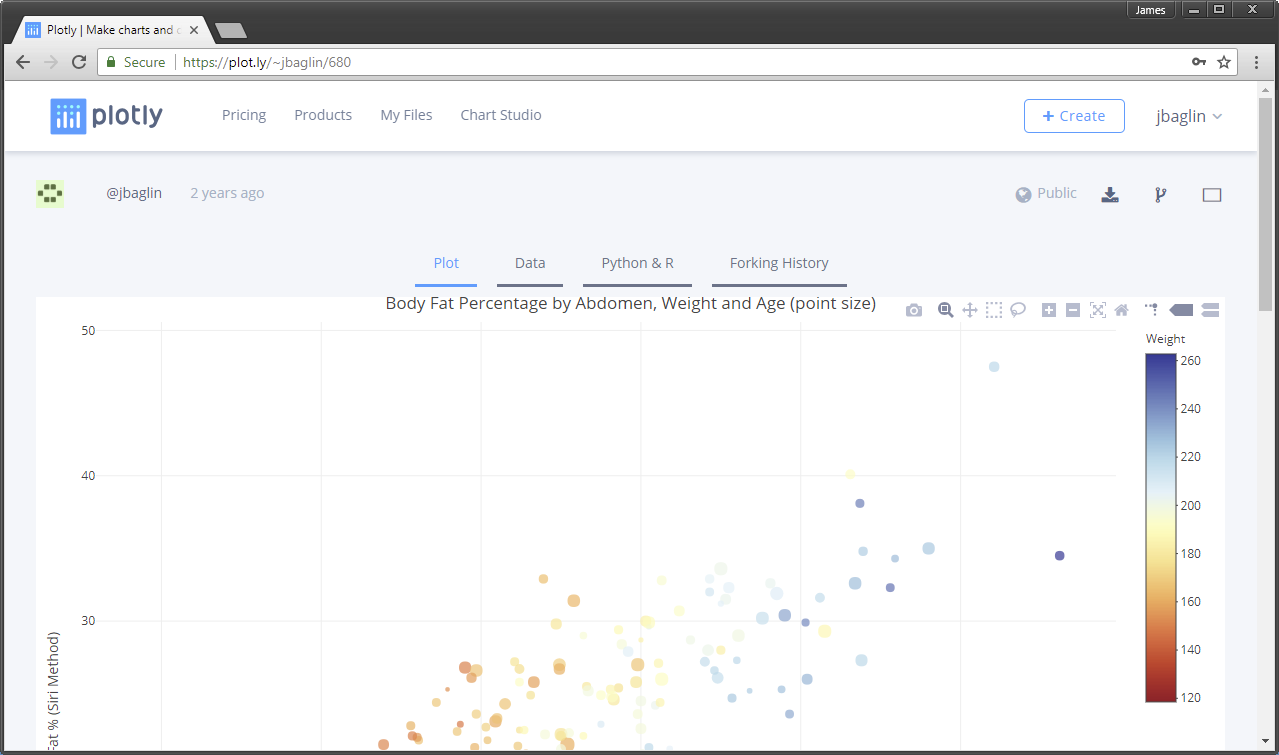
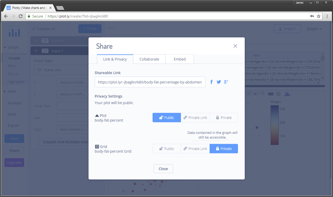
Always check the online plot’s spit and polish. The process of casting the plot online can result in conversion issues. If you are logged into your Plotly account, you can click the Edit button to open the web Workspace. You can use this interface to customise the plot online.
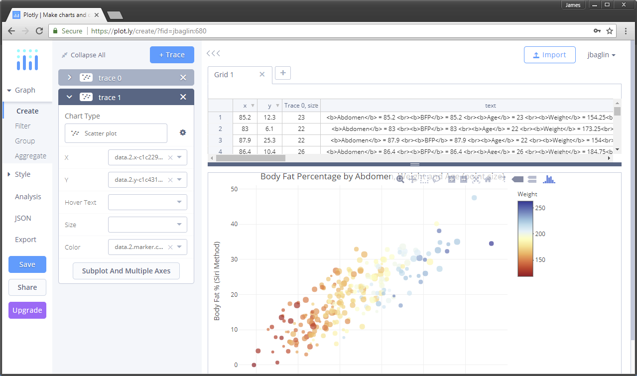
Click Save and then hit the Share button. This is where you can get all the information to share your plot with the world.
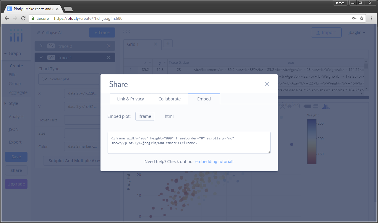
The following is an example of how to embed the plot in a webpage. The following code was used in the HTML page:
Plotly makes sharing visualisations seamless.
8.3.5 ggplotly
The plotly functions are numerous and feature rich. However, we observed in the previous example that adding trend lines and visualisation elements based on subgroups becomes tedious. There is no doubt that ggplot2 has the upper-hand when it comes to quickly adding layers and faceting the data. plotly accepts that people love ggplot2 for these reasons and have added a ggplotly wrapper that will convert ggplot2 objects to plotly objects. Let’s have a go at converting the following ggplot, which includes a facet_grid and geom_smooth layer.
p7 <- ggplot(data = FEV, aes(x = height, y = FEV, colour = smoking)) +
  geom_point() + geom_smooth() + facet_grid(. ~ sex)
p7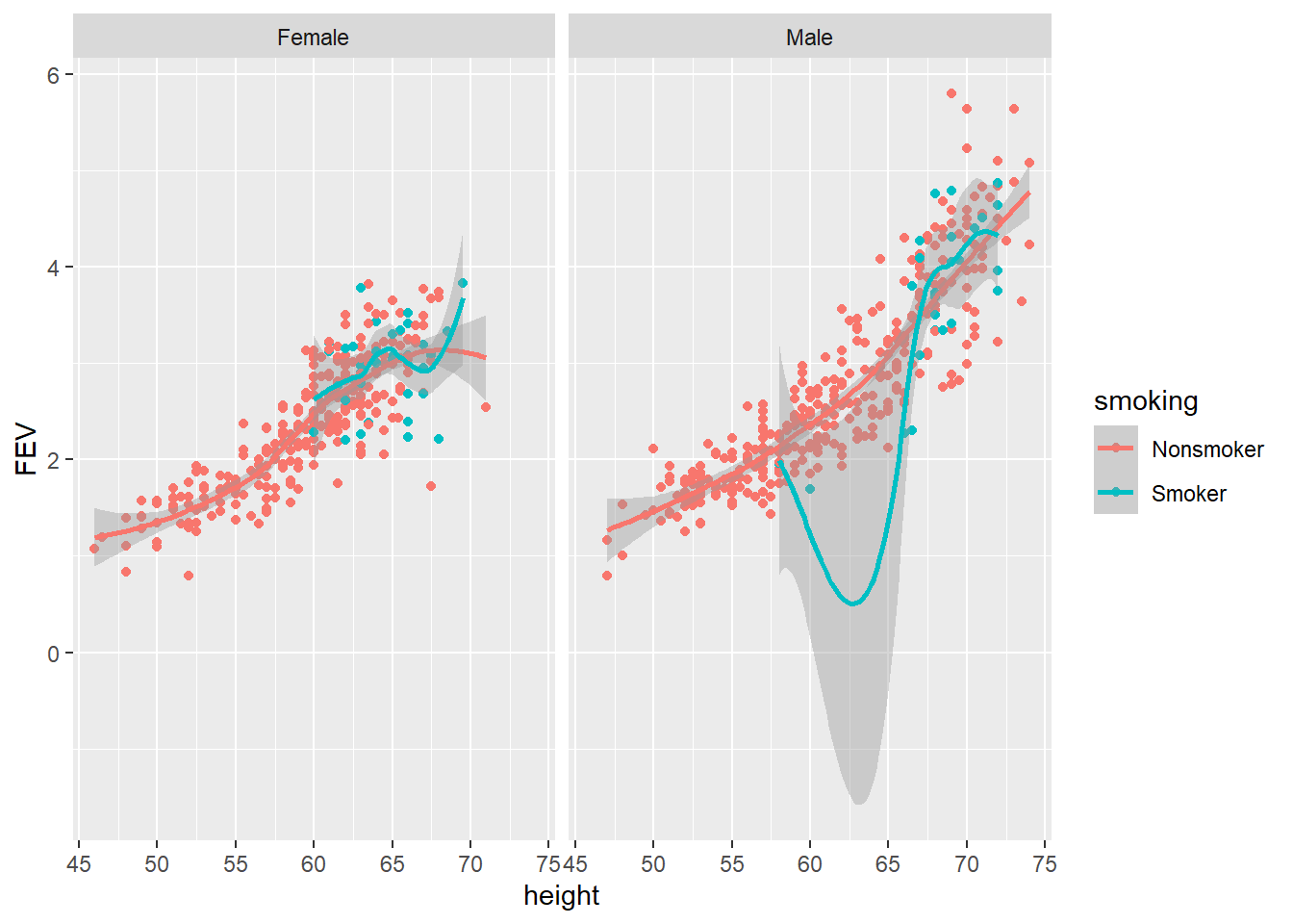
A nice static ggplot. Now let’s try the ggplotly wrapper:
gg1 <- ggplotly(p7, width = 800, height = 600)

gg1
Awesome! D3.js enabled ggplot, the best of both worlds! The conversion process isn’t perfect, so make sure you check your plot after converting. However, the plotly R package continues to get better and better. It now supports pretty much all ggplot geoms and aesthetics.
8.3.7 Highlighting
Highlighting, or “brushing” is an interactive feature that allows a user to highlight a feature of one plot and have it highlighted across other linked plots using the crosstalk package. You can read all about it here.
Now let’s use the gapminder dataset to create a visualisation that looks at the relationship between GDP and life expectancy across time.
The gapminder dataset contains select official statistics for 143 countries between 1952 - 2007. The dataset includes the following variables:
- country: Factor with 143 levels
- continent: Factor with 5 levels
- year: ranges from 1952 to 2007 in increments of 5 years
- lifeExp: life expectancy at birth, in years
- pop: population size
- gdpPercap: GDP per capita/per person
To load the data, use the following code:
library(gapminder)
gapminder::gapminder
We will use time to facet the scatter plots, but add a feature to highlight a country by clicking on it. This will then highlight that country across the facets (time).
library(gapminder)
library(crosstalk)

gapminder_filt <- gapminder::gapminder %>% filter(country != "Kuwait") # remove outlier!

gapminder_filt <- SharedData$new(gapminder_filt, ~country)

p12 <- ggplot(data = gapminder_filt, aes(x = gdpPercap, y = lifeExp, group = country))

p12 <- p12 + geom_point() +
  scale_x_continuous(breaks =seq(0, 115000, 25000)) +
  labs(x = "GDP Per Capita",
       y = "Life Expectancy",
       title = "Country GDP per capita predicts life expectancy") +
  facet_wrap(~year)

gg12 <- ggplotly(p12, tooltip = "country",width = 800, height = 600)

gg12 <- highlight(gg12,on = "plotly_click",color = "red")

gg12
8.3.8 Animations
Plotly has a very simple and powerful animation feature. Animation is a great way to show how variables change overtime. Let’s recreate the famous Gapminder visualisation by Hans Rosling.
library(gapminder)
gapminder_filt <- gapminder::gapminder %>% filter(country != "Kuwait") # remove outlier!
p12 <- plot_ly(gapminder_filt, x = ~gdpPercap, y = ~lifeExp, color = ~continent,
               size = ~pop, frame = ~year, alpha = 1) %>%

  add_trace(type = "scatter", mode = "markers") %>%

  layout( title = "GDP Per Capita vs. Life Expectancy by Year",
    yaxis = list(zeroline = FALSE, title = "Life Expectancy"),
         xaxis = list(zeroline = FALSE, title = "GDP Per Capita"))

p12
The animation requires very little code and the result is a beautifully smooth animation.
As this chapter demonstrates, the Plotly R library is a highly powerful way to add rich interactive features to your data visualisations. However, this chapter only scratched the surface. I recommend the following websites to learn more:
- Plotly Github page - https://plotly-book.cpsievert.me/index.html
- Plotly R Documentation - https://plot.ly/r/
- Plotly for R by Carson Sievert (lead package author) https://plotly-book.cpsievert.me/index.html
8.4 Concluding Thoughts
This chapter introduced Plotly as a powerful tool for converting data visualisations built using R into interactive data visualisations for the web. You were introduced to the broad categories of interactivity used in data visualisation. While adding interactive features to data visualisations is relatively easy nowadays, you must keep one important message in mind. Adding interactivity should always serve a clear and practical purpose.