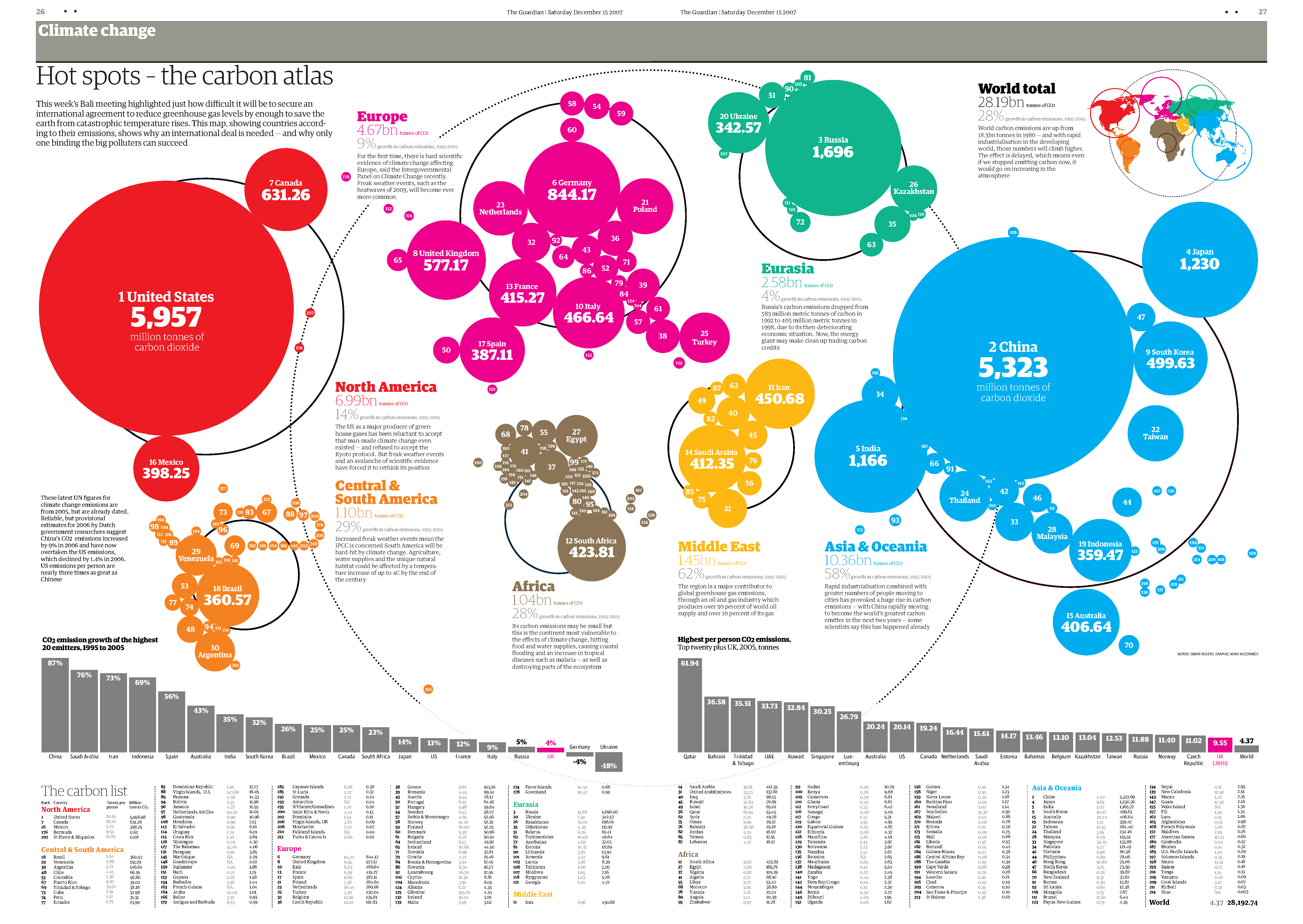
Chapter 7 Spatial Data
7.1 Summary

Spatial relationships between ourselves and our environment have always been of great interest. Spatial representation of data contextualises the data in a unique way; it can make the data relevant to you and help you understand how your situation varies from someone else, somewhere else. Rapid advances in mapping technology and the recent explosion in accessibility to cheap or open source geospatial data has made spatial data visualisation very easy. However, using spatial data adds the extra dimension of space, which brings its own set of challenges. In the following chapter we will introduce the basics of spatial data visualisation and work through a couple of case examples to give you a feel for what options you have. We will use both ggplot2 and the open source interactive package Leaflet to deal with the challenges of mapping data to spatial coordinate systems.
7.1.2 Learning Objectives
The learning objectives associated with this chapter are:
- Define and explain the purpose of spatial data visualisation.
- Identify common map-based spatial data visualisations including isarithmic, choropleth, point, proportional symbol maps and cartograms.
- Understand the basic concepts of spatial data visualisation including
- spatial data models
- spatial reference systems (geographic coordinate systems, projected coordinate systems, and people/organisational systems).
- Demonstrate the ability to design choropleth and point maps that accurately visualise spatial data.
- Use open source mapping tools and R to import and merge geospatial shape files with statistical datasets ready for spatial data visualisation.
- Use open source mapping tools, namely
ggplot2and Leaflet, to create choropleth and point maps. - Understand how to combine new and previously learned techniques to create meaningful and interesting visualisations with raw data
7.2 Thinking Spatially
Perhaps the most famous historical spatial data visualisation is by John (Snow 1854) which mapped cases of the 1854 London Cholera epidemic (7.1). He used a dot density map to help identify the source of the outbreak as the public water pump on Broad Street and to connect poor water quailty to disease spread. This was revolutionary at the time and still clearly highlights the importance of spatially analysing and visualising data to brining new insight.
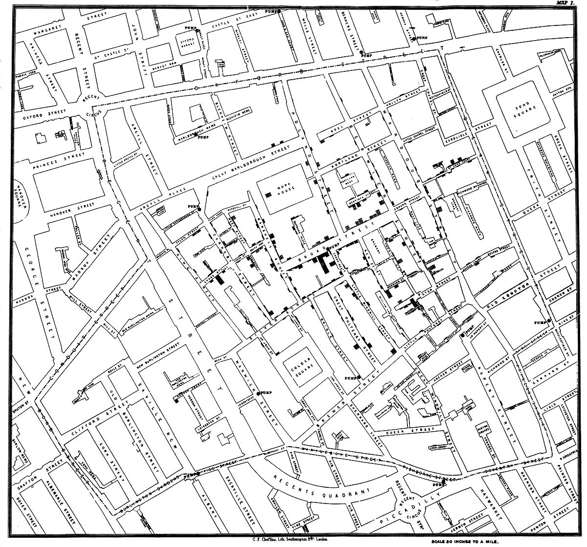
Figure 7.1: John Snow’s cholera map (Snow 1854).
Cameron Beccario’s interactive earth is a great example of how far things have come since the 1850’s. Beccario used weather, oceanographic, and geospatial data to make a beautiful and informative global forecasts graphic, that’s interactive (Only available online, Beccario (2020), see Figure 7.2 for a static screenshot). The breadth and depth of data that he used is quite amazingly large and, importantly, it is all open source.
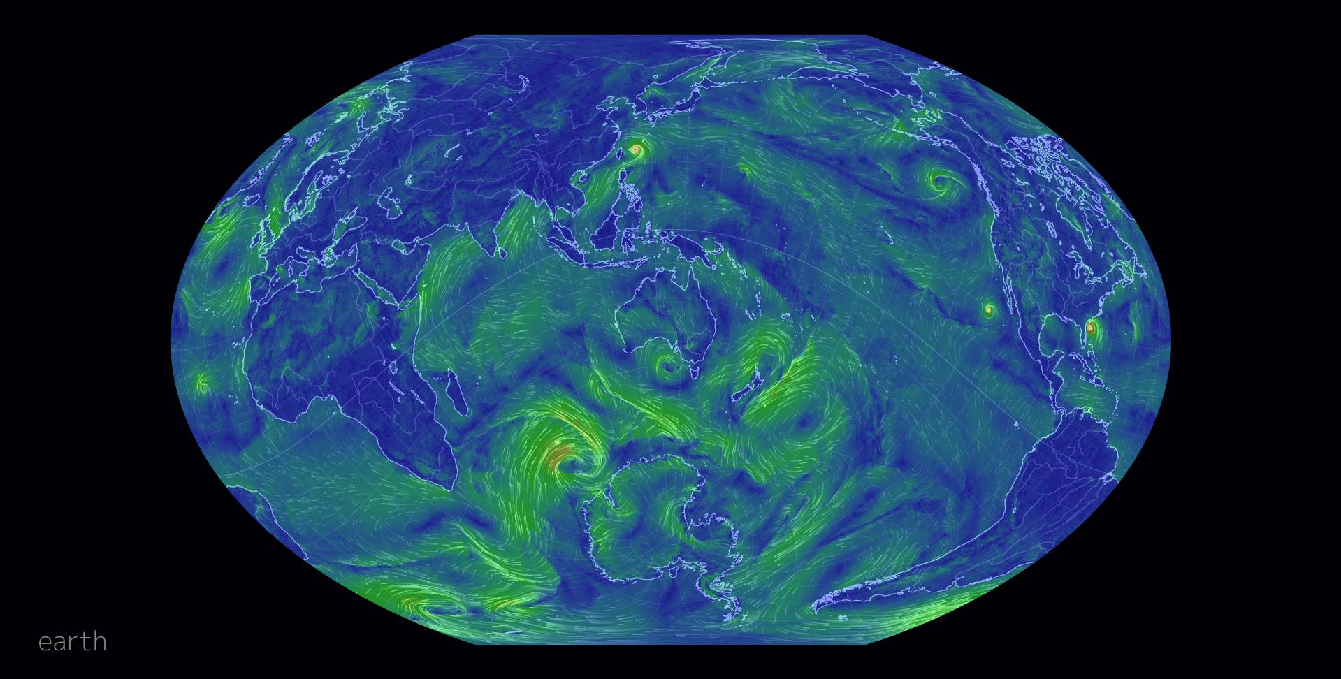
Figure 7.2: earth by Beccario (2020).
Spatial data visualisations deal with variables that are linked to a location. Everything happens somewhere after all. Visualising the location of data aims to provide important context or a sense of spatial autocorrelation. The idea of spatial autocorrelation is based on Tobler’s first law of geography, which states that
Everything is related to everything else, but near things are more related than distant things. – Tolber (1970)
For example, the geography of an area (e.g. vegetation, terrain, elevation) is more likely to be similar to neighouring areas than it is to more distant areas.
The most common examples of spatial data visualisation relate to data mapped to a geographical coordinate system (e.g. a data point is assigned a latitude/longitude or a geographic region). However, spatial data can be defined more broadly. Examples of other spatial systems might include sporting arenas, the universe/galaxy, a computer chipboard, a chess board, a building, or a virtual world in a computer game. This chapter will focus on map-based data visualisation as it is by far the most common. However, the ideas covered within this chapter are applicable to all spatial data.
7.3 Types of Spatial Visualisations
Thematic maps are the most common form of spatial data visualisations. Thematic maps link a variable, or ‘theme’, to a map’s aesthetics, using the base map data (e.g. coastlines, boundaries and places) only as points of reference for the phenomenon being mapped. This is in contrast to a normal (general reference) map, which has the primary purpose of representing a geographical region. In the following sections, we will take a look at a few of the most common types of thematic maps, which include isarithmic maps, choropleth maps, points maps and cartograms (click on the tabs for the different types).
7.3.1 Choropleth Map
In a choropleth map, predefined regions of a map are coloured or darkened to indicate the value of a statistical quantity. The spatial scale of the data used in a choropleth map should logically match the spatial scale of the defined regions. For example, you would not plot population data for Australian capital cities on a map with state/territory boundaries as the defined regions since this would suggest these data apply to the whole state/territory. The choropleth map in Figure 7.3 shows the percentage, as a continuous colour scale, of people living in Statistical Local Areas (SLA) that identified as being Christian in the 2011 Census. The SLA are the predefined regions of the map.
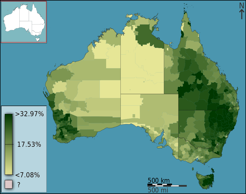
Figure 7.3: (Hudson 2012).
7.3.2 Isarithmic Map
In an isarithmic map (a.k.a. a contour or topological map) colour or lines are used to convey the spatial variability in a statistical quantity across the map. The contoured colours or lines represent density estimated using a smoothing algorithm. For example, in Figure 7.4, contours and colours are used to represent plant hardiness zones in North America. An isarithmic map would be used in preference to a choropleth map when the patterns of data being displayed transcend or are mismatched to any distinct regional boundaries.
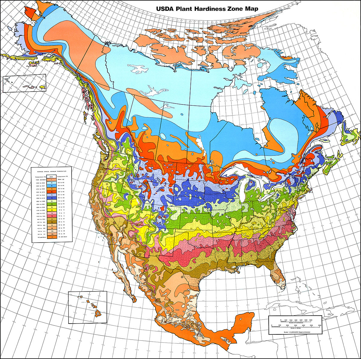
Figure 7.4: USDA plant hardiness zone map 1990 (Cathey 1990).
7.3.3 Point Map/Dot Density Map
Point maps, also known as dot density maps, use location points to visualise the spatial distribution of a statistical frequency. Our eyes are drawn to the clustering of points. Figure 7.5 below shows the location of pictures taken in London by Fischer (2010). Different colours are used to denote locals and tourists. We can clearly see the tourist hot-spots. As the proliferation of GPS recording devices increases, the accuracy and ubiquity of detailed location data is making these types of maps more popular. However, be aware of the potential sensitivity of directly plotting a phenomenon or data incident at a given location.
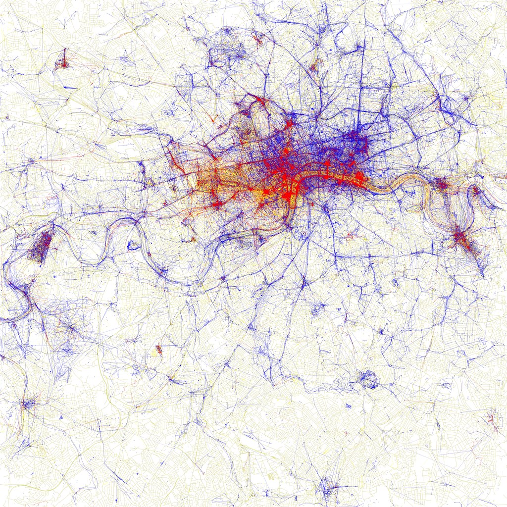
Figure 7.5: Dot density maps of pictures taken by locals (blue), tourists (red) and unknown (yellow) persons in London. (Fischer 2010).
7.3.4 Proportional symbol/Bubble maps
Proportional symbol/bubble maps have the added advantage of being able to map an additional variable to the size of a point. Colour is also sometimes added to introduce categorical distinction. However, be aware that we are inherently bad at directly comparing values based on area. Gapminder Foundation (2020)’s interactive map of total population size by country shows which countries have contributed the most to population growth overtime (see Figure 7.6). Note, however, how difficult it is to estimate exactly how much larger the population is in China (1.42B) in 2018 compared to Australia (28.4M).
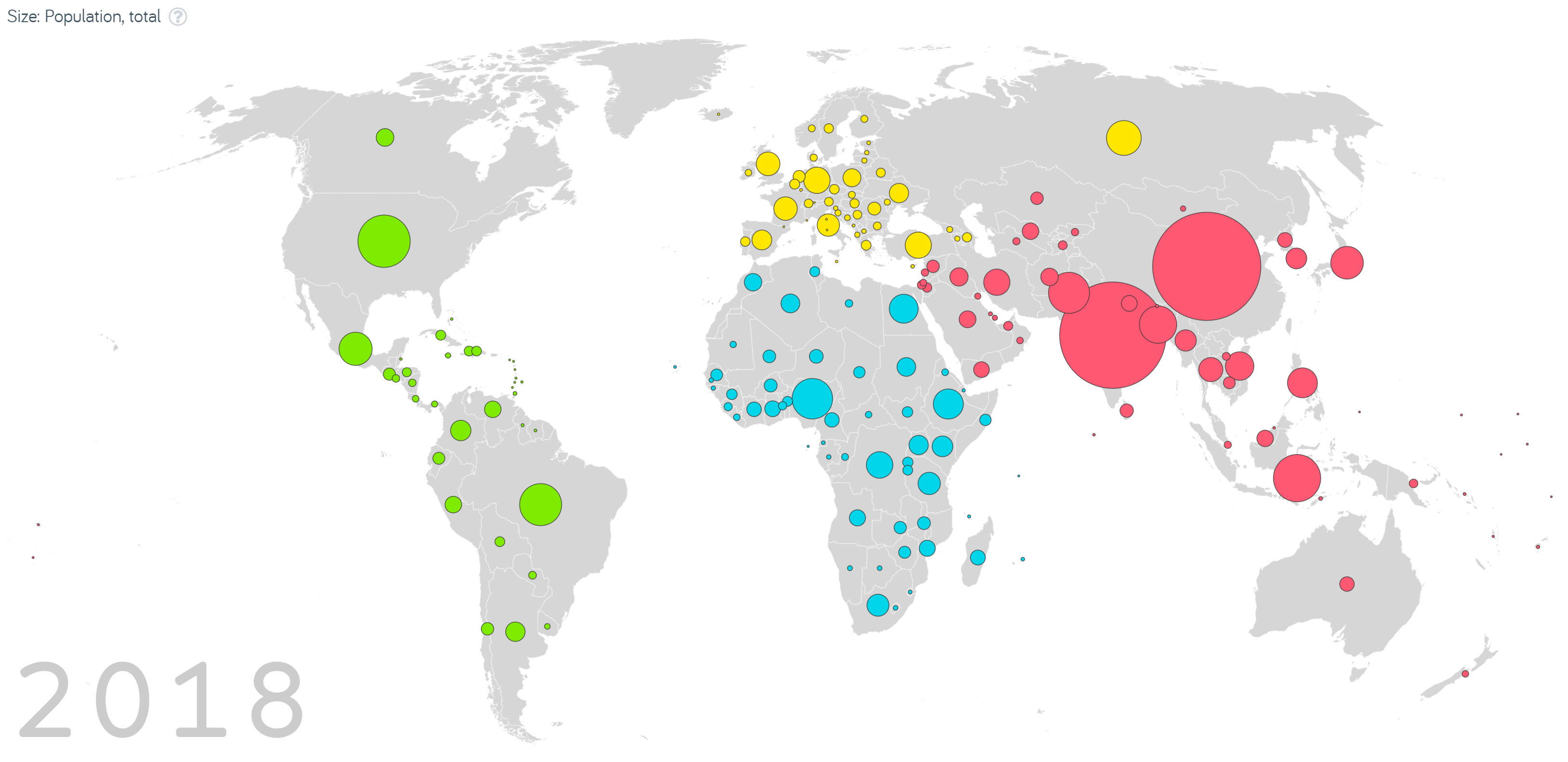
Figure 7.6: Screenshot from Gapminder Foundation’s interactive map of total population size by country (Gapminder Foundation 2020).
7.3.5 Area Cartograms
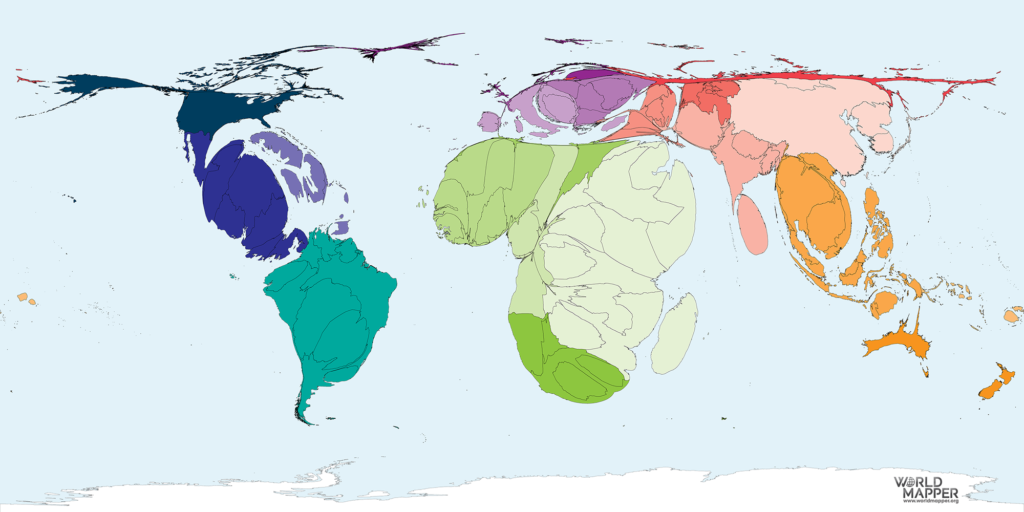
Cartograms use distance or area to represent a variable. For example, in the area cartogram below, the area of a country is proportional to the number of droughts that country has experienced between 2000 and 2017. Interestingly, we think of Australia as a drought stricken country, but this image gives a fresh perspective; most of the damaging droughts happened in China, followed by the United States of America, Somalia and Mozambique. Cartograms are risky because they often look very unusual, and people unfamiliar with a map might be confused by the distortion. For this reason, cartograms are best used when your audience is relatively familiar with the original size and shape of the regions. Insets of the original map help too. World Mapper has great examples of a range of area cartograms
7.3.6 Dorling Cartograms
Named after Professor Dorling, of The University of Sheffield, Dorling cartograms represent each geographic region with a circle that generally resembles the regions location, with preservation of the neighbouring locations. The size of the circle indicates the value of the variable of interest and colour another categorical variable (if need be). These are definitely on the abstract end of the spatial spectrum, but useful when only relational and not exact spatial information is needed. Squares rather than circles can used in what are called ‘Demers cartograms’.
7.4 Understanding Spatial Data
Spatial data comes in a variety of forms. It can be as simple as latitude and longitude coordinates assigned as variables to records in a data table, or it can be complex shape files (more on these later) comprising of spatially referenced points, line, and polygons with linked non-spatial attributes (data variables like soil moisture, temperature, primary vegetation etc.). The key aspect is that they have coordinate values and a system of reference for these coordinates (more on this later). We represent the purely spatial information of entities through spatial data models.
7.4.1 Spatial Data Models
All maps are a representation of reality and models are used to translate features of the landscape into features on the map. There are two types of spatial data models; raster and vector.
7.4.1.1 Raster
Raster data models represent a space and its features using a grid of cells. Think of a TV screen or monitor’s pixels. Each cell has a specific feature, e.g. colour. If there are enough cells, with enough resolution, a detailed model of an area can be represented.
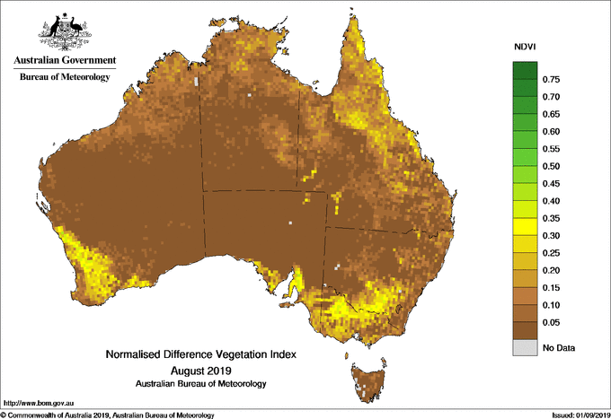
Raster models are great for representing continuous spatial features, such as temperature, elevation and rainfall. For example, the Normal Difference Vegetation Index (NDVI) map from the Australian Bureau of Meteorology uses a raster data model to visualise the amount of green vegetation across Australia. You can see Australia is broken-up into small cells. Each cell has a corresponding colour which is mapped to a discrete colour scale for NDVI.
A major drawback of the raster model is data size and pixelisation. As the cells become smaller and the resolution of the continuous spatial features increase, so too does the file size. This can create computational challenges as the images require increased computational power and memory. However, with increasing computer power and storage this is becoming less and less of an issue. On the other hand, larger cells reduce the quality of the image because individual cells become more easily perceived (pixelated). This is especially evident when zooming in or displaying a map on screens with different resolution.
7.4.1.2 Vector
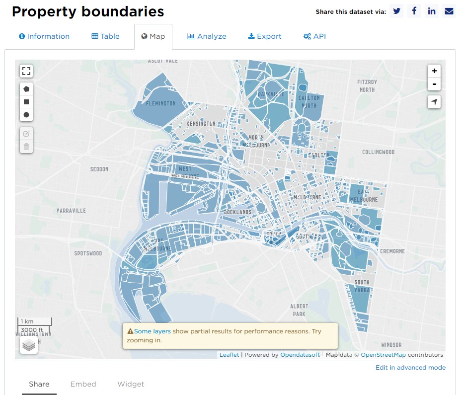
Vector data models use graphical primitives (lines, points, polygons) to represent spatial features. These models are well suited to represent discrete objects (boundaries, roads, rivers, buildings). For example, the property boundaries layer from the City of Melbourne’s open data repository uses polygons to represent Melbourne property demarcations.
Because vector data is based on coordinates and primitives, the map is very accurate and not impacted by cell size. The main issue is that vector data is poorly suited to continuous-type data. One way to display continuous data in vector format is using contours.
7.4.2 Spatial Referencing Systems
Say you were interested in all the vending machines in the RMIT city campus and wanted to map where they were. How would you go about recording their location? Would you use their build/floor/room number? Their latitude/longitude? Or something else, say their x/y/z location in relation to your favourite coffee shop? These are all valid systems of reference for spatial data.
When dealing with GIS (Geographic Information System) data (GISGeography has a great list of open source sites for data) you will mostly be working with data that has coordinate reference systems. However, a lot of socio-economic data that you come across is likely to be spatially referenced using towns, cities or countries. Let’s talk about these different systems a bit more.
7.4.2.1 Coordinate Systems
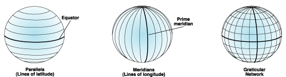
7.4.2.1.1 Geographic coordinate systems
A geographic coordinate system describes the position of a location on the earth’s surface using spherical measures of latitude and longitude, which are measure of the angles (in degrees) from the center of the earth to the point on the surface.
Since the earth is not completely round (nor is it flat, despite what some people still believe), we need a model to define the surface. The global standard used is the World Geodetic System (WGS), with WGS84 as the latest revision. WGS84 is also the reference coordinate system used by the Global Positioning System, so we have that to thank for not getting lost!
Australia officially uses the Geocentric Datum of Australia 1994 (GDA94), however we are currently transitioning to GDA2020. Referencing systems need to be updated on a periodic basis due to continental drift (plate tectonics), changes to the Earth’s crust, and improved measurements of the Earth’s shape. GDA94, for example, moves with the Australian continental plate. It was identical to the WGS84 datum in 1994, but since then has drifted at the rate of approximately 6 cm north per year.
Although latitude and longitude can locate exact position on Earth, they are not uniform unit of measures. One degree on latitude is not the same at the South Pole as it is at the Equator. This has wide ranging implications for any analysis from such data.
7.4.2.1.2 Projected coordinate systems
Projected coordinate systems are defined on flat 2D surfaces (Cartesian x and y coordinates) and, unlike a geographic coordinate system, they have constant length, angles and areas. The issue, however, is that a round object needs to be made flat…
Map projection is the process of transforming geographic coordinates from a 3D surface (latitude and longitude) to a 2D plane. Many different projections have been proposed. Each with their own quirks and advantages. As Mark Monmonier explains well in his book How to Lie with Maps:
Map projections distort five geographic relationships: areas, angles, gross shapes, distances, and directions. Although some projections preserve local angles but not areas, others preserve areas but not local angles. All distort large shapes noticeably (but some distort continental shapes more than others), and all distort at least some distances and some directions.
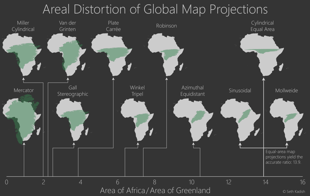
Here is a fantastic image by Seth Kadish (and blog post) that summaries how map projections can distort country area, by comparing how the areas of Africa (near the equator; grey) and Greenland (far from the equator; green) change with different projections.
7.4.2.1.3 Using coordinate systems
There are in excess of 4000 coordinate spatial referencing systems used throughout the world. Here I have tried to highlight the specialised and technical nature of mapping and why it requires a map coordinate system. The most important thing to keep in mind when working with spatial data is that all data must use the same spatial reference system. If two data sets use different coordinate reference systems, this can cause issues such as object alignment, especially at large spatial scales. There is a lot of help resources out there that go into this further. A few favourites are the ArcGIS Help Docs and the US Gov’s GVC Spatial Data Science Site.
7.4.2.2 People/Organisational Systems
On a day-to-day basis we are unlikely to use a coordinate reference system directly when referring to the spatial location of something. The closest you might get is to send your friend a pin drop with your latitude/longitude coordinates via Google maps. But you are more likely to use something like a street address. This is an example of a people or organisational reference system. Others include electorates, local government areas, postcodes, and suburbs.
These systems are more practical, but at a cost. They are discrete in nature and this sacrifices precision. A street address, for example, indicates where a house will be on a street, relative to other houses, but it will not tell you the boundaries of the property. It may also be inaccurate due to a subdivision or merger with another property. People also spell addresses differently. Many addresses are similar and many countries and states share the same names for streets, suburbs and cities/towns. For example, if you said you lived in Melbourne, you would have to qualify that with Australia. Otherwise, someone from Canada might mistake this for the township with the same name in Quebec (unlikely, but you get the point).
Often when visualising spatial data, you may be required to convert people/organisation systems into coordinates. For example, you might need to find the coordinates for a street address. Where would you put the coordinates? In the center of the property? Or do you try to find the property boundaries and draw it as a polygon? How do you even find this information? Fortunately in Australia, we have the PSMA Geocoded National Address File (G-NAF) which provides longitude and latitude coordinates for over 13 million Australian addresses. However, finding coordinates for people/organisational systems won’t always be this easy.
7.5 Worked Examples
We now understand that the challenges in spatial data visualisation largely come from the need to convert a three-dimensional physical space into a model that outputs coordinates for mapping to a two-dimensional plane. Once we have these coordinates, we can merge spatial features with statistical data and create spatial data visualisations.
In the following sections we will work through some methods in R to create two of the most common thematic maps - choropleth and point maps. We will also look at a case study by a former student to demonstrate how to bring together techniques that you have learnt to answer a ‘real world’ question.
7.5.1 Choropleth Map
In the following sections, we will introduce spatial data visualisation tools using the lga_profiles_data_2011_pt1 dataset. We will first produce a choropleth map of Victoria showing the spatial distribution of pertussis incidents, notifications_per_1_000_people_of_pertussis by LGA. Pertussis, more commonly known as whooping cough, is a highly contagious and deadly respiratory infection that affects newborns. The bacterial infection has made a comeback in recent years due to low national immunization rates. The consequences have been deadly. Understanding the spatial distribution of this serious infection can help inform health policy and intervention in an effort to control this preventable infection.
We will introduce this topic by using the mapping features of ggplot2 and ggmap. We will then introduce the open source Leaflet package which will allow you to create interactive spatial data visualisations using R.
7.5.1.1 Data
First download the lga_profiles_data_2011_pt1 data.
This dataset contains the aggregated 2011 census data for all 79 Victorian local government areas (LGA). The original dataset was derived from the Vic Map Lite webpage. Part 1 of the Vic Map Lite data contains a range of indicators including population demographics, diversity, social engagement and crime, economic and employment, housing and sustainability, education and health. You can read a complete description of each of the variables by downloading the LGA_profiles_data_201_definitions.pdf document. Note that Part I of data includes only the first 167 variables. The following table provides a preview of the dataset.
7.5.1.2 ggplot2
ggplot2 is well equipped to deal with spatial data thanks to its map coordinate system and access to a range of powerful spatial data visualisation packages in R. I will show you how to create a choropleth map of Victorian LGA’s distribution of pertussis cases. I must acknowledge the very clearly and well explained blog post, Mapping with ggplot: Create a nice choropleth map in R by Slawa Rokicki, that guided this section.
To get started we need to ensure we have the right packages installed and loaded. The order of loading is important here. I’m not joking. Install and load these packages in the following order.
install.packages("rgeos") # If required
install.packages("maptools") # If required
install.packages("ggmap") # If required
library(ggplot2)
library(dplyr)
library(rgeos)
library(maptools)
library(ggmap)Next we import the shape file. To do this correctly you need to import the shape file from a folder with all the contents from vmlite_lga_cm.zip. This means you will need to extract the files from vmlite_lga_cm.zip into a separate folder prior to importing the shp file into R. If the other files in the vmlite_lga_cm.zip are not present in the same folder when you import vmlite_lga_cm.shp the importation will fail.
If this stage works you should be able to check that the vic.lga.shp object is class sp and the shp file has a list of objects to draw the LGA polygons for the choropleth map, including the LGA names which we will use as a unique ID value. Run the following code:
## [1] "SpatialPolygonsDataFrame"
## attr(,"package")
## [1] "sp"## [1] "ufi" "ftype_code" "lga_name" "state" "scale_usec"
## [6] "labeluse_c" "ufi_cr" "lga_name3" "cartodb_id" "created_at"
## [11] "updated_at"As we can see, the commands verify that the object vic.lga.shp is class sp (SpatialPolygonDataFrame) with 11 variables. To verify the LGA names are stored in vic.lga.shp$lga_name we run:
## [1] SWAN HILL TOWONG
## [3] MOUNT BAW BAW ALPINE RESORT SOUTH GIPPSLAND
## [5] SOUTHERN GRAMPIANS WELLINGTON
## 87 Levels: ALPINE ARARAT BALLARAT BANYULE BASS COAST BAW BAW ... YARRIAMBIACKThe code verifies 87 lga_names which is higher than the expected 79. This is because the shp file also includes some islands, resort regions and repeated LGA names.
Now we need to bring in the LGA variables that we would like to map from the lga_profiles_data_2011_pt1.csv dataset. We also want to view the lga_name variable as these will be used as our unique IDs to merge the shp file and the dataset.
lga_profiles_data_2011_pt1 <- read.csv("data/lga_profiles_data_2011_pt1.csv")
head(lga_profiles_data_2011_pt1$lga_name)## [1] "ALPINE" "ARARAT" "BALLARAT"
## [4] "BANYULE" "BARWON-SOUTH WESTERN" "BASS COAST"In order to merge the shp file with the profile data, we need to have matching IDs in both variables. I can’t stress the importance of having these two variables perfectly matched. To merge the shp file and the lga_profiles_data_2011_pt1 data frame, we first use the fortify function from the ggplot2 package to convert the shp file to a data.frame. This will make it easy to merge with lga_profiles_data_2011_pt1.
## long lat order hole piece id group
## 1 147.1260 -36.44808 1 FALSE 1 ALPINE ALPINE.1
## 2 147.1233 -36.44827 2 FALSE 1 ALPINE ALPINE.1
## 3 147.1237 -36.45444 3 FALSE 1 ALPINE ALPINE.1
## 4 147.1208 -36.45889 4 FALSE 1 ALPINE ALPINE.1
## 5 147.1215 -36.46418 5 FALSE 1 ALPINE ALPINE.1
## 6 147.1256 -36.46769 6 FALSE 1 ALPINE ALPINE.1Note how the LGA names are now called id. We need to fix this so that both data frames have an lga_name variable to use in the merge.
## long lat order hole piece id group lga_name
## 1 147.1260 -36.44808 1 FALSE 1 ALPINE ALPINE.1 ALPINE
## 2 147.1233 -36.44827 2 FALSE 1 ALPINE ALPINE.1 ALPINE
## 3 147.1237 -36.45444 3 FALSE 1 ALPINE ALPINE.1 ALPINE
## 4 147.1208 -36.45889 4 FALSE 1 ALPINE ALPINE.1 ALPINE
## 5 147.1215 -36.46418 5 FALSE 1 ALPINE ALPINE.1 ALPINE
## 6 147.1256 -36.46769 6 FALSE 1 ALPINE ALPINE.1 ALPINEFixed! Now for the merge. Ensure we use by="lga_name" to link the data frames by the unique LGA names.
And one, final and very, very important step. We must order the final data frame to be used in the choropleth mapping by merge.lga.profiles$order. This will ensure the polygons are drawn correctly in the ggplot object. If you skip this step, you will know it right away! Trust me… Skip it to see what I mean… I dare you.
Now we can start with our first plot.
p1 <- ggplot(data = choro.data.frame,
aes(x = long, y = lat, group = group,
fill = notifications_per_1_000_people_of_pertussis))
p1 + geom_polygon(color = "black", linewidth = 0.25) +
coord_map() 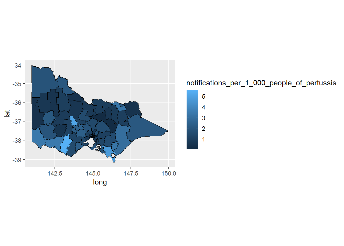
Then we can pretty it up…
p1 + geom_polygon(color = "black", size = 0.25) +
coord_map() +
scale_fill_distiller(name = "Cases \n per 1,000",
guide = "legend",
palette = "YlOrRd", direction = 1) +
theme_minimal() + theme(axis.title.x = element_blank(),
axis.title.y = element_blank(),
axis.text.x = element_blank(),
axis.text.y = element_blank(),
panel.grid = element_blank()) +
labs(title="Victorian LGA Pertussis Cases - 2011")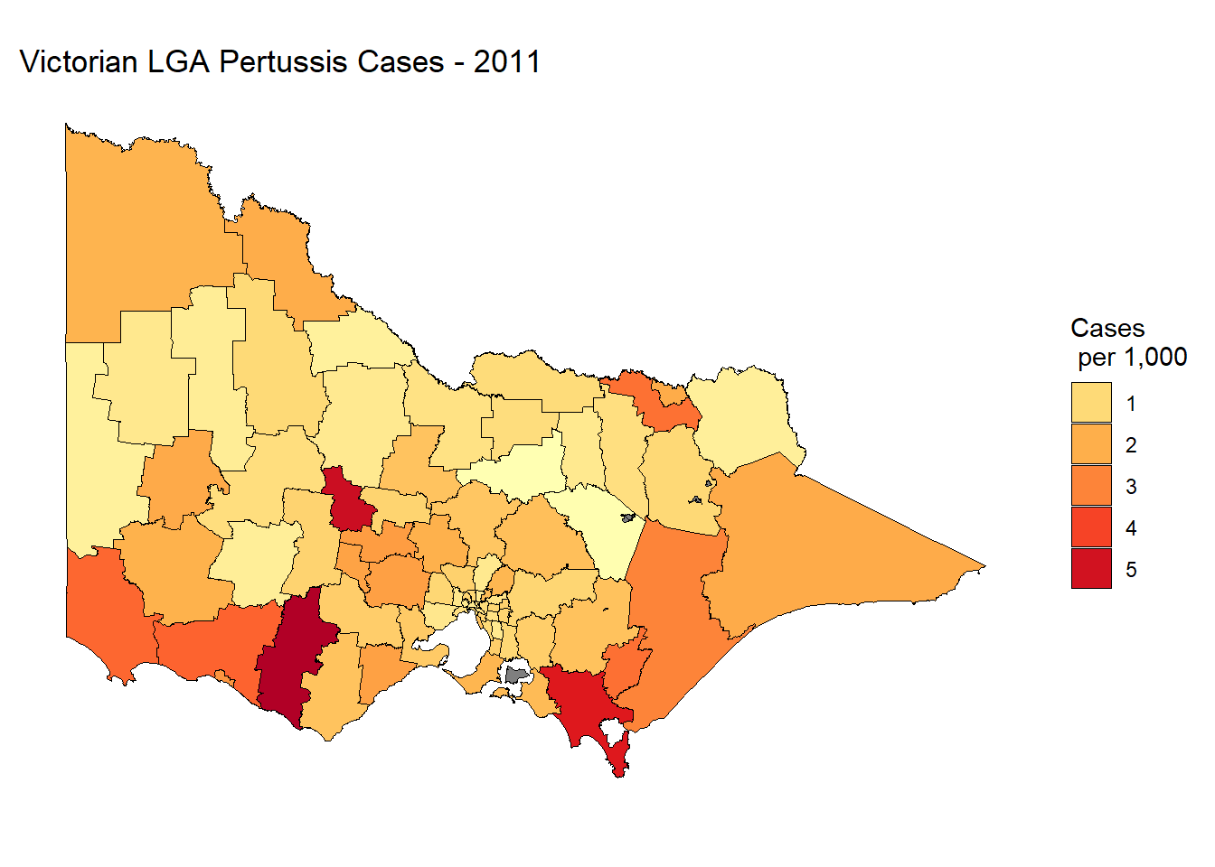
Not bad. It’s a static plot, so we are unable to zoom into Melbourne metro where the majority of Victoria’s population is concentrated. It’s also difficult to see some of the smaller LGA’s and near impossible to see Queenscliff. We could also add some hover information to report the LGA name and exact rate of pertussis cases per 1000 people. We will do this in the following section by introducing Leaflet.
7.5.1.3 Leafleft
The leaflet package for R allows you to create interactive spatial data visualisations using Leaflet, a powerful, open source, JavaScript library. In the following example, we will reproduce the choropleth map of Victorian pertussis cases by LGA in 2011.
Let’s start by installing and loading the leaflet package.
For Leaflet choropleth maps, we need to use a SpatialPolygonDataFrame, which was created when we imported the original .shp file.
## [1] "SpatialPolygonsDataFrame"
## attr(,"package")
## [1] "sp"We can plot the LGA polygons quickly using the leaflet function and addPolyons. We need to set a default view and zoom level. You may need to experiment to get these values right.
This returns a choropleth map of the LGA boundaries. Note how you can zoom and move the map around.
The next step will be to merge the LGA profile data, lga_profiles_data_2011_pt1 with the vic.lga.shp spatial polygon data frame. We use the merge functions from the sp package again. When merging the .shp file directly with the LGA data frame we will encounter errors with duplicated LGAs. To overcome this issue, we can add an argument to duplicate the matches. This won’t impact the choropleth map. Ideally, you would remove the duplicates to ensure a clean merge.
merge.lga.profiles3<-sp::merge(vic.lga.shp, lga_profiles_data_2011_pt1,
by="lga_name", duplicateGeoms = TRUE)Now we can create a discrete colour scale. There are numerous methods but a simple approach is to base the scale on the quantiles of pertussis notifications. We can use the quantile() and colourBin() function from the leaflet package for this purpose. First, we calculate the quantiles for 5 levels.
bins <- quantile(
lga_profiles_data_2011_pt1$notifications_per_1_000_people_of_pertussis,
probs = seq(0,1,.2), names = FALSE, na.rm = TRUE)
bins## [1] 0.09988014 0.76654278 1.04295663 1.40278076 2.07256177 5.59552358bins now contains five sequential colour levels so that 20% of the data falls within each bin The following histogram visualises the breaks used to create the scale. Note how each bin does not have an equal interval.
ggplot(data = lga_profiles_data_2011_pt1,
aes(x = notifications_per_1_000_people_of_pertussis)) +
geom_histogram(colour = "white", bins = 40) +
geom_vline(
xintercept = quantile(
lga_profiles_data_2011_pt1$notifications_per_1_000_people_of_pertussis,
probs = seq(0,1,0.2), na.rm = TRUE),
colour = "red", lwd = 1, lty = 2)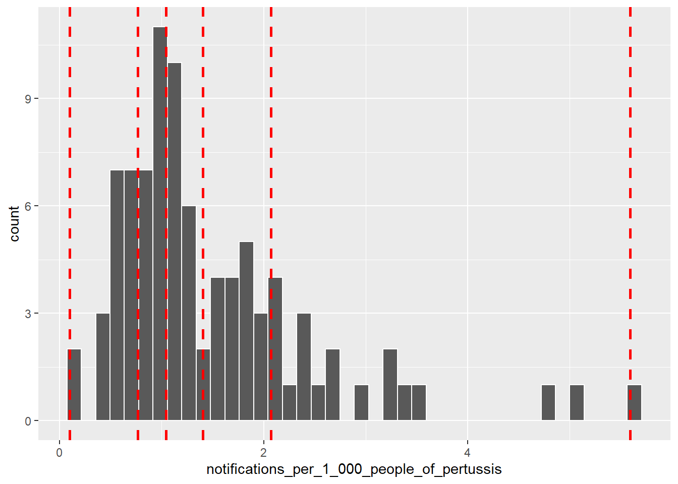
bins can be used to create a colour scale, named pal, using the colorBin() function, which maps the bins to a palette. We have selected the YlOrRd palette from the ColourBrewer package.
pal <- colorBin(
"YlOrRd",
domain = lga_profiles_data_2011_pt1$notifications_per_1_000_people_of_pertussis,
bins = bins
)Now we can add the colour scale named pal to the choropleth map. Note how we had to change the dataset to the merged dataset, merge.lga.profiles3.
p3 <- leaflet(merge.lga.profiles3) %>%
setView(lng = 147, lat = -36.5, zoom = 6)
p3 %>% addPolygons(
fillColor = ~pal(notifications_per_1_000_people_of_pertussis),
weight = 2,
opacity = 1,
color = "white",
dashArray = "3",
fillOpacity = 0.7)
We can also add highlighting…
p3 %>% addPolygons(
fillColor = ~pal(notifications_per_1_000_people_of_pertussis),
weight = 2,
opacity = 1,
color = "white",
dashArray = "3",
fillOpacity = 0.7,
highlight = highlightOptions(
weight = 3,
color = "#666",
dashArray = "",
fillOpacity = 0.7,
bringToFront = TRUE))
When we hover over an LGA, we should also be able to see the name and pertussis rate.
labels <- sprintf(
"<strong>%s</strong><br/>%g notifications / 1,000 people",
merge.lga.profiles3$lga_name,
merge.lga.profiles3$notifications_per_1_000_people_of_pertussis
) %>% lapply(htmltools::HTML)
p3 %>% addPolygons(
fillColor = ~pal(notifications_per_1_000_people_of_pertussis),
weight = 2,
opacity = 1,
color = "white",
dashArray = "3",
fillOpacity = 0.7,
highlight = highlightOptions(
weight = 5,
color = "#666",
dashArray = "",
fillOpacity = 0.7,
bringToFront = TRUE),
label = labels,
labelOptions = labelOptions(
style = list("font-weight" = "normal", padding = "3px 8px"),
textsize = "15px",
direction = "auto"))
Finally, we need a title and legend.
labels <- sprintf(
"<strong>%s</strong><br/>%g notifications / 1,000 people",
merge.lga.profiles3$lga_name,
merge.lga.profiles3$notifications_per_1_000_people_of_pertussis
) %>% lapply(htmltools::HTML)
library(htmlwidgets)
library(htmltools)
title <- tags$div(
HTML('<h3>Victorian LGA Pertussis Cases - 2011</h3>')
)
p3 %>% addPolygons(
fillColor = ~pal(notifications_per_1_000_people_of_pertussis),
weight = 2,
opacity = 1,
color = "white",
dashArray = "3",
fillOpacity = 0.7,
highlight = highlightOptions(
weight = 5,
color = "#666",
dashArray = "",
fillOpacity = 0.7,
bringToFront = TRUE),
label = labels,
labelOptions = labelOptions(
style = list("font-weight" = "normal", padding = "3px 8px"),
textsize = "15px",
direction = "auto")) %>%
addLegend(pal = pal,
values = ~notifications_per_1_000_people_of_pertussis,
opacity = 0.7, title = "Notifications /1,000 people",
position = "bottomright") %>%
addControl(title, position = "topright")
While the code for interactive mapping using leaflet might not be as elegant as ggplot2, the result is pleasing. The ability to zoom, pan, highlight and reveal information as the user hovers over the map enhances an otherwise static map.
7.5.1.4 Colour Scales
Changing the colour scale on a choropleth map can have a drastic effect on its appearance. In the following section we will experiment with two other scales - equal intervals and continuous.
Equal intervals use a variable’s minimum and maximum value to define cut points along a variable’s scale that have the same interval. This is the same approach used by a histogram. We use the colourBin() function from the Leaflet package to define the cut points. In this situation, we set bins = 4. You won’t necessarily get 4 bins because Leaflet will try to find a “pretty” number of intervals, which appears to minimise decimal rounding. If you want to force the exact number of bins, insert pretty = FALSE.
pal2 <- colorBin(
"YlOrRd",
domain = lga_profiles_data_2011_pt1$notifications_per_1_000_people_of_pertussis,
bins = 4,
pretty = FALSE
)
p3 %>% addPolygons(
fillColor = ~pal2(notifications_per_1_000_people_of_pertussis),
weight = 2,
opacity = 1,
color = "white",
dashArray = "3",
fillOpacity = 0.7,
highlight = highlightOptions(
weight = 5,
color = "#666",
dashArray = "",
fillOpacity = 0.7,
bringToFront = TRUE),
label = labels,
labelOptions = labelOptions(
style = list("font-weight" = "normal", padding = "3px 8px"),
textsize = "15px",
direction = "auto")) %>%
addLegend(pal = pal2,
values = ~notifications_per_1_000_people_of_pertussis,
opacity = 0.7, title = "Notifications /1,000 people",
position = "bottomright") %>%
addControl(title, position = "topright")
This map is drastically different to the scale based on quantiles. Because pertussis notifications are skewed, the use of an equal interval scale hides the variability in the bulk of the distribution. However, it does do a good job of highlighting outliers, e.g. Corangamite and Central Goldfields.
What about a continuous colour scale? We can try the colorNumeric function from Leaflet.
pal3 <- colorNumeric(
"YlOrRd",
domain = lga_profiles_data_2011_pt1$notifications_per_1_000_people_of_pertussis
)
p3 %>% addPolygons(
fillColor = ~pal3(notifications_per_1_000_people_of_pertussis),
weight = 2,
opacity = 1,
color = "white",
dashArray = "3",
fillOpacity = 0.7,
highlight = highlightOptions(
weight = 5,
color = "#666",
dashArray = "",
fillOpacity = 0.7,
bringToFront = TRUE),
label = labels,
labelOptions = labelOptions(
style = list("font-weight" = "normal", padding = "3px 8px"),
textsize = "15px",
direction = "auto")) %>%
addLegend(pal = pal3,
values = ~notifications_per_1_000_people_of_pertussis,
opacity = 0.7, title = "Notifications/1,000 people",
position = "bottomright") %>%
addControl(title, position = "topright")
A continuous colour scale is the best option. Due to the skewed nature of the variable, the continuous colour scale highlights the outliers, but provides enough sensitivity in the scale to discern the more subtle differences state-wide.
7.5.1.5 Simplify .shp Files
When converting .shp to a data.frame, you can sometimes end up with some unusually large datasets. This depends on the .shp file being used. Sometimes their high level of precision (which is needed in mapping) creates a computational problem for spatial data visualisations. Connie Herrity, a former Data Visualisation student, had this very problem. After converting a .shp file to a data.frame she was left with 85.5 million rows. Suffice to say, the map took a prohibitively long time to render. This level of precision is often not needed for data visualisation, so it’s important to have a method to reduce the “resolution” of the .shp file. Connie helped me put together the following section to take you through the process.
In order to understand the process, Connie found this site useful - http://mapshaper.org/. As she explained, you can drag in a .shp file, check the result of simplifying it and export it when you are ready. It doesn’t use R, but it certainly is an effective way to simplify a .shp file. Connie’s dataset went from 85.5 million lines when merged to 500,000 lines!
If you want to stick to R, you can use the gSimplify() function from the rgeos package. First, let’s determine the size of the previous .shp data.frame, lga.shp.f.
## [1] "29285 rows"## 1.4 MbWe can now test the effect of gSimplify().
vic.lga.shp.simp1 <- gSimplify(vic.lga.shp, tol = .01, topologyPreserve=TRUE)
vic.lga.shp.simp1 <- SpatialPolygonsDataFrame(vic.lga.shp.simp1,
data=vic.lga.shp@data)
lga.shp.f.simp1 <- ggplot2::fortify(vic.lga.shp.simp1, region = "lga_name")
print(paste(nrow(lga.shp.f.simp1),"rows"))## [1] "8588 rows"## 0.3 MbThe tol controls the degree of simplification. Increasing this value will increase the simplification. tol = .01 makes a drastic decrease to the file size, so there is no need to increase this value. Now, let’s re-plot using the simplified .shp file.
lga.shp.f.simp1$lga_name <- lga.shp.f.simp1$id
merge.lga.profiles2<-merge(lga.shp.f.simp1, lga_profiles_data_2011_pt1,
by="lga_name", all.x=TRUE)
choro.data.frame2<-merge.lga.profiles2[order(merge.lga.profiles2$order), ]
p4 <- ggplot(data = choro.data.frame2,
aes(x = long, y = lat, group = group,
fill = notifications_per_1_000_people_of_pertussis))
p4 + geom_polygon(color = "black", size = 0.25) +
coord_map() +
scale_fill_distiller(name = "Cases \n per 1,000",
guide = "legend",
palette = "YlOrRd", direction = 1) +
theme_minimal() + theme(axis.title.x = element_blank(),
axis.title.y = element_blank(),
axis.text.x = element_blank(),
axis.text.y = element_blank(),
panel.grid = element_blank()) +
labs(title="Victorian LGA Pertussis Cases - 2011")
You would be hard-pressed to notice a difference. This function may save you a lot of trouble when dealing with precision .shp files or optimising a data visualisation app to run smoothly in the cloud.
7.5.2 Point Map
Point maps are essentially scatter plots where x and y refer to coordinates. Points represent the occurrence of an event. Overlaying points on a map helps to visualise the spatial variability in the frequency of an event. Our eyes are naturally drawn to clustering or areas of the map with a high density of points (Gestalt law of proximity). Clustering implies that the occurrence of spatially distributed random events may follow a predictable trend and the viewer can quickly generate hypotheses regarding the underlying factors that might explain the clustering. In the following demonstration, we will produce a point map visualising the spatial distribution of Victorian traffic accidents from the accidents dataset. We will create a map of road fatalities focused on the Melbourne area.
7.5.2.1 Data
The accidents dataset (which you will need to download from the link) contains the details and location of over 140,000 Victoria traffic-related accidents spanning 2006 to April 2016. The original datasets can be obtained from the Crash Stat datasets hosted on the data.vic.gov.au website. The following table provides a random preview of the dataset.
7.5.2.2 ggplot2
We will start with ggplot2 to produce our first point map. The first step is to use ggmap (Kahle and Wickham 2013) to select a basemap for the greater Melbourne area. The get_map function from ggmap can download maps using the Google Maps API. Maps can be searched using the location name or by using coordinates. The zoom level (a value between 3 and 21) can be adjusted along with the maptype. Let’s use this function to set our map for “greater” Melbourne. We can use the ggmap function to preview the map.
To use ggmap we first need to register with Google to access the Google Maps API - https://cloud.google.com/maps-platform/. You do need a credit card to register an account, so skip this section if you are not willing to do so. The functions in Leaflet are more than sufficient. With that being said, your credit card will only be charged if you exceed the free charges, which are very generous. To read more see here - https://cloud.google.com/maps-platform/pricing/.
Once you have access to the Google Cloud Console, enable Maps Static API and the Geocoding API. In the Google Maps Static API dashboard, click on Credentials and generate an API key. Copy this key and use register_google() function to record the key in your R session (the key below is a fake). Note you will need to do this for each session. It will also help to enable billing to unlock the quotas for your project. Otherwise, you will be very limited in the number of map requests you can make.
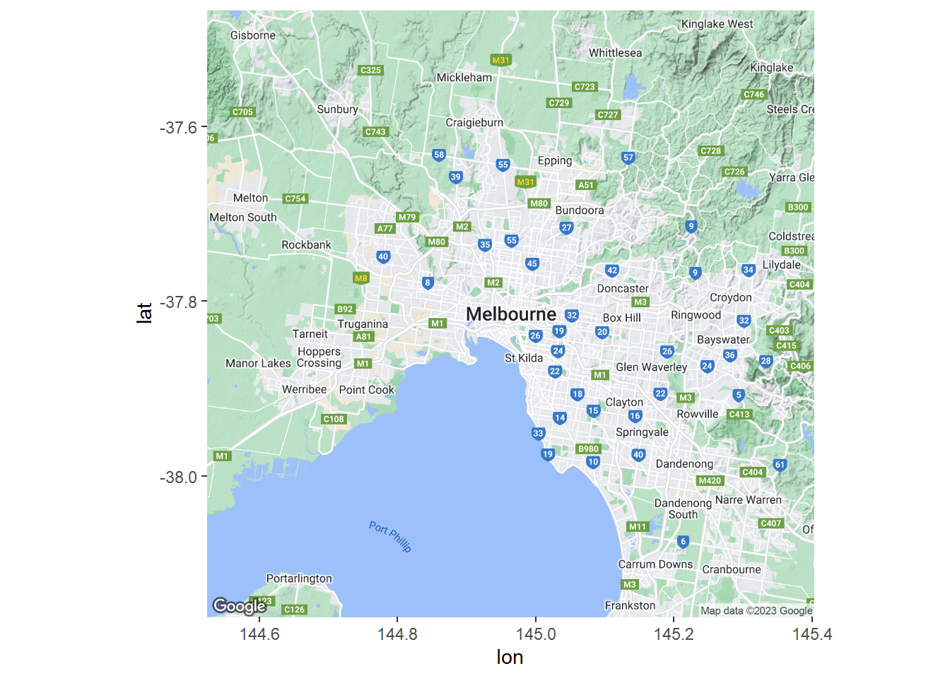
The map extends from Sunbury in the north-west to Frankston in the south-east. This is a road map so the labels and other map features will detract from the data. Let’s make the background a lot plainer. We can take advantage of the stamen maps.
Melb2 <- get_map("Melbourne,Australia", zoom = 10,
source = "stamen", maptype = "toner")
ggmap(Melb2)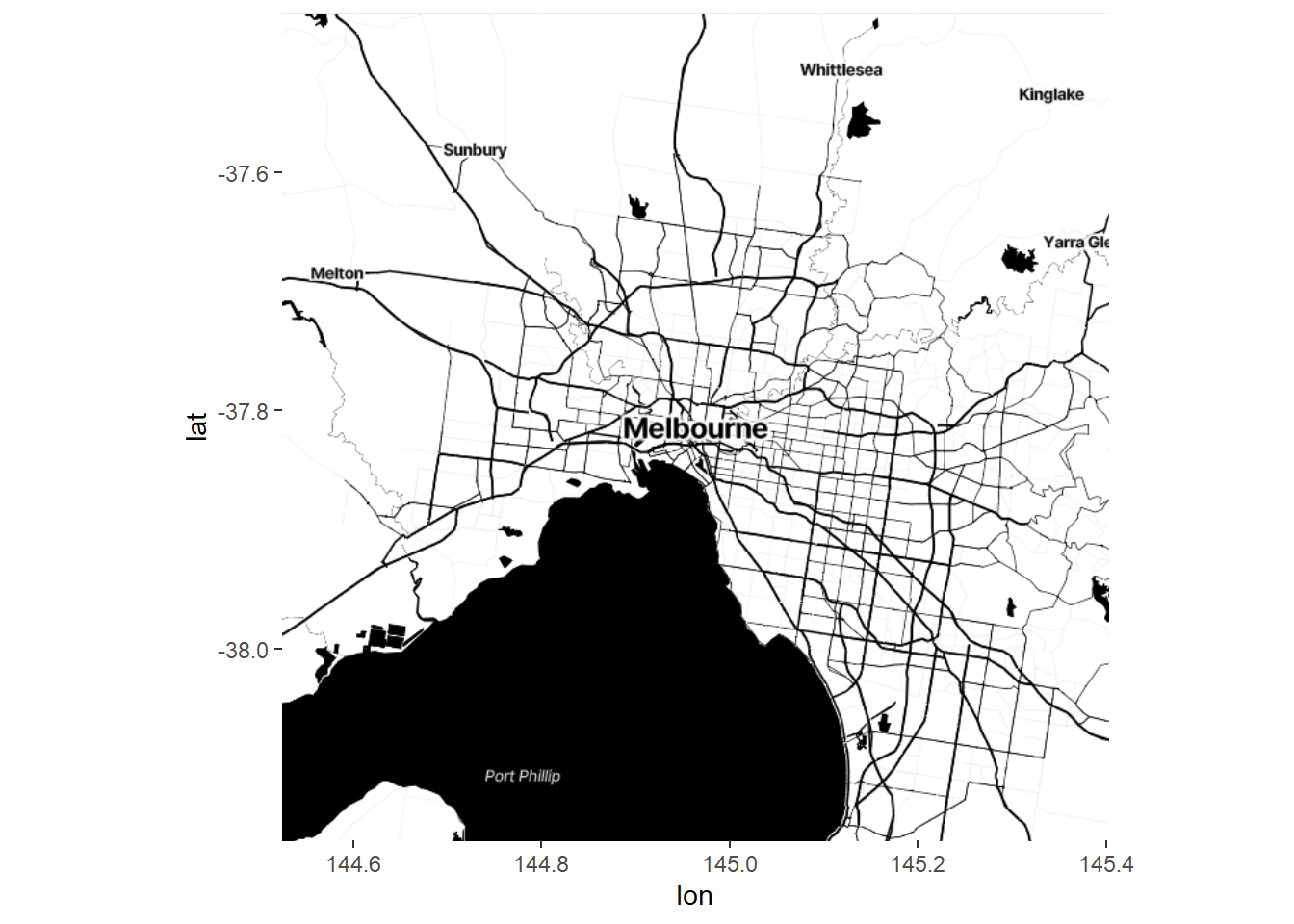
Next we filter the accidents dataset by fatalities.
Now we build up our ggmap.
p5 <- ggmap(Melb2)
p5 + geom_point(data=accidents_fatality, aes(x=Long, y=Lat),
size=1, colour = "red", alpha = .5) +
labs(title = "Melbourne Traffic Fatalities (2006 - Apr 2016)",
x = "Longitude", y = "Latitude")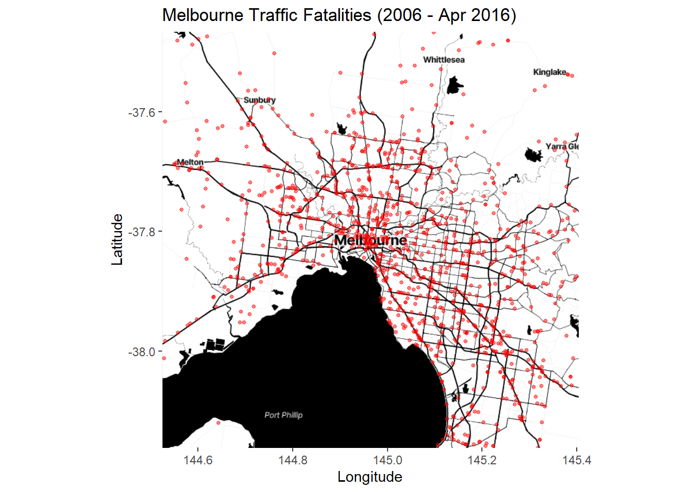
Lots of points. The trend is hard to see. We can try a stat_bin2d layer instead:
p6 <- ggmap(Melb2)
p6 + stat_bin2d(data=accidents_fatality,
aes(x=Long, y=Lat), alpha = .5, bins = 75) +
scale_fill_gradientn(colours = c("blue","red")) +
labs(title = "Melbourne Traffic Fatalities (2006 - Apr 2016)",
x = "Longitude", y = "Latitude")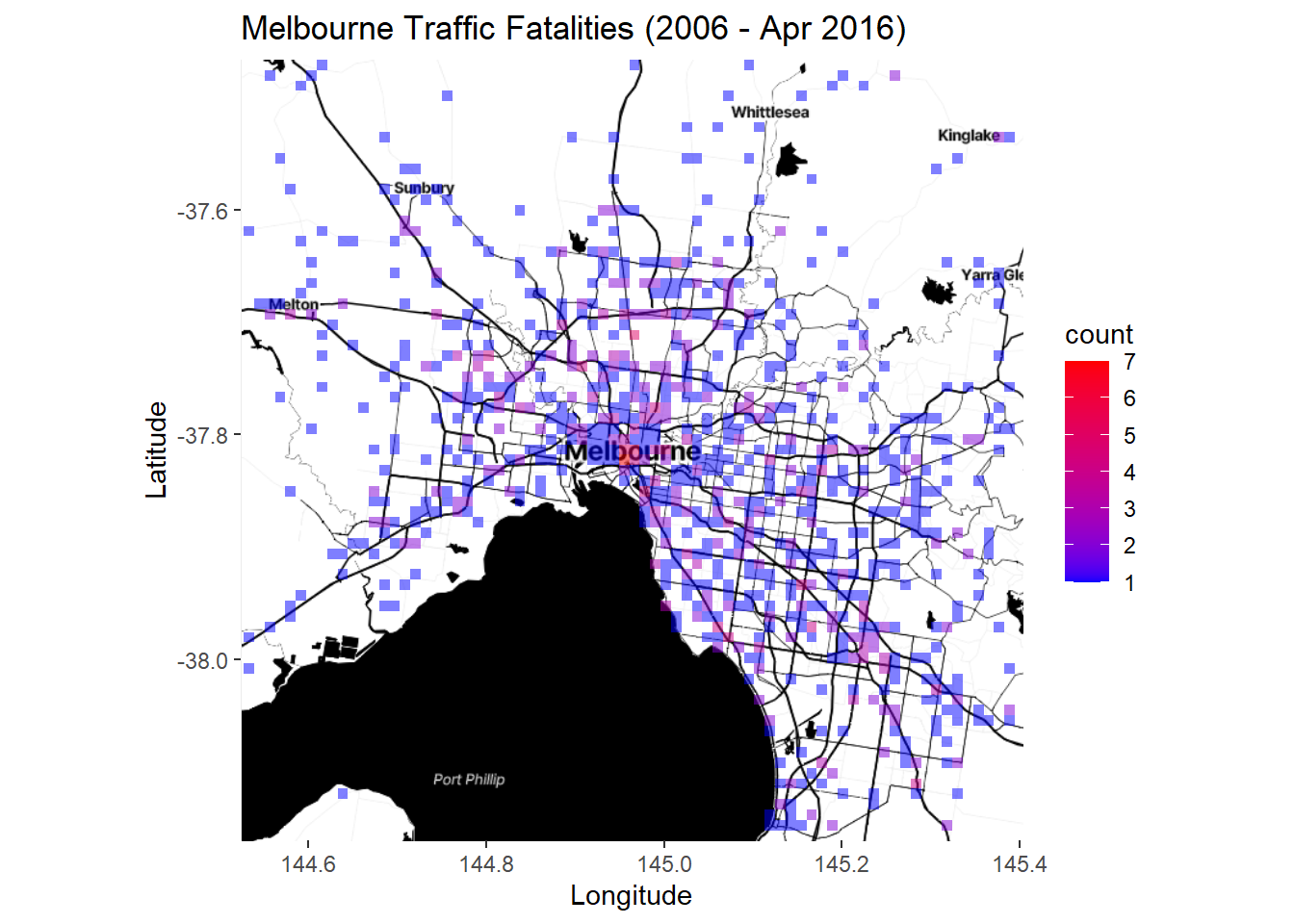
Better. Or we could try a contoured density plot:
p7 <- ggmap(Melb2)
p7 + stat_density2d(data=accidents_fatality,
aes(x=Long, y=Lat, fill = ..level.., alpha = ..level..),
geom = "polygon") +
labs(title = "Melbourne Traffic Fatalities (2006 - Apr 2016)",
x = "Longitude", y = "Latitude") + scale_alpha(guide = FALSE) +
scale_fill_continuous(name = "Accidents")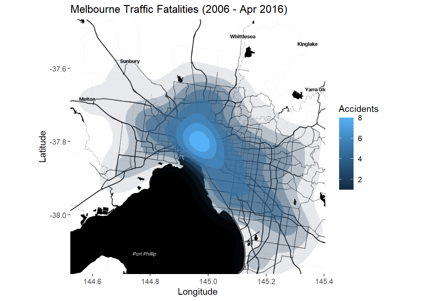
There is no need to set coord_map as ggmap defaults to a map coordinate system. This is a simple example of point-based and aggregate mapping using the ggmap package. It’s very simple to use and the results are quite pleasing. However, the static nature of these plots is a limitation.
7.5.3 Case Study - The City of Melbourne’s Urban Forest
In the next section we are going to be using work done by a former student, Simon Weller, to highlight how it is possible for you to combine new and previously learned techniques to create visualisations that provide meaningful insight into questions or hypothesis about our environment.
The public spaces of Melbourne are home to around 70,000 trees, worth approximately $650 million. These trees have significant environmental, social, and economic benefits, but are under threat due to climate change, ageing tree stock (yes, trees have life expectancy too) and urban growth. In response, the City of Melbourne has developed an Urban Forest Strategy which, among other goals, aims to continue to replenish dead and dying trees.
Of the 57 families represented, 6 dominate the landscape and one particular family Plantanaceae (aka plane trees) monopolizes the central CBD district. Plane trees are the subject of much ridicule due to their high pollen output and are being balmed for much of the hay fever experienced by city dwellers in spring. In response, “No more plane-tree” actions groups have been formed.
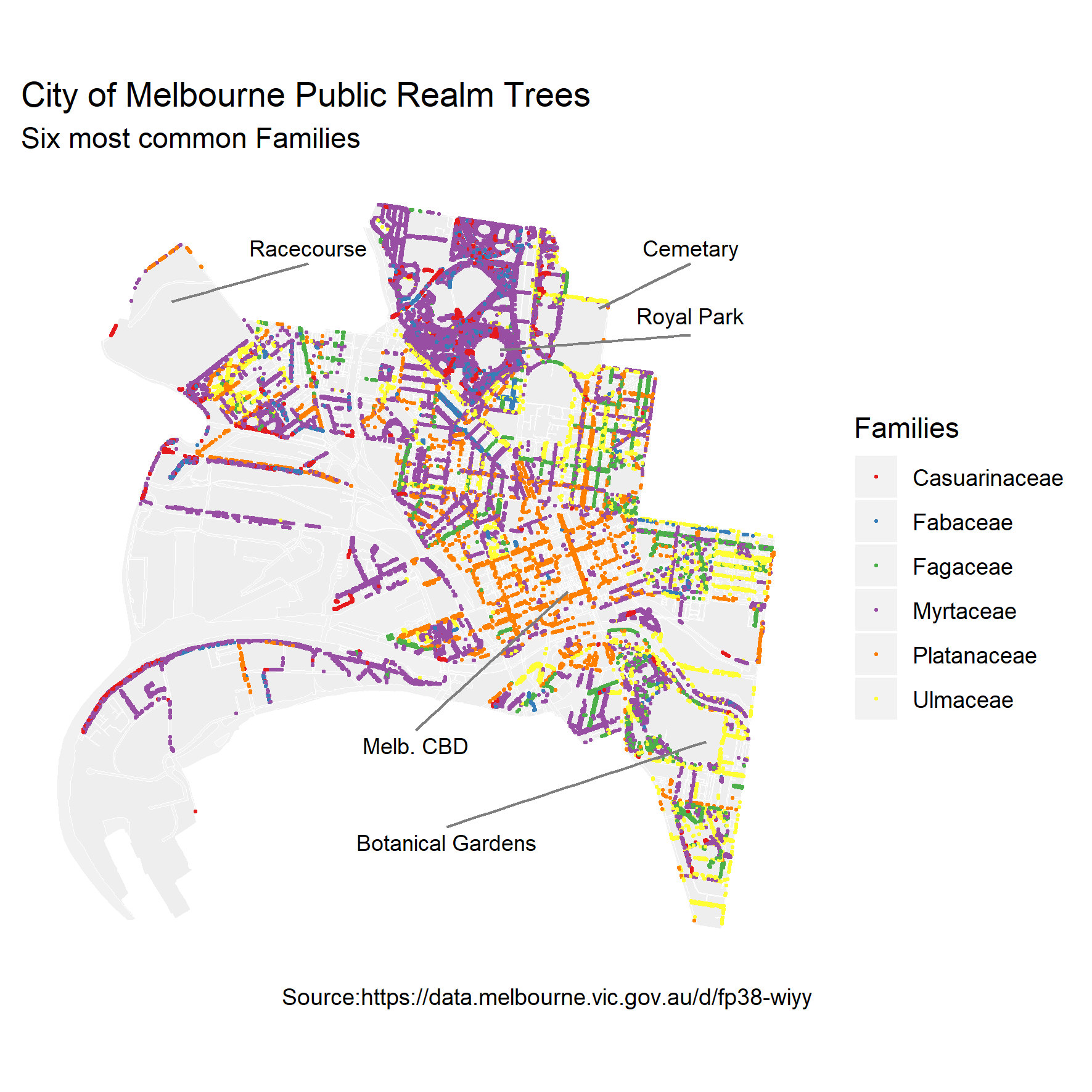
Simon Weller, who worked for the City of Melbourne, wanted to know how the future of Melbourne’s urban forest would look if the city ceased it’s tree replenishment programs. This is a really nice example of visualising real world data to answer a very clear question. We will use Simon’s work as a case study and I thank Simon for access to his code which formed the basis for what we will go through here. The specific question we are asking is: “what will Melbourne’s urban forest look like in future decades if we no longer plant trees?” To answer this we need to find out how long the currently established trees have left to live.
The data we are going to use is the City of Melbourne’s urban forest data, which records all the trees in Melbourne. The data table you need for this exercise is trees_Melb, but the original dataset, its metadata and associated interactive tools can be found here. This dataset contains over 70,0000 records of trees planted between 1899 and 2019, including their taxonomic classification, date planted, location and expected life-span. The following table provides a preview of the dataset, showing only a subset of values.
Let’s start by making sure we have the right packages installed and loaded:
# only install the packages that you require
install.packages("RSocrata")
install.packages("dplyr")
install.packages("tidyr") # for cleaning data
install.packages("ggplot2") # for visualising data
install.packages("lubridate") # for manipulating dates
install.packages("geojsonR") # for use with geoJSON files
install.packages("geojsonio") # for use with geoJSON files
install.packages("sp")
install.packages("mapproj")
library(dplyr) # for manipulating data
library(tidyr) # for cleaning data
library(ggplot2) # for visualising data
library(lubridate) # for manipulating dates
library(BiocManager)
library(mapproj)
# geojson libraries for map backgrounds
library(geojsonR)
library(geojsonio)
library(sp)Next, import the data trees_Melb.csv.
The data here is a subset of the online database. It has been tidied up slightly, but, given that it is still raw data it might not be 100% in-shape for our analysis. We need to have a closer look at it before we start doing our visualisations.
To start with, the variables we are most interested in are the Useful.Life.Expectency.Value, which will tell us how long a tree is expected to live, and the Year.Planted, which should be self explanatory. Together these will give us an idea of when (i.e. what year) we can expect a tree to die.
First we can look at what unique values these variables take.
## [1] 1899 1900 1977 1997 1998 1999 2000 2004 2005 2006 2007 2008 2009 2010 2011
## [16] 2012 2013 2014 2015 2016 2017 2018 2019## [1] 1 5 10 20 30 60 80 NAWe can see a couple of things straight away:
- There is an obvious gap between 1900 and 1997 where either trees were not planted (unlikely) or the data wasn’t collected (more likely). This isn’t really an issue, just something to keep in mind.
- There are missing values for
Useful.Life.Expectency.Value(as indicated by the NA), which means we have records of trees planted without any idea of how long they are expected to live.
Let’s find out exactly how many of these record are missing their useful life expectancy value.
## [1] 45981That’s nearly 64% of the records! Missing data is a common issue and you should always be on the lookout for it. Never just dismiss missing data, it might have something interesting to tell you.
Now we have identified that there are values missing we need to decide what to do. Is there any other information in the data that can help us fill in the gaps? Or should we remove them from the analysis? Handling missing data is often complicated and should be approached with thoughtfulness for the context of your data. Alvira Swalin has done a nice job of summarizing the common approaches in this blog post: How to Handle Missing Data. As she points out, “there is no good way to deal with missing data”. But some ways are better than others, situation depending. It’s a case-by-case approach.
Over half the records are missing Useful.Life.Expectency.Value, which is a very large proportion of the data set. Too large to justifiably remove them from the analysis. If you haven’t already, visually inspecting the trees dataframe might be helpful at this point. You can either open it in your own R session, or look back at the preview of the data at the start of this case example. If you play around with arranging the data by different variables you might notice that, for a given species (labelled Scientific.Name), a lot of entries have NA’s in their Useful.Life.Expectency.Value column while one or two entries have a numeric value. We can summarise this as follows.
trees %>% group_by(Family, Scientific.Name) %>%
count(Useful.Life.Expectency.Value) %>%
spread(key = Useful.Life.Expectency.Value, n)## # A tibble: 520 × 10
## # Groups: Family, Scientific.Name [520]
## Family Scientific…¹ `1` `5` `10` `20` `30` `60` `80` `<NA>`
## <chr> <chr> <int> <int> <int> <int> <int> <int> <int> <int>
## 1 "" "" NA NA NA NA NA NA NA 1
## 2 "Adoxaceae" "Viburnum t… NA NA NA NA NA NA NA 1
## 3 "Altingiaceae" "Liquidamba… NA NA NA NA NA NA NA 1
## 4 "Altingiaceae" "Liquidamba… 1 3 6 18 30 42 NA 119
## 5 "Anacardiaceae" "Harpephyll… NA NA NA NA NA NA 2 19
## 6 "Anacardiaceae" "Pistacia c… NA NA NA NA NA 1 1 175
## 7 "Anacardiaceae" "Schinus ar… NA NA NA NA NA NA NA 28
## 8 "Anacardiaceae" "Schinus mo… 1 4 10 15 32 293 87 207
## 9 "Anacardiaceae" "Schinus te… NA NA NA 1 NA 2 NA 1
## 10 "Apocynaceae" "Nerium ole… NA NA NA NA 3 NA NA 9
## # … with 510 more rows, and abbreviated variable name ¹Scientific.NameThe column headings are the Useful.Life.Expectency.Value values and the data entries are the counts of those values by Scientific.Name and Family. This tells us that there are some species that we have no data on (e.g. Viburnum tinus), but others with known life expectancies for some trees, but not all. We can work with this.
Starting with the species that we have data on. The question is how do we use the data we have to fill in the NA’s for that species? As you have probably noticed, some species have a range of trees with different life expectancy values (e.g. Liquidambar styraciflua). This is because trees of different ages/maturity have been planted. One way to use this information is to assume that the trees without life expectancy values follow the same distribution as those with values. We can then randomly sample (with replacement) the values we have to fill in the missing values. This assumes that the distribution in the sample represents the true distributions of life expectancies for different species of planted trees. But let’s not get too statistical…
sample_na <- function(x){
if(all(is.na(x))){ return(NA) }
vals <- x[!is.na(x)]
if(length(vals) == 1){return(vals)}
return(sample(x[!is.na(x)], size = length(x[is.na(x)]), replace = T))
}
trees <- trees %>% group_by(Scientific.Name) %>%
mutate(useful_life_sp = ifelse(is.na(Useful.Life.Expectency.Value),
sample_na(Useful.Life.Expectency.Value),
Useful.Life.Expectency.Value))There is a lot going on here, but don’t worry too much about it. In summary, the first section is function we defined to take a vector x and, if x is not all NA’s, it will take a sample from all the non-NA values of x. The second section takes the trees dataframe, groups the entries by species, and then adds a new column called useful_life_sp. This new column then takes the Useful.Life.Expectency.Value value of the tree if it had one, or, if it didn’t (i.e. the record had NA), adds the new entry according to the sample_na function, where x is the list of the Useful.Life.Expectency.Value values for the species of that tree.
Let’s look at a summary of the updated useful_life_sp.
trees %>% group_by(Family, Scientific.Name) %>% count(useful_life_sp) %>%
spread(key = useful_life_sp, n)## # A tibble: 520 × 10
## # Groups: Family, Scientific.Name [520]
## Family Scientific…¹ `1` `5` `10` `20` `30` `60` `80` `<NA>`
## <chr> <chr> <int> <int> <int> <int> <int> <int> <int> <int>
## 1 "" "" NA NA NA NA NA NA NA 1
## 2 "Adoxaceae" "Viburnum t… NA NA NA NA NA NA NA 1
## 3 "Altingiaceae" "Liquidamba… NA NA NA NA NA NA NA 1
## 4 "Altingiaceae" "Liquidamba… 3 5 14 38 71 88 NA NA
## 5 "Anacardiaceae" "Harpephyll… NA NA NA NA NA NA 21 NA
## 6 "Anacardiaceae" "Pistacia c… NA NA NA NA NA 85 92 NA
## 7 "Anacardiaceae" "Schinus ar… NA NA NA NA NA NA NA 28
## 8 "Anacardiaceae" "Schinus mo… 2 11 14 25 57 414 126 NA
## 9 "Anacardiaceae" "Schinus te… NA NA NA 1 NA 3 NA NA
## 10 "Apocynaceae" "Nerium ole… NA NA NA NA 12 NA NA NA
## # … with 510 more rows, and abbreviated variable name ¹Scientific.Name## [1] 4234Great. We can see that only those species lacking individuals with life expectancy information have NA values now. But we still have 4234 records without values for this variable.
If we assume that trees of the same genera (one taxonomic unit up from species) have similar distributions of life expectancies, we can apply the same method again to further reduce our missing values.
trees <- trees %>% group_by(Genus) %>%
mutate(useful_life_gn = ifelse(is.na(useful_life_sp),
sample_na(useful_life_sp), useful_life_sp))
is.na(trees$useful_life_gn) %>% sum()## [1] 1034Now only 1.5% of the records are missing life expectancy values. Much better. We can either remove these values or continue with our current logic and go up one for taxonomic unit to family. Since variation in life expectancy is similar between and within genus and species, it’s arguably the same to continue our data filling at the family level.
trees <- trees %>% group_by(Family) %>%
mutate(useful_life = ifelse(is.na(useful_life_gn), sample_na(useful_life_gn), useful_life_gn))
is.na(trees$useful_life) %>% sum()## [1] 560We are now down to <1% of records without a life expectancy value. Statistically speaking, omitting these records should not compromise the power of our analysis. So we will do that and, at the same time, assign the cleaned dataframe a new name and remove the superfluous variables.
trees_clean <- trees %>% filter(!is.na(useful_life)) %>%
select(-useful_life_sp, -useful_life_gn, -Useful.Life.Expectency.Value)Now we know the year each tree was planted (Year.Planted) and have an estimate on how long each tree will live for (useful_life). From this, we can calculate the year in which we can expect the tree to no longer be of use (end_year).
Our original question was “what will Melbourne’s urban forest look like in future decades?” To answer this let’s imagine that we can jump forward in time and take a snapshot of the urban forest which include information on how long each of those trees will have left to live at that point in time. We can actually calculate this from the data that we have.
Let’s use the year 2030 as an example. We’ll create a new variable called snapshot_expect_2030 and this will record the number of years a tree has left in the year 2030; i.e. the difference between its end_year and the year 2030.
Let’s look at the range of values this produces.
## [1] -130 -129 -126 -125 -121 -120 -111 -110 -101 -100 -71 -70 -51 -50 -32
## [16] -31 -30 -29 -28 -27 -26 -25 -23 -22 -21 -20 -19 -18 -17 -16
## [31] -15 -14 -13 -12 -11 -10 -9 -8 -7 -6 -5 -4 -3 -2 -1
## [46] 0 1 2 3 4 5 6 7 8 9 10 11 12 13 14
## [61] 15 16 17 18 19 27 28 29 30 35 36 37 38 39 40
## [76] 41 42 43 44 45 46 47 48 49 50 55 56 57 58 59
## [91] 60 61 62 63 64 65 66 67 68 69We can see that there are negative values, which make sense, since the trees that were planted in the early 1900’s would definitely be dead by 2030. Let’s redo the mutate so that we set the negative values to NA’s (since we are only interested in the trees that will be around after the snapshot year).
trees_wide <- trees_wide %>% mutate(snapshot_expect_2030 = ifelse(end_year - 2030 >=0, end_year - 2030, NA))
unique(trees_wide$snapshot_expect_2030) %>% sort(na.last = T)## [1] 0 1 2 3 4 5 6 7 8 9 10 11 12 13 14 15 16 17 18 19 27 28 29 30 35
## [26] 36 37 38 39 40 41 42 43 44 45 46 47 48 49 50 55 56 57 58 59 60 61 62 63 64
## [51] 65 66 67 68 69 NAMuch better.
But that is just for one snapshot in time. We want to have a look at a few snapshots. We can use a for-loop to repeat this over a range of years, using decadal gaps between years.
snapshot_yrs <- seq(2020, 2090, by = 10)
for(i in 1:length(snapshot_yrs)) {
ss_yrs <- snapshot_yrs[i]
trees_wide <- trees_wide %>%
mutate(!!paste("snapshot_expect_", ss_yrs, sep = "")
:= ifelse(end_year - ss_yrs >=0, end_year - ss_yrs, NA))
}Here is a sample of the of the outputs:
This table is currently in a wide-format, where our variable snapshot_expect_ is spread across multiple columns. As you know, ggplot doesn’t work well with wide data, it is much easier and more powerful to work with data that is in a long-format (every variable is an column and every observation a row). So we will convert the data from wide to long. At the same time we will remove the superfluous naming from the new variable snapshot_yr and filter out the NA values from life_left (since these were the trees that had died by this point in time).
trees_long <- trees_wide %>%
gather(key = "snapshot_yr", value = "life_left",
snapshot_expect_2030:snapshot_expect_2090) %>%
separate(snapshot_yr, c(NA, NA, "snapshot_yr")) %>%
filter(!is.na(life_left))Here is a sample of the first few rows of the outputs
Great. Now we have the data cleaned, manipulated, and in the format we want. But this is a spatial data chapter and we haven’t spoken at all about mapping these data. Looking at trees_long we know that for each record we have a Latitude and a Longitude value. Let’s just check that there are no missing values here.
## [1] 0## [1] 0OK, we are good. Before we map these records, let’s get a basic map of the area to help with context. Again we have used the City of Melbourne’s Open Data repository to obtain the municipal boundary ( MelbData_Municipal_boundary.geojson ) and the roads ( MelbData_Road_corridors.geojson ) geospatial datasets. Download these spatial files.
When downloading City of Melbourne’s geospatial data, you have a couple of format options. We have gone with GeoJSON, which is an open standard format, based on the JavaScript Open Notation. Unlike Shapefiles (.shp), is it a single text-based file which makes it extremely useful for web based applications like Leaflet.
To use the imported GeoJSON spatial data with ggplot you need to fortify the data into a table format, which is easy enough with fortify.
Melb_bound <- geojson_read("data/MelbData_Municipal_boundary.geojson", what = "sp")
summary(Melb_bound)## Object of class SpatialPolygonsDataFrame
## Coordinates:
## min max
## x 144.89696 144.99130
## y -37.85066 -37.77545
## Is projected: FALSE
## proj4string : [+proj=longlat +datum=WGS84 +no_defs]
## Data attributes:
## mccid_gis maplabel name xorg
## Length:1 Length:1 Length:1 Length:1
## Class :character Class :character Class :character Class :character
## Mode :character Mode :character Mode :character Mode :character
## mccid_str xsource xdate mccid_int
## Length:1 Length:1 Length:1 Length:1
## Class :character Class :character Class :character Class :character
## Mode :character Mode :character Mode :character Mode :characterdf_bound <- fortify(Melb_bound)
Melb_roads <- geojson_read("data/MelbData_Road_corridors.geojson", what = "sp")
summary(Melb_roads)## Object of class SpatialPolygonsDataFrame
## Coordinates:
## min max
## x 144.89696 144.99130
## y -37.85066 -37.77545
## Is projected: FALSE
## proj4string : [+proj=longlat +datum=WGS84 +no_defs]
## Data attributes:
## seg_id str_type dtupdate status_id
## Length:4184 Length:4184 Length:4184 Length:4184
## Class :character Class :character Class :character Class :character
## Mode :character Mode :character Mode :character Mode :character
## seg_descr poly_area gisid street_id
## Length:4184 Length:4184 Length:4184 Length:4184
## Class :character Class :character Class :character Class :character
## Mode :character Mode :character Mode :character Mode :character
## seg_part
## Length:4184
## Class :character
## Mode :charactersummary() gives us a break down of the spatial data. We can see that neither spatial dataset is projected (Is projected: FALSE) so they are using a lat/long projection (+proj=longlat), and they share the same coordinate reference systems (see proj4string:). Melanie Frazier at the NCEAS has done a fantastic summary on projections and coordinate reference systems in R. This means that they should line up well when we plot them.
ggplot() +
geom_map(data = df_bound, map = df_bound,
aes(map_id=id, x=long, y=lat),
fill="azure4", color="white", size=0.1, alpha = .4) +
geom_map(data = df_roads, map = df_roads,
aes(map_id=id, x=long, y=lat),
fill="white", color="white", size=0.1, alpha = .2)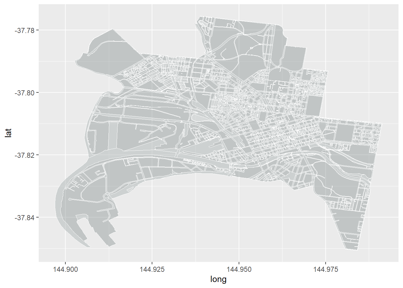
OK, it looks a bit stretched out and not what we are used to. Remember, we are projecting a portion of the earth (which is approximately spherical) on to a 2D surface. However, we haven’t explicitly told R what map projection we would like it to use. ggplot defaults to using Cartesian coordinates, which is effectively a rectangular projection with the aspect ratio chosen so that longitude and latitude scales are equivalent at the center of the picture. It then sizes the graphic to the device window. Thankfully there is an easy solution for this. The coord_map() layer in ggplot let’s you easily assign a projection to the graphic. The default is the Universal Transverse Mercator projection, which we learnt earlier is the one we are most familiar with thanks to Google maps.
ggplot() +
geom_map(data = df_bound, map = df_bound,
aes(map_id=id, x=long, y=lat),
fill="azure4", color="white", size=0.1, alpha = .4) +
geom_map(data = df_roads, map = df_roads,
aes(map_id=id, x=long, y=lat),
fill="white", color="white", size=0.1, alpha = .2) +
coord_map(projection = "mercator")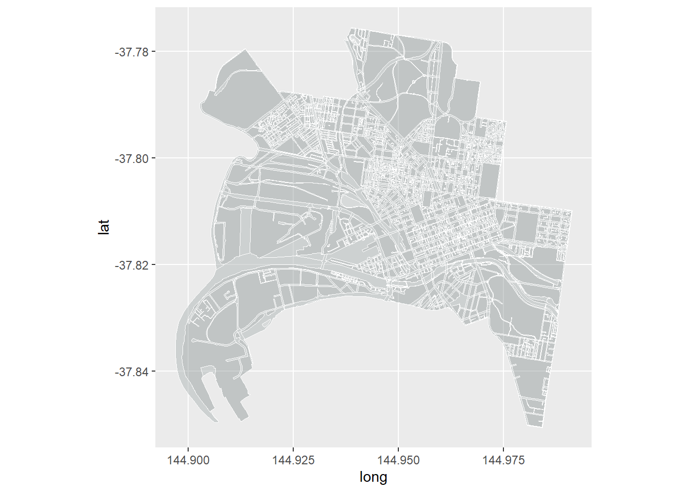
Much better. You can also play around with other projections, (see ?mapproject). Here is an extreme example: a type of Azimuthal projection, which is centered on the North Pole and causes regions further away from the pole to appear laterally ‘squished’. As a side note, this type of map projection is used in the United Nations’ Emblem to represent equality across the nations. It is also the map of choice for flat earthers, who ignore the fact it was produced via projection of a sphere.
ggplot() +
geom_map(data = df_bound, map = df_bound,
aes(map_id=id, x=long, y=lat),
fill="azure4", color="white", size=0.1, alpha = .4) +
geom_map(data = df_roads, map = df_roads,
aes(map_id=id, x=long, y=lat),
fill="white", color="white", size=0.1, alpha = .2) +
coord_map(projection = "azequalarea")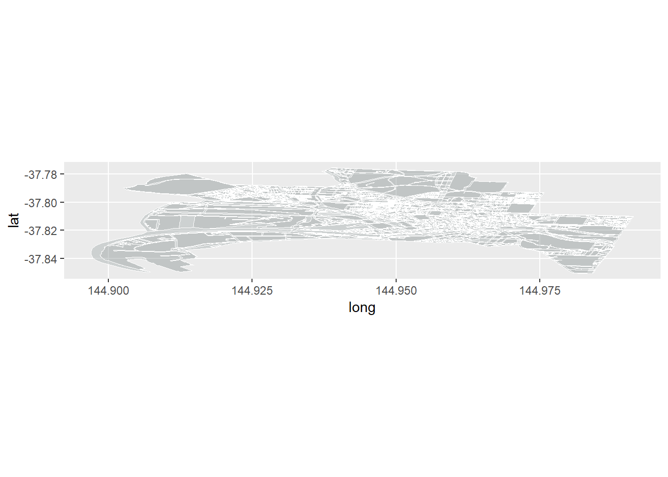
We’ll stick with the Mercator projection.
Time to add the data.
Here we will use the geom_point layer to map individual trees and assign a colour to each point (tree) based on how long it has left (life_left) in a given year (snapshot_yr). The magic here (thanks to Simon’s cleverness) is that we are going use facet_wrap to break the graphic down into small multiples in which each snapshot_yr get’s its own facet.
ggplot() +
geom_map(data = df_bound, map = df_bound,
aes(map_id=id, x=long, y=lat),
fill="azure4", color="white", size=0.1, alpha = .4) +
geom_map(data = df_roads, map = df_roads,
aes(map_id=id, x=long, y=lat),
fill="white", color="white", size=0.1, alpha = .2) +
coord_map(projection = "mercator") +
geom_point(data = trees_long,
aes(x = Longitude, y = Latitude, color=life_left), size=0.1) +
facet_wrap(~snapshot_yr, nrow = 2)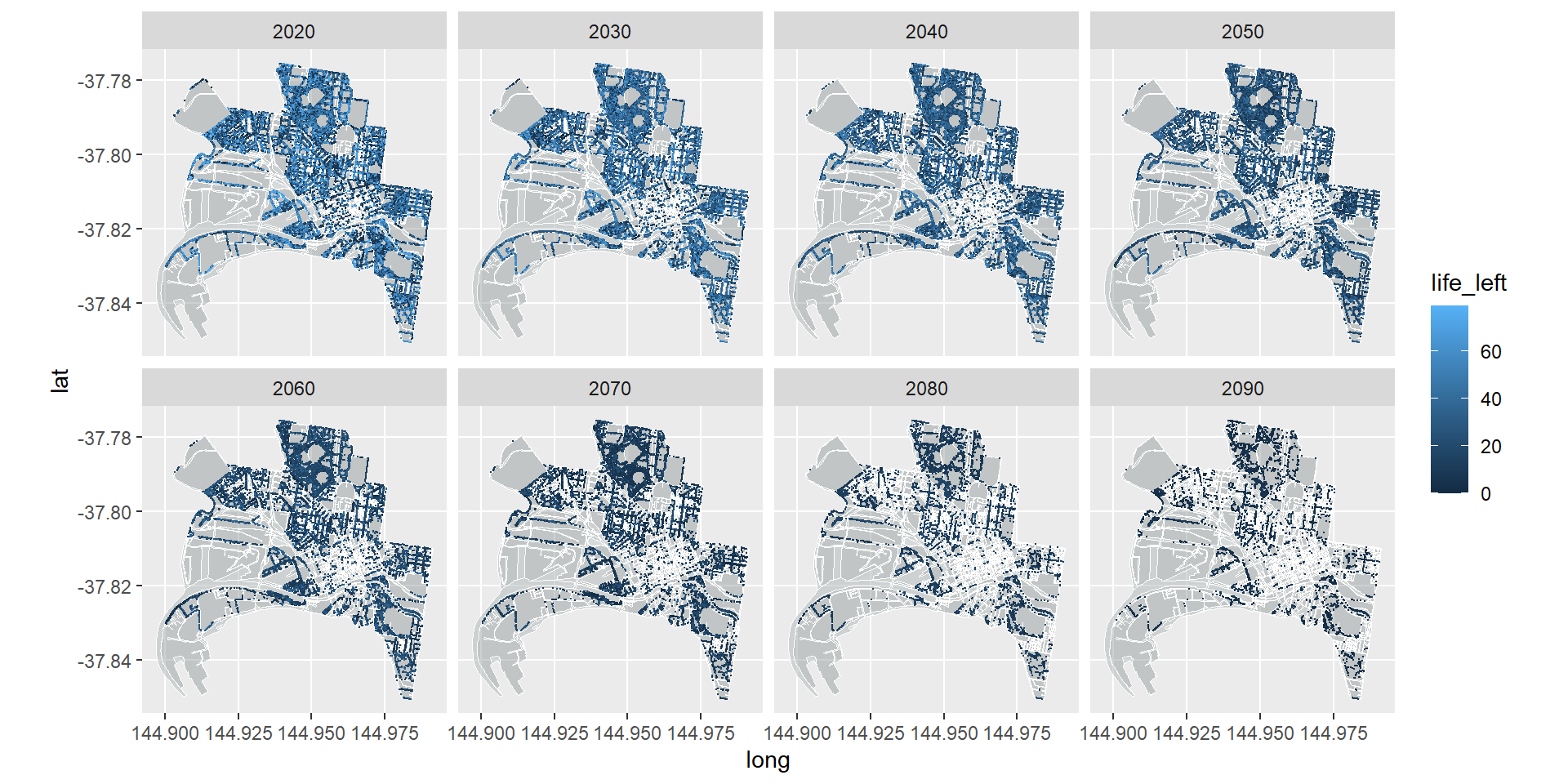
Great. Now lets fix up the theme aesthetics, set a better colour system, and add some labels.
ggplot() +
geom_map(data = df_bound, map = df_bound,
aes(map_id=id, x=long, y=lat),
fill="azure4", color="white", size=0.1, alpha = .4) +
geom_map(data = df_roads, map = df_roads,
aes(map_id=id, x=long, y=lat),
fill="white", color="white", size=0.1, alpha = .2) +
coord_map(projection = "mercator") +
geom_point(data = trees_long, aes(x = Longitude, y = Latitude, color=life_left), size=0.1) +
facet_wrap(~snapshot_yr, nrow = 2) +
scale_colour_gradient(low = "dark orange", high = "dark green") +
theme(legend.position = "bottom",
panel.background = element_blank(),
axis.title = element_blank(),
axis.text = element_blank(),
axis.ticks = element_blank()) +
labs(title = "City of Melbourne Public Realm Trees",
subtitle = "Forecast remaining life of each tree without a replanting program",
color = "Years of life remaining",
caption = "Source: City of Melbourne - Trees, with species and dimensions
(https://data.melbourne.vic.gov.au/d/fp38-wiyy)")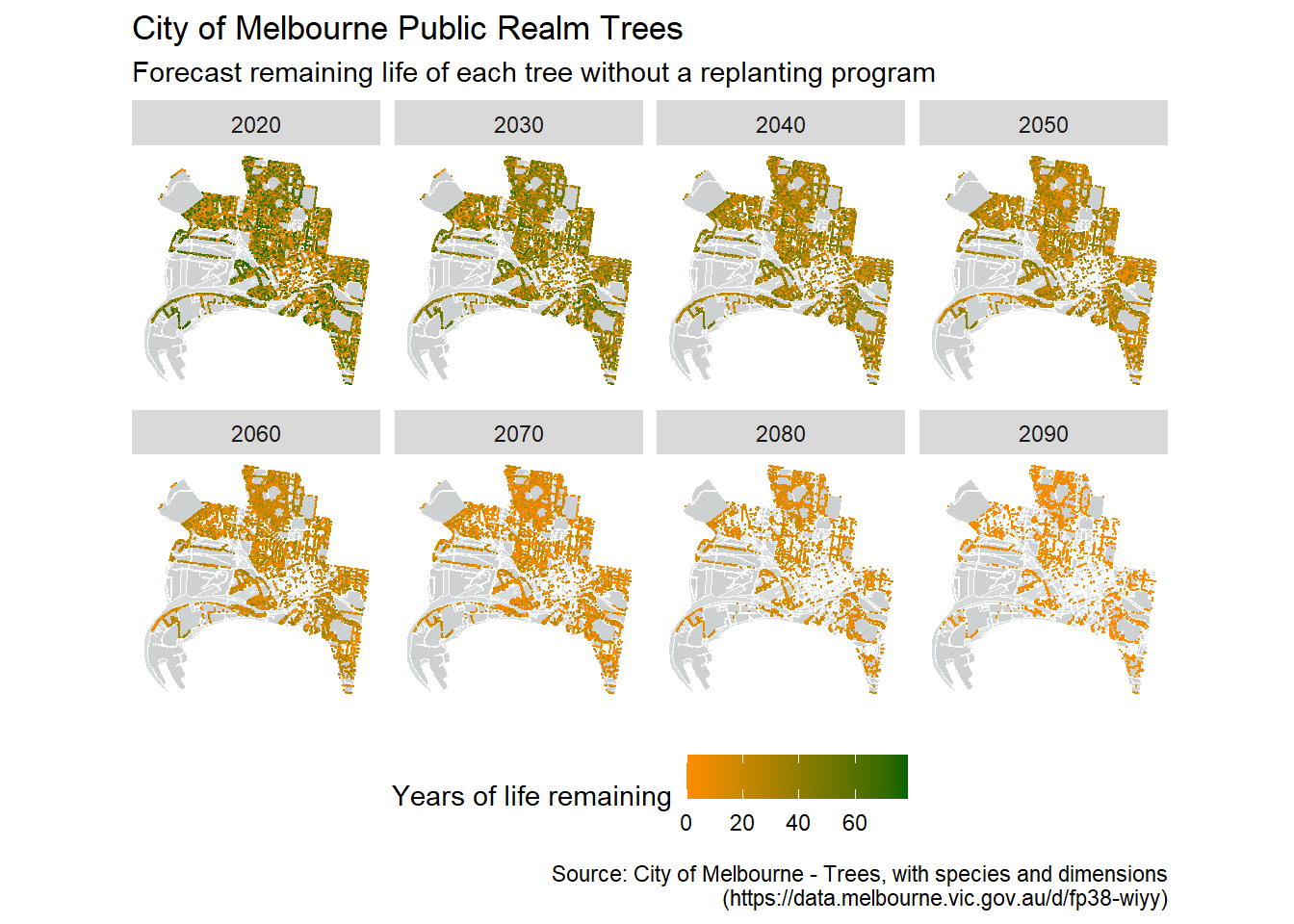
This varies a bit from the original image that Simon created:
The main reason for this is the assumptions used when interpolating the missing values data. Simon used the mean values of the species/genus/family to fill the gaps, where as we sampled from the distribution of available data. Have a think about why our analysis suggested we would have more trees in 2090 than Simon’s? Another method might be to assume all trees planted are young and healthy and, therefore, have the maximum life-span for their species. What implications might this have? Another variation from Simon’s original figure is that we coloured the points by years of life remaining, while he used percentage of life remaining. What implications might this have for interpreting the graphic? How else could you colour code the points?
This is a fantastic example of the use of faceting with spatio-temporal data. We could have made a video time-series from the data that runs through year-by-year, but I feel that the way Simon has chosen to present the data is much more effective. For one, it is print friendly. But importantly it captures the dramatic loss in tree cover that can only been fully appreciated at the decadal (rather than yearly) scale. Furthermore, by having the comparisons laid out in front of you (rather than having to skip back through a video or remember a previous image) you can directly compare between snapshots. Do be careful though that you aren’t missing anything in between facet time steps.
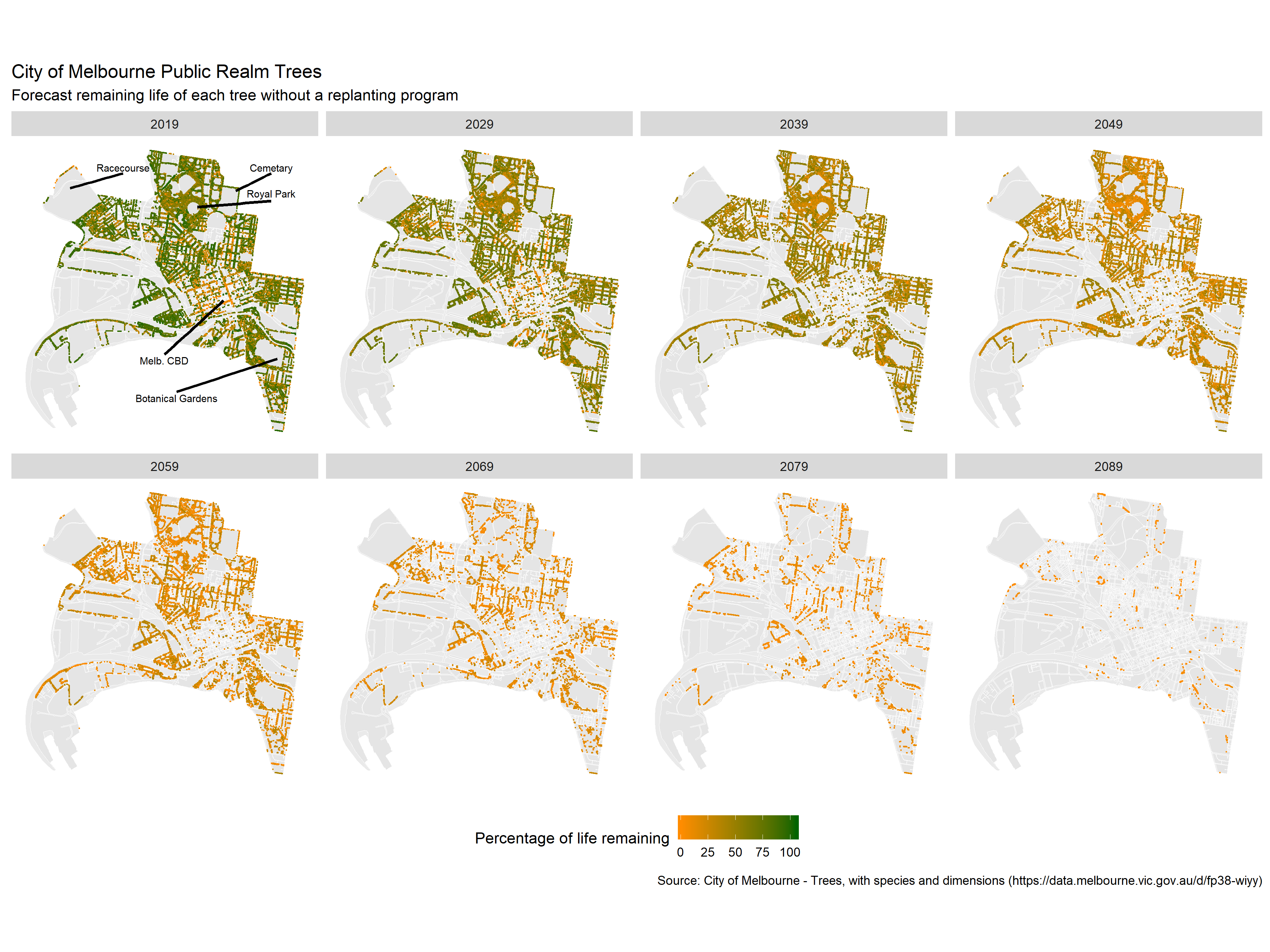
On a final note, the City of Melbourne have their own visualisation of the Urban Forest that is worth having a look at.
7.6 Concluding Thoughts
This chapter has introduced you to the basics of spatial data and the complexities of mapping the world around us. We have only touched on the basics of spatial data visualisation, working through choropleth and point maps examples. I have also shown you how you could combined spatial data with facet_wrap to help visualise complex multi-variate data. This gives you the foundation for spatial data visualisation, but you are encouraged to continue exploring leaflet and the ggmap packages to develop your knowledge and skills within this specialised field.