Chapter 1 Design and Integrity
1.1 Summary

Chapter 1 will introduce data visualisation as a design process. The chapter will start with a discussion of the definition of data visualisation and the various reasons why data need to be visualised. This will help introduce the first stage of design, “determining your audience and visualisation objective”. The two other stages, “Focusing, justifying and choosing methods” and “Construction and evaluation” will also be introduced. You will examine and apply two handy tools for guiding the critique and preparation of data visualisations for publication. The second part of the chapter introduces data visualisation ethics and data integrity. You will consider the principles of ethical data visualisation and the responsible use of data, including how to identify reliable data sources.
1.1.1 Learning Objectives
The learning objectives of this chapter are as follows:
- Define data visualisation
- List and explain the different types of data and why data types are important to data visualisation
- Identify the various components of a basic data visualisation plot
- Explain the data visualisation design process including the following three stages:
- Identifying a targeted audience and a data visualisation design objective
- Focusing, justifying and choosing methods
- Construction and evaluation
- Apply the Trifecta Check-up to guide the critique of a data visualisation
- Apply the Data Visualisation Check-list to produce publication quality data visualisations
- Discuss ethical principles and data integrity as it relates to the practice of data visualisation
- Locate and identify reliable and reputable sources of data for visualisation
1.1.2 Chapter Video
In the video below, David McCandless (2012) discusses the beauty of data visualisation during a TEDEd talk in 2012 (Only available online).
1.2 Defining Data Visualisation
The classic saying, “seeing is believing”, effectively articulates the importance of data visualisation. Whether you are exploring vast datasets; communicating your data analysis in meaningful ways; presenting the story behind your data in order to captivate your audience, data visualisation is the most powerful tool at your disposal. So, what is data visualisation? Kirk (2012) defined data visualisation as “the representation and presentation of data that exploits our visual perception abilities in order to amplify cognition” (p. 17). Let’s break this down:
- Representation: There isn’t much we can discern from raw, unprocessed data. However, if we can represent data in forms that we are familiar with, like geometric objects, we can start to gain insight. Data visualisation represents data in a visual form ready for our brains to process.
- Presentation: Careful presentation of data is necessary to ensure that the story behind the data comes to light. There are infinite choices and decisions that need to be made when presenting your visualisation.
- Visual perception: Our brain is a very complex and powerful pattern recognition and processing machine. We can exploit our visual processing capabilities to quickly and accurately interpret data. Good data visualisation exploits our visual systems and avoid its pitfalls.
- Amplify cognition: Data visualisation should always inform and increase knowledge.
What are the specific advantages of visualising data? Let’s explore a few classic examples. Anscombe (1973) published a quartet, reproduced in Figure 1.1, which warns us of the perils of not visualising data. All four scatter plots share the same line of best fit and correlation, however, visually the data all tell very different stories. Some of the datasets have outliers present while one is not linear. Visualisation serves an important perceptual role in exploring your data.
## `geom_smooth()` using formula = 'y ~ x'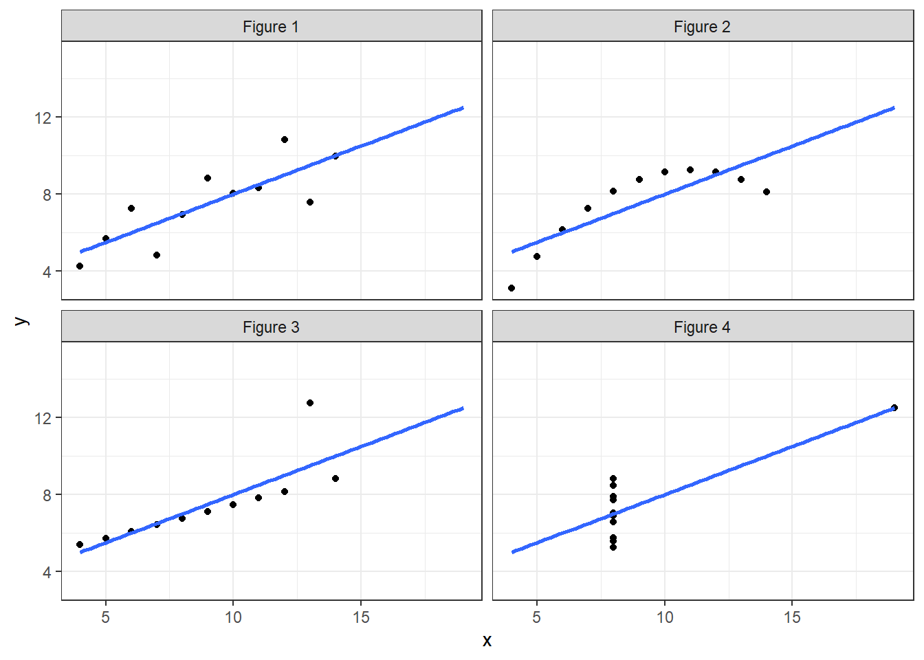
Figure 1.1: Anscombe’s quartet (Anscombe 1973).
Another pioneering example of the power of data visualisation was John Snow’s 1854 cholera map shown in Figure 1.2 (Snow 1854). This visualisation clearly showed authorities that the reported cases of cholera (highlighted in black) were centered around the Broad Street water pump.
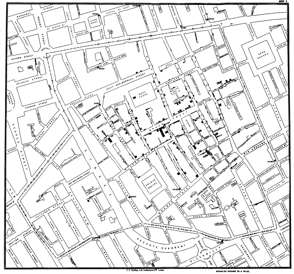
Figure 1.2: John Snow’s cholera map (Snow 1854).
Few (2014) lists the following main advantages:
- Allows you to see the big picture
- Allows you to easily and rapidly compare values
- Allows you to see patterns amongst the data
- Allows you to compare patterns
Additionally, Ware (2013) identified that data visualisation has the advantage of being able to:
- Comprehend vast volumes of data
- Facilitate the emergence of properties that might otherwise be hidden
- Highlight problematic data and assist in quality control
- Facilitate an understanding of data at all scales, small and large
- Promote hypothesis formation
However, data visualisation is often much more than a window into our data. It is also used to persuade, inform, educate and tell data-based stories because of it’s often intuitive and accessible nature. The goal of visualisation is to leave a lasting impression and, thus, Kosara (2016), termed these types of visualisations ‘presentation-orientated techniques’. For example, Charles Minard (1869) published a famous visualisation of Napoleon’s Russian Campaign in 1869. This visualisation was, and still remains, quite unique (see Figure 1.3). It takes the viewer some time to comprehend as the story is composed of many layers and variables. Despite this, Minard’s work is still considered one of the best data visualisations of all time. That’s quite the lasing impression.
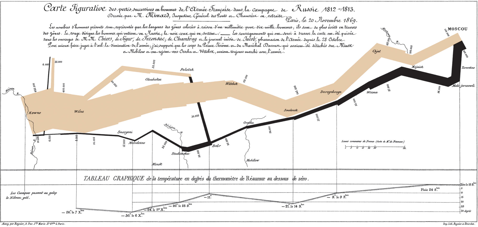
Figure 1.3: Charles Minard’s famous visualisation of Napoleon’s Russian Campaign (Minard 1869).
Data visualisation, which sits within the broader area of information visualisation, is concerned with statistical data. Statistical data can mean many different things, but all statistical data have one major characteristic in common - variability. It’s this variability that we try to measure, describe and predict that sits at the heart of statistics. As you will learn, data visualisation plays a central role in statistical practice, but it’s rarely taught formally. Times are changing and data visualisation has been developing very quickly since the widespread availability of cheap computing power and the internet.
Rarely are we given the opportunity to learn about data visualisation. Often the way we visualise data is not informed by any targeted training. In fact, many of the visualisations we have previously created are, embarrassingly, guided by the default settings available in software like Excel, SAS and SPSS. We use gut instincts to decide if it looks right, instead of making informed decisions based on good design principles and an understanding of human perception.
As a truly interdisciplinary field, data visualisation continues to be heavily influenced by research in visual perception and psychology, statistics, computer science, art and many other fields. Therefore, becoming an effective data visualisation designer requires a specialised body of multidisciplinary knowledge. This book will help you to design intuitive, accessible and compelling data visualisations that communicate the story behind the data and address practical, real-world problems. However, before we delve into data visualisation design, we need to do a bit of revision and take a quick look at plot anatomy.
1.3 Data Types - A Quick Revision
When visualising data it’s important to be able to identify the types of variables present in our data. Types of variables govern the appropriate methods of data visualisation. As such, we will do a quick revision of variable types.
When you measure a variable, qualitative and quantitative variables can take on different scales or levels of measurement. Levels of measurement have a direct bearing on the choice of data visualisation methods you choose. We need to understand the language used to describe different scales. The following short video by Petty (2011) provides a great overview (Only available online).
- Categorical or Nominal (Qualitative): Categorical variables are group variables, or categories if you will. There are no meaningful measurement differences such as rankings or intervals between the different categories. Categorical or nominal variables include binary variables (e.g. yes/no, male/female) and multinomial variables (e.g. religious affiliation, hair colour, ethnicity, suburb).
- Ordinal (Qualitative): Ordinal data has a rank order by which it can be sorted, but the differences between the ranks are not relative or measurable. Therefore, ordinal data is not strictly quantitative. For example, consider the 1st, 2nd and 3rd place in a race. We know who was faster or slower, but we have no idea by how much. We need to look at the race times.
- Interval (Quantitative): An interval variable is similar to an ordinal variable except that the intervals between the values are equally spaced. Interval variables have an arbitrary zero-point and therefore no meaningful ratios. For example, think about our calendar year and the Celsius scale; 1000 AD is not half of 2000 AD, and 20 degrees Celsius is not twice as “hot” as 10 degrees Celsius. This is because our calendar and Celsius scale have an arbitrary value for zero. Zero AD and zero degrees Celsius do not imply the presence of zero time or zero heat energy.
- Ratio (Quantitative): A ratio variable is similar to an interval variable; however, there is an absolute zero point and ratios are meaningful. An example is time given in seconds, length in centimetres, or heart beats per minute. A value of 0 implies the absence of a variable. We can also make statements like 30 seconds is twice the time of 15 seconds, 10 cm is half the height of 20 cm, and during exercise a person’s resting heart beat almost doubles. Zero heart rate, call 000!
Interval and ratio variables might also be described as being discrete (can only take on a particular value, e.g. the number of times a person exercises each week) or continuous (a variable can theoretically take on an infinite number of values within a given range, e.g. someone’s height).
1.4 Plot Anatomy
Most data visualisations are plotted or graphed, usually on a two-dimensional plane. That makes sense because in recent history, most publications were in print. The dominance of two-dimensional visualisations continues even today, however, we must not forget that technology allows us to move beyond an x and y axis. For example, EarthWindMap visualises global wind patterns using an interactive 3D globe.
However, for now, as we get started, let’s take a look at the components of a simple plot, based on a two-dimensional Cartesian plane. This will help us to build some common terminology used throughout the book. Figure 1.4 shows a hypothetical plot visualising the relationship between an x and y variable for two groups, A and B. This is an example of a scatter plot.
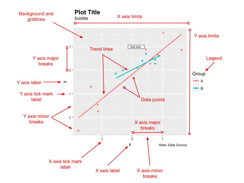
Figure 1.4: Plot anatomy.
Looking at this plot, ensure you can locate and name the following basic components:
- Plot title
- Subtitle
- Background and gridlines
- x and y axis labels
- Major and minor x and y axis breaks and tick marks
- x and y axis limits
- Data points and trend lines
- Data labels
- Legend
- Notes
1.5 A Visual Design Process
The following sections will summarise a visual design process outlined by Kirk (2012). Having a design process ensures you approach a visualisation task in a systematic way that is efficient and effective. However, no matter how much planning and coordination, the design process rarely goes exactly to plan and in a step-by-step fashion. Problems will occur. Remain flexible, learn from your mistakes and don’t be afraid to take a step backwards before you move on again.
Also realise that data visualisation is both a science and art. There are many ways to approach a visualisation and many suitable solutions. You will often have to choose between multiple solutions that best serve the purpose of the design. Remain open-minded and don’t be afraid to be creative. However, also exercise constraint and don’t forget about the important role that data visualisation plays in accurately conveying the story behind the data. The following sections discuss Kirk (2012)’s guiding principles and organises his structured design process into three distinct stages as follows:
- Identifying a targeted audience and a data visualisation design objective
- Focusing, justifying and choosing methods
- Construction and evaluation
1.5.1 Guiding Principles
There are four overarching princples that Kirk (2012) considers to govern the entire design process. These principles are as follows:
- Strive for form and function: Form versus function (or style versus substance) relates to the perceived tension between making a data visualisation look good, but also accurately conveying the story behind the data. Data visualisation sits at a cross-roads between art and science. Go too much towards form and you risk losing statistical accuracy. Go too much towards function and you risk losing the eye-catching impact of a visualisation. The trick is to balance the two, maybe sometimes leaning a little to one side or the other depending on your intended audience. For example James (Cheshire 2014)’s “Population Lines” visualisation (Figure 1.5) focuses on form for his intended audience who appreciate data visualisation art. Despite the perceived tension between these two goals, it can be argued that good form can help enhance function. Making your data visualisation aesthetically pleasing is always a goal of the design process.
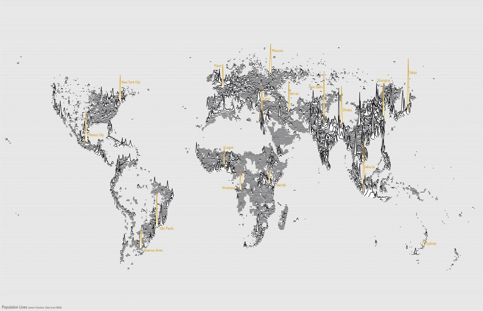
Figure 1.5: Population Lines (Cheshire 2014).
- Justify the selection of everything you do: Just because you know how to create Sankey or network diagrams, doesn’t mean you should, especially when a simple bar chart might do the trick. Data visualisation is no different to statistical data analysis. Every stage and decision you make along the way should be recorded, explained and justified. Even more important, it should be reproducible. If you can’t explain why you are doing something a certain way, stop and think. Spending extra time thinking about what you are going to do can save you from making a lot of false starts.
- Creating accessibility through intuitive design: We should always aim to design intuitive and simple-to-interpret visualisations. Keep it simple, if you can, and tap into the power of people’s innate perceptions and prior knowledge. There will be times when there is no way to keep the visualisation simple due to the complexity of the data or story, but under such circumstances, you must still do your very best to make the visualisation accessible.
- Never deceive the receiver: Intentionally or unintentionally, data visualisation can deceive the viewer or distort the story behind the data. You should be conscious of common pitfalls of bad visualisation and vow to never intentionally use these poor design principles.
These principles of data visualisation design effectively summarise the learning objectives of this book. Memorise these principles. The content that follows will help you to abide by these values.
1.5.2 Identifying a targeted audience and a data visualisation design objective
In the first stage, you will need to identify your audience (who you are communicating with) and your design objective or purpose. With these two points clearly articulated, you will be ready to commence the next stage. If you do not complete this stage, you will risk wasting time and designing a visualisation that lacks a clear purpose and misses its mark.
1.5.2.1 Audience
Your target audience is broadly defined as who you are trying to communicate with. Sometimes your audience is as broad as the general population, similar to what a news journalist will target. Sometimes it is an audience of one, for example, during your exploratory data analysis. Regardless, you need to take your audience into account when designing a data visualisation. Consider Figure 1.6 showing Arctic sea ice area published in The New York Times by Watkins (2015). Who do you think the audience is?
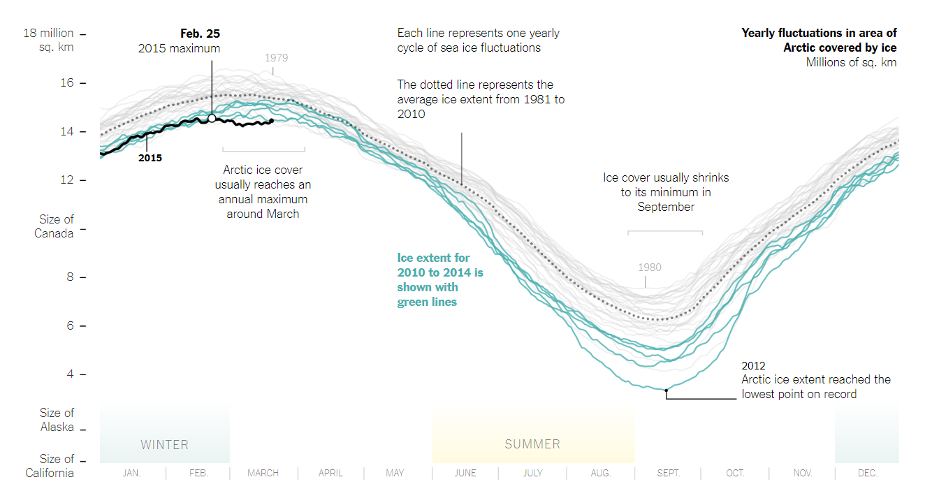
Figure 1.6: Arctic ice reaches a low winter maximum (Watkins 2015).
The fact that it is published in The New York Times, a prestigious news publication, provides a good idea, but there are clear features in the plot that provide additional clues. Notice the use of annotations that explain key features of the visualisation, aid in interpretation and help to tell a story? The x and y axis are contexualised. We can see months of the year linked to seasons, which helps the viewer to understand arctic seasons. The y axis has reference lines that equate the area of ice to the area of well known states and countries in North America. Colour is used to help the viewer draw their attention to key points. Based on the contextualisation, easy to understand annotations and highlighting, you can assume that this plot was designed for a general audience in North America, mainly the U.S. No surprise there, but this does highlight how the intended audience of a visualisation shapes the design.
Understanding or empathising with your audience is an essential characteristics of design thinking. As Brown (2008) explains, being able to empathise with your audience means you can understand multiple perspectives, which will help you to deliver a design that meets the needs and expectations of your audience. The best way to empathise would be to talk to your audience in order to understand them. However, this is not always possible, so you will often need to make some educated guesses. Here are some things to consider:
- How diverse or broad is the audience? Are they relatively homogeneous (e.g. a group of engineers) or diverse (e.g. the general Australia population)? How do they vary in terms of age, education, and other background factors?
- How big is your audience? Small audiences allow for personalisation.
- How technical is your audience? Can we assume they understand data visualisation? Do they have subject-knowledge expertise? Do they know about statistics?
- Does the audience have any special requirements? Your audience might have colour-blindness, poor vision, cognitive impairments, English as a second language.
- How much time does your audience have? Many people consider themselves time-poor.
- What makes your audience tick? Understanding their interests and motivations can help you to engage them.
There a many more considerations, but you get the point. Take the time to put yourself in your audiences’ shoes. This will greatly improve the final design.
1.5.2.2 Objective
All data visualisation must have a clear objective or purpose. Evergreen and Emery (2016) referred to this as the “so what?” question. Why does the visualisation exist? What effect will it have?. If you don’t have a good answer to this question, you need to reconsider your design. The objective of your design is different to the question or practical problem that underlies it. That probably sounds confusing, so let’s apply this to the Arctic Sea Ice visualisation.
The question or problem the visualisation answers is “How is the arctic sea ice volume changing across time?” The question is readily answered by the visualisation. The viewer can clearly see that records from 2010 to 2014 are trending down compared to previous years. Question answered, but so what?
If you can answer this “so what?” question, you will understand the objective or the purpose of the visualisation. Fortunately, it was used in a New York Times article discussing climate change, so we can get a very clear idea of the objective. Even without the article you can get a clear idea thanks to the accessible design and informative annotations. Watkins (2015)’s objective was to educate and empathise the issue of climate change to their readers.
There are a multitude of objectives. A visualisation can and often will serve more than one purpose. According to Kirk (2012), broadly speaking, you can split the objective of a visualisation into two mains functions.
- Function
Explanatory: When the function is to explain (i.e. ‘presentation-orientated techniques’, Kosara (2016)) the visualisation is often carefully constructed around a narrative. Every feature of the visualisation has been carefully crafted to facilitate the telling of a compelling story.
Exploratory: When the function is to explore, a single story does not dominate and the focus of the visualisation promotes exploration and self-discovery of stories hidden in the data. Exploratory visualisations often make use of interactive features to help immerse the viewer in the data.
You also need to consider tone:
- Tone: A visualisation’s tone refers to features of the visualisation that are used to trigger an emotive response. Pragmatic or analytical visualisations, or those used for technical purposes, are often characterised by a clear-cut design that favours precision and detail over form. On the other hand, visualisations may use abstraction and manipulate aesthetic qualities (e.g. colour) to convey different emotive tones.
Kirk (2012) provides the following phrases to give you a sense of how you might communicate the objective of your visualisation:
- Persuade; Shape opinion; Inspire; Change behaviour; Shock; Make an impact
- Learn; Increase knowledge; Answer questions; Trigger questions; Enlighten
- Conduct analysis; Monitor; Find patterns; no patterns; lookup
- Familiarise with data; Play with data
- Tell a story; Contextualise data
- Serendipitous discoveries
- Emphasize issues; Grab attention
- Present arguments; Assist decisions
- Experimentation
- Art; Aesthetic pleasure; Creative technique
Use these phrases to help you to articulate a clear objective to your design. Now that you know your audience and have a clear objective, you can move to the next stage.
1.5.3 Focusing, justifying and choosing methods
In the second stage, you will determine how to turn your objective into a deliverable. Kirk (2012) refers to this as editorial focus, or the ability to identify the salient stories behind the data and delivering a visualisation targeted to your audience and objective.
The first major challenge faced during this stage is acquiring and preparing the data for visualisation (see the later sections in this chapter for tips in locating reliable data). Most of your time will often go into this process. During this stage, you will have to source your data (a lot easier these days with the Internet), examine it for completeness and quality, familiarise yourself with the variables and data types and transform or compute additional variables. Data transformation might include tasks such as the following:
- Parsing: Splitting variables. For example, extracting the day of week from a date string or breaking a person’s name between their first and last.
- Merging: Creating a new variable by combining two or more variables. For example, merging a first and last name into a full name variable.
- Converting: Transforming variables into new variables. For example, converting age into age bands or converting qualitative variables (Male and Female) into numeric codes (0 and 1).
- Deriving: Inferring a new variable from another. For example, calculating someone’s age using their date of birth.
- Calculations/computations: Creating a new variable by performing a calculation on existing variables. For example, calculating BMI based on height and weight.
- Removing: variables that are not needed. For example, removing sensitive identifying information and replacing them with unique codes. Be careful though. You never know what you might end up needing.
You might also be faced with adjusting the resolution or scale of large data. Plotting millions of data points is often unnecessary. You may be faced with adjusting the resolution of your data using one of the following methods:
- Full: All data.
- Filtered: Exclusion criteria applied.
- Aggregate: Data are parceled up into a lower resolution (e.g. per month, year etc).
- Sample: Visualisation based on a randomly representative sample of the entire dataset.
- Summaries: Data are based on summary statistics only. There are no raw data portrayed.
Once you have completed the data stage, you should be intimately familiar with it. You should be starting to refine your focus in order to draw out the story behind the data that will meet your objective. You might begin to get an idea of the variables that you will use and the method of visualisation that will suit your audience. At this point you should re-clarify and fine tune your focus if needed before moving on.
Data visualisations are used to tell data stories (Chapter 2 will discuss data story-telling in-depth). Just as a good story teller will use well known techniques to convey their intended narrative, so too does a good data visualisation. The main techniques can be organised into the following categories:
- Comparisons and proportions
- Range and distribution
- Ranking
- Measurement
- Context
- Trends and patterns
- Direction
- Rate of change
- Fluctuation/variance
- Significance
- Intersections
- Relationships and connections
- Exceptions
- Correlations/Associations
- Clusters and gaps
- Hierarchical relationships
You will be learning all about these features through the book. Purpose and editorial focus will help you to use these techniques in a compelling manner.
As you develop your data visualisation, you will be faced with many design choices, all the while, keeping our objective and audience in mind. Having a strong editorial focus and knowledge of data visualisation will help you to make the best choices. You will need to make decisions for how to best represent your data as well as how best to present your visualisation. Presentation concerns the overall look and appearance of the visualisation. This book will focus on many of these issues. As such, we will outline some of the major considerations at this point in the design process:
- Representation: This includes choosing an appropriate visualisation method, while taking into account the characteristics of the data, the story to be told and the audience. You also have to think about the degree of precision (form vs. function), and, at the end of the day, settle on a final solution. Keep in mind that there might be many suitable solutions and choosing the right one might come down to personal preference or the requirements of the project.
- Presentation: When presenting your data visualisation, there is often a lot of work to be done. You need to think about the appropriate use of colour, interactive features (manipulating parameters, adjusting views, annotated details, animation), annotation (titles, introductions, user guides, labels, captions with narratives, visual annotations, legends and units, data sources and acknowledgements!), and arrangement. Fortunately, Evergreen and Emery (2016) provide a Data Visualisation Checklist for this purpose. This checklist in discussed in a later section.
There are a plethora of data visualisation methods currently available. For example, The Data Vis Project (Ferdio 2019) is an online list of the most common information visualisation methods. The list is exhaustive and includes many data and non-data visualisation methods (e.g information visualisation). There is no attempt to critique the limitations of each method, so use with caution. However, in terms of representing the extent of the known methods available to a designer, point proven. Tried and tested, many of these methods are the best place to start. However, sometimes, you might need to invest in an original design. The main focus of this book will be on using the existing methods appropriately for a range of data visualisation tasks. You will learn which methods are suited to your data and story, the strengths and weaknesses of different approaches and how to use open source data visualisation tools to create beautiful visualisations.
1.5.4 Construction and evaluation
The third stage is construction and evaluation. Constructing or building your design is largely done using specialised data visualisation tools. Just as there are a plethora of data visualisation methods, there are also a plethora of data visualisation packages that can help you construct your designs. This book will focus on using open source tools because they are free and highly powerful. They also force us to be deliberate with our design choices because they require knowledge and time for coding. Many commercial packages are dangerously attractive because they are very easy to use. With very little understanding of data, statistics and data visualisation, users are able to visualise data very quickly using very powerful tools. However, this is often a recipe for disaster as the user has little understanding about effective data visualisation. They are completely reliant on the tool to guide them through the design and good data visualisation practice.
Construction should be a relatively straight-forward process if you have the necessary coding knowledge and a clear design. It will just be a case of sitting down to code the visualisation, fix errors, add features one-by-one and add any finishing touches. Once you have finished construction, you need to start evaluate the accuracy. This includes the following:
- Data and statistical accuracy: Double check your calculations and make sure the visualised data make sense in the context of your familiarity with the data.
- Visualisation accuracy: Check that your visualisation accurately portrays the data. Do not deceive the viewer.
- Functional accuracy: Are all the functions of the visualisation working as intended? This is more relevant to interactive or animated designs.
- Visual inference: Does the visualisation design facilitate correct inference from the data? Again, we want to avoid deceiving the viewer, both intentionally and unintentionally.
- Formatting accuracy: Check the visualisation for consistency including things like font type/size, colour and terminology.
- Annotation accuracy: Proofread all your labels and annotations.
Evergreen and Emery (2016)’s Data Visualisation Checklist, discussed in a following section, is perfect for this pre-publication check.
Evaluation continues after finalising your design. This can include small (clients, focus-groups, mum) or large group feedback (social media, data visualisation blog, comments from a news site). These methods may include the following:
- Metrics and benchmarks: Google analytics, Tweets, Facebook likes, Google +1, hits on the visualisation’s webpage etc.
- Client feedback: Direct feedback from stakeholders.
- Peer review: Feedback from other visualisation experts.
- Unstructured feedback: Comments or emails from viewers.
- Invited user assessment: Use a form or survey to receive structured feedback.
- Formal case study: A usually independent, academic evaluation of the visualisation written into a report.
And let’s not forget about self-reflection. Ask yourself the following questions:
- Did you accomplish your objective?
- Did it have an impact?
- Did you meet the needs of your audience?
- Did you create something you were satisfied with?
- Were you satisfied with how you justified your choices?
- Did you enjoy the work? Was it rewarding and worth the time?
Evaluation will ensure you continue to learn and develop your data visualisation skills.
Kirk (2012)’s design approach provides a comprehensive and useful overview of the data visualisation design process. Who would have thought that there was so much to developing a data visualisation?
1.6 Trifecta Check-up
Fung (2014), from the excellent blog Junk Charts, provides a very simple and powerful framework to use when quickly evaluating a data visualisation. This framework, named the Trifecta Check-up, is useful for both evaluating your own work and the work of others.
Fung’s framework helps you to explain why a particular data visualisation works, fails or falls somewhere in between. Being a “tri”-fecta, there are three questions that we use to evaluate the visualisation as shown in Figure 1.7.
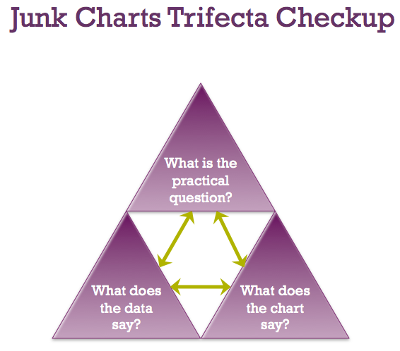
Figure 1.7: The Trifecta Check-up (Fung 2014).
- What is the question?
- What does the data say?
- What does the visual say?
All three questions should result in the same answer. Any discordance between two of these questions results in a poor visualisation. Let’s consider an example of a good and not so good data visualisation.
Figure 1.8 shows a data visualisation by Stiles (2016) which considers “How Popular is Your Birthday?”. You can see the interactive version here.
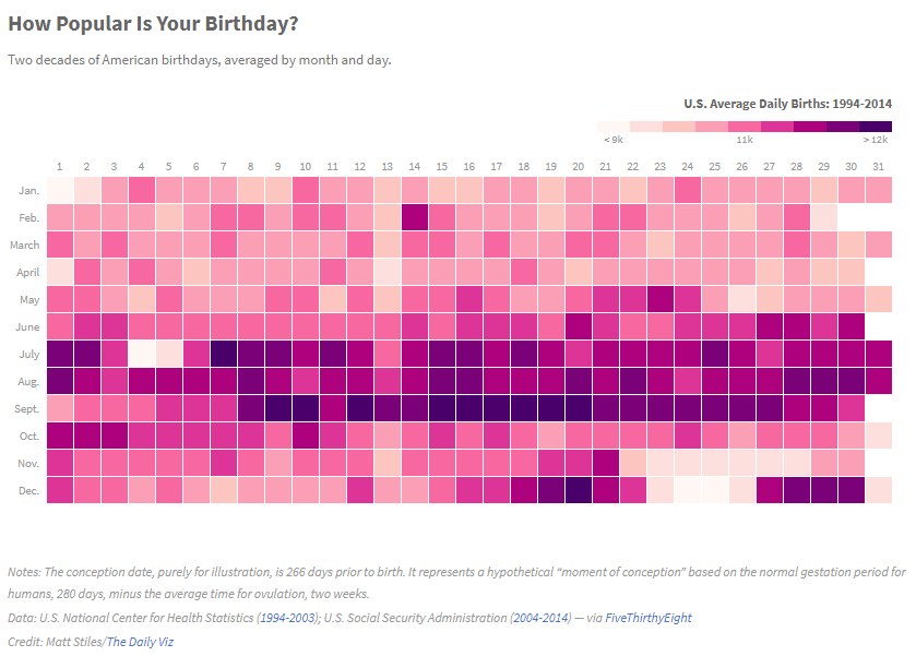
Figure 1.8: How Popular Is Your Birthday? (Stiles 2016).
1.6.1 (Q) What is the question?
All data visualisations aim to answer a question using data. Without a question, a data visualisation doesn’t really have a point. Therefore, the Q in the trifecta sits at the top of the check-up. We use the question to evaluate the other two questions.
The “How Popular is Your Birthday” visualisation answers a clear question, and many would agree (particularly those from the US), an interesting question. The answer to the question is likely to appeal to a wide audience and the data are sufficiently complex to be aided by a data visualisation. The ability to address this question with a data visualisation is a good objective.
1.6.2 (D) What does the data say?
You can have a really good question, but fail to find the right data to answer the question. The D of the Trifecta check-up ask whether the data presented addresses Q. This often requires a designer to make many decisions about what data to use, how to clean, aggregate and transform data ready for visualisation. During the data stage, the decisions made by the designer will determine the success of the visualisation. The viewer must be able to connect the data with the question and be assured of its quality. If the data doesn’t connect with the question or questions are raised about the source or quality of the data, the data visualisation may fail the data question of the check-up.
Looking back to the “How Popular is Your Birthday” example, the data visualisation includes annotations that reference the context of the data (U.S. daily birth rates from 1994 - 2014). We can read the source of the data was the U.S. Census data (generally very reliable), and also a note how birth rates were transformed to reflect the average between 1994-2014. The data also directly relates to the question.
1.6.3 (V) What does the visual say?
You can have a question and good data, but unless you can visually communicate the answer using an effective visualisation method, a data visualisation may fail the V of the check-up. Again, there are many ways to visualise the same data, some will be excellent, some will be OK and some that will be plain wrong. The challenge for the designer will be to link an appropriate method with the type of data and the question being addressed.
“How Popular is Your Birthday” does an excellent job of answering the V question. A heat map, with days of the month on the x axis and month on the y axis, presents a familiar, almost calendar-like, grid. A discrete colour scale is used to visualise the magnitude of the average birth-rate for a particular day. While colour scales lack visual accuracy, the viewer can still glean the high density of births between July and September. These correspond to conception times in cooler months of the year and during the Christmas holiday period. The interactive version of the plot has a hover-over effect where the viewer can read the actual average values. Overall, this data visualisation brings a whole new meaning to the Christmas holiday period in the U.S.
1.6.4 Failing the Trifecta
Figure1.9 shows an example of a not so great data visualisation.
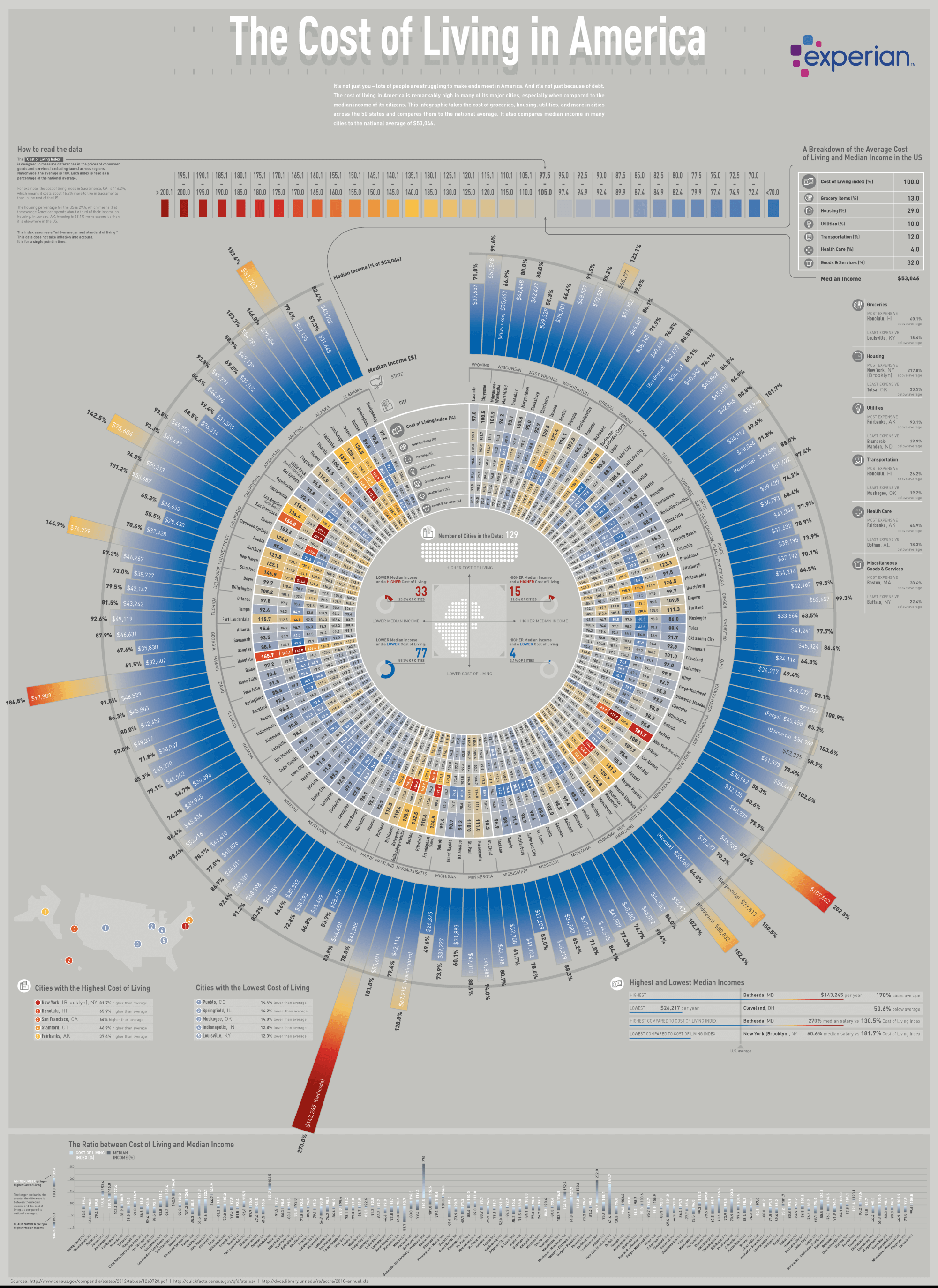
Figure 1.9: The cost of living in America (EDQ.com 2019).
The previous polar bar chart from EDQ.com (2019) (click here to see full-sized image), entitled “The Cost of Living in America” is an example of where the D and V in the Trifecta check-up needed improvement. The Q is clear and interesting. Visually it looks impressive. The source of the data is the U.S Census, so quality is not a concern. Where this data visualisation starts to fail is in the complexity. There is a lot going on. So when trying to link the question with the data, the visualisation doesn’t lead to quick and powerful insight. It takes a lot of time to scan the visualisation and take into account the large amount of information. It could be improved by focusing first on the main story and using sub-plots to dig deeper into a break down of living costs and median income. The aggregation also needs to be reconsidered. The massive polar bar chart breaks the statistics into cities within states. Is this really required to answer the question?
In terms of V, I believe there are a few major issues. First, it is very visually “busy”. The eyes are drawn to multiple features. The brain isn’t quite sure where to start. Much time is needed to decode the features and put them back together again before interpretations can be made. I can’t help but feel that the complexity could be avoided by presenting more aggregated data first and then by drilling down into detail in smaller sub-plots.
Another issue is the polar coordinate system. The visualisation is a simple bar chart, but, perhaps in order to fit on the page, the coordinate system was changed to polar (circle). The issue with this coordinate system is that it makes visual comparisons very difficult because the x and y axis are curved and therefore, the baseline and top of the bars never align to a common scale. The actual values are reported inside the bars, but this defeats the purpose of the visualisation if we rely on the actual values to make comparisons. We could just report a table of values instead.
The bars are also organised in alphabetical order. Does this make sense? Visually it results in a random scattering of bar heights that aesthetically looks pleasing. However, it doesn’t aid in rapid comparison or identification of states and cites with low or high incomes/costs of living. Ordering the cities lowest to highest by one of these variables would greatly improve the visualisation. However, I expect that doing so would make the polar bar chart look unusual and less appealing.
It’s not all bad. As I said, it’s visually impressive and draws the viewer in. While I expect most people to scratch their head for 5-10 minutes taking this in, if it gets people thinking about wages and costs of living across the country, that’s a good thing. I just wonder if this could be achieved using a better focused visualisation.
1.6.5 Critiques
According to Kaiser’s Trifecta check-up, there are eight possible critques for a data visualisation.
| Type | Description |
|---|---|
| Q | Poor question |
| D | Poor data |
| V | Poor visuals |
| QD | Poor question and problematic data, but visuals are OK. |
| QV | Data are good, but question and visuals are out of sync |
| DV | Good question, but issues with data and visuals |
| QDV | The data visualisation fails everything |
| Trifecta | Q, D and V are in sync. Good data visualisation |
1.7 Publication Ready Data Visualisations
How do we know if a data visualisation is ready for sharing and publication? There are many things to consider outside the obvious like spelling and attributing (referencing) your data. Fortunately, Evergreen and Emery (2014) and later Evergreen and Emery (2016) developed a very helpful data visualisation check-list for this purpose. Using this check-list, you can avoid many of the common issues found in data visualisation and greatly improve the presentation of your plots. The Updated Data Visualisation Checklist can be downloaded and used to rate a visualisation. There is also an online version of the tool. Visualisations scoring between 90 and 100% are said to be well-formatted. The check-list is summarised here, but please refer to the full checklist which is freely available for further detail. The checklist is broken into five main sections: Text, Arrangement, Colour, Lines an Overall
1.7.1 Text
Data visualisations use text sparingly. Just enough to get the job done. It should not detract or draw attention away from the data. Specific considerations include the following:
- Descriptive title that answers a “so what” question. This helps the viewer to take away a key message and contextualise the visualisation. Evergreen and Emery (2016) suggest that the title be top and left justified.
- Subtitles and annotations are used to provide important explanations and to highlight key data points.
- Text size is hierarchical. Important text (e.g. titles) is larger than less important text, such as axis labels.
- Text is horizontal. Vertical text is hard to read. You can re-orientate plots if you are having trouble fitting your labels.
- Data are effectively labelled. Try to avoid legends if you can because reading back and forth is difficult. If you use legends, get them as close as possible to the data (e.g. embedded within the plot assuming it doesn’t overlap other elements). Ideally, locate data labels next to data points.
- Use labels sparingly. For example, in a time-series, you don’t need to label every date. Avoid numeric labels if the plot already has a y-axis scale.
1.7.2 Arrangement
The arrangement of a data visualisation’s elements, including axes, scales, ordering and non-data elements (e.g. graphics) must make the visualisation easy to interpret. Specific considerations include the following:
- Proportions are accurate. For example, a bar representing 50% is twice as big as a bar that is 25%.
- Data are ordered in a meaningful way. For example, in a visualisation of the highest number of page visits for a website, the pages are ordered from highest to lowest, instead of a default ordering such as alphabetically.
- Axis intervals are distanced equally. Breaks in an interval must be carefully noted.
- Graph is two-dimensional. Avoid 3D plots, shadows, bevels etc.
- Avoid decorations such as images and graphics. Icons that support interpretation may be used.
1.7.3 Colour
Colour is used with purpose and carefully selected. Specific considerations include the following:
- Keep colour associations in mind. For example, red is the colour of love and violence.
- Use colours to highlight and draw attention to the key message. Other elements are deemphasised (e.g. less-saturated colours, transparency added).
- Be wary of using colour if your plot has to be printed in black and white.
- Where possible, avoid red-green combinations for those with the most common form of colour blindness.
- Text and data elements are sufficiently contrasted with the background.
1.7.4 Lines
Avoid using excessive lines in your plots because they cause clutter. Specific considerations include the following:
- Grid lines are muted into the background (e.g. grey). They are visible just enough to help interpretation, but do not detract from the data. If numeric value labels are included, grid lines are not needed.
- Remove graph borders.
- Axes use tick marks and axis lines sparingly. Avoid axis lines where possible.
- Avoid secondary or dual axis plots.
1.7.5 Overall
A good visualisation will attract attention, be focused on the data, and have a clear purpose. Specific considerations include the following:
- The data visualisation answers a practical question. Comparison data are used effectively to provide context and meaning.
- The data visualisation type is appropriate for the data and the question being asked.
- The data visualisation has an appropriate level of accuracy. For example, do you really need four decimal places for your numerical variable?
- All data visualisation elements work together to succinctly and effectively convey a takeaway message.
The Data Visualisaiton Checklist is a comprehensive tool to keep in mind when building and finalising your visualisation. Following these guidelines will help you avoid many of the most common issues. However, many of these guidelines require in-depth discussion and extensive knowledge and experience to apply. That will be the objective of the remainder of this book. There is still much, much more to learn.
1.8 Ethical Principles
The Cambridge English Dictionary defines ethics as follows:
“the study of what is morally right and wrong, or a set of beliefs about what is morally right and wrong”
Many professions codify ethics as set of rules or guiding principles that govern the professional practice and behaviour of its members. For example, the National Health and Medical Research Council’s (NHMRC) National Statement on Ethical Conduct in Human Research (National Health and Medical Research Council, Australian Research Council, and Universities Australia 2018) provides guidelines for human research performed in Australia. Another examples is the Media Entertainment & Arts Alliance (MEAA) Journalist Code of Ethics (Media Entertainment and Arts Alliance 2019). Most peak professional bodies include a code of ethics. However, data visualisation lacks a unified set of ethical guidelines most likely because it is practiced widely across many professions and is informed by numerous disciplines (Correll 2019; Skau 2012). As such, ethical guidelines in data visualisation need to be informed by other professional codes.
It is important to note that a code of ethics is not the same as the law. Ethical guidelines are an agreed upon set of standards that help us to determine if what we are doing is right or wrong relative to a professional. If we breach a code of ethics, it doesn’t mean we have broken the law. For example, a guiding principle of many journalism code of ethics is fairness, or the idea of presenting both sides of a story. If the journalist doesn’t fairly present both sides of the story, will they have broken a law? Probably not. Will they be sued? Possibly, but it would depend on the circumstances (e.g. defamation). Another guideline for journalists is not to plagiarise or copy the work of others. Plagiarism is a breach of the Australia Copyright Act 1968 which can lead to criminal charges or civil action. Therefore, plagiarism is both an ethical and legal issue.
Ethical guidelines are not black and white. If we all agreed on what is right or wrong and this never changed or depended on context, ethics would not need to exist. Therefore, ethical codes are often referred to as guidelines. They help point us in the right direction and help us to critically think about the morality of our practice and behaviour. However, they do not always provide a clear answer and sometimes guidelines can be contradictory. For example, journalists are required to attribute the sources of their information, but also protect confidential sources if the need arises. There will always be situations where the ethics are unclear. In these situations, it is always a good idea to discuss the issue with someone more experienced or qualified to advise (many professional or ethical bodies have ethical advisors) or with someone who is considered to have a high level of integrity. This brings us to the next definition.
According to the Cambridge English dictionary, integrity can be defined as follows:
“the quality of being honest and having strong moral principles that you refuse to change”
Integrity is a personal quality and something that we must strive for in our professional careers and in data visualisation design. Without integrity, our data visualisations risk losing their credibility, deceiving our viewers, misrepresenting facts, and failing in their objective. Following ethical guidelines is a good way to practice integrity, but integrity is much broader than ethics alone. Integrity applies to the entire design process from choosing data, being transparent about our decisions, producing reproducible work, following guidelines for the responsible use of data and giving and responding to feedback.
Without a dedicated set of ethical principles for data visualisation, we need to draw upon the ethical standards of other related fields and experts (Skau 2012; Cairo 2014; Correll 2019). In the following sections, the major ethical principles that apply to data visualisation will be briefly outlined followed by the key considerations of data integrity.
The principles outlined below were adapted from the following codes of ethics:
- NHMRC National Statement on Ethical Conduct in Human Research (National Health and Medical Research Council, Australian Research Council, and Universities Australia 2018)
- MEAA Journalist Code of Ethics (Media Entertainment and Arts Alliance 2019)
- Engineers Australia Our Code of Ethics (Engineers Australia 2019)
You might find the inclusion of an Engineering code of ethics a little odd. However, Cairo (2014) rightfully suggested that engineering ethics are relevant to data visualisation because the designer must be technically competent to deliver a solution that balances efficiency and effectiveness.
The following principles are a work in progress. The discussion of each principle is kept relatively brief. The goal of this section is to help you reflect more critically on the data visualisation design process from an ethical perspective. The principles are not mutually exclusive and upholding one principle might raise issues in others. You won’t always get it right, or find the perfect outcome to an issue. However, you can commit to taking the time to reflect and always strive to do better. Therefore, the overarching principle of an ethical mindset is integrity or being honest about our shortcomings.
1.8.1 Beneficence
Your data visualisation must serve a valuable purpose by succinctly and accurately representing data in a way that leads to new knowledge and better decision making. Creating visualisation that don’t have a clear purpose, use unreliable data, misrepresent the truth, and deceive or confuse the viewer can be said to be maleficent. Maleficent data visualisations can be trivial data visualisations which waste peoples’ time or dangerous data visualisation that misrepresents the truth (e.g. fake news). It might be hard to think that a data visualisation can be immoral (Skau 2012), but the flaws of humanity never disappoint.
Consider the following data visualisation taken from Wikipedia (2009) shown in Figure 1.10. This choropleth map visualisation is based on data from the book IQ and the Wealth and Poverty of Nations by Lynn and Vanhanen (2002). Each country includes a colour which represents the proposed average IQ of that nation. The authors conclude from their analysis that intelligence, measured using IQ, is a major determinant of national wealth around the world. You can see obvious indications of this in Figure 1.10, where the continent of Africa, which historically has the lowest wealth as measured by GDP, is dominated by colours indicative of low IQ. However, the work of Lynn and Vanhanen (2002) has drawn heavy criticism. Palairet (2004) pointed out substantial statistical issues with the estimates of country IQ as only 81 out of 185 countries included in the analysis had estimates available. Missing data were imputed by using IQ data from adjacent countries. Furthermore, Ervik (2003) writes that the book fails to establish the reliability and cross-cultural validity of IQ test scores and control for other important factors, not to mention the fact that correlation does not equal causation. For example, richer countries invest more in education which is also highly correlated with IQ.
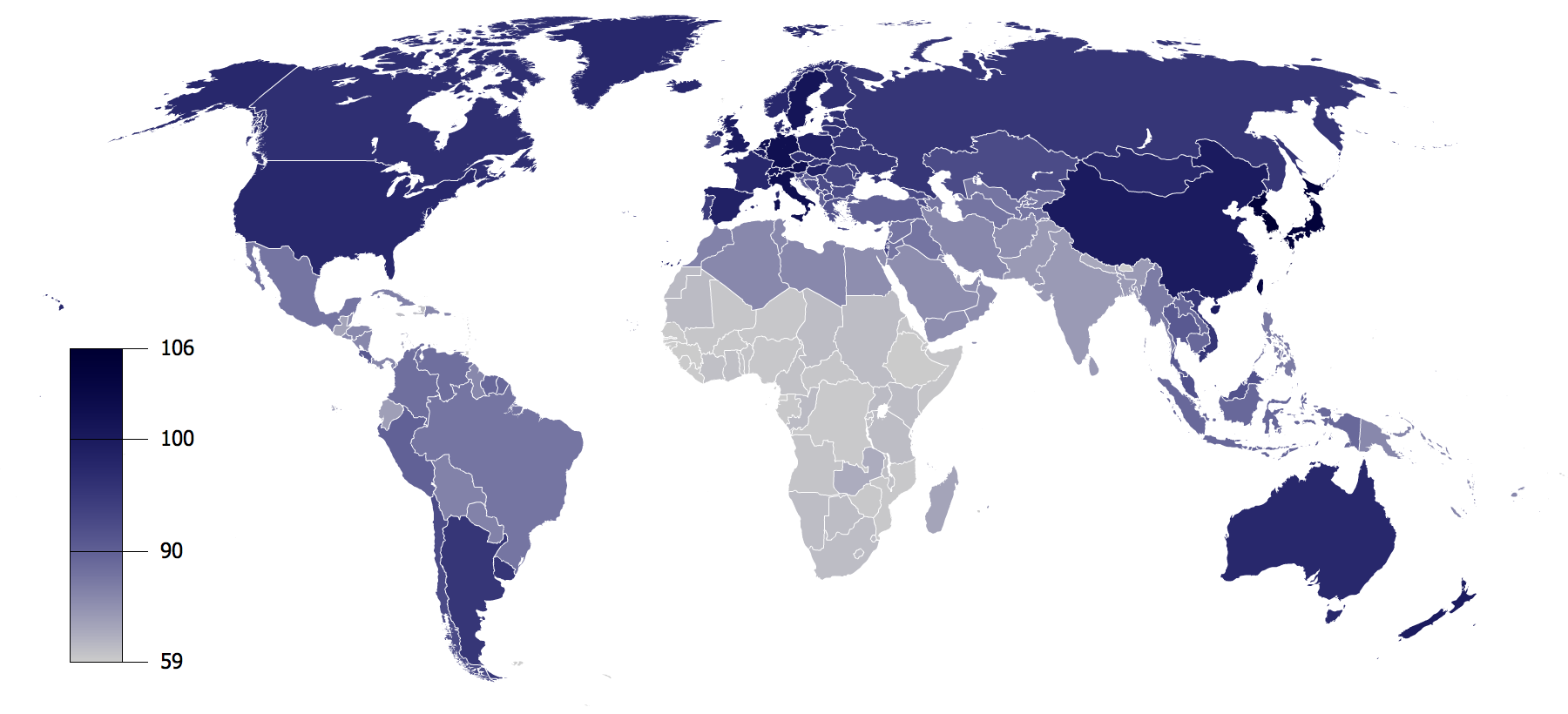
Figure 1.10: IQ by Country (Wikipedia 2009) based on data from Lynn and Vanhanen (2002).
Figure 1.10 presents data devoid of the critical discourse contributed by the book reviewers. Viewed in isolation it presents questionable data and a potentially dangerous idea. It is not hard to see how predjudice would shape viewer’s interpretation. Fortunately, other researchers have developed much better explanations of wealth and economic development. For example, Hausmann et al. (2011) show that economic complexity, or the more diverse and specialised jobs are in a given country, the higher a country’s income. Complex economies require citizens with a high level of collective knowledge which might explain variability in the average IQ of nations. Highly complex nations are more likely to invest in knowledge through education and skilled migration which would translate to higher average IQ when compared to nations with less complex economies. Our World in Data (2016) show this relationship in Figure 1.11 based on 2016 data. The higher a country’s economic complexity (lower ranks indicate higher complexity), the higher the GDP per capita.

Figure 1.11: Economic complexity rank vs. GDP per capita, 2016 (Our World in Data 2016).
1.8.2 Transparency
Correll (2019) referred to transparency as making the invisible visible. Many stages of data visualisation are not visible to the viewer. The viewer sees the “end product” and has little insight into data collection, data preprocessing, the numerous designs tested (or ignored) and the technology used to generate the visualisations (Correll 2019). This means the viewer places a high degree of trust in the designer. In order to earn this trust you should always document and be able to explain and justify these invisible steps. You need to prove you can be trusted. Sharing your data visualisation project code, datasets (assuming you have permission) and correctly attributing external data sources promotes transparency. This will allow others to verify your data and designs, reproduce your work, and produce alternate visualisations. Transparency and reproducibility are cornerstones of scientific research, and data visualisation should be no different. There are limitations to transparency. Depending on your data and topic, you might be restricted in what you can disclose. However, you should still keep this principle in mind because it will help you go back over your work at a later time and allow you to show technical details to others who have permission
1.8.3 Accuracy
Accuracy refers to the the overall validity of our data visualisation. It relates to the quality of the data used, the rigour of data preprocessing and statistical analysis undertaken, and the method and choices used to represent the data. It also extends to the choice of variables visualised and how they relate to the objective of the visualisation. Your designs must be able to be verified and withstand critique. Where limitations are present, you raise the caveats and avoid overstating the findings.
Statistics teaches us methods of expressing uncertainty using probabilistic frameworks. Uncertainty is often ignored in data visualisation and Correll (2019) and Brodlie, Allendes Osorio, and Lopes (2012) reminds us that as designers we need to do a better job of visually representing uncertainty inherent in measurements, sampling and statistical estimates. This is a challenge because it usually involves adding complexity and risks confusing our viewers, especially in lay audiences (Spiegelhalter, Pearson, and Short 2011). However, there are many examples of data visualisation where including depictions of uncertainty improves viewers’ understanding of a situation. A good example is visualising the path of hurricanes. Figure 1.12 shows the projected path of Hurricane Sandy which swept across the the U.S. in 2012 (Huffington Post 2012). The shaded areas surrounding the hurricane’s line presents the uncertainty at the time about it’s forecasted path. Visualising this uncertainty was crucial for informing the public so they could take action to stay safe if they were in vicinity of the projected path.
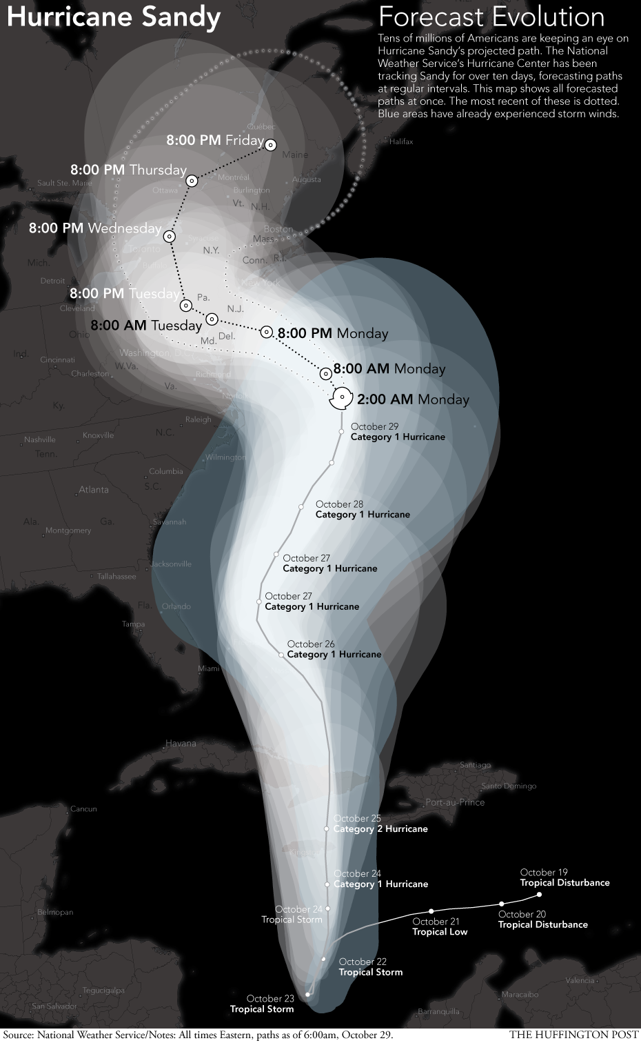
Figure 1.12: Hurricane Sandy’s project path (Huffington Post 2012).
1.8.4 Objectivity
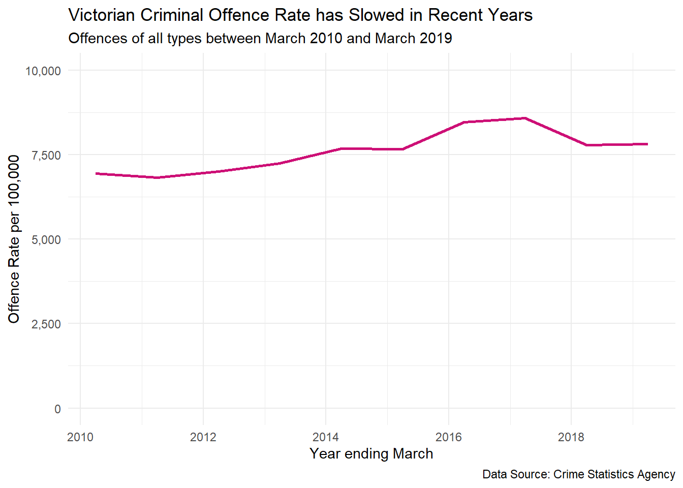
When designing data visualisations we need to be aware how our own personal expectations, biases and experiences can shape decisions and design. For example, using an easy to access dataset might bias data visualisations because the convenience of accessing the data means it leads to an over-representation of data visualisations using the same source. All data has some degree of bias or limitations, so data visualisation can propagate a bias. Objectively, you should match the best data needed to achieve your objective and minimise sources of bias such as convenience. You should also maintain an open, but sceptical mindset. Data visualisation can often uncover unexpected results and you need to be careful not suppress them because they don’t fit with our preconceived ideas. We also need to be equally careful to question and validate outcomes that fit with our expectations. Research has found that we are far less critical of facts that fit with our world view which is a phenomenon known as confirmation bias (see Nickerson 1998). Bias can creep in during all stages of our designs. For example, removing outliers because they ruin the appearance of a plot, removing subgroups of data because it doesn’t fit well with the story you want to tell, or failing to explain important context behind the data that will impact the viewer’s interpretation. Consider the following data visualisation of criminal offending in Victoria between 2010 and 2019 (Crime Statistics Agency 2019). Now assume you have just read a news article stating that Victorian crime is out of control, the usual rhetoric you get from politicians. If this fits with your experience and belief, you might not think critically about the following plot. Crime is clearly on the rise.
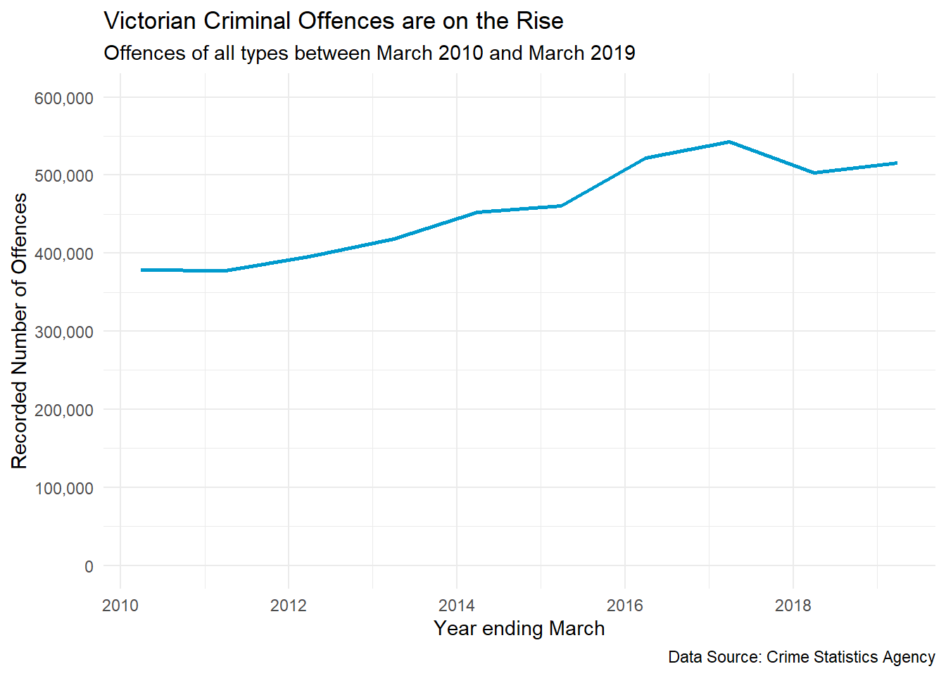
Now what if I told you that Victoria and Melbourne are undergoing massive population growth and the increase in the number of criminal offences can be partially explained by an increase in population. Instead, we can look at the criminal offence rates per 100,000 Victorian residents. Does this change the story? The change doesn’t appear as drastic and since 2017, the crime rate has remained steady. It does present a different, and a more objective side to the story.
Thinking again, is it even useful to look at overall crime? Wouldn’t it be more accurate and objective to look at this problem by considering major crime types…
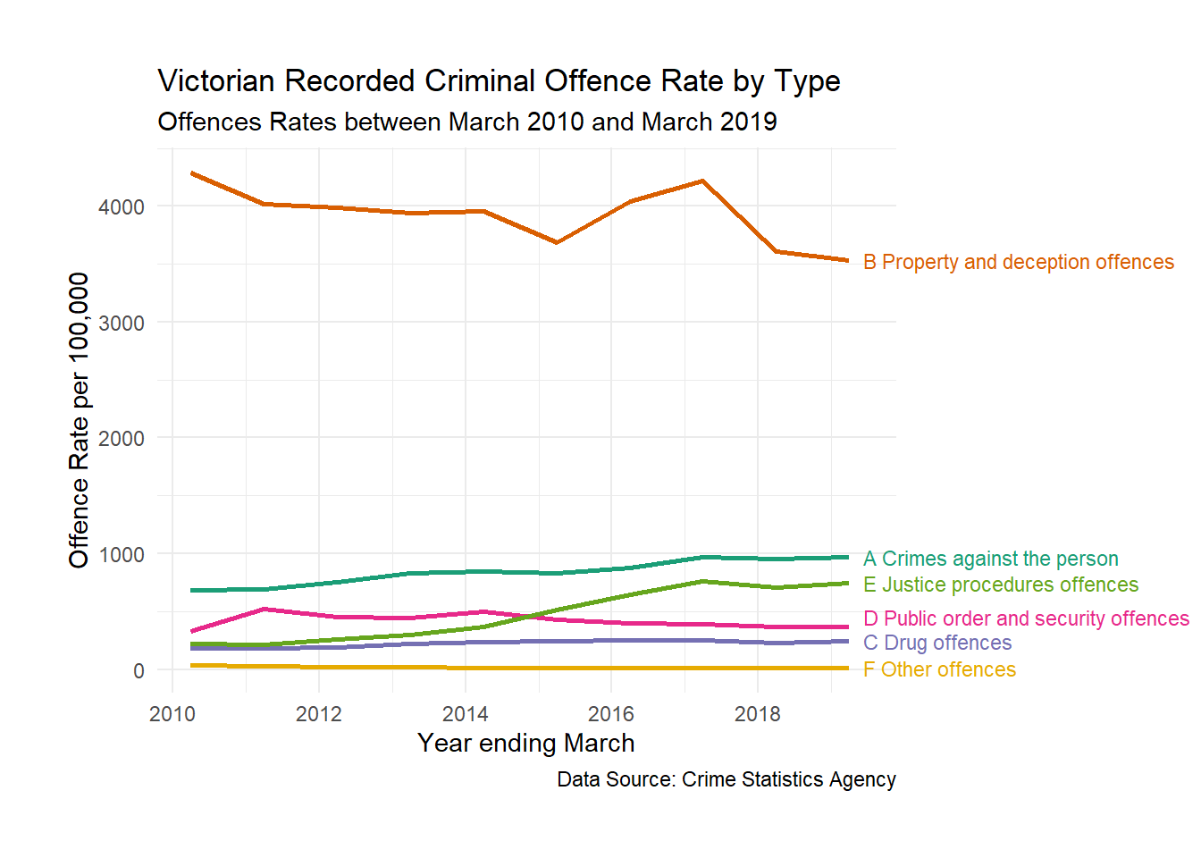
Now this plot paints a far more informed and balanced picture of Victorian crime. We can see what are the most common offence types and which types have changed across time. Better yet, we have controlled for population growth by standardising the offence rate to 100,000 people.
1.8.5 Respect
When practicing data visualisation you need to respect your position of power, the rights of others and the law. We have already looked at examples of how unethical data visualisations can be used to misinform others in order to promote ideological and political agendas. Data visualisation has power because it can present very powerful ideas succinctly and accessibly. For example. studies have shown that the mere presence of a data visualisation can add instant credibility to information being presented about the efficacy of medication (Tal and Wansink 2016).You must respect that power and do your best not to abuse it, especially when your audience might lack the the knowledge and training to critically interpret a data visualisation. You must also be aware that other people may use your data visualisations in unintended and unethical ways. You must commit to respecting the rights of individuals and the law, especially privacy and copyright. Your designs must avoid bias towards others especially in respect to ethnicity, religion, gender, age, sexual orientation, or disability. This doesn’t mean to avoid these topics. In fact data visualisation is a powerful way to draw attention to many issues of discrimination (see the gender pay gap visualisation from Kommenda, Barr, and Holder (2018) in Figure 1.13 for an example). However, when dealing with sensitive topics, we need to be especially careful so as to avoid contributing to the problem.
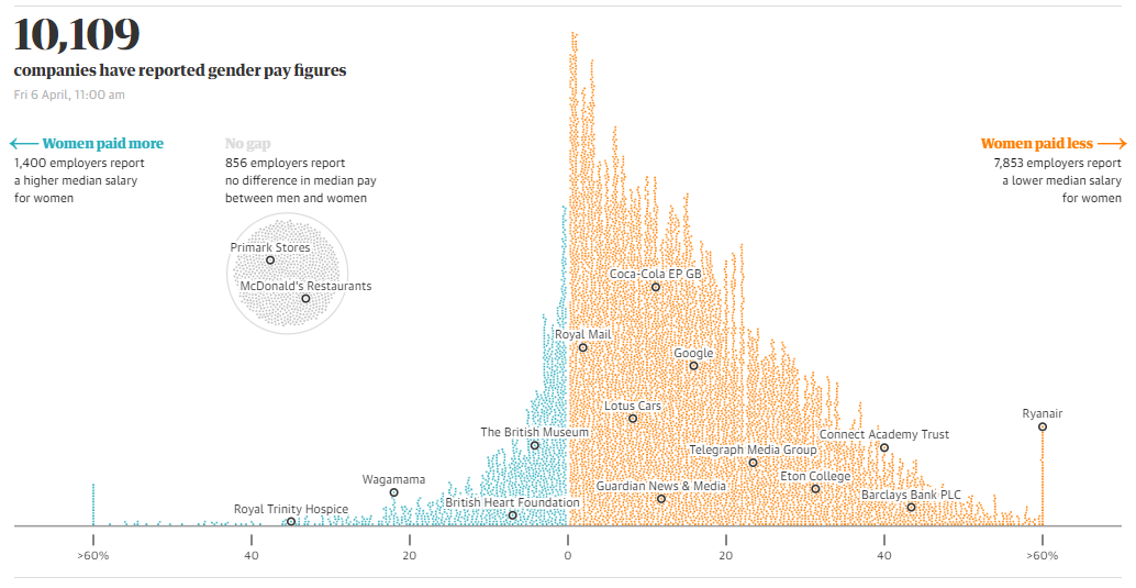
Figure 1.13: Gender pay gap by Kommenda, Barr, and Holder (2018).
You must also respect your clients (who you are designing for), the work of your colleagues and other designers, students (who are still learning) and your audience. When providing feedback or critique, avoid ridicule. Make helpful suggestions and try to understand other peoples’ perspective (even if they are wrong). It is OK to disagree, but do so in a dignified and respectful way.
1.8.6 Accountability
You are accountable for your designs. You take credit where credit is due, and you are responsible when you make a mistake or do not achieve your objective. You strive to always improve and continue learning. When you are doing something outside your area of expertise or experience, you take steps to learn the required skills, seek supervision from someone qualified and get feedback from experts.
An outstanding example of accountability was published by Leo (2019) from The Economist (see Figure 1.14). The article discusses examples of improving visualisation practice at The Economist by looking back at previously published plots, explaining common issues and designing an improved version. The article is a rare introspection into the practice of a data visualisation powerhouse.
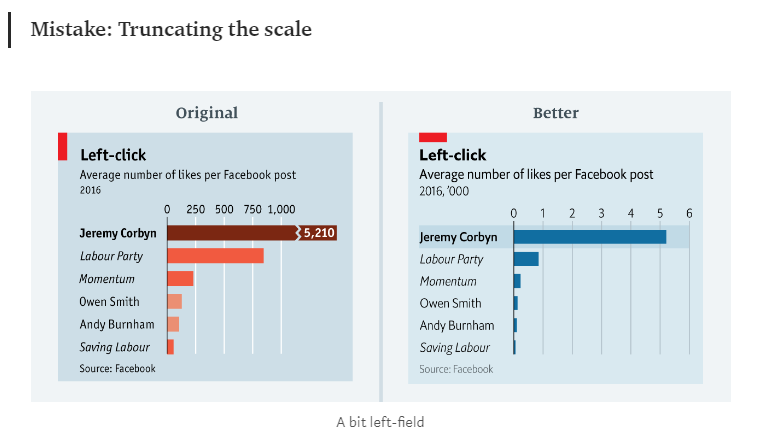
Figure 1.14: The Economist learning from their mistakes (Leo 2019).
1.9 Data Integrity
Data are powerful and must be used responsibly. Our data visualisations rely on it. As the old saying goes, “Garbage in, garbage out.” Scandals in the misuse of social media data also remind us that we need to improve knowledge about the responsible use of data, especially around privacy and consent. A recent example was the Cambridge Analytica scandal that was credited to assisting the election of U.S. President Donald Trump in 2016 (Cadwalladr and Graham-Harrison 2018). Cambridge Analytica took Facebook user data from 50 million Americans to help manipulate voters. Facebook was aware of data being harvested in 2015, but failed to notify users or take steps to retrieve the data. In another example, fitness social media app, Strava, published a massive heatmap of its users GPS fitness data in 2018 (Blue 2018). It wasn’t long until major security and privacy concerns were raised. Viewers were able to see GPS data from users in military bases, Government buildings and other sensitive areas. The heatmap was so detailed, it was possible to potentially identify individuals. These two examples highlight illegal and unethical misuse of data that are becoming all too common in today’s data-driven world. You need to help put a stop to this lack of integrity by understanding how to use data responsibly. The following sections will discuss the major issues surrounding the use of data and what you need to keep in mind.
1.9.1 Permission
The first thing you need is permission to access and use data for the purpose of visualisation. This might be simple to ascertain, for example, the data come from your workplace and you require it to complete your job. Sometimes it is not clear. For example, you do not automatically have permission to use data published on a website. Check the website’s policies or whether the data have a license for reuse. For example, many sites that publish data have a Creative Common’s License that will clearly outline how the data can be used and shared. If you cannot find any information on a licence for the published data, contact the site and seek written permission. Some sites ask you to submit requests for permission to access data sources. This allows the data owner to audit and control access. You might be asked questions about your identity, who you represent, what do you intend to do with the data, how you will store it, and who else will have access. Be truthful or you might risk violating a policy or license which can have legal implications. Sites will also sell data which effectively buys a license. It can be a bit of a minefield understanding licenses and permission. The important thing is that you take reasonable steps to verify permission before you start a visualisation.
1.9.2 Security
Once you have your data, you are responsible for security if the license or conditions of use requires it. Again, this might be a simple task. For example, working on company data, using company computers and servers. However, can you copy the data to a portable drive and work on it at home? Maybe, maybe not. Get permission. What if you lose the portable drive or someone steals it? Are the data encrypted and password protected? Is your password secure? Accessing data remotely using databases is a more secure. However, what if your computer at home is compromised and your data are stolen? What if your computer hardware fails and the data are destroyed? Do you have a back-up? How long will you retain the data after a project is complete? Security is your responsibility.
1.9.3 Consent
Informed consent is a complex ethical issue that relates to an individual’s voluntary permission to collect, use or disclose their personal data. Consent is needed prior to the collection of data. Consent must be informed. Informed consent is when the individual providing consent is fully aware of the purpose and risks associated with collection of their data and has the capacity to make an informed decision (National Health and Medical Research Council, Australian Research Council, and Universities Australia 2018). For example, obtaining informed consent from minors and people with cognitive impairments often requires consent from a guardian. Consent is still relevant for previously collected data used for a secondary purpose (i.e. a purpose that wasn’t explained to the individual when consent was first gained). If it is reasonable to assume that an individual would consent to the secondary use of data and the data are anonymous, consent can sometimes be assumed. The Cambridge Analytica scandal is a relevant case study here. Facebook requires users to sign a user agreement, which outlines how Facebook will collect, store and use user data. Users must agree to this before they can access the site. Facebook will claim that they use this data for operational purposes, for example finding friend connections, making content recommendations and targeted advertising (revenue). Most users consider this a reasonable way to use their data for access to Facebook’s powerful social media services. However, Cambridge Analytica harvested that data for a different purpose (political) without the user’s knowledge and Facebook sat on the information. Therefore, the use of Facebook data by Cambridge Analytica did not have informed consent, nor was it reasonable to assume that the users would ever consent to the use of their data in this way.
You might not think that informed consent is relevant to you. But think again. What if you were the analyst at Cambridge Analytica that was tasked with mining this data for political gain? Would you have questioned your manager about permission and consent? You might not worry too much because it is the company that is taking the risk. But think again. Unauthoried use of personal data is considered breaking the law in many countries (including ones that you can be extradited to). These laws typically come under privacy legislation such as the Australian Privacy Act (1988).
Serious concerns have also been raised about the incomprehensible nature of privacy policies used by many organisations that routinely collect user information. Litman-Navarro (2019) analysed and visualised the features of 150 major tech and media company’s privacy policies. The policies were often very long, complicated and filled with legal jargon. Litman-Navarro (2019) suggests that many companies might not be sufficiently informing its users and therefore, failing to achieve informed consent. This is irresponsible and unethical.
1.9.4 Privacy and Sensitive Information
Most countries have privacy laws that aim to protect personal and sensitive information about individuals. In Australia, the Privacy Act (1988) defines personal information as follows:
…information or an opinion, whether true or not, and whether recorded in a material form or not, about an identified individual, or an individual who is reasonably identifiable.
Examples of private information includes names, health records, phone numbers, finance information, and internet usage data etc. Anonymous data are not private. Companies often need to collect private information for the purpose running their business. For example, hospitals need medical histories to ensure their patients receive proper care. With the consent from an individual, this information can be collected, stored, used and disclosed in accordance with the Privacy Act. Companies that come under privacy legislation in Australia have to abide by a set of privacy principles that relate to transparency of data collection and management, the right to anonymity (if practical), use and disclosure of personal information, maintenance of data, data security and the right of an individual to correct information (Office of the Australian Information Commissioner 2019). Not all private information is equal. The Privacy Act 1988 has even more stringent rules about the use of sensitive information such as health, ethnic origin, political opinions, religious beliefs, sexual orientation, and criminal records.
The current globalised environment allows data to flow effortlessly between national borders, resulting in complications when trying to understand data privacy laws (Svantesson 2016). To address possible privacy law issues, we have to be aware of how the data has been sourced. ‘The right to be forgotten’ case involing Google Inc. against the Spanish DPA is a great example. As the Advocate General Jääskinen (Judgment of the Court (Grand Chamber) 2014) explained; Google Inc. main offices are in California, USA and have subsidiaries across Europe. The office in charge of processing data in Europe is based in Ireland and has data centres in Belgium and Finland. Google Inc.’s subsidiary in Spain provides only support for business and advertising services. If a case of data misuse by Google Inc. occurs in Spain, which privacy laws apply? Who is responsible? Confused? You are not alone. You don’t need to be an expert in data privacy laws in all countries; however, it is your responsibility to raise possible issues and get appropriate legal advice to evaluate the situation.
Today more than ever, privacy is under threat due to the ease at which personal information can be collected using technology and the internet. When visualising data, ensure you do not violate privacy laws. Ensure your designs do not use data that can be used to identify or potentially identify an individual where you are obliged to protect their privacy.
1.9.5 Data Quality
The quality of a data visualisation can only be as good as the data source. As Cairo (2014) explains:
“Stories are sometimes built without assessing the quality of their sources or applying proper reporting and analysis methods. This can lead to disastrous results. (p. 26)”
Take the time to locate and identify quality data sources. Here are some tips:
- Data taken from primary sources are more reliable than secondary sources. Primary sources are those that originally collected the data. If another individual or organisation republishes the data, it is a secondary source. Don’t be lazy. Track down the original source and confirm the data for yourself.
- Use reliable sources which can be trusted. Reliable sources have the following characteristics:
- Who collected the data (qualifications and authorisation)
- Provide clear details on how and when the data were collected including sampling
- Disclose potential conflicts of interest
- Use quality control processes
- Data have been collected in an ethical way
- A data dictionary has been provided to help users understand the dataset.
- Be wary of sample size.
- Use up to date data or data relevant to your problem.
- Use variables that have known reliability and validity.
- Check missing values. If there appears to be a lot, make sure you understand the reasons before using the data. Some degree of missing data are expected, but a quality data source will provide details.
Getting access to data has never been easier. You are spoilt for choice. However, when searching for data, keep the above guidelines in mind. Not all sources of data are equal. For example, data taken from the Australian Bureau of Statistics, or most other official statistics agencies, is the gold standard of data collection. Data are collected in a routine and systematic way, rigorously processed and quality checked, and summarised into topic articles with extensive technical detail. Contrast this with data derived from Kaggle. Kaggle is a online community of data scientists where users can post data, usually scraped from websites (therefore by default Kaggle datasets are a secondary source), and compete in prediction challenges. Kaggle is a massive repository of interesting and diverse datasets, however, because the data are contributed by its users, it must be used with caution because much of the advice given above will not be determinable. No doubt, reliable data can be found on Kaggle. You just can’t automatically rely on it. Do your homework.
Here is a list of reliable data sources to help you get started.
- Australian Bureau of Statistics
- Australian Bureau of Meteorology
- World Bank Open Data
- Global Health Observatory (GHO) data
- U.S. Government’s Open Data
- DataVic
- Data.gov.au
- EU Open Data Portal
Here are a few of the best sites with interesting open data (unknown reliability):
- UCI Machine Learning Repository
- Kaggle Datasets
- FiveThirtyEight
- Google Public Data Search - Google search engine that links to sources of data.
- Registry of Open Data on AWS
- Google Cloud Platform Datasets
There are heaps more, but this will keep you busy for now.
1.9.6 Citing a Data Source
Often a data visualisation will incorporate data, structured or unstructured, from an external source. When this occurs, you should always cite the data source in a note. For example, Figure 1.15 shows a visualisation of vaccine coverage by measles cases worldwide by Vanderslott and Roser (2018). You will notice the inclusion of a source at the bottom of the plot - Global Health Observatory Data Repository (2017).

Figure 1.15: Cite your data source in your visualisations (Vanderslott and Roser 2018).
Citing a data sources used in a data visualisation is important for several reasons:
- Avoids copyright issues because it credits the data to the original source (assuming the data are licensed for reuse)
- Informs the viewer where the data underlying the visualisation was sourced which is important for assessing the quality of the data.
- Allows the viewer to independently source and verify the data and resulting visualisation.
Citations add credibility to your work. Where possible, use a recognised referencing style such as APA, Harvard or Vancouver, to name a few. Often, a company, journal, news site etc will have a preferred style. The goal of any referencing style is to provide a clear, succinct and consistent set of rules to help others locate your sources of information.
1.10 Concluding Thoughts
This chapter defined data visualisation, revised types of variables, introduced plot anatomy, and outlined a data visualisation design process. You were also introduced to two very useful tools, the Trifecta Check-up and the Data Visualisation Checklist. In the final sections, you examined the ethics of data visualisation and data integrity. Would you have thought there was so much to data visualisation? Are you keen to learn more? If so, you are in luck. You have only begun to scratch the surface.