Chapter 3 Visual Perception and Colour
3.1 Summary

Data visualisation designers need to understand the laws and limitations of human visual perception. Humans do not directly perceive reality. Vision is our brain’s reconstruction of reality put together using neural impulses triggered by light in the photoreceptors of our eyes. Our brains follow well known heuristics in it’s construction of vision. Understanding and exploiting these heuristics will help you to understand and design effective data visualisations. Humans can also see in colour. Colour is one of the most powerful visual properties of human vision as it encodes vast amounts of information present in the environment. Therefore, colour is one of the most versatile tools used by data visualisation designers. This chapter will discuss some of the important rules about using colour effectively and responsibly.
3.1.1 Learning Objectives
The learning objectives for this chapter are as follows:
- Discuss how visual illusions provide insight into visual perception and its limitations.
- Outline the three stages of Ware’s visual information processing model and its implications for designing data visualisations.
- Explain the concept of preattentive processing and identify common features that are preattentively processed.
- Define the Gestalt laws of proximity, similarity, connectedness, continuity, symmetry, closure, figure-ground and common fate and explain how they inform data visualisation design.
- Define and differentiate between change and inattentional blindness and explain their implications on data visualisation design.
- Identify common data visualisation features and the types of variables they are used to represent.
- Rank the accuracy of different data visualisation features used to represent quantitative variables for comparative purposes.
- Define colour as perceived by the human visual perception system, and the RGB (red, green, blue) and HSV (hue, saturation and value) colour models.
- Explain the hexadecimal (hex) colour code system
- Define colour blindness, identify the most common types and apply colour blind friendly colour schemes to your data visualisations.
- Identify common natural and cultural colour associations and be sensitive to these associations when designing data visualisations.
- Be aware of the most common colour rules and considerations related to data visualisation and apply good colour sense to design accurate and impactful visualisations.
3.2 Visual Complexity
The following video by Lotto (2009) discusses the surprising ways in which optical illusions help us to understand human vision (Only available online).
Visual illusions demonstrate the sensitive nature of our powerful visual perception system. Our eyes and brain do not operate like a video recorder. What we perceive is our brain’s interpretation of light entering our eye and triggering electrical impulses from the cones and rods in our eyes. The brain uses its enormous power to turn these signals into what we perceive as sight. Vision is a construct of our brain.
However, because of the complexity involved in converting light to vision, our brains use some short-cuts or assumptions to ensure that we can perceive vision as accurately and quickly as possible. Most of the time, these assumptions hold and our brain’s construction of reality is good enough for us to survive. Visual illusions, on the other hand, mess with these assumptions or exploit limitations in our visual processing system with surprising results. Check out the following slideshow of some famous visual illusions (Only available online).
Visual illusions remind us of the limitations of our visual perception system. We must be conscious of this fact and respect our perceptual boundaries. By understanding a little about our visual perception system we can ensure we design intuitive data visualisation that do not deceive.
3.3 Our Visual Information Processing System
In order to design good data visualisations you need to be aware of some of the important theory underlying visual perception. The goal of data visualisation “is to amplify cognition” (Kirk, 2012), but to do so, we need to be able to get a signal (data visualisation) through the human sensory system (eye, retina, optic nerve) and processed correctly by the brain. You might believe this process is simple and instinctual, but I assure you there is a lot going on and there is a lot that can go wrong. Visual perception is an enormous area of research, so, in this chapter we will focus on the big ideas and take home messages related to data visualisation. For the authoritative reference on this area please see Ware (2013).
We will first take a look at an overview of how visual information is processed by the brain. Ware (2013) proposes a simplified three stage model to help explain our eye’s and brain’s complex visual information processing system (see Figure 3.1). To start the process, our eyes scan a scene, such as a data visualisation. Our eyes convert light into electrical signals that travel along the optic nerve and into the visual cortex of the brain. Visual processing enters stage 1.
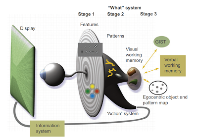
Figure 3.1: Ware’s (2013) three stage model of visual information processing, p. 20.
Stage 1: Parallel Processing to Extract Low-Level Properties of the Visual Scene
Once the signal from our neurons in the eye reach the visual cortex, networks of billions of neurons work in parallel to extract low level properties of the visual field, such as colour, texture, orientation and movement. This happens automatically and unconsciously. The results of this process are held temporarily in iconic memory (<1000 ms), which is just enough time for our conscious processes to divert attention if required and move to the next stage. During stage 1, information that is optimised for recognition by the vast neuronal networks in the visual cortex will be readily detected and processed. This will enable efficient interpretation of our data visualisation.
Stage 2: Pattern Perception
During the pattern perception stage, information obtained from stage 1 is further processed in order to identify patterns. Our visual field is broken into regions and our brains analyse contours, regions of colour, texture and motion. Stage 2 starts to involve our attention as we choose to make visual queries of the display. This stage is slower and less automatic than stage 1 but is still very rapid. Patterns perceived in the visual display can be held for a few seconds in our memory. Our brains will also transition between our object perception pathways and our action pathways. Data visualisation mainly concerns the object recognition pathway or the “what” system. The action pathway relates to our body’s reaction to the environment. For example, the action of catching a ball rapidly approaching you.
Stage 3: Visual Working Memory
This is the fully conscious stage of visual information processing. Our attention has been drawn to a visual task, for example, interpreting a data visualisation that has caught our attention in an online news article. Our identification of the data visualisation based on the broad layout of the graphic is referred to as “gist”. We are all familiar with visual gist. Think about how quickly we can identify the scene of a TV show as you rapidly flick through channels. Almost instinctively, we can identify the broad spatial layout of the scene as something like a beach, park, bush, studio, house etc. This suggests another important implication for data visualisation. Using visualisations that have “gist” will lead to more rapid interpretation. For example, most people are familiar with common data visualisations such as bar charts and scatter plots. Using these familiar data visualisation methods will allow the viewer to get the “gist” of the data visualisation very quickly.
Once we get the gist of the visualisation, we commence a series of visual queries driven by stages 1 and 2. We employ visual search strategies to bring the information together. Our working memory allows us to keep a few pieces of the visualisation in mind at any one time, however, we can also exploit our long-term memory stores to help fill in the gaps and activate contextual cues.
With this in mind, Ware (2013) compiled the following list of the costs versus benefits considerations for data visualisation (p. 24 - 25):
- Where two or more tools can perform the same task, choose the one that allows for the most valuable work to be done per unit of time.
- Consider adopting novel design solutions only when the estimated pay-off is substantially greater than the cost of learning to use them.
- Unless the benefit of novelty outweighs the cost of inconsistency, adopt tools that are consistent with other commonly used tools.
- Effort spent on developing tools should be in proportion to the profits they are expected to generate. This means that small-market custom solutions should be developed only for high value cognitive work.
Essentially, however you choose to visualise your data, the benefit (knowledge and insight) must outweigh the cost in your time (creating the visualisation) and your audience’s time (in processing and interpretation). Always try to keep it “perceptually” simple, or “kips” for short.
3.4 Important Visual Laws
A good data visualisation will allow the viewer to quickly find the important patterns that tell the story behind the data. There are well known rules and laws of human visual processing that allow us to do this job in the most efficient way possible. We are all, innately, but unconsciously familiar with these laws. Through hard-wiring and learning from our environment, our brains are highly tuned to process visual information in certain ways. We will start from the beginning with the most important law related to data visualisation - preattentive processing.
3.4.1 Preattentive Processing
What first draws your attention in Figure 3.2?

Figure 3.2: Delicious.
The delicious cherries! Why? Why not the leaves or branches of the tree or the blue sky?
Consider another example. What features in Figure 3.3 “pop-out” to you?

Figure 3.3: Paradise.
The curvature of the beach, the rows of coloured beach chairs, the vibrant blue of the ocean? Why did these things so readily draw our attention? These are examples of preattentive processing.
Let’s consider another, more sterile, example. Count the number of 3s in the following sequence of numbers.

It takes a while, doesn’t it! You have to visually scan each digit. Now, try again.
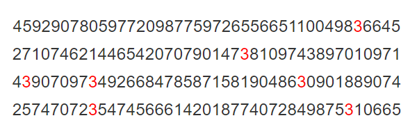
Much quicker, I bet. Now you only had to scan the colour red to count all the 3s. Colour is said to be preattentively processed. What exactly does this mean? Researchers discovered long ago that certain visual features appear to stand-out. Preattentive features were so quickly processed by the brain, that researchers originally believed such features were processed prior to conscious attention. This turned out to be not quite true, as attention is still necessary, but the name stuck. Ware (2013) defines preattentive processing as the degree to which a visual object is made available for our attention. Camouflage can be thought of the opposite of preattentive processing. Camouflage seeks to conceal objects by reducing the degree to which an object draws attention. Preattentive processing is a very powerful idea and governs much of “why” we design data visualisations using particular methods.
Colour, and many other features, are known to be preattentively processed. Figure 3.4 provides some concrete examples that demonstrate how other visual properties are preattentivelty processed. For contrast, the last two boxes (juncture and parallelism) are examples of features that are not preattentive.
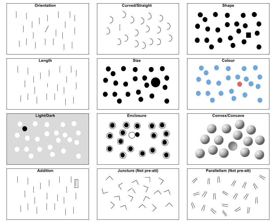
Figure 3.4: Examples of preattentively processed features adapted from Ware (2013).
Using preattentive features helps us to design data visualisations that allow efficient processing by the perceiver. For example, we use colour and shape to rapidly distinguish groups, and size, length and colour intensity to allow rapid comparisons. Many common data visualisation methods are based on preattentive principles. When designing your own, heed preattentive theory. Use it to draw the viewer’s attention to the most important elements of the visualisation, while ensuring that other features of the visualisation don’t detract attention from the story.
3.4.2 Gestalt Laws
The Gestalt (German translation meaning “pattern”) school of psychology, founded in 1912, sought to understand the ways in which humans recognise visual patterns. It turns out that our brains are incredible at this task. Let’s put ourselves to the test. Can you see the dog in Figure 3.5?

Figure 3.5: Our brains fill in the gaps (Boyer and Sarkar 2000).
To someone who has never seen a dog, this image would appear to be a collection of black blobs. However, our brains use what are known as Gestalt laws to “fill in” the perceptual gaps and allow us to see the dog. Beware though, because we are highly tuned to see patterns in our environment, we are also known to get it wrong, sometimes very wrong! Our psychological predisposition to see patterns, where no patterns exist, is referred to as pareidolia. A prime example was the face on Mars (Figure 3.6).

Figure 3.6: Face on Mars (NASA 2007).
There are heaps of other hilarious examples to be found on the internet. As long as you don’t actually believe that Jesus is appearing in your food, enjoy this human tendency. There are eight common Gestalt laws that you need to know about. These laws are introduced in the following sections. We will also consider how these laws apply to data visualisation.
3.4.2.1 Proximity
Objects close or clustering together are perceptually grouped (Figure 3.7). Data visualisations use proximity to highlight relationships between categories and trends in the data. This also means that spacing can be used to visualise no relationship.

Figure 3.7: Proximity examples.
Network data visualisations such as Transport Clusters by Grandjean (2016) (Figure 3.8) use proximity to show clusters of nodes that share a relationship. The visualisation shows the increased connectedness of airports within continents which form distinct clusters, but also how airports connect between continents.
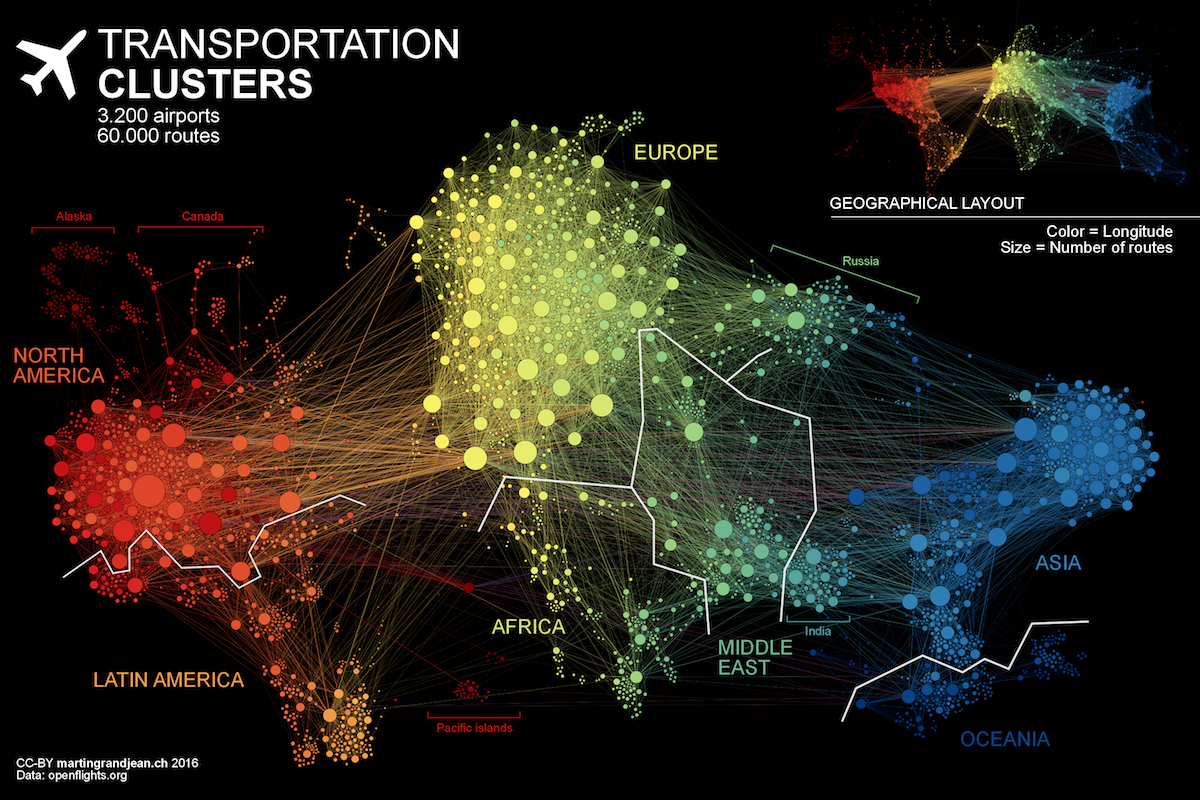
Figure 3.8: Network data visualisations use clustering to visualise relationships (Grandjean 2016).
3.4.2.2 Similarity
Objects of similar characteristics (e.g. size, shape, colour) are grouped (Figure 3.9). Visualisation implication: Use colour, size, shape and other attributes to group related objects or to differentiate between categories.

Figure 3.9: Similarity examples.
The choropleth map of the 2019 Australian Federal Election results by the Guardian demonstrates this law (Figure 3.10). Colour is used to represent political parties. Electorates sharing the same colours are grouped together so the viewer can quickly see which seats belong to Labour, the Coalition and other parties.
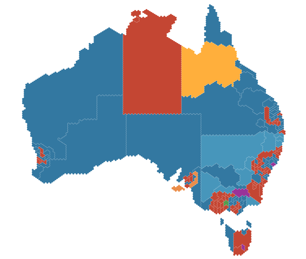
Figure 3.10: The 2019 Australian Federal Election results (The Guardian 2019).
3.4.2.3 Connectedness
Connectedness is more powerful than proximity, colour, size or shape. Objects connected by lines demonstrate relationships between objects (Figure 3.11). Data visualisations, such as times series plots and network diagrams, use connections between data points to represent temporal changes and highlight relationships.
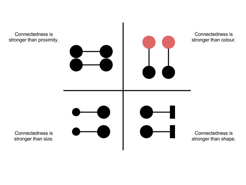
Figure 3.11: Connectedness examples.
Time series plots are the best example of data visualisations that demonstrate connectedness. For example, the Median values of capital city houses by Kusher (2018) from CoreLogic shows the significant down turn in the property market experienced in Australia commencing in 2018 (Figure 3.12). The lines connect time series data from each of the capital cities. The connectedness of the lines provides a strong sense of temporal relationship between data points for each city.
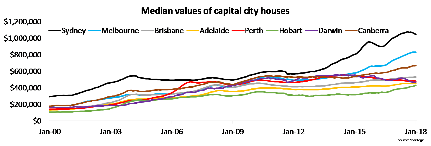
Figure 3.12: Mind the housing value gap (Kusher 2018).
3.4.2.4 Continuity
This law predicts that we are inclined to perceive objects from elements that are smooth and continuous, versus irregular and jagged (Figure 3.13). Smooth lines are easier to perceive the connection between data points and identify trends. We should also be careful with how we arrange foreground and background objects that overlap to ensure objects are perceived correctly.

Figure 3.13: Continuity examples.
The smooth continuous lines of a Sankey Diagram demonstrate this law. The Data Team (2015) from the Economist compared the flow of asylum seekers in Europe in 2014 and 2012 (Figure 3.14). The smooth lines that transition between the nodes are easily tracked and are perceptually grouped.
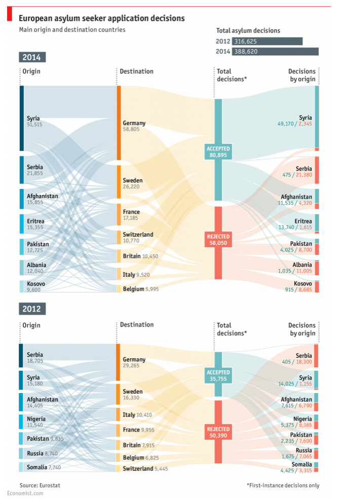
Figure 3.14: The smooth continuous lines of a Sankey Diagram demonstrate continuity (The Data Team 2015.).
3.4.2.5 Symmetry
We tend to group symmetrical objects together (Figure 3.15 ). Aligning data visualisations, for example side-by-side, promotes comparisons and allows differences to be readily perceived.

Figure 3.15: Symmetry examples.
The world population pyramid by Roser (2019) from Our World in Data uses symmetry to compare the age distribution of males and females across time and projected into the future (Figure 3.16). By aligning the population distributions as a mirror image, you can see some subtle differences based on the projections into 2100. The projections suggest males will outnumber females, but with females living longer.
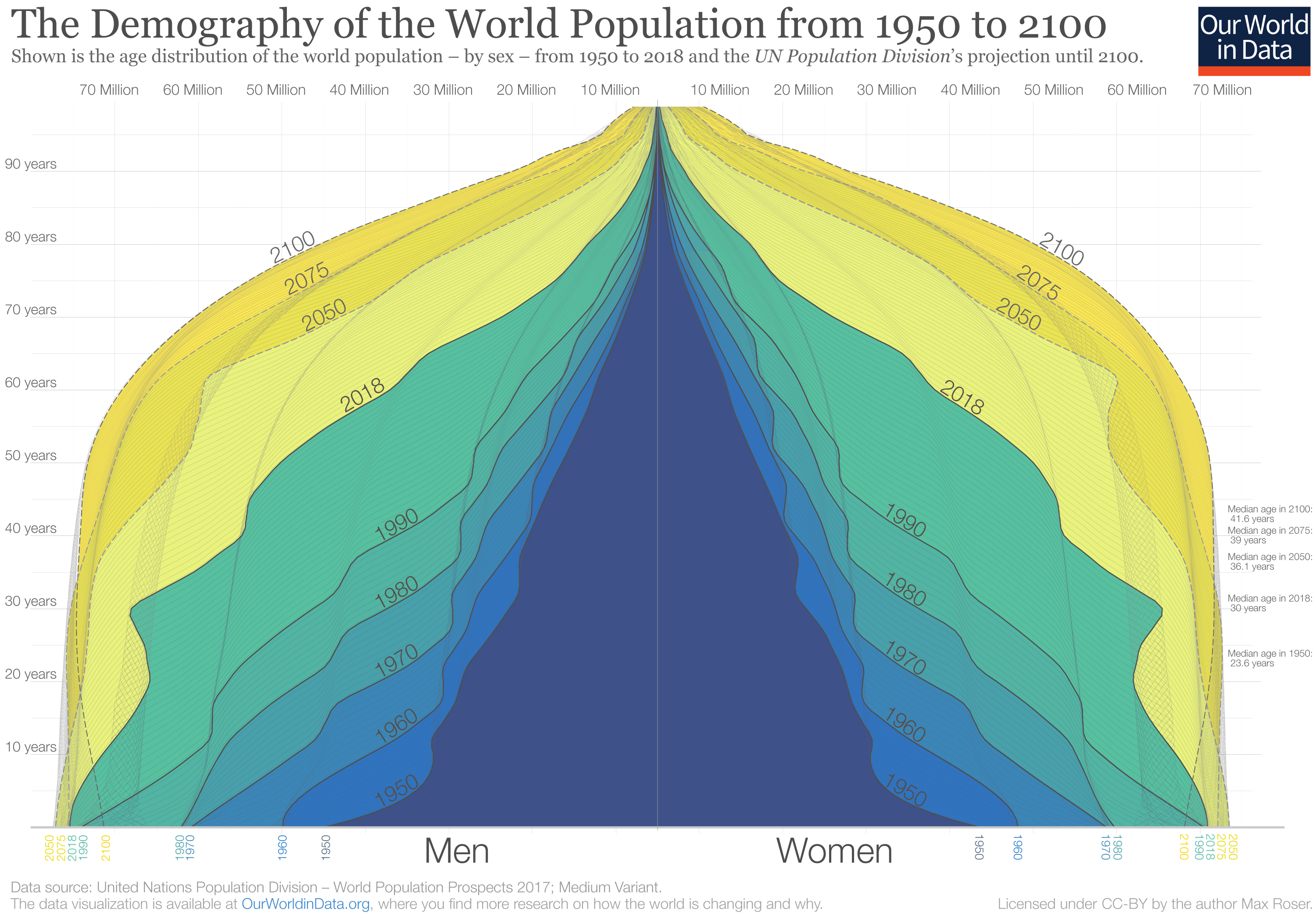
Figure 3.16: Population pyramids use symmetry (Roser 2019).
3.4.2.6 Closure
Closure refers to our tendency to “fill in the gaps” when we see incomplete patterns that resemble familiar shapes and objects (Figure 3.17). This means we should group related objects around closed shapes and ensure that overlapping objects are “closed” correctly by the brain. Contrasting overlapping objects using shapes and colour can help ensure the correct closure is achieved.
Figure 3.17: Closure examples.
Closure comes in handy when we have overlapping elements. For example, when you have two overlapping points, our brains fill in the shape and perceive two points. Ridgeline plots like M. Smith (2018) also show this law in action. Here you perceive the full density distribution even through it is obscured by other distributions (Figure 3.18). The transparency also helps.
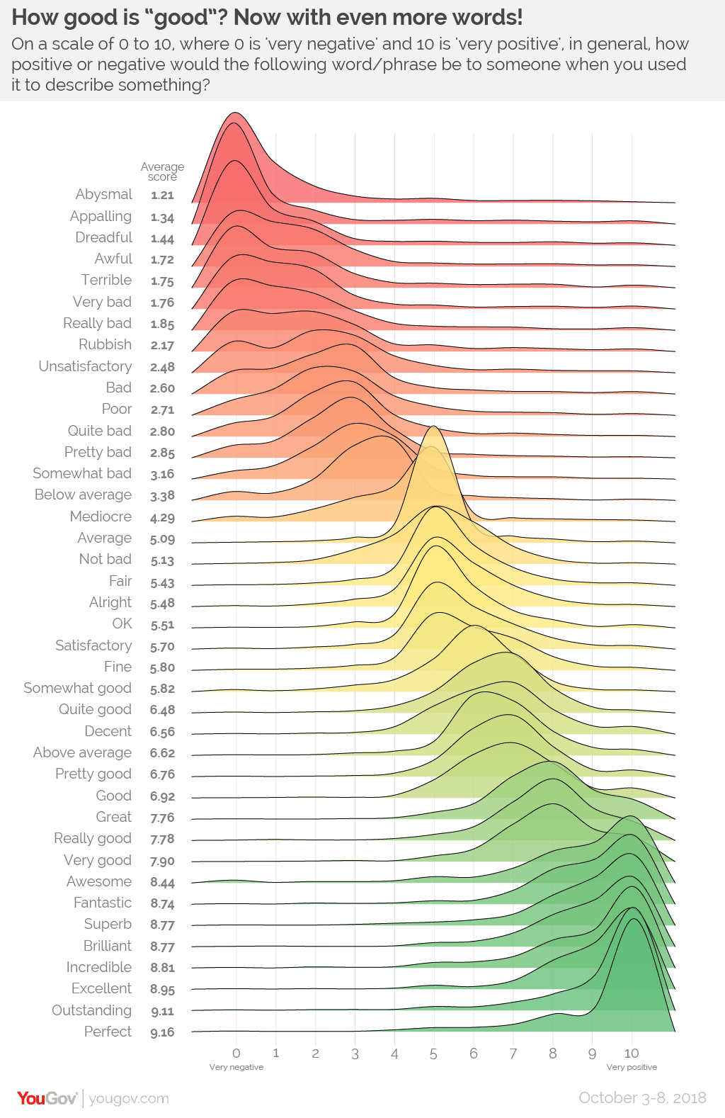
Figure 3.18: Closure helps reduce confusion with overlapping elements (M. Smith 2018).
3.4.2.7 Figure Ground Principle
The figure ground effect tells us that smaller objects within a figure are interpreted as the foreground, while larger objects make up the background (Figure 3.19). Data visualisations often plot data objects to backgrounds. This ensures that the objects within the border of the background are perceived to be representations of the data.

Figure 3.19: Figure group principle examples.
This law explains why non-data elements, such as grid lines, plot background and axis labels are faded into the background. You want the data to draw the audiences’ attention. Zev (2016) shows what happens when you over-emphasise background plot colours and grid lines (Figure 3.20). Instead of the data drawing attention, you first must look past the grid lines which compete for the foreground. Think of the data as the prisoner and the bars of the prison cell as the grid lines. The data appear to be locked-up.
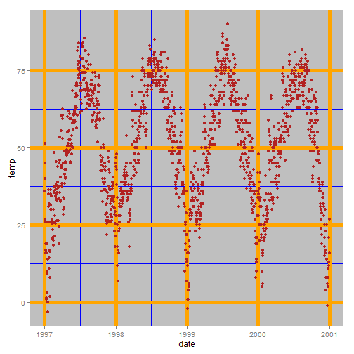
Figure 3.20: Bold grid lines compete with the data for visual attention (Zev 2016).
3.4.2.8 Common Fate
Objects perceived to be moving in the same direction are grouped together and share a common path (Figure 3.21). Animated and interactive data visualisations use this principle to show relationships between categories and highlight changes across time or based on user input.
Figure 3.21: Common fate examples (Only available online).
Han Rosling’s (BBC 2010) animated bubble charts show this law in action (Figure 3.22, https://youtu.be/jbkSRLYSojo). Countries that move together are perceived to be related. Rosling uses this law to explain the underlying factors that drive these trends.
Figure 3.22: Hans Rosling’s animated bubble charts BBC (2010).
3.4.3 Change and Inattentional Blindness
Watch the following video for a great overview and example of change and inattentional blindness (Only available online - https://youtu.be/VkrrVozZR2c).
Change blindness is caused by the finite capacity of our short-term memory. We simply cannot process and store all the information that we receive from our environment. Instead, we must limit our attention and memory to the important things that are occurring and sometimes this means we will miss subtle, sometimes abrupt, changes in the environment due to breaks in attention or interruptions to line of sight. This has important implications for data visualisations that include dynamic or animated features. It’s important to ensure that changes are easy to pay attention to and are not hidden by distractions. For interactive visualisations that change multiple parameters, each change to the data visualisation should use visual perception laws to ensure the changes “pop out” and draw attention.
Inattentional blindness is also caused by the limitations of our short-term memory. Attentional limitations imposed by a finite short-term memory means that we can only focus our attention on a limited number of objects in the environment. The more attention required, the more likely that other obvious, but irrelevant, objects in the environment will go unnoticed. This phenomenon has been extensively researched and replicated in real-world experiments. Watch the following movie and count how many times the participants wearing white pass the ball (Only available online - https://youtu.be/vJG698U2Mvo). Once you have the answer, visit this website here to see if you are correct. If you haven’t seen this video before, you might be very surprised with the answer.
Inattentional blindness shows us that human beings have a limited ability to hold information in short-term memory. If we over-burden the viewer with unnecessary visual complexity or too many irrelevant/redundant objects, we run the risk of the viewer missing important details. To avoid inattentional blindness ruining our data visualisations, Kirk’s process (Chapter 1) cautions us to exercise editorial focus and narrow down on the salient features of the data.
3.5 Visual Variables
Based on what we have learnt about visual perception, we can define a common set of visual objects/features/aesthetics that can be mapped to different types of variables. Figure 3.23 lists the most common examples. There are many more examples out there, but most are variations of the ones listed below. Note that the quantitative scales refer to all interval and ratio variable measures on discrete or continuous scales. Some features can be used to represent multiple data types. As such, the following list represents the most common type that you are likely to see paired with the different features. All demonstrate good visual design principles based on human visual information processing theory.
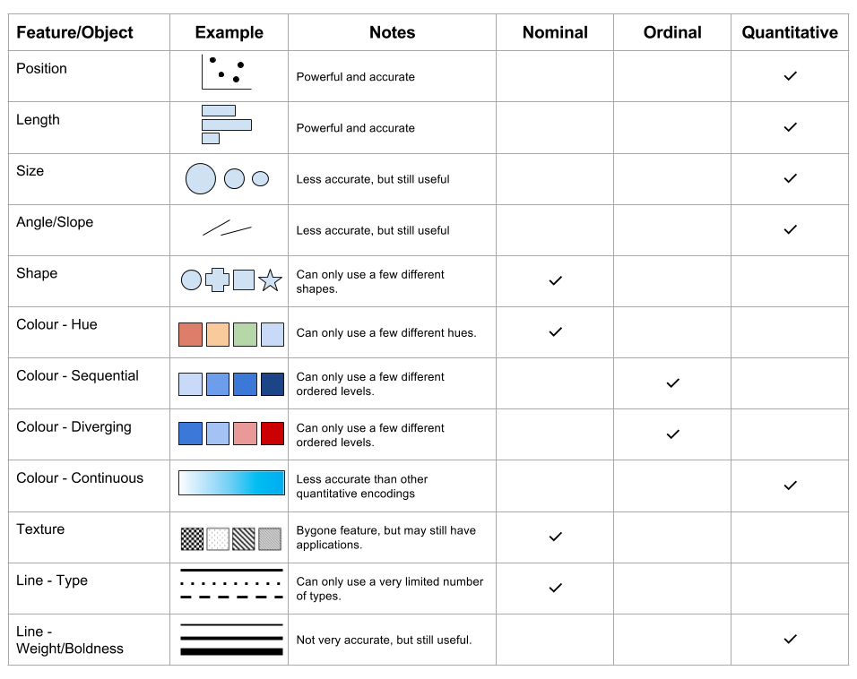
Figure 3.23: Visual variables.
3.6 Visual Comparison Accuracy
Different methods of comparing quantitative data in visualisations will impact the time it takes for the viewer to accurately complete comparisons. This is based on our visual perception system and our brain’s ability to perceive certain patterns more readily than others. Cleveland and McGill (1985) proposed a hierarchy of accurate data visualisation methods commonly used to represent comparisons. Figure 3.24 summarises this hierarchy.
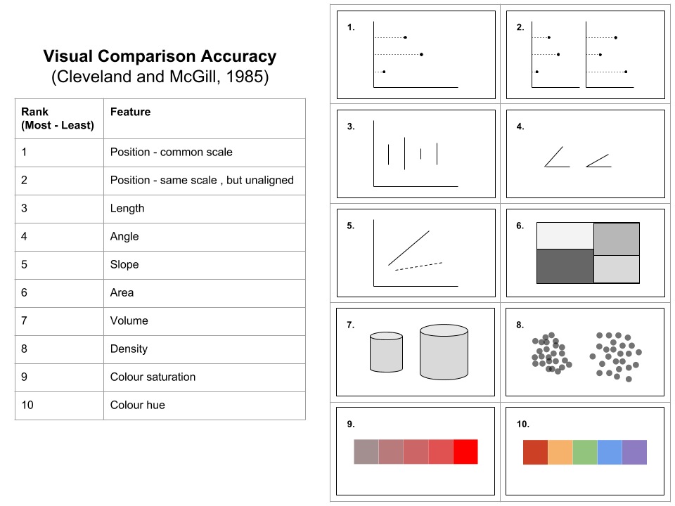
Figure 3.24: Visual comparison accuracy adapted from Cleveland and McGill (1985).
Cleveland and McGill (1985) informs us that position, length, angle and slope are the most accurate representations for comparing quantitative variables. We should carefully use area, volume and density, and only use colour saturation and hue where absolutely necessary. This is not to say that colour is ineffective. The contrary is true. However, colour is better suited to grouping related objects as opposed to reflecting a quantitative variable used for comparison. Judging the degree of difference between saturation and hue is a lot less accurate than position, length and the like. We learn more about colour in the next section.
3.7 Colour
In the following video, Colm Kelleher explains the difference between the physical concept of colour and colour perceptions (Only available online - https://youtu.be/UZ5UGnU7oOI & https://youtu.be/l8_fZPHasdo)
MacDonald (1999) wrote, “Color is one of the most effective visual attributes for coding information in displays and is capable, when used correctly, of achieving powerful and memorable effects.” (p. 26). Colour is used extensively in data visualisation to make elements “pop out” (preattentive processing), improve aesthetics, trigger certain emotional associations, draw connections between related elements and reflect quantitative values. Colour is a powerful data visualisation tool, but it must be used with care. In this chapter we will take a close look at the topic of colour and what we need to know to use colour effectively in practice.
Colour perception is our visual perception system’s response to the visible spectrum of light. Visible light is electromagnetic radiation emitted in wavelengths between 400 - 700 nanometer (nm)(Figure 3.25). Light outside this range is not visible to the human eye and include the infrared range (700 nm to 1 mm) and the ultraviolet range (10 - 400 nm).

Figure 3.25: The visible light spectrum (Spigget 2010).
Within the visible light range there are three primary colours that eye’s photoreceptors (cones) can respond to, hence humans are said to be trichromatic. These colours are blue, green and red (don’t confuse these with the primary colours used in art - blue, yellow, red). The relative activation of the three types of cones within the eye determine the colour we perceive, assuming a person is not colour blind (Figure 3.26).
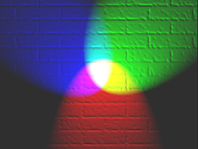
Figure 3.26: The primary colours of human vision are blue, green and red (En:User:Bb3cxv 2007).
The three primary colours interact with each other to form a three-dimensional colour space (Figure 3.27).
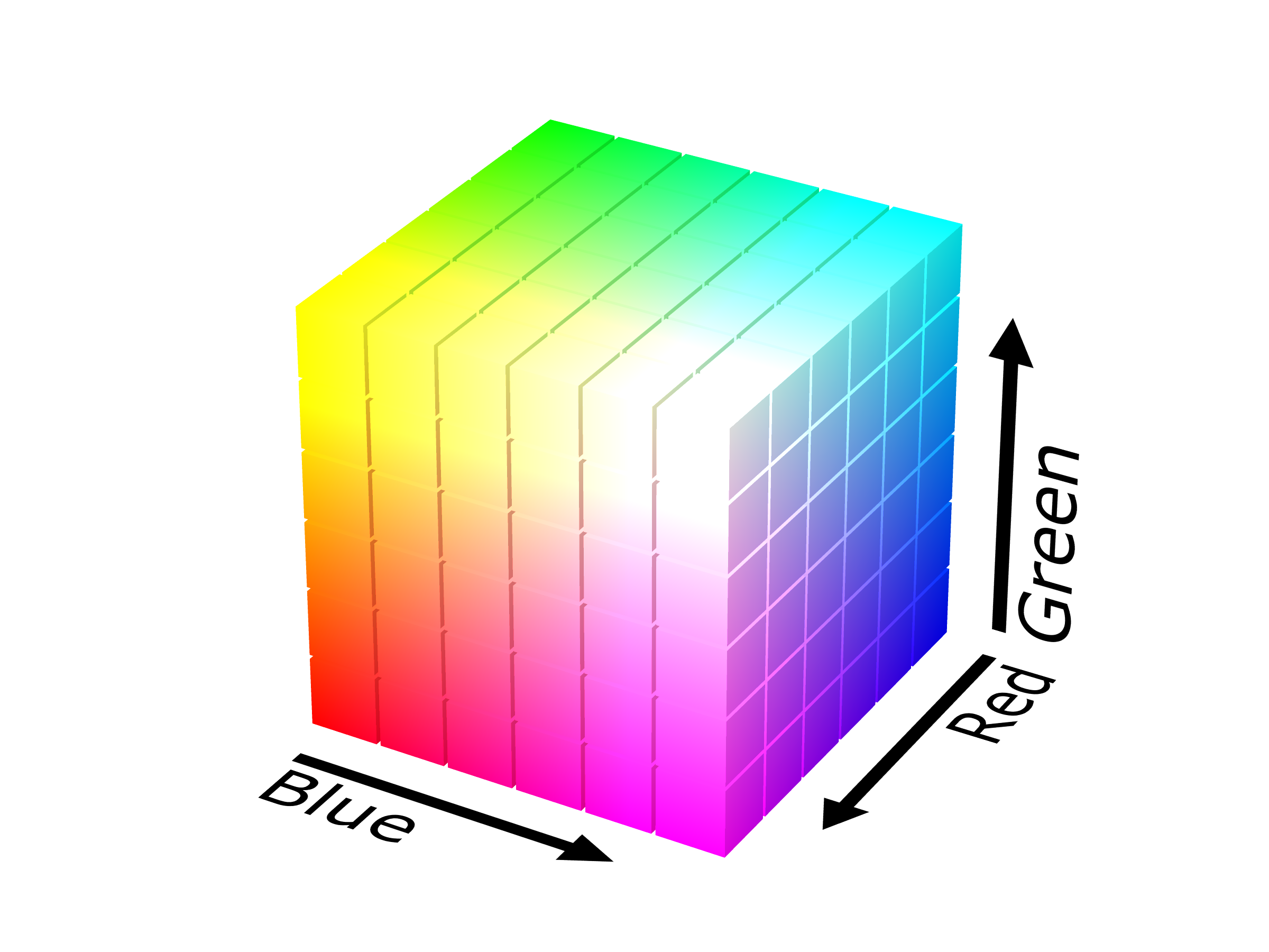
Figure 3.27: Three colours create a 3d colour space (SharkD 2008).
It’s important to note that colour is not discrete. Therefore, defining colour isn’t as simple as listing all the colours you know. While our brains automatically transcode colour from electrical impulses sent from the eye, computers, which run data visualisation software, need colour models that can form a basic language for defining colour rendered on computer screens and used in print. In the next section we will take a look at the RGB and HSV colour models.
3.8 Colour Models
Colour models aim to specify colour in a standard way (Silva, Sousa Santos, and Madeira 2011). This is very important for computing and web technologies which rely heavily on colour. The most efficient way to do this, is to create a colour model that can be used to specific a colour and reproduce that colour on another system using small pieces of code. There are numerous colour models (e.g. RGB, CMYK, HSV and HSL), however, in this section we will pay close attention to one of the most intuitive.
The HSV model specifies colour using three main parameters: hue, saturation and value, or HSV (Figure 3.28). Hue refers to what we perceive to be different colour types, e.g. red, green, blue, orange etc. Saturation refers to colour purity, and value to the brightness of the colour. To remember the difference between saturation and value, consider the following analogy. When you buy a new bright red (hue) shirt, the colour is very pure. However, after you wash the shirt and dry it on the clothesline, the colour slowly fades. Basically, purity reduces because the colour pigments are slowly being washed out and destroyed by the sun. Value refers to brightness. You are wearing your bright red shirt outside on a sunny day. It captures everyone’s attention because of the brightness of the sun. The sun starts to go down and night approaches. There is less light, so your shirt appears less bright. Eventually, your shirt appears almost black because it is dark outside. Most colour models also include an alpha parameter which codes for transparency. While not technically a colour parameter, alpha is a very important scale in data visualisation for dealing with overlapping elements.
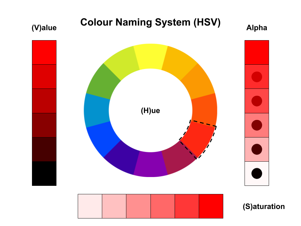
Figure 3.28: The HSV colour model.
Many data visualisation packages are based on the common RGB (red, green and blue) colour model. Therefore, to use HSV, you may need to convert between colour models. This is easy to do using online tools discussed below.
To make coding colours more efficient in web programming, a hexadecimal colour coding system was developed. The hexadecimal system is a base 16 number system. Each colour (red, green and blue) is represented as one of 16 characters using the following format: #rrggbb. The 16 characters include:
Therefore… you can select different hues as follows:
#000000
#FFFFFF
#FF0000
#00FF00
#0000FF
You can also express the hexadecimal systems as a number between 0 - 255 (i.e. 162), to represent an RGB colour. For example, black would be rgb(0,0,0), white rgb(255,255,255) or red rgb(255,0,0). However, the hex codes are more common in web technologies. Working with hex codes can be difficult, so you should explore colour picking tools that will allow you to visually scan the colour space and output the relevant hex code (Figure 3.29).
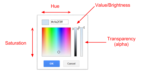
Figure 3.29: Colour pickers make choosing colours easy.
There are also excellent websites like http://colorizer.org/ that allow you to pick colours, check colour codes and convert between different colour models (HSV, HSL, RGB and CMYK). Figure 3.30 summarises the hex based colour coding system used in many data visualisation packages.
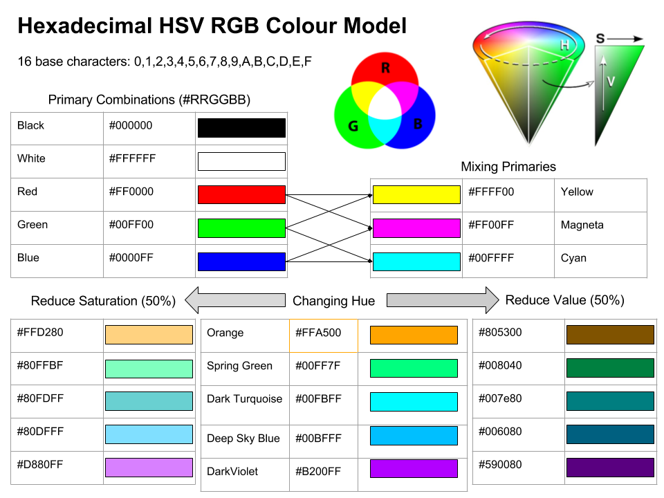
Figure 3.30: The hex colour coding system.
3.9 Colour Scales and Data Types
Colour is a very versatile visual property used in data visualisation. One of the most common ways it is used is to represent a variable. There are a range of different colour scales that can be used to represent different types of variables. Figure 3.31 provides a useful overview. The infographic splits the colour scales by the types of variables - nominal, ordinal, interval and ratio. Nominal and ordinal colour scales are said to be discete because each level represents a single colour. Ordinal colour scales incorporate a sequence of discrete colours that represent the ordering present in the variable. Continuous colour scales, on the other hand, can take on any colour value within a range specified by the scale, which makes them ideal for interval and ratio variables.
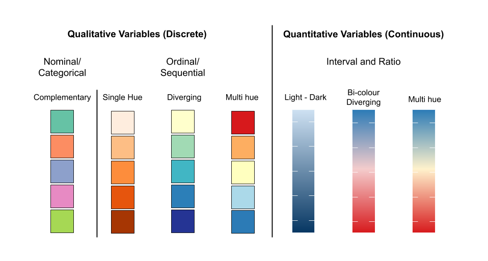
Figure 3.31: Colour can be used to create many different types of scales.
Changing colour scales can sometimes have drastic effects on the appearance of a visualisastion. Find the right colour scale can be tricky. Fortunately, there are tools available to assist.
3.10 ColorBrewer
Choosing colour scales is not an easy task. The first problem you are faced with when choosing colours is that are easy to distinguish. This might be easy for a few colours, but the problem gets harder as the number of colours required grows. How do you know the colours are readily distinguishable? How do you know your colours will appear consistently on other devices? Are your colours colour blind safe? Fortunately, there are tools that can help such as the ColorBrewer scales (Harrower and Brewer 2003; Brewer and Harrower 2019). Cynthia Brewer developed these scales to promote best practice in map representation, being a geographer herself. However, her work has much broader applications to data visualisation. The ColorBrewer 2.0 web tool allows a user to select colour themes based on sequential, diverging or qualitative data, single or multi-hue schemes and colourblind, print- and photocopy-safe palettes. The tool also allows you to preview your colour scheme in order to check suitability and accuracy and allows you to export the scheme as a vector of colour hex codes for easy implementation into applications (Figure 3.32).
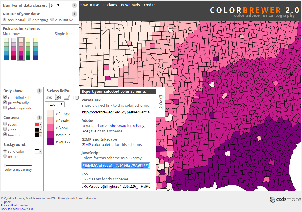
Figure 3.32: ColorBrewer web tool (Brewer and Harrower 2019).
This tools provides some interesting insight into the limitations of colour scales. The maximum number of colour levels/classes is 12 (Figure 3.33). However, this is only possible for qualitative variables. Looking at the map, I think you would agree that 12 colours is hard work. There is a lot of looking back and forth between the map and the colour legend.
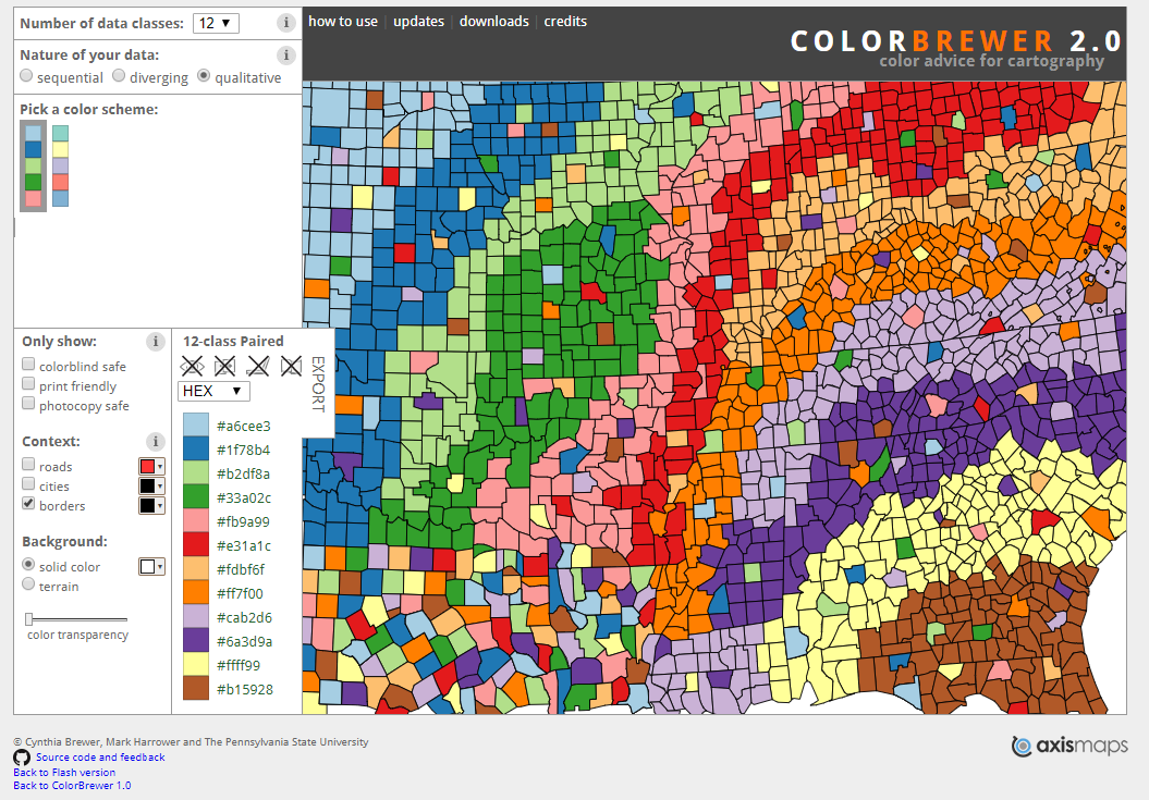
Figure 3.33: Too many colours… (Brewer and Harrower 2019).
Things are even more interesting if you want to choose a colourblind safe palette. The maximum number of colours considered colourblind safe in the qualitative scales is only four (Figure 3.34). However, colour blind scales for sequential and diverging scales can support up to 11 colours. This is a nice segue to the the next section on colour blindness.
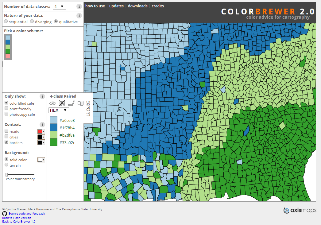
Figure 3.34: Few colour blind safe colour palettes are available (Brewer and Harrower 2019).
3.11 Colour Blindness
You need to do your best to ensure your data visualisations can be readily interpreted by people with colour blindness. Colour blindness is caused by missing or dysfunctional cones in the eye’s retina. Approximately 8% of males and 0.4% of females have some form of colour blindness. There are many variations based on the type and number of dysfunctional or missing cones in the retina. The red-green colour blindness types are the most common. These types make it difficult to distinguish red from green. Figure 3.35 will help you to understand the different classifications of colour blindness.
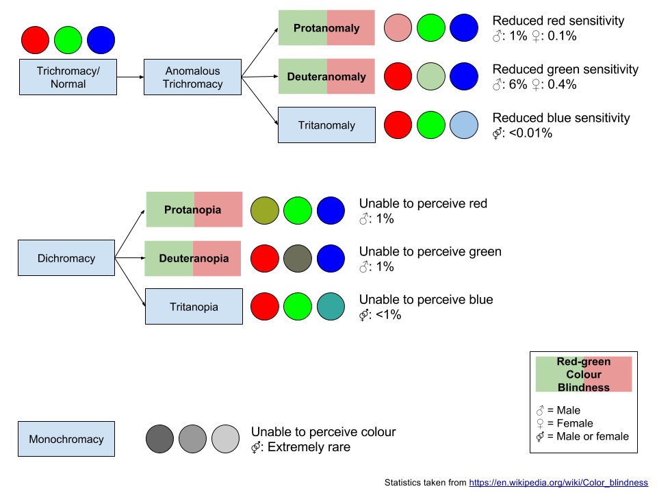
Figure 3.35: Colour blindness.
Figure 3.36 shows how colour blindness changes the perception of colour. Of course, I am assuming you’re not colour blind! The images above were created using the Coblis Colour Blindness Simulator (Wickline 2001). This is a very useful tool.
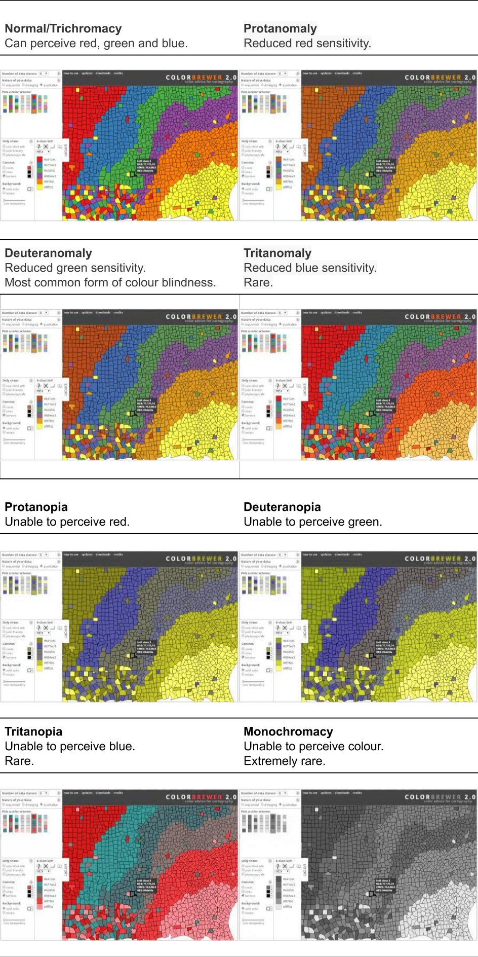
Figure 3.36: Different types of colour blindness and their simulated effect.
Colour blind simulators can help us to determine how our data visualisation will appear to people with colour blindness. You won’t be able to cater to all forms of colour blindness. Red-green colour blindness is the most common, so checking your visualisation using a red-green colour blindness simulator is recommended.
3.12 Colour Associations
Colours have many natural and cultural associations. We need to keep these in mind when choosing colours as we might need to avoid particular associations or use these associations to trigger the right emotional response. Table 3.1 was reproduced from MacDonald (1999).
| Colour | Positive | Negative |
|---|---|---|
| Red | Passion, strength, energy, heat, love | Blood, war, fire, danger, anger, aggression |
| Green | Nature, spring, fertility, safety, environment | Inexperience, decay, envy, misfortune |
| Yellow | Sun, summer, gold, harvest, optimism | Cowardice, treason, hazard, illness, folly |
| Blue | Sky, sea, stability, peace, unity, depth | Depression, obscenity, conservatism, passivity |
| White | Snow, purity, peace, cleanliness, innocence | Cold, clinical, surrender, sterility, death, banality |
| Gray | Intelligence, dignity, restraint, maturity | Shadow, concrete, drabness, boredom |
| Black | Coal, power, formality, depth, solidarity, style | Fear, void, night, secrecy, evil, anonymity |
3.13 Responsible Use of Colour
Colour is a big topic. We have outlined the basics, but you really need to know how to use colour responsibly in data visualisation. The following sections will outline the most important considerations that all designers must understand. The ideas are all explained using examples. This advice has been adapted from Few (2008b), Lujin Wang et al. (2008), MacDonald (1999), Silva, Sousa Santos, and Madeira (2011) and Ware (2013). If you stick to these rules and you will rarely go wrong.
3.13.1 Use colour with purpose
The first rule is simple. Use colour with purpose (Few 2008b). Figure 3.37 A. uses colour unnecessarily. It does not improve the effectiveness of the data visualisation in communicating insight. Figure 3.37 B. shows that less is more. Colour is used to differentiate the “All employees” categories from the age bands. This signals to the viewers that the “All employee” category is different. No other colours are necessary.
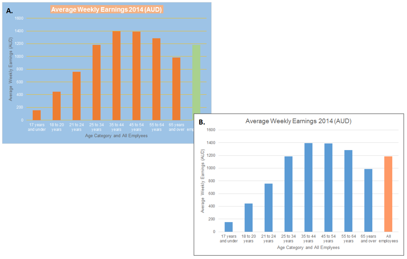
Figure 3.37: A. Use colour sparingly. Less is more. B. Use as few colours as possible to achieve what you intend to communicate.
3.13.2 Use colour to differentiate important features
Colour is a powerful way to help the audience differentiate features, groups, or values in a data visualisation (Few 2008b). Figure 3.38 A. uses a different colour for each category on the x-axis. The x-axis is one variable and the categories within the variable are already defined on the x-axis. The use of colour is redundant. Figure 3.38 B., on the other hand, uses colour to differentiate the age categories from a different statistical summary, “All employees”.
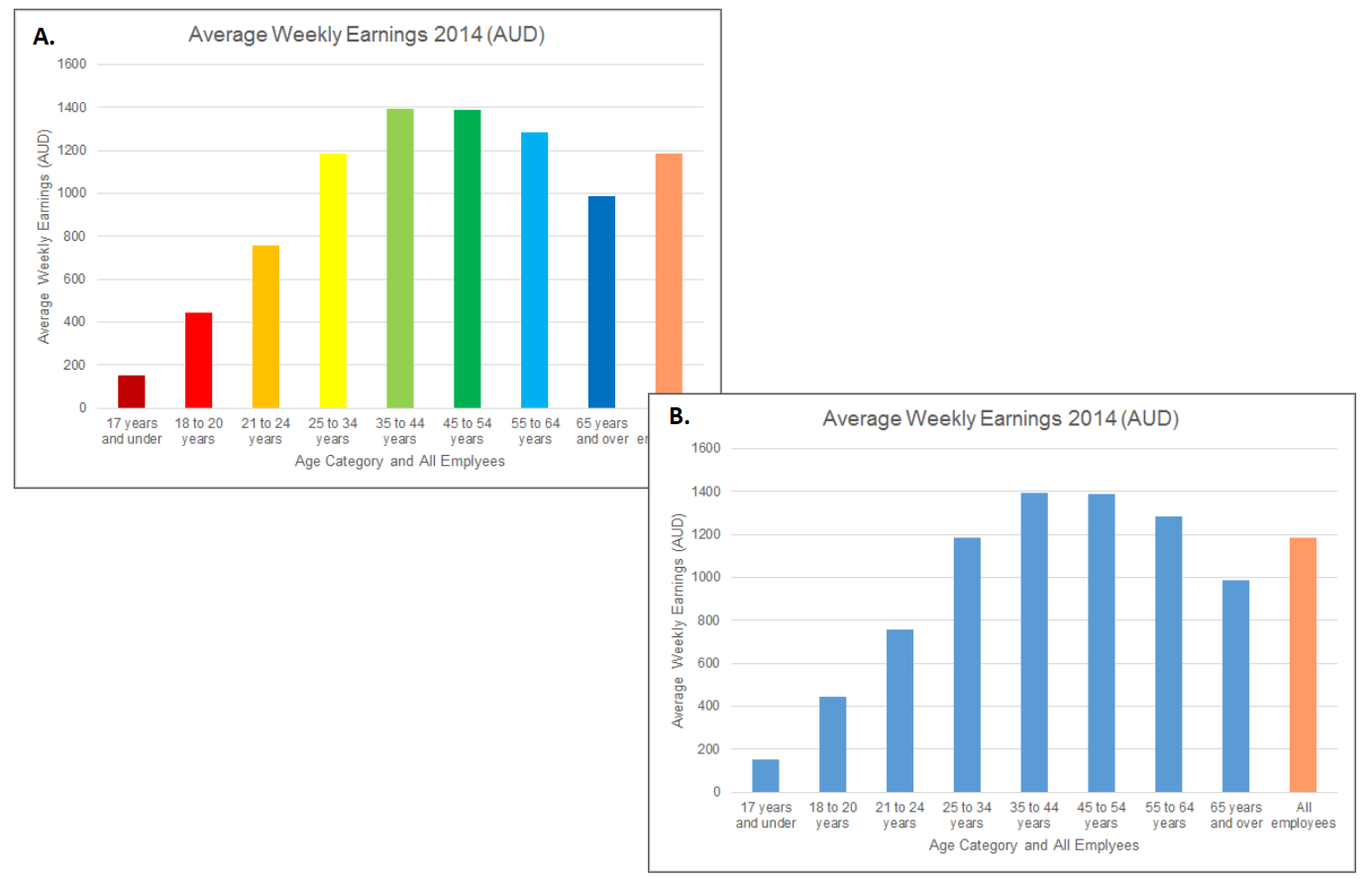
Figure 3.38: A. Colour is used in a redundant manner. B. Colour is used to differentiate between two different statistical summaries - average earning by age category vs. all employees.
3.13.3 Ensure colour constancy
Our perception of an object’s colour can change based on the colours of the objects surrounding it. Consider the squares in Figure 3.39. The two squares in the image appear to have a different level of saturation.

Figure 3.39: Two squares, different colours?
Now consider what happens when we remove the background colours and use a constant white background (Figure 3.40).

Figure 3.40: Same colour…
The colours are exactly the same. Not convinced? Consider Figure 3.41. In this image, the squares appear to be the same colour and saturation, however, if you trace the objects’ colours side-by-side, they are clearly different.
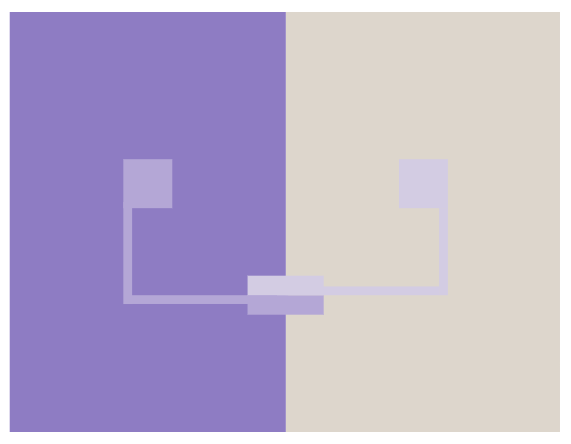
Figure 3.41: Our perception of colour depends on the other colours surrounding an object.
Few (2008b) summarises this rules as follows: “If you want different objects of the same colour in a table or graph to look the same, make sure the background colour that surrounds them is consistent.”
3.13.4 Ensure adequate contrast
Data visualisation is first about the data. You want the data to “pop-out” and draw people’s attention. You also want non-data elements (e.g. titles, labels, axis labels etc.) to be easily read. Therefore, data visualisation must use background colours that provide sufficient contrast (Few 2008b). Figure 3.42 provides examples of good and bad contrast.

Figure 3.42: Examples of good and bad contrast.
3.13.5 Define objects with equiluminous colour using thin borders
When you have overlapping coloured elements, sometimes the elements can be difficult to discern, especially, if the elements have the same level of brightness (equiluminous). Ware (2013) recommends using a thin border with a higher level of luminosity (e.g. white) to improve object definition. This principle is demonstrated in Figure 3.43.

Figure 3.43: The circle with the white border is seen more clearly.
3.13.6 Avoid highly saturated colours
Stare at the dot in the coloured image of Figure 3.44 for 30 seconds. Then look at the dot in the right image for another 10 seconds. What do you notice?

Figure 3.44: After image experiment.
The opposite colours are superimposed on the white background. This is an example of an after image. The reason the colours are inverted (red > cyan, cyan > red, yellow > blue, and blue > yellow) relates to retinal fatigue. The cones in the retina that respond to a given colour become fatigued, for example the red cones. When you look at the white background, the three cone types (red, green, blue) are equally stimulated, but because the red cone type is fatigued, the other two cone types, green and blue, respond equally producing a cyan coloured after image. The effect is weakened if the colours are weakened. Run the experiment again using Figure 3.45

Figure 3.45: The after image is less pronounced and more transient.
So what is the lesson here? MacDonald (1999) explains as follows: “Areas of strong colour and high contrast can produce after images when the viewer looks away from the screen, resulting in visual stress from prolonged viewing.” (p. 22).
3.13.7 Reserve bright colours to highlight important information
Colour is one of the most versatile tools available to a designer. It is incredibly powerful at drawing viewers’ attention. Therefore, when we use it, it must serve an important purpose. Few (2008b) recommends using soft or natural colours for most elements and reserving bright or dark colours to draw attention to the most crucial information. Using bright and artificial colours can also produce unsightly visualisations (see Figure 3.46).
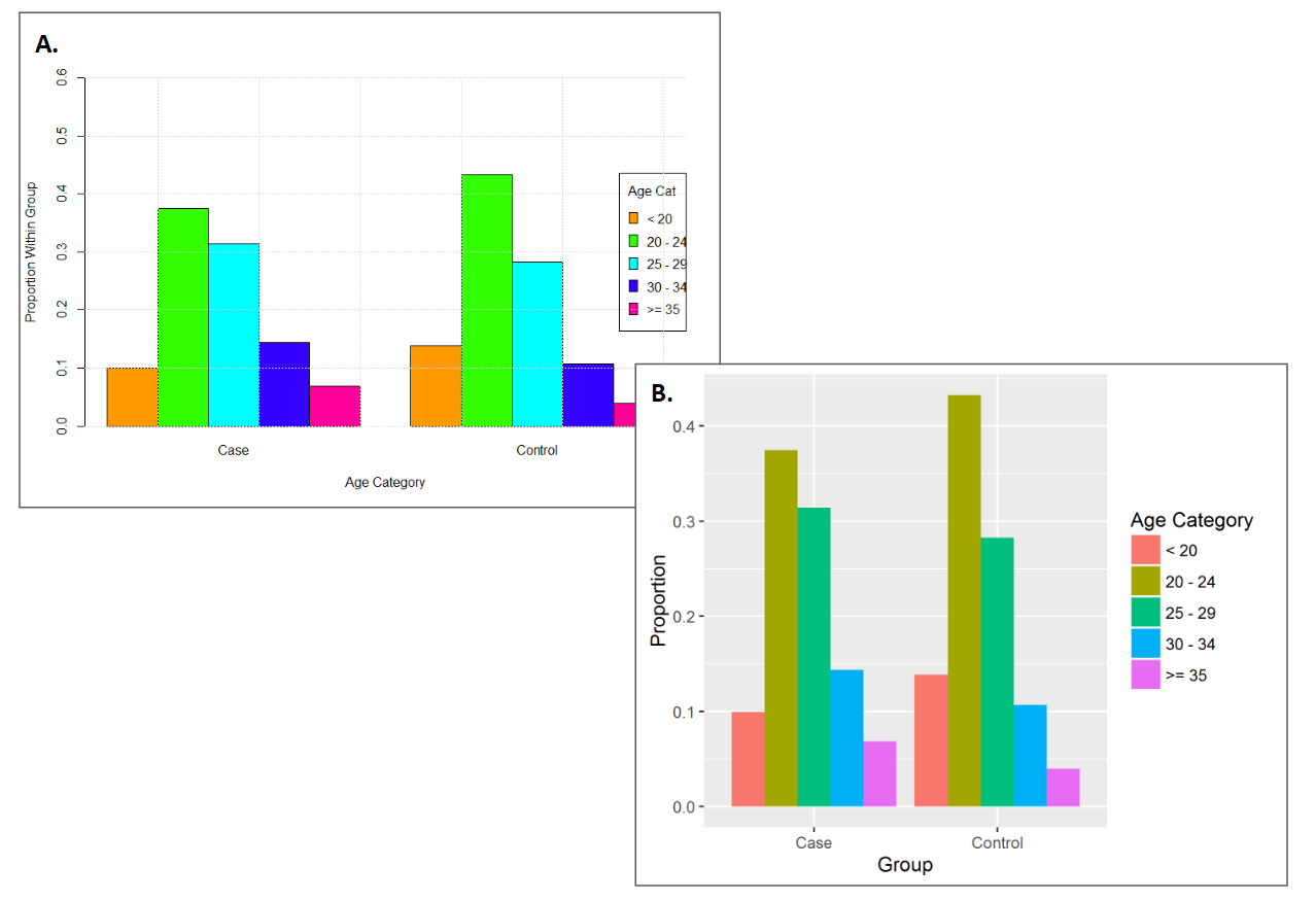
Figure 3.46: A. Bright colours belong in Vegas. B. Reduce saturation and use more natural hues in most situations.
3.13.8 Saturated colours can be used for small data points
There are situations when bright colours can be helpful. Small data points are often hard to see (Figure 3.47 A.). Increasing the size of the points as well as increasing their brightness can make them easier to see (Few 2008b) (Figure 3.47 B.).
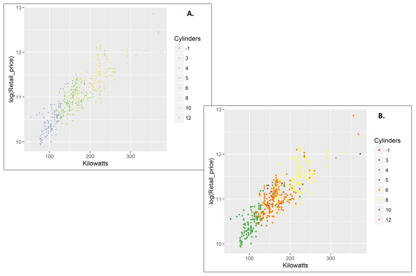
Figure 3.47: A. Small data points are hard to see. B. Increase size and colour brightness to make them easier to see.
3.13.9 Use colour scales to encode important information
Colour can be used to create many scales; nominal, ordinal, interval and ratio When using colour to represent a variable, ensure the colour scale matches the variable type (Few 2008b). For example, a diamond’s cut, fair, good, very good, premium and ideal is a sequential or ordinal variable. Figure 3.48 A. uses a complementary or nominal colour scale to encode cut. This is a missed opportunity. Figure 3.48 B. corrects this and uses a single hue, sequential colour scale.
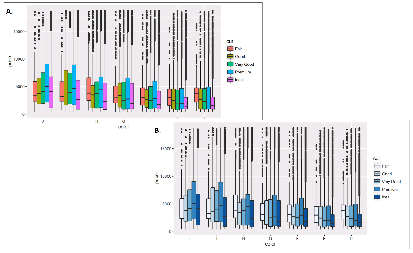
Figure 3.48: A. Cut is an ordinal variable, but the colour scale is nominal. B. The colour scale for cut is now ordinal.
3.13.10 Non-data elements should not compete with the data
Titles, labels, grid lines, and plot backgrounds are all examples of non-data elements. These features should not detract from the data or key elements that communicate insight. They should be visible only enough to perform their supportive role (Few 2008b). For example, the bold gridlines and colourful background in Figure 3.49 A. enhance the accuracy of reading data points from the plot and constrasting data points, respectively. However, they complete for attention with the data. A grey background and white grid lines are still noticable and supportive, but ensure your attention first focuses on the trend in the data (Figure 3.49 B.)
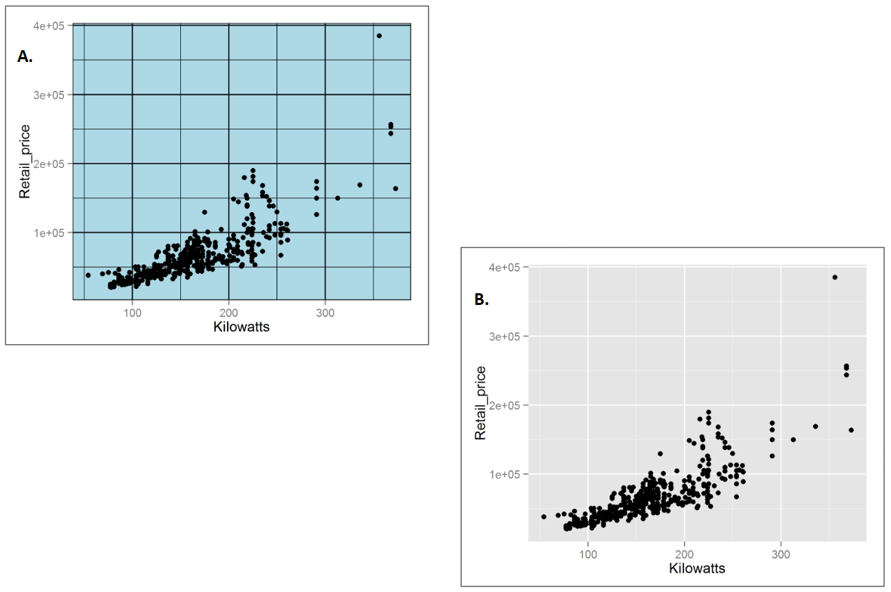
Figure 3.49: A. The bold grid lines and colourful plot background detract from the data. B. A grey background and white gridlines ensure the data speak for themselves.
3.13.11 Try to avoid colour scales that use red and green.
Colour scales that use red and green should be avoided where possible due to the most common forms of red-green colour blindness (Few 2008b). For example, the continuous red-green colour scale used in Figure 3.50 A., appears very different to a person with Dueteranopia (unable to perceive green - Figure 3.50 B., simulated).
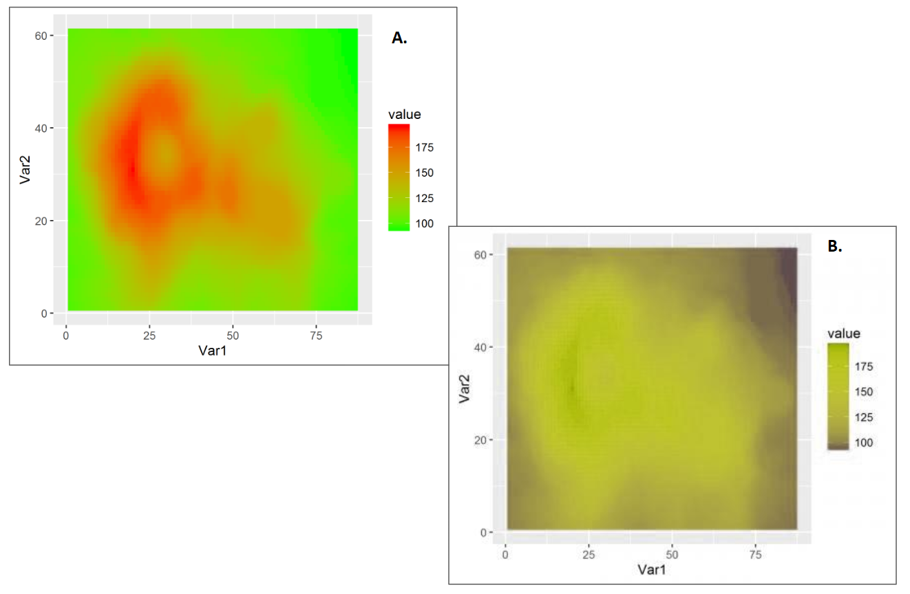
Figure 3.50: A. A red-green continuous diverging colour scale. B. The same plot as A. but the simulated appearance for someone with Dueteranopia.
3.13.12 Avoid visual effects.
Special effects belong in Hollywood movies. Avoid using them in visualisations (Few 2008b). For example, the shadows in Figure 3.51 A. serve no purpose except for a cheap visual thrill. The 3D effect in Figure 3.51 B. is worse. It introduces a depth distortion. Because the “17 year and under” category appears further away, the height of the bar will be underestimated.
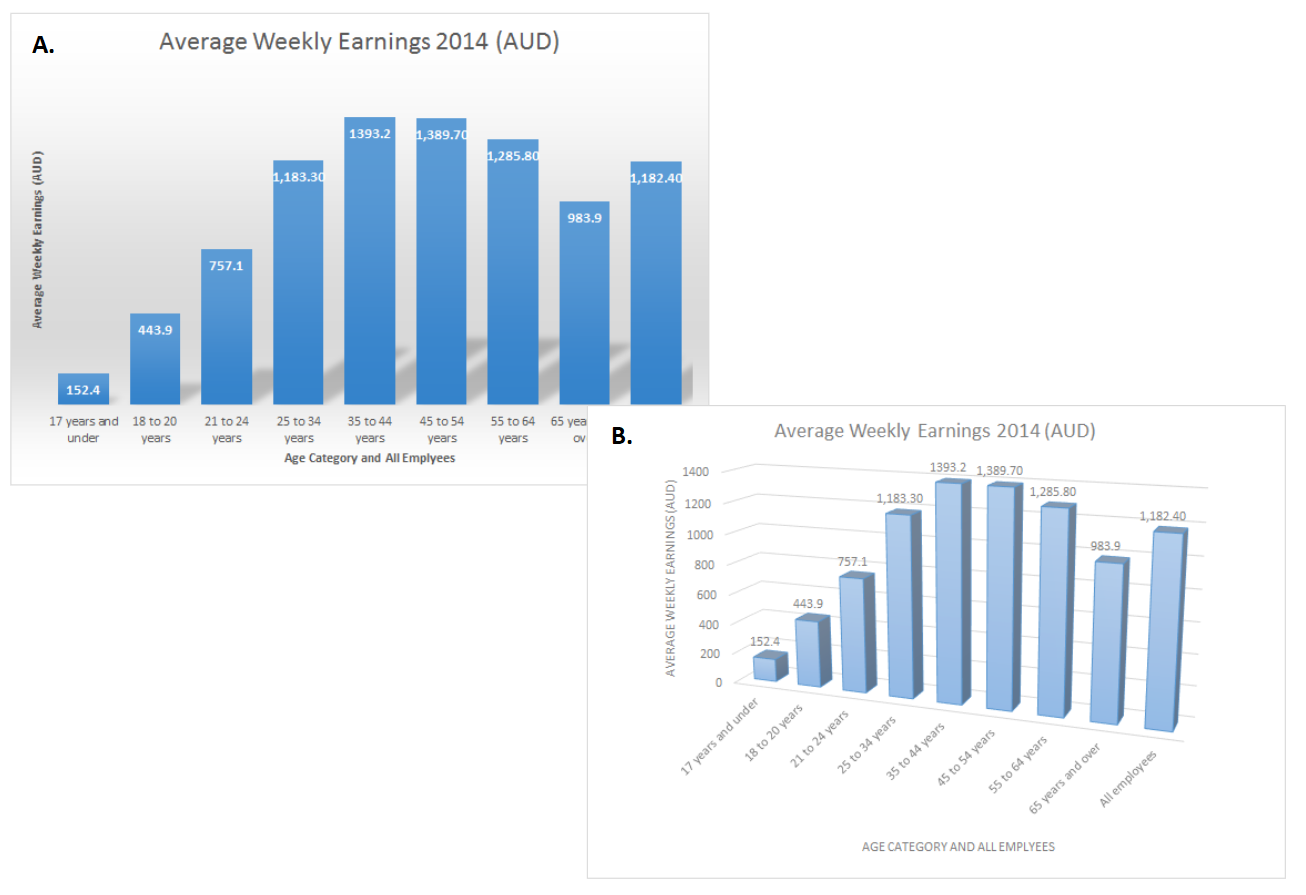
Figure 3.51: A. The shadows serve no purpose. B. 3D effects can distort data visualisations.
3.14 Concluding Thoughts
This chapter introduced and discussed the important relationship between data visualisation and human visual information processing. Vision is a construct of the brain enabled by rapid processing and powerful heuristics. However, optical illusions remind us that our visual system has its limitations. As a data visualisation designer, you must respect the power and limits of human vision. Preattentive processing demonstrates that certain visual features are more readily seen and data visualisation takes full advantage of this ability. Gestalt laws help designers to use human pattern recognition laws to relate meaning to features in data. Human vision relies heavily on colour, and therefore, there is little surprise that colour is a designer’s most versatile tool. Colour can be used to draw attention, differentiate groups, highlight important features and represent statistical quantities. This chapter introduced the physical and perceptual concepts of colour, computer colour models and, most importantly, the rules of responsible colour use for data visualisation. The theoretical and practical knowledge covered in the chapter has laid a solid foundation that informs many of the design decisions to come.