Chapter 2 Storytelling with Data
2.1 Summary
Using storytelling techniques in data visualisation can help you to better engage your audience and leave a lasting impression. Building upon the data visualisation design process introduced in Chapter 1, this chapter will introduce the notion of telling visual data stories. Examples and case studies will be explored and the scholarly literature discussed in order to define and characterise “narrative visualisation”. You will ultimately learn to identify and apply common strategies and techniques used for data visualisation storytelling.
2.1.1 Learning Objectives
The learning objectives of this chapter are as follows:
- Define storytelling and why it is important for data visualisation
- Define data visualisation storytelling
- Identify the explain the following common elements of data visualisation storytelling:
- Genre
- Structure
- Highlighting
- Transition
- Ordering
- Interactivity
- Messaging
- Apply tools and strategies to help incorporate data visualisation storytelling techniques.
2.2 The Power of Storytelling

A story can be defined as a sequence of causally related events that unfold over time at a pace tailored to an audience in order to hold their attention and leave a lasting impression (Kwan-Liu Ma et al. 2012). Storytelling continues to play an important role in human history across all cultures (Chaitin 2003). Stories are still used today to entertain, educate and pass on important cultural norms, customs and morals. For example, storybooks read to young children are not just about introducing reading and writing. They are a way to entertain, develop imagination, and help children understand the world around them. However, storytelling isn’t restricted to books. Before written language, our ancestors would have told oral stories, which continues even today. Many cultures also used dance, music and art. Technology has allowed us to merge many of these modes of storytelling into radio, movies, TV, computer games and other media. From a very young age and throughout life, humans learn through story.
This is no coincidence. Stories allow you to structure information in a way that sends a clear and memorable message (Kosara and Mackinlay 2013). Human memory is greatly enhanced when information is organised in a meaningful way. Perhaps this explains why we can often recount stories many years on. Stories are also often tailored to their audience in order to maximise their engagement by using characters, settings, events and interactions that resonate with an audience. For example, children books employ colourful illustrations and characters to capture kids’ attention, while adult media tends to focus on real images and actors. In the next section, you will consider how storytelling can be extended to data visualisation.
2.3 Storytelling and Data Visualisation
Storytelling and data visualisation can be used together because the characteristics of a story can be applied in almost every communication activity (Dahlstrom 2014) and, given the power of storytelling, you have good reason to use it. Using storytelling technique for data visualisation is argued to make visualisation more interesting and memorable (Kwan-Liu Ma et al. 2012), or as Kosara (2016) puts it “getting a point across and making it stick” (p. 80). Data visualisation storytelling is different to general storytelling because data and context replace traditional story elements such as a linear sequence of causally related events, settings and characters (Segel and Heer 2010). Therefore, while a narrative is central to the definition of data stories, it has a slightly different meaning in data visualisation. Lee et al. (2015) built upon the work of Segel and Heer (2010) by proposing three key elements that characterise a visual data story. These elements are as follows:
- A series of story pieces that present data-driven facts
- Story pieces are visualised to support each intended message and each visualisation is supported by annotations or narrations that focus on the intended message
- Each story piece is linked and presented in a meaningful order that aims to maximise the objective of the story
The last point specifically relates to the importance of order. For example, time is used in traditional stories as a way to understand cause and effect (Kosara and Mackinlay 2013). Lee et al. (2015) argue that storytelling data visualisations must help guide the viewer and not wholly leave the viewer to their own interpretations. Therefore, data visualisations produced during exploratory data visualisation are not considered examples of visual data stories.
While a relatively new and emerging field, data visualisation storytelling has established itself as a persuasive field that specialises in the intersection of storytelling and data visualisation. Before we describe data visualisation storytelling strategies, let’s take a close look at a case study to explore a data visualisation storyteller in action.
2.4 Case Study
In order to understand the strategies employed by a visual data storyteller, the following section will examine an article that appeared in the New York Times written by Litman-Navarro (2019) (see Figure 2.1). You can view the article here. The title of the article was “We read 150 privacy policies. They were an incomprehensible disaster”. The author skillfully used data visualisation to highlight the issues of privacy policies used by major tech and media companies. They effectively used data visualisation and storytelling to turn a potentially dry topic into an engaging and memorable article. Before you continue reading, click on the image below to read the article.
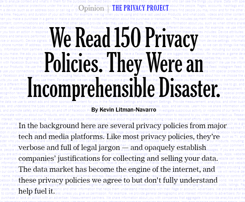
Figure 2.1: Title and summary (Litman-Navarro 2019).
There are very deliberate features of this article that highlight effective data visualisation storytelling. The opening statement paints an immediate picture of the problem and objective of the article. The first visualisation is the background of the first page. A splattering of legal writing comprising the contents of several privacy policies reviewed by the author. It is deliberately overwhelming and seems to be printed in the same size font that many companies use to publish (and perhaps hide) their privacy policies. Without even realising it, the viewer is already looking at a visualisation of the raw data.
As the viewer scrolls down the page, the background disappears, new text appears and the first data visualisation is presented (see Figure 2.2). It is clear the author will take control of the story and guide the viewer through the story piece by piece. This article is similar to a slideshow. This first piece of information looks at how long each privacy policy took to read. A dot plot was used to show the distribution of reading times in minutes. Companies like Facebook, Uber and AirBnB are labelled to put the data in perspective. The user can also hover over individual data points for further labels to appear. The message is clear. Reading many of the privacy policies was a time consuming process.
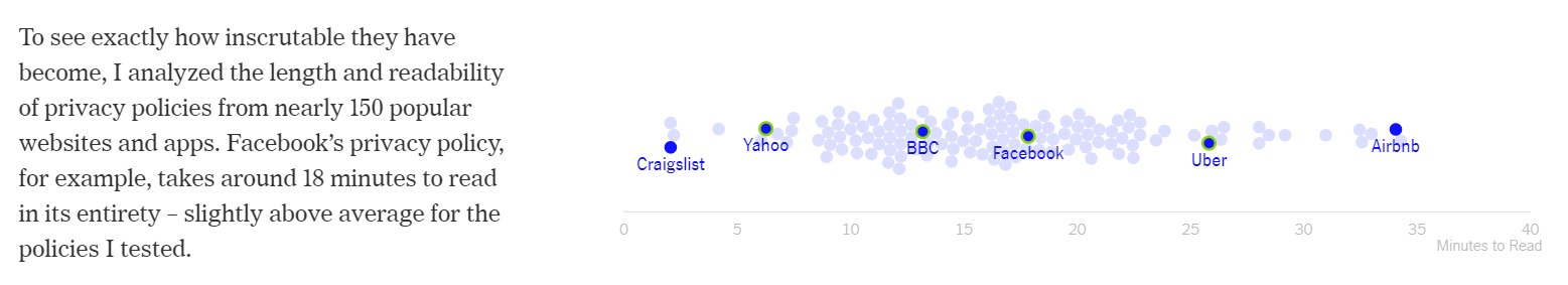
Figure 2.2: Visualising privacy policy reading time (Litman-Navarro 2019).
Next, Litman-Navarro (2019) measures the complexity of the text using the Lexile test. A scatter plot shows the relationship between a privacy policy’s complexity and reading time (see Figure 2.3). This is a positive relationship, but not strong. What was surprising was the large degree of variability. Again, labels are used to identify well known companies.
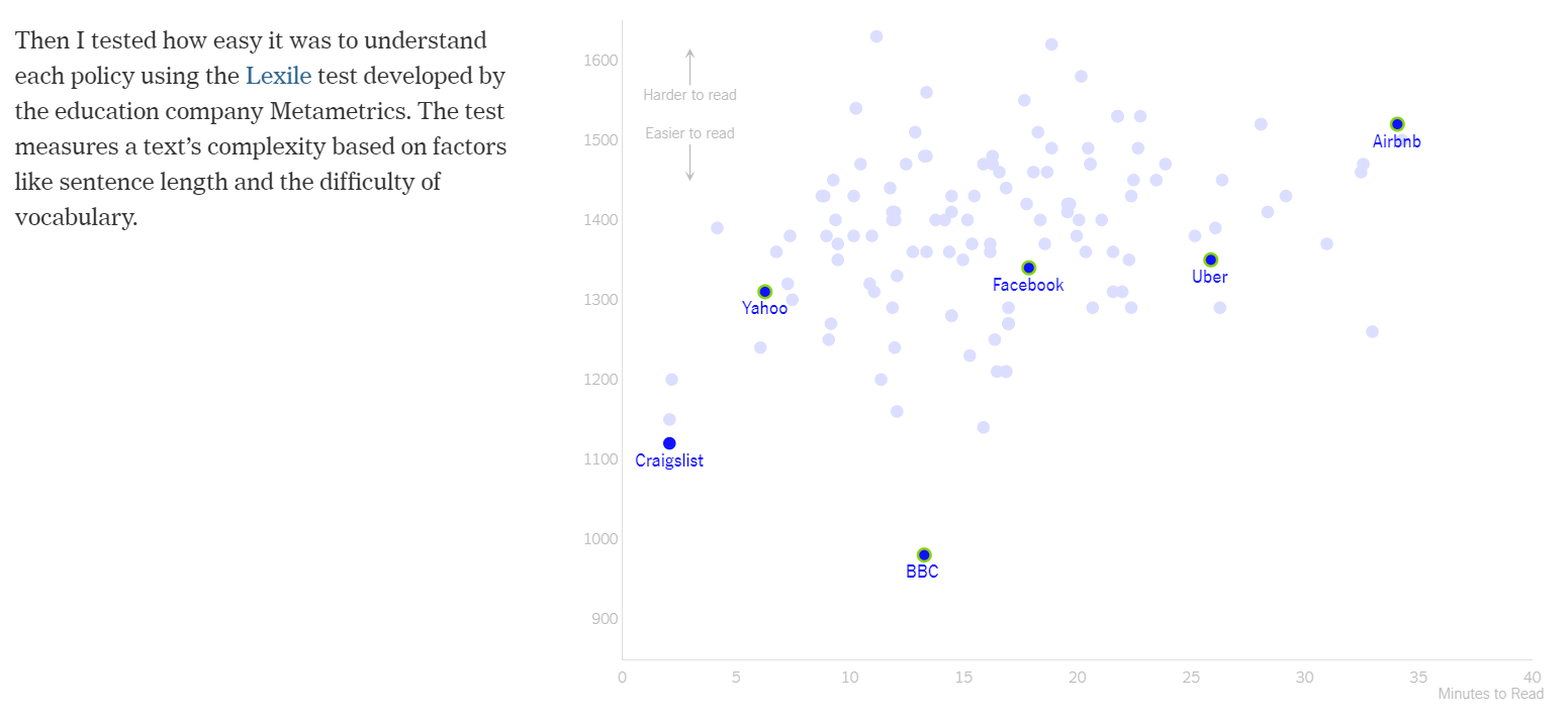
Figure 2.3: The relationship between privacy policy readability and reading time (Litman-Navarro 2019).
The same scatter plot is then shaded by educational bands, helping the reader to put the Lexile scores into perspective (see Figure 2.4). By relating Lexile scores to level of education, you can quickly see an issue. Most privacy policies appear to require a college degree or higher to understand. This was a very effective way to help the viewer understand a metric that they were unlikely to be familiar with. This demonstrates an excellent understanding of the audience and the commitment of the storyteller to guide the audience in their interpretation of the data visualisation.
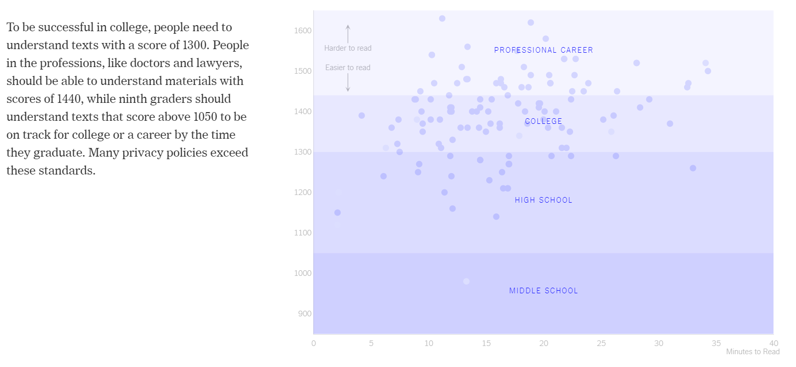
Figure 2.4: Adding context using education bands (Litman-Navarro 2019).
The next transition reinforces the first comparison by overlaying the reading time and Lexile scores of the first chapters of some well known texts, such as Stephen Hawking’s “A Brief History of Time” (see Figure 2.5). It becomes clear than popular texts are likely be more readable than privacy policies.
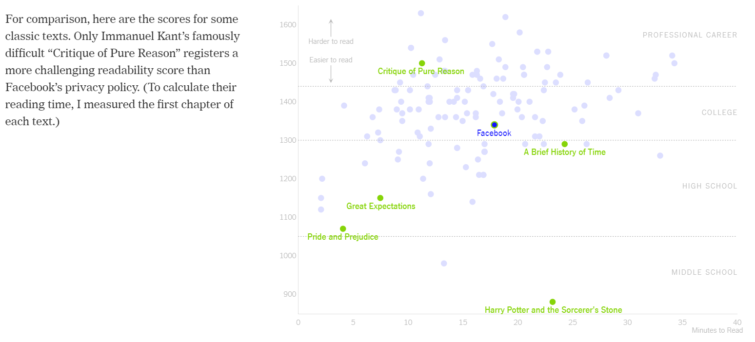
Figure 2.5: Adding additional context using classic texts (Litman-Navarro 2019).
The major point of the scatter plot is stated in the next transition by highlighting all the privacy policies that require a college degree or higher to understand (see Figure 2.6).
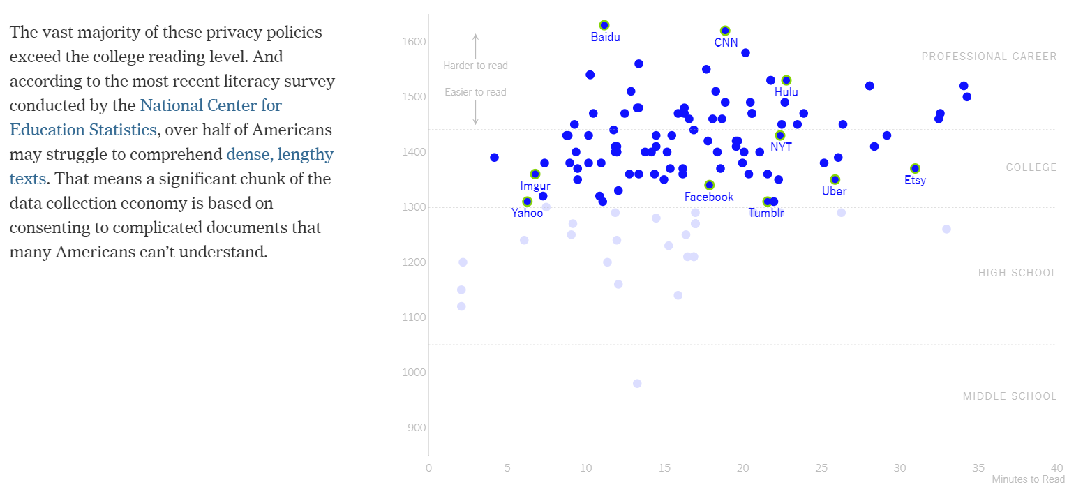
Figure 2.6: Highlighting policies requiring higher education (Litman-Navarro 2019).
The next two transitions focus on outliers (see Figure 2.7). This is common strategy of storytellers, as outliers often provide interesting comparisons and discussion. The BBC shows that it is possible for privacy statements to be quick and easy to understand. AirBnB, on the other hand, is presented as a cautionary tale of just how bad the situation can get, being both difficult to understand and time consuming to read.
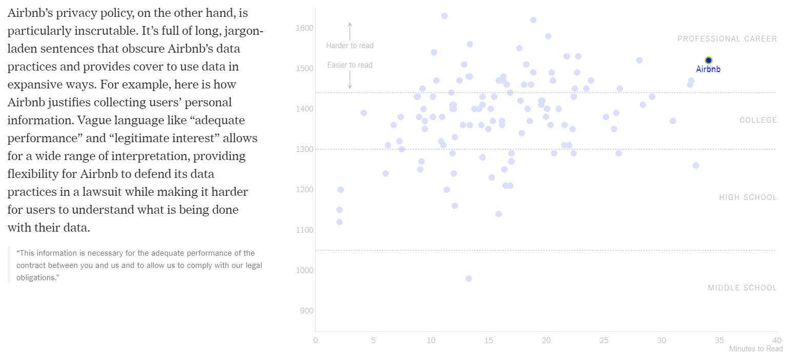
Figure 2.7: Highlighting and discussing outliers (Litman-Navarro 2019).
Another transition and Google’s various versions of their privacy policy are plotted across time by linking data points using a directional line (see Figure 2.8). This highlights how things have gotten worse overtime as the value of data and the complexity of technology has increased. The author also suggests that legislation might play a mixed role in changing the situation. The author draws the viewer’s attention to the fact that the readability of Google’s privacy policy was improved at the expense of reading time after the General Data Protection Regulation from European Union came into effect in 2018.
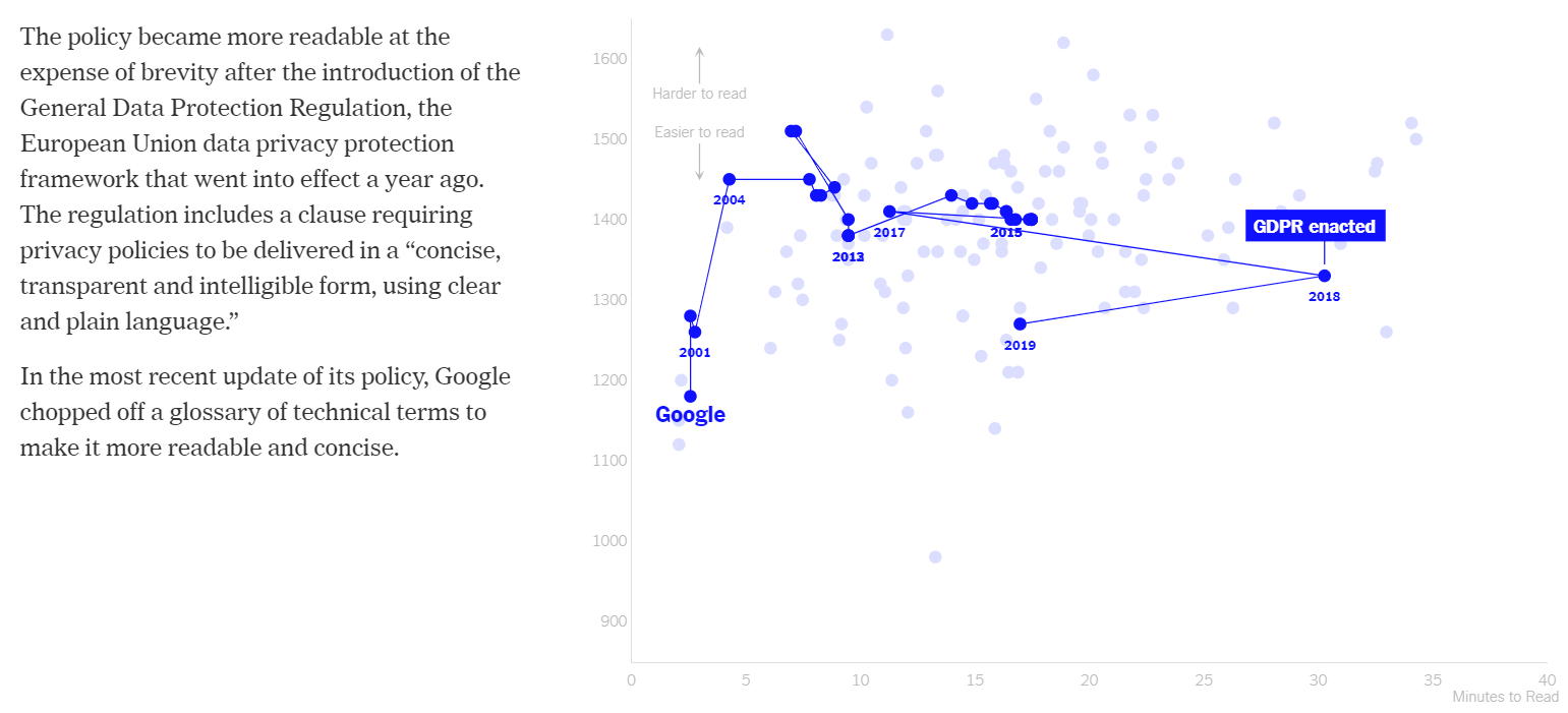
Figure 2.8: Tracking Google’s privacy policy across time (Litman-Navarro 2019).
The data visualisations end at this point and the author sums up in text. Issues regarding the accessibility of privacy policies remain and is likely to continue. Technology users beware.
There were many techniques identified in the literature about data visualisation story-telling used by Litman-Navarro (2019). Consider the following features and think how they helped to tell a story:
- A compelling introduction and graphic (background text) to hook you.
- A clear and concise, piece-by-piece, ordering of information achieved using a slide-like presentation style.
- Labeling of data points to provide context (including hover information)
- Supporting text/annotations and highlighting to guide the viewer’s attention and summarise key points
- Explanations of variables (Lexile scores) using everyday references (education level, popular texts)
- Consistent use of a scatter plot that transitioned layers, labels and annotations to make different points in a logical order.
- A slider bar as a visual reference of the viewer’s position in the story.
- A detailed discussion of individual data points (outliers and by time) to highlight interesting trends and to delve deeper into the data.
- Transition animations (moving text, data point labels appearing, data point becoming highlighted etc) to draw peoples’ attention to changes and position in the story.
The ordering or structure of a story is a defining element a storytelling data visualisation (Lee et al. 2015). Providing a meaningful order helps to optimise the message being sent. A summary of the main points in Litman-Navarro (2019) are as follows:
- Our data are being unknowingly sold because we don’t understand the complex privacy policies used by major media and tech companies (Opening statement)
- Privacy policies are time consuming to read (Dot plot)
- Privacy policies are difficult to understand (Scatter plot)
- Most privacy policies require a college level of education (Scatter plot)
- Some privacy policies are better than others (Scatter plot)
- Privacy polices have progressively gotten worse (Scatter plot with connected lines)
- Legislative changes has had mixed results (Scatter plot with connected lines)
- Things are not likely to get better anytime soon, so beware! (Conclusion)
Lee et al. (2015) refers to each of the above points supported using a data visualisations a “story piece”. The logical ordering of these stories piece is what makes a data story.
2.5 Well Known Data Visualisation Storytelling Sites
If you enjoyed the work of Litman-Navarro (2019), you will enjoy the following list of well known sites that publish data visualisation stories.
2.6 Storytelling Strategies
Segel and Heer (2010) developed a framework to organise common storytelling strategies used in data visualisation or what they refer to as a narrative visualisations. This framework is a unique and useful starting point for exploring the specific strategies used by narrative designers. The following section will summarise their framework in order to help you incorporate effective storytelling elements into your own work.
2.6.1 Genre
Segel and Heer (2010) suggested that most narrative visualisations fit within a specific genre. Figure 2.9 lists the seven genres identified: magazine style, annotated chart, partitioned poster, flow chart, comic strip, slide show and film/video/animation. The genre establishes the framing of the visualisation and how each element or story idea will appear or be presented to the viewer. For example, in an annotated chart, the narrative is contained within a single visualisation, while in a slide show, multiple frames are used to present text, visualisations and other supporting content to tell a more in depth story. Determining which genre to use comes down to the story and situation. Sometimes the genres are mixed. Ojo and Heravi (2018) suggest that the most common genre present in award winning data storytelling by a substantial margin was the annotated graph. The case study of Litman-Navarro (2019) is an example of a slide show genre. Even through the page is “scrolled”, the transitions present each story idea as a single frame or slide.
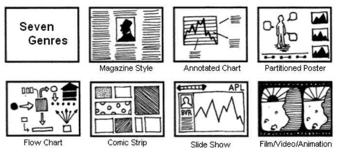
Figure 2.9: Genres of Narrative Visualisation (Segel and Heer 2010).
Hannen and Burn-Murdoch (2019) (Figure 2.10, click here to view online), published in the Financial Times, is an example of video of a bar chart race looking at the most populous cities across times. Hannen and Burn-Murdoch (2019) skillfully use data visualisation, animation, narration and photography to tell a compelling tale of human history. If only all history lessons could be like this.
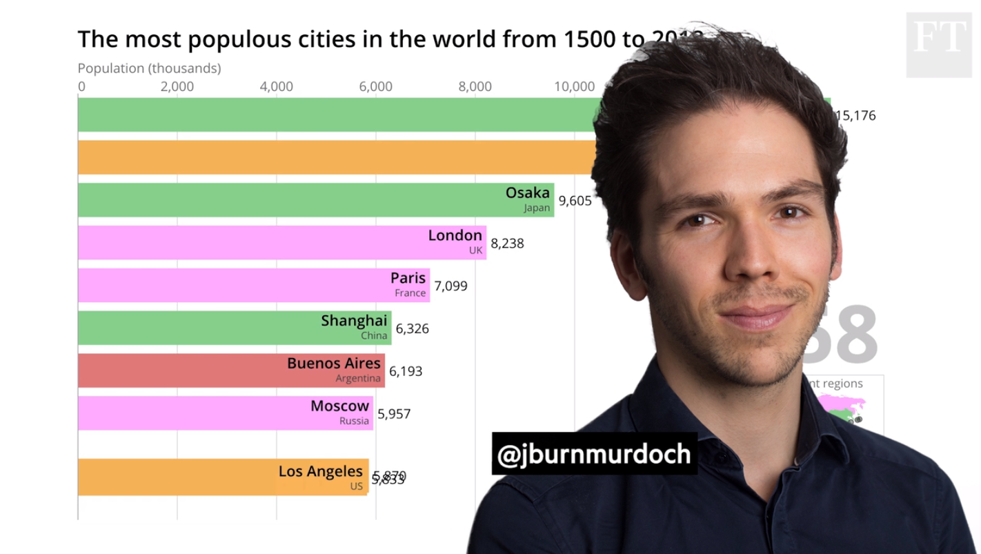
Figure 2.10: Telling a story using a bar chart race (Hannen and Burn-Murdoch 2019).
2.6.2 Approach
Segel and Heer (2010) explain that narrative visualisations exist on a continuum between author-driven and reader-driven approaches. Author driven approaches employ a linear ordering of ideas, extensive messaging (annotation, text, highlighting etc) and minimal interactivity on the user’s behalf. At the other end of the spectrum, reader-driven approaches have no clear ordering of information, minimal messaging and extensive interactivity (filtering, searching, changing views etc.). Litman-Navarro (2019) and Hannen and Burn-Murdoch (2019) were examples of author-driven approaches. Strict reader driven approaches are not common because a user will risk missing the point, so, many narrative visualisations employ a hybrid-type approach by incorporating both author-driven and reader-driven elements.
For example, Smith et al. (2018) visualise broadband speeds across Britain and conclude that, despite widespread belief to the contrary, some rural areas experience speeds far greater than many urban areas (Figure 2.11, click here to view online). The article’s initial approach was author-driven, but they also include a data visualisation app that allows the user to explore different postcodes and compare them to the national average. At this point the article introduces a reader-driven element. Segel and Heer (2010) referred to this as a hybrid approach, which can be more engaging than a purely author-driven method.
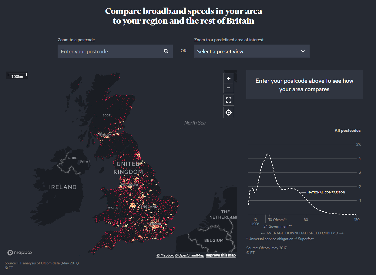
Figure 2.11: Comparing broadband speed in the UK (Smith et al. 2018.).
2.6.3 Design Strategies
The design of a narrative visualisation is broken into two major concepts, narrative structure and visual narrative. Narrative structure refers to design elements that determine how the narrative will unfold. This includes the ordering of elements (linear or user directed), the degree of user interaction and control over the story and the use of messaging (annotations, introductory and summary statements). The visual narrative refers to specific strategies used to elicit a narrative experience. This includes visual elements that direct a user’s attention to important points and transitions between frames as well as the user’s position within a story. In the following sections, the most important design strategies discussed by Segel and Heer (2010) will be summarised.
2.6.3.1 Annotation
Annotations are used to explicitly summarise and draw viewers’ attention to key story elements. These can appear as text overlaid on plots or audio narration. They aim to focus the narrative and ensure the key objective of the story is clear. For example, Holder et al. (2018) used annotations in their map of the 2018 U.S. midterms published in The Guardian (Figure 2.12, click here to view online). The annotations summarised key outcomes of the midterms that helped to support the broader narrative of the article. However, Kosara and Mackinlay (2013) warns that you must be careful to balance text and data. You don’t want the text to detract from the visuals.
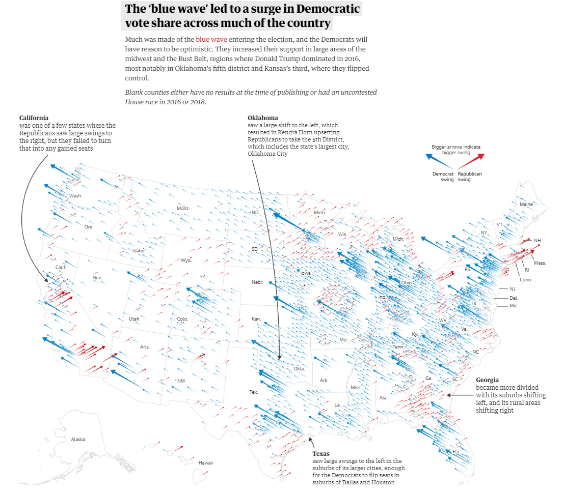
Figure 2.12: Annotations ensure the main story cannot be missed (Holder et al. 2018.).
2.6.3.2 Visual highligthing
Visual highlighting is any method that draws attention to key data observations, statistics, outliers or trends present in the data. There are many ways we can highlight or draw peoples’ attention. For example, Watkins (2015) uses colour to draw attention to the shrinking arctic sea ice area across time (Figure 2.13). The most common strategy is using colour. However, size, boldness, connections and animations are also relevant. When using highlighting, other data elements remain visualised, but are de-emphasized, for example, by adding transparency, de-saturating colours or using neutral colours like grey. Highlighting ensures that viewers draw their to the right elements in the the right order. In later chapters you will learn about human perception and the rules that govern our visual attention.
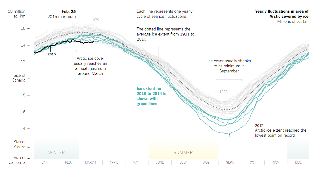
Figure 2.13: Highlighting draws attention to key information (Watkins 2015.).
2.6.3.3 Matching Content
Matching content refers to the consistent appearance of visual elements that share a relationship between different sections or plots of a data visualisation. This can refer to the consistent use of colour to refer to the same categories or the consistent ordering of categories. While not an example of narrative data visualisation, the Global COVID-19 Tracker by Tableau (2020) demonstrates the idea of matching content (Figure 2.14). The consistent use of the colour blue to represent “cases” means our brains instinctively group these plots (a visual law referred to as the Gestalt law of similarity) together and therefore must share something in common. Matching content creates efficiency and predictability as the viewer can see the relationship or carry-over of elements from different sections.
Figure 2.14: Colour is used to match content, in this example “cases”, between the various plots that comprise the dashboard (Tableau 2020).
2.6.3.4 Progress Bars
Story books have pages which are a visual and numerical way to measure progress through a story and a way to find your way back to specific information. Movies and videos have a linear play bar which reports time, progress and provides a way to navigate the video. Narrative visualisations that incorporate a slide show-like structure use progress bars for a similar purpose. They help to situate the viewer in terms of the story progress and a way to navigate the story.
2.6.3.5 Consistent Visual Platform
Litman-Navarro (2019) reuse of the scatter plot in the privacy policy article is an example of using a consistent visual platform. Contents within the platform are changed, while the general layout remains consistent. Again, this creates efficiency and predictability. Once the user understands the platform, they can focus on the story as it unfolds, reading annotations, drawing their attention to highlighted elements and interacting when prompted.
2.6.3.6 Multi-messaging
Multi-messaging refers to the use of a combination of text, annotations or graphics that work together to enrich the narrative. Narrative visualisations can be well distinguished from exploratory data visualisations in this respect. Narrative visualisations are often accompanied by both text and annotations to support the story and reveal further detail.
2.6.3.7 Details on Demand
Extensive annotations and text can overwhelm a viewer. Interactive data visualisations can overcome this by providing details on demand. For example, Litman-Navarro (2019) make company labels appear when a user hovers over a point (see Figure 2.2). Showing all the labels on the same plot would create a visual mess of overlapping elements. Instead, hovering over the data point will quickly reveal the company name. Another example was the new.com.au interactive map visualising the results of the Australian 2017 Same Sex Marriage Vote reported in Reynolds (2017). The viewer could click on an electorate to reveal a detail break-down of participation rates by gender and age distribution (Figure 2.15, click here to view online).
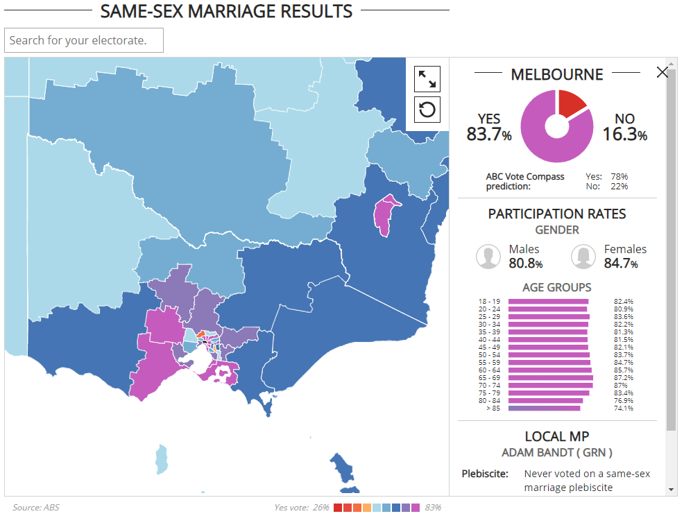
Figure 2.15: Clicking on an electorate reveals detailed analysis (Reynolds 2017.).
2.6.3.8 Timeline slider
Timeline sliders are a common interactive element used in data visualisation that encourages a viewer to transition the back and forth. The act of sliding and transitioning the visualisation allows the viewer to control and experience a trend unfold before their eyes. The U.S. Geological Survey (USGS 2015) created an app to explore U.S. water use across the time (see Figure 2.16, click here to view online. The viewer transitions water use categories across time to see how different states compare. Sliding through the visualisation, the viewer can see a story of peak water in the 1980’s and a subsequent decline. The ability to readily control the transition allows the viewer to isolate specific states to drill deeper into the history of water use.
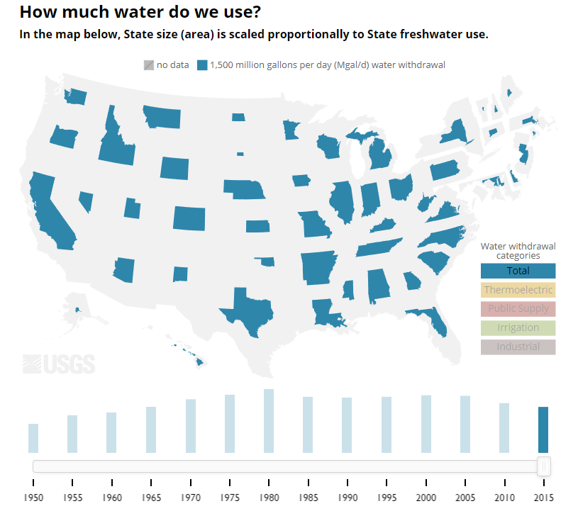
Figure 2.16: A slider controls the transition of time (USGS 2015.).
2.6.3.9 Tacit tutorial
Many narrative visualisations include interactive features designed to engage the viewer in a deeper and more memorable experience. This often requires the user to interact with controls and data visualisations that they might not be familiar with or be immediately aware how to use in the intended way. Designers can help the viewer by using tacit tutorials that imply how to understand or engage with a visualisation. The tutorials are tacit because an explicit tutorial will detract and possible disengage viewers. People don’t like reading instructions. Therefore, the challenge is to hide the instructions within the story. A simple, yet effective example of this can be seen in the work of Hanrahan, Elvery, and Byrd (2017) from the ABC News who published a narrative visualisation of data taken from the 2016 Australian Census (click here to view online). The story explains the Census using a frequency based approach by standardising the Australian population as 100 people. Therefore, each dot in the visuals represents approximately 240,000 Australians. To explain this point, Hanrahan, Elvery, and Byrd (2017) include a frame that presents a visualisation and provides a brief explanation of how to interpret the dots (Figure 2.17). This very simple explanation is embedded in the narrative and sets the consistent visual platform for the remainder of the story.
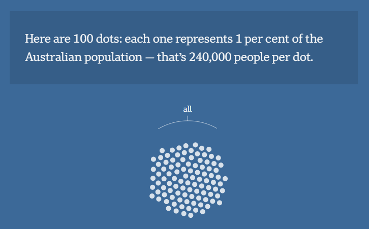
Figure 2.17: A tacit tutorial helps the viewer to understand the visuals (Hanrahan, Elvery, and Byrd 2017.).
2.6.3.10 Semantically Consistent
Semantic consistency is demonstrated by the consistent use of a visual aesthetics to represent a variable. A clear example of this is the consistent use of colour or size used to represent a variable across related visualisations. This aims to create predictability and efficiency for the viewer as the representation of variables remains consistent. For example, The New York Times article, How Much Hotter Is Your Hometown Than When You Were Born? (Figure 2.18, click here to view online) uses a consistent colour scale to represent temperature throughout the article (Popovich et al. 2019).If the designers had also used colour to refer to another variable, such as year or age, the efficiency of the visuals are reduced as the audience must learn the new colour encoding.
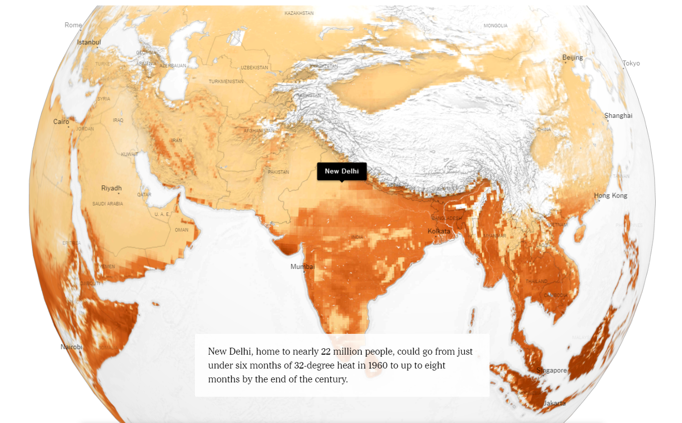
Figure 2.18: Using colour consistently to encode information creates efficiency (Popovich et al. 2019.).
You might have trouble understanding the difference between semantic consistency and matching content. Both strategies have the same outcome in terms of increasing efficiency of visuals, but the difference is important. Semantic consistency refers specifically to the visual properties or “aesthetics” of data visualisations used to encode information. Each aesthetic has a scale that controls its appearance. Aesthetics include visual properties such as colour, size, length or the location of a point on a plot (x,y). Being semantically consistent means that each time you refer to a variable, e.g. temperature, the same aesthetic, e.g. colour, is used. Once the audience learns the encoding of an aesthetic and its scale, they can reuse it for other plots, thus saving time. However, if the same scale is swapped for different variable at any point, e.g. semantic inconsistency, the audience must relearn the scale, or worse, misinterpret the visual.
Matching content does not refer to the consistent encoding of visual information. The use of the colour blue to refer to cases in Figure 2.14 matches the “contents” of the plots in relation to the variable it is depicting. Each plot has a different aesthetics used to refer to cases. The time series plots uses lines connected along an x (time) and y (case count) axis, the bubble map uses the location and size of points to depict country case counts and the bar chart compare countries using the height of bars. The semantics are inconsistent. Cases are visually depicted in many ways. The audience has to check each aesthetic and scale carefully. However, this isn’t a problem because the dashboard is fairly simple in terms of the variables depicted.
2.6.3.11 Markers of Interactivity
Interactive features used in narrative visualisation can be easily missed. Designers need to be sure that the viewer’s attention is draw to features and points in the narrative where the viewer can interact. This might include a tacit tutorial or any method including highlighting and animation to distinguish interactive elements to the viewer. The previous example by Popovich et al. (2019) presents the user with input boxes to type in their home city and age. The page will stop the viewer from scrolling and progressing the story until they fill in the boxes. This ensures the interactive element of the story cannot be missed.
2.6.3.12 Animated Transitions
Without transitions, changes in narrative visualisations can go unnoticed. Animated transitions act as a implicit visual cue to ensure the viewer is aware that the narrative has progressed or important visual elements have changed. Thinking back to many of the examples in this chapter, can you remember the many instances of animated transition? If not, work back through a few of the examples. The transitions are hard to miss.
You now have a great overview of the main strategies employed by narrative visualisation designers. The strategies you choose will always depend on the objective of the story, the nature of the data and visuals chosen. Most narrative visualisations use a combination of strategies, but never should the aim be to use as many as possible. Mindlessly adding as many strategies as possible will be a recipe for disaster. Make sure each element is justified and supports the overall story.
2.7 Storytelling Structure
The key to a good data visualisation story is an underlying structure or ordering of information. This structure should be implicit to the viewer. However, when designing your narrative, explicitly outlining the structure is important. Mannon (2018) adapted Freytag’s Pyramid, to generalise storytelling to data stories, which provides a useful starting point for data visualisation storytelling (see Figure 2.19). Mannon (2018)’s ideas are visualised in the following graphic and briefly explained in the following sections.
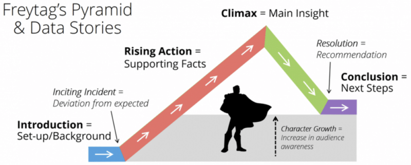
Figure 2.19: Good stories are well structured (Mannon 2018).
2.7.1 Set-up
The first step is to hook your audience. This is the point where your audience will decide whether to continue viewing the data visualisation story. Think carefully about your audience and how you might capture their attention. There are many ways to achieve this, such as a powerful anecdote, surprising statistic, thought provoking question, images, or a provocative statement. The set-up will also need to provide some context and background, but the main focus should be on “hooking the audience”. At the end of the set-up, the audience is clear on the purpose or objective of the visualisation story. Once you have the audiences’ attention, you are ready to give them the facts.
2.7.2 Supporting Facts
Use a series of ideas supported by data visualisations that will guide the viewer in understanding the key points of your narrative. These ideas must all tie into the overall objective and main insight of the story. Stick to a small number of important ideas. Do not bombard the viewer with too much information or detail. Less is often more. Interactive elements can be used to allow the viewer to explore the detail if necessary. Think of each idea as a piece of evidence or fact. You need just enough to achieve your objective. Too few, and your audience won’t be convinced. Too much, and your audience will be left behind.
2.7.3 Main Insight
Your supporting ideas will culminate in the overall insight or message that you want the audience to remember. Even if they forget some of the supporting facts, they must reach this point convinced of the veracity of the main insight.
2.7.4 The Solution
A compelling story doesn’t stop at the main insight. There needs to be a resolution, or what is commonly referred to as a “call to action”. This is where the objective of your story is reiterated. You must explain the implications of your insight. A compelling story has a lasting effect on your audience. They might be better informed, they might be motivated to change something, they might start to worry about an issue they were unaware of, or they might have been persuaded to change their mind. State this final conclusion explicitly. Don’t make your audience read between the lines. You have failed if your audience gets to the end of the story and thinks “so what?”.
Now let’s think back to the privacy policy case study by Litman-Navarro (2019) and determine if this structure is present.
Set-up
The background image of the page contains the text of several privacy policies from major tech and media companies. It is small and difficult to read. The first paragraph introduces the background of the article and paints a depressing picture of the issue that the article will address.
Supporting Facts
An ordered series of key ideas, supported by data visualisations, used to support the main insight.
- Privacy policies are time consuming to read
- Privacy policies are difficult to understand
- Most privacy policies require a college level of education
- Some privacy policies are better than others
- Privacy polices have progressively gotten worse
- Legislative changes has had mixed results
Main Insight
After the presentation of the supporting facts, the conclusion is obvious. Privacy policies are a massive issue in our digital lives.
The Solution
The story concludes by discussing what a good privacy policy should do, and warns viewers to assume that someone is always watching.
It is a pretty good fit. The structure outlined by Mannon (2018) won’t work in all situations, nor should you try. However, Mannon (2018) does remind us of one thing. Structure is key to good storytelling.
2.8 Concluding Thoughts
This chapter introduced storytelling and generalised storytelling to the design of data visualisation. The chapter explored many examples of narrative visualisations and discussed data visualisation storytelling strategies using the framework developed by Segel and Heer (2010). In the final section, Mannon (2018) showed how Freytag’s Pyramid story structure can be applied to narrative visualisations. This chapter was an extension of the data visualisation design process introduced in Chapter 1. Both chapters emphasise the point that data visualisation requires deliberate design. It is not something that can be replaced by a software package. Data visualisation software doesn’t understand your audience, objective, dataset, ethics, integrity or narrative. Designers do the hardwork. Designer have to think before they create. Chapters 1 and 2 have given you some powerful thinking tools to help you along the way.