References
ACMA Research and Analysis Section. 2015. “Australians get mobile.” https://www.acma.gov.au/theACMA/engage-blogs/engage-blogs/Research-snapshots/Australians-get-mobile.
Adnia Solutions. 2020. “Introduction to dashboards.” https://adniasolutions.com/dashboard-design-principles/introduction-to-dashboards/.
Aero Data Lab. 2019. “A bird’s eye view of pharmaceutical research and development.” https://www.aerodatalab.org/birds-eye-view-of-research-landscape.
Anscombe, F. J. 1973. “Graphs in statistical analysis.” The American Statistician 27 (1): 17. https://doi.org/10.2307/2682899.
BBC. 2010. “Hans Rosling’s 200 countries, 200 years, 4 minutes - The joy of stats - BBC Four.” https://www.youtube.com/watch?v=jbkSRLYSojo{\&}feature=youtu.be.
Beccario, Cameron. 2020. “Earth.” https://earth.nullschool.net/about.html.
Blue, V. 2018. “Strava’s fitness heatmaps are a ’potential catastrophe’.” https://www.engadget.com/2018/02/02/strava-s-fitness-heatmaps-are-a-potential-catastrophe/.
Boyer, K. L., and S. Sarkar. 2000. Perceptual organization for artificial vision systems. 1st ed. New York, NY: Springer.
Bresciani, S., and M. J. Eppler. 2008. “The risks of visualization: A classification of disadvantages associated with graphic representations of information.” Institute for Corporate Communication. https://pdfs.semanticscholar.org/23d2/3f5152c9b8b34f104b43d1c862ee62d2edac.pdf.
Brewer, C. A., and M. Harrower. 2019. “ColourBrewer 2.0 web tool.” http://colorbrewer2.org.
Brodlie, Ken, Rodolfo Allendes Osorio, and Adriano Lopes. 2012. “A review of uncertainty in data visualization.” In Expanding the Frontiers of Visual Analytics and Visualization, edited by J. Dill, R. Earnshaw, D. Kasik, J. Vince, and P. Wong, 81–109. London: Springer London. https://doi.org/10.1007/978-1-4471-2804-5_6.
Brown, T. 2008. “Design thinking.” Harvard Business Review June: 1–10.
Buckbuckyyy. 2019. “NYC water consumption over the years from 1979-2017.” https://www.reddit.com/r/dataisbeautiful/comments/be6yww/oc{\_}nyc{\_}water{\_}consumption{\_}over{\_}the{\_}years{\_}from/.
Buja, A., J. A. McDonald, J. Michalak, and W. Stuetzle. 1991. “Interactive data visualization using focusing and linking.” In VIS ’91 Proceedings of the 2nd Conference on Visualization ’91, edited by G. M. Nielson and L. Rosenblum, 156–63. San Diego, California. https://dl.acm.org/citation.cfm?id=949633.
Buts, A. 2012. “2. Visual Perception: Optimizing Information Visualization regarding the human visual system.” https://www.medien.ifi.lmu.de/lehre/ws1112/iv/folien/IV-W11-02-Perception.pdf.
Cadwalladr, Carole, and Emma Graham-Harrison. 2018. “Revealed: 50 million facebook profiles harvested for Cambridge Analytica in major data breach.” https://www.theguardian.com/news/2018/mar/17/cambridge-analytica-facebook-influence-us-election.
Cairo, A. 2014. “Ethical infographics: In data visualisation journalism meets engineering.” Investigative Reporters \(\backslash\)& Editors Journal, no. Spring: 24–27.
Cathey, Henry M. 1990. “File:USDA Hardiness zone map.jpg.” https://commons.wikimedia.org/w/index.php?curid=1510512.
Cawthon, Nick. 2007. “Qualities of perceived aesthetic in data visualization.” In Proceedings of the 2007 Conference on Designing for User eXperiences - DUX ’07, 1. New York, New York, USA: ACM Press. https://doi.org/10.1145/1389908.1389920.
Chaitin, J. 2003. “Narratives and story-telling.” https://www.beyondintractability.org/essay/narratives.
Cherdarchuk, Joey. 2014. “Salvaging the pie.” https://www.darkhorseanalytics.com/blog/salvaging-the-pie.
Cheshire, J. 2014. “Population lines.” http://spatial.ly/2014/08/population-lines/.
Cleveland, W. S., and R. McGill. 1985. “Graphical perception and graphical methods for analyzing scientific data.” Science 229 (4716): 828–33.
Cleverland, W. S., P. Diaconis, and R. McGill. 1982. “Variables on scatterplots look more highly correlated when the scales are increased.” Science 216 (4550): 1138–41. https://doi.org/10.1126/science.216.4550.1138.
Correll, M. 2019. “Ethical dimensions of visualization research.” In Proceedings of the 2019 CHI Conference on Human Factors in Computing Systems, edited by S. Brewster, Geraldine Fitzpatrick, Anna Cox, and Vassilis Kostakos, 188. Glasgow, Scotland.
Crime Statistics Agency. 2019. “Recorded offences.” https://www.crimestatistics.vic.gov.au/crime-statisticslatest-crime-data/recorded-offences-0.
Croxton, Frederick E., and Roy E. Stryker. 1927. “Bar charts versus circle diagrams.” Journal of the American Statistical Association 22 (160): 473. https://doi.org/10.2307/2276829.
Dahlstrom, M. F. 2014. “Using narratives and storytelling to communicate science with nonexpert audiences.” Proceedings of the National Academy of Sciences 111 (Supplement 4): 13614–20. https://doi.org/10.1073/pnas.1320645111.
Daly, Max. 2016. “Exclusive: New conviction data tells us how the UK sells drugs.” https://www.vice.com/en{\_}us/article/dp5npk/foi-uk-drug-conviction-ethnicity-282.
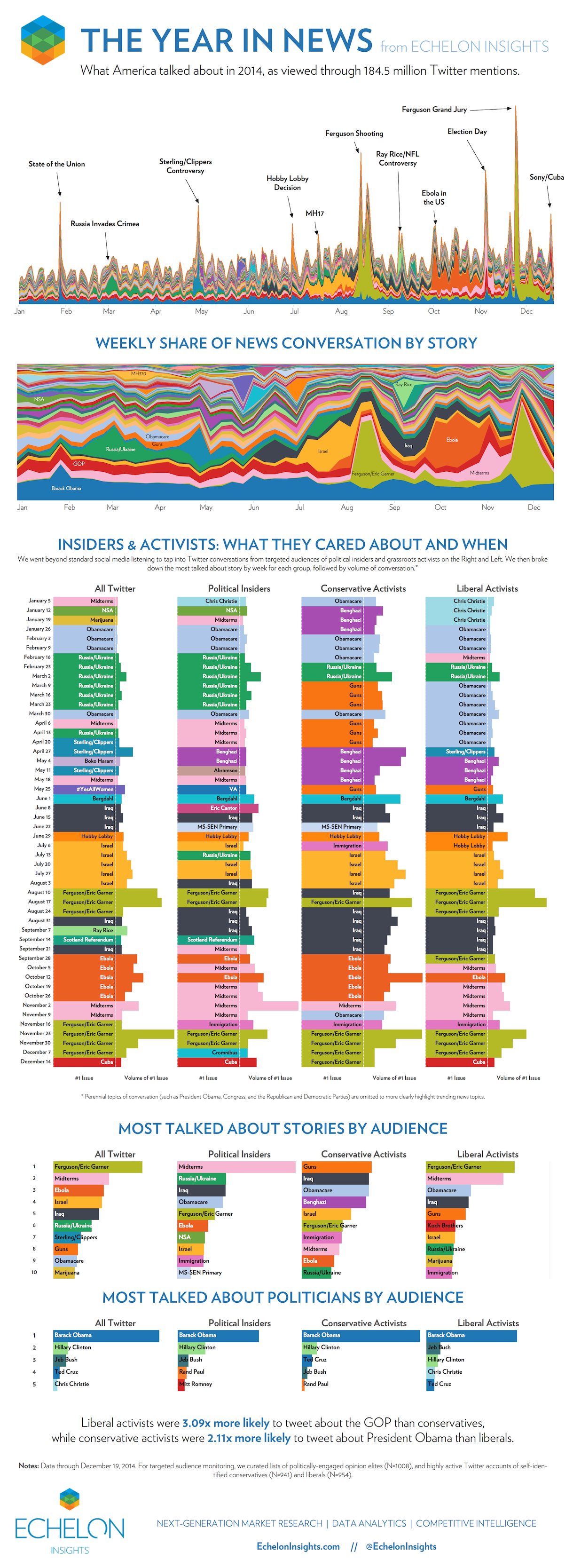
Echelon Insights. 2014. “The year in news.” http://echeloninsights.com/wp-content/uploads/2014/12/theyearinnews20141.png.
EDQ.com. 2019. “The cost of living n America.” https://www.edq.com/data-quality-infographics/cost-of-living-in-america/.
Energy Rating. 2019. “Water heating.” http://www.energyrating.gov.au/products/water-heaters.
Engel, P. 2014. “This chart shows what happened to gun deaths in Florida after ’Stand Your Ground’ was enacted.” https://www.businessinsider.com.au/gun-deaths-in-florida-increased-with-stand-your-ground-2014.
Engineers Australia. 2019. “Our code of ethics.” https://www.engineersaustralia.org.au/ethics.
En:User:Bb3cxv. 2007. “File:RGB illumination.jpg.” https://commons.wikimedia.org/wiki/File:RGB{\_}illumination.jpg.
Ervik, Astrid Oline. 2003. “Book Review: IQ and the wealth of nations.” The Economic Journal 113 (488): F406–8. https://doi.org/10.1111/1468-0297.13916.
Evergreen, S. 2020. “Two alternatives to using a second y-axis.” http://stephanieevergreen.com/two-alternatives-to-using-a-second-y-axis/.
Evergreen, S., and A. K. Emery. 2014. “Introducing the data visualization checklist.” https://stephanieevergreen.com/dataviz-checklist/.
———. 2016. “Updated data visualization checklist.” https://stephanieevergreen.com/updated-data-visualization-checklist/.
Feng, Mi, Cheng Deng, Evan M. Peck, and Lane Harrison. 2018. “The effects of adding search functionality to interactive visualizations on the web.” In Proceedings of the 2018 CHI Conference on Human Factors in Computing Systems - CHI ’18, 1–13. New York, New York, USA: ACM Press. https://doi.org/10.1145/3173574.3173711.
Ferdio. 2019. “Data vis project.” https://datavizproject.com/about/.
Few, S. 2006. Information dashboard design: Effective visual communication of data. 1st ed. Cambride, MA: O’Reilly Media, Inc.
———. 2008a. “Dual-scaled axes in graphs. Are they ever the best solution?” https://www.perceptualedge.com/articles/visual{\_}business{\_}intelligence/dual-scaled{\_}axes.pdf.
———. 2008b. “Practical rules for using color in charts.” http://www.perceptualedge.com/articles/visual{\_}business{\_}intelligence/rules{\_}for{\_}using{\_}color.pdf.
———. 2014. “Why do we visualise quantitative data?” https://www.perceptualedge.com/blog/?p=1897.
Fischer, Eric. 2010. “Locals and Tourists #1 (GTWA #2): London.” https://www.flickr.com/photos/walkingsf/sets/72157624209158632/.
Fung, K. 2014. “Junk Charts Trifecta Checkup: The definitive guide.” https://junkcharts.typepad.com/junk{\_}charts/junk-charts-trifecta-checkup-the-definitive-guide.html.
Gapminder Foundation. 2020. “Gapminder.” https://www.gapminder.org/.
Gelman, Andrew, and Antony Unwin. 2013. “Infovis and statistical graphics: Different goals, different looks.” Journal of Computational and Graphical Statistics 22 (1): 2–28. https://doi.org/10.1080/10618600.2012.761137.
Grandjean, Martin. 2016. “Connected world: Untangling the air traffic network.” http://www.martingrandjean.ch/connected-world-air-traffic-network/.
Hannen, Tom, and John Burn-Murdoch. 2019. “Bar chart race: the most populous cities through time.” https://www.ft.com/video/83703ffe-cd5c-4591-9b4f-a3c087aa6d19.
Hanrahan, Catherine, Simon Elvery, and Joshua Byrd. 2017. “Census 2016: This is Australia as 100 people.” https://www.abc.net.au/news/2017-06-27/census-australia-as-100-people/8634318.
Harrower, M., and C. A. Brewer. 2003. “ColorBrewer.org: An online tool for selecting colour schemes for maps.” The Cartographic Journal 40 (1): 27–37. https://doi.org/10.1179/000870403235002042.
Hausmann, R., C. E. Hidalgo, S. Bustos, M. Coscia, S. Chung, J. Jimenez, A. Simoes, and Yildirim. M. A. 2011. The atlas of economic complexity. Cambride, MA: MIT Press.
Holder, Josh, Cath Levett, Daniel Levitt, and Peter Andringa. 2018. “Blue wave or blue ripple? A visual guide to the Democrats’ gains in the midterms.” https://www.theguardian.com/us-news/ng-interactive/2018/nov/07/blue-wave-or-blue-ripple-a-visual-guide-to-the-democrats-gains.
Hudson, Toby. 2012. “File:Australian Census 2011 demographic map - Australia by SLA - BCP field 2715 Christianity Anglican Persons.svg.” https://commons.wikimedia.org/w/index.php?curid=27035177.
Huffington Post. 2012. “Hurricane Sandy graphics show storm’s changing path.” https://big.assets.huffingtonpost.com/hurricane{\_}sandy{\_}forecast{\_}evolution{\_}map.png.
Inselberg, A. 1985. “The plane with parallel coordinates.” The Visual Computer 1 (2): 69–91. https://doi.org/10.1007/BF01898350.
Isenberg, P., A. Bezerianos, Pierre Dragicevic, and Jean-Daniel Fekete. 2011. “A study on dual-scale data charts.” IEEE Transactions on Visualization and Computer Graphics 17 (12): 2469–78. https://doi.org/10.1109/TVCG.2011.160.
Judgment of the Court (Grand Chamber). 2014. “Google Spain SL \(\backslash\)& Google Inc. v AEPD \(\backslash\)& González Case C‑131/12.” http://curia.europa.eu/juris/document/document.jsf?docid=138782{\&}doclang=EN.
Kahle, D., and H. Wickham. 2013. “ggmap : Spatial visualization with ggplot2.” The R Journal 5 (1): 144–61. https://doi.org/10.1023/A:1009843930701.
Kirk, A. 2012. Data visualization: a successful design process. Birmingham, UK: Packt Publishing Ltd.
———. 2014. “The fine line between confusion and deception.” https://www.visualisingdata.com/2014/04/the-fine-line-between-confusion-and-deception/.
Kommenda, N., C. Barr, and J. Holder. 2018. “Gender pay gap: what we learned and how to fix it.” https://www.theguardian.com/news/ng-interactive/2018/apr/05/women-are-paid-less-than-men-heres-how-to-fix-it.
Kosara, Robert. 2016. “Presentation-oriented visualization techniques.” IEEE Computer Graphics and Applications 36 (1): 80–85. https://doi.org/10.1109/MCG.2016.2.
Kosara, Robert, and Jock Mackinlay. 2013. “Storytelling: The next step for visualization.” Computer 46 (5): 44–50. https://doi.org/10.1109/MC.2013.36.
Kusher, Cameron. 2018. “Mind the housing value gap.” https://www.corelogic.com.au/news/mind-housing-value-gap.
Kwan-Liu Ma, I. Liao, J. Frazier, H. Hauser, and H.-N Kostis. 2012. “Scientific storytelling using visualization.” IEEE Computer Graphics and Applications 32 (1): 12–19. https://doi.org/10.1109/MCG.2012.24.
Lee, Bongshin, Nathalie Henry Riche, Petra Isenberg, and Sheelagh Carpendale. 2015. “More than telling a story: Tansforming data into visually shared stories.” IEEE Computer Graphics and Applications 35 (5): 84–90. https://doi.org/10.1109/MCG.2015.99.
Leo, S. 2019. “Mistakes, we’ve drawn a few.” https://medium.economist.com/mistakes-weve-drawn-a-few-8cdd8a42d368.
Litman-Navarro, Kevin. 2019. “We read 150 privacy policies. They were an incomprehensible disaster.” https://www.nytimes.com/interactive/2019/06/12/opinion/facebook-google-privacy-policies.html.
Lotto, Beau. 2009. “Optical illusions show how we see.” https://youtu.be/mf5otGNbkuc.
Lujin Wang, J. Giesen, K. T. McDonnell, P. Zolliker, and K. Mueller. 2008. “Color design for illustrative visualization.” IEEE Transactions on Visualization and Computer Graphics 14 (6): 1739–54. https://doi.org/10.1109/TVCG.2008.118.
Luster, Max. 2018. “Multivariate data visualization and the limits of human perception.” https://uxdesign.cc/multivariate-data-visualization-and-the-limits-of-human-perception-60ad47b4f59f.
Lynn, R., and T. Vanhanen. 2002. IQ and the wealth of nations. Westport, CT: Praeger Publishers. http://www.rlynn.co.uk/uploads/pdfs/Intelligence and the Wealth and Poverty of Nations.pdf.
MacDonald, L. W. 1999. “Using color effectively in computer graphics.” IEEE Computer Graphics and Applications 19 (4): 20–35. https://doi.org/10.1109/38.773961.
Mannon, N. 2018. “Persuasive storytelling with data visualization.” https://www.blastam.com/blog/persuasive-storytelling-with-data-visualization.
McCandless, David. 2012. “The beauty of data visualization.” https://www.youtube.com/watch?v=5Zg-C8AAIGg{\&}feature=emb{\_}title.
Media Entertainment and Arts Alliance. 2019. “MEAA journalist code of ethics.” https://www.meaa.org/meaa-media/code-of-ethics/.
Minard, C. 1869. “File:Minard.png.” https://commons.wikimedia.org/wiki/File:Minard.png.
Murray, S. 2013. Interactive data visualization for the web. Sebastopol, CA: O’Reilly Media, Inc.
NASA. 2007. “File:Face on Mars with Inset.jpg.” https://commons.wikimedia.org/wiki/File:Face{\_}on{\_}Mars{\_}with{\_}Inset.jpg.
National Health and Medical Research Council, Australian Research Council, and Universities Australia. 2018. National Statement on Ethical Conduct in Human Research 2007 (Updated 2018). Commonwealth of Australia, Canberra: National Health; Medical Research Council. http://www.nhmrc.gov.au/guidelines/publications/e72.
Nickerson, Raymond S. 1998. “Confirmation bias: A ubiquitous phenomenon in many guises.” Review of General Psychology 2 (2): 175–220. https://doi.org/10.1037/1089-2680.2.2.175.
NYC OpenData. 2019. “Water consumption in the New York City.” https://data.cityofnewyork.us/Environment/Water-Consumption-In-The-New-York-City/ia2d-e54m.
Office of the Australian Information Commissioner. 2019. “Australian Privacy Principles.” https://www.oaic.gov.au/privacy-law/privacy-act/australian-privacy-principles.
Ojo, Adegboyega, and Bahareh Heravi. 2018. “Patterns in Award Winning Data Storytelling.” Digital Journalism 6 (6): 693–718. https://doi.org/10.1080/21670811.2017.1403291.
Our World in Data. 2016. “Economic complexity rank vs. GDP per capita, 2016.” https://ourworldindata.org/grapher/eci-ranking-vs-gdp-per-capita.
Palairet, M R. 2004. “Book review: IQ and the wealth of nations.” Heredity 92 (4): 361–62. https://doi.org/10.1038/sj.hdy.6800427.
Pandey, Anshul Vikram, Katharina Rall, Margaret L. Satterthwaite, Oded Nov, and Enrico Bertini. 2015. “How deceptive are deceptive visualizations?” In Proceedings of the 33rd Annual ACM Conference on Human Factors in Computing Systems - CHI ’15, 1469–78. New York, NY: ACM Press. https://doi.org/10.1145/2702123.2702608.
Parkinson, Caroline. 2013. “Men’s average height ’up 11cm since 1870s’.” https://www.bbc.com/news/health-23896855.
Petty, N. 2011. “Types of data: nominal, ordinal, interval/ratio - Statistics Help.” https://www.youtube.com/watch?v=hZxnzfnt5v8{\&}feature=emb{\_}title.
Plotly Blog. 2015. “How to analyze data: 21 graphs that explain the same-sex marriage case, public opinion, & Supreme Court.” https://plotlyblog.tumblr.com/post/119513174852/how-to-analyze-data-21-graphs-that-explain.
Popovich, N., B. Migliozzi, R. Taylor, J. Williams, and D. Watkins. 2019. “How much hotter is your hometown than when you were born?” https://www.nytimes.com/interactive/2018/08/30/climate/how-much-hotter-is-your-hometown.html?mtrref=climatetracker.org.
“Privacy Act.” 1988. https://www.legislation.gov.au/Details/C2019C00025.
Reynolds, Emma. 2017. “Why NSW had most marginal Yes vote of any state.” https://www.news.com.au/lifestyle/gay-marriage/how-australia-voted-on-samesex-marriage/news-story/856052cb744b25f734d04c1714e202e7.
Ritchie, Hannah, and Max Roser. 2017. “CO₂ and greenhouse gas emissions.” https://ourworldindata.org/co2-and-other-greenhouse-gas-emissions.
Roser, Max. 2019. “The global population pyramid: How global demography has changed and what we can expect for the 21st century.” https://ourworldindata.org/global-population-pyramid.
Rost, Lisa Charlotte. 2018. “Why not to use two axes, and what to use instead.” https://blog.datawrapper.de/dualaxis/.
Sankey, M. H. 1898. “File:JIE Sankey V5 Fig1.png.” https://commons.wikimedia.org/w/index.php?curid=2734254.
SAPE. 2019. “ggplot2 Quick Reference: colour (and fill).” http://sape.inf.usi.ch/quick-reference/ggplot2/colour.
Scarr, S. 2011. “Iraq’s bloody toll.” https://www.scmp.com/news/asia/australasia/article/3020639/chinese-students-clash-new-zealand-university-over-hong-kong.
Segel, E, and J Heer. 2010. “Narrative visualization: Telling stories with data.” IEEE Transactions on Visualization and Computer Graphics 16 (6): 1139–48. https://doi.org/10.1109/TVCG.2010.179.
SharkD. 2008. “File:RGB color solid cube.png.” https://commons.wikimedia.org/wiki/File:RGB{\_}color{\_}solid{\_}cube.png.
Silva, Samuel, Beatriz Sousa Santos, and Joaquim Madeira. 2011. “Using color in visualization: A survey.” Computers \(\backslash\)& Graphics 35 (2): 320–33. https://doi.org/10.1016/j.cag.2010.11.015.
Skau, Drew. 2012. “A code of ethics for data visualization professionals.” https://visual.ly/blog/a-code-of-ethics-for-data-visualization-professionals/.
Skau, Drew, and Robert Kosara. 2016. “Arcs, angles, or areas: Individual data encodings in pie and donut charts.” Computer Graphics Forum 35 (3). https://doi.org/10.1111/cgf.12888.
Smith, Alan, Nic Fildes, David Blood, Max Harlow, Caroline Nevitt, and Ændrew Rininsland. 2018. “Broadband speed map reveals Britain’s new digital divide.” https://ig.ft.com/gb-broadband-speed-map/.
Smith, Matthew. 2018. “How good is "good"?” https://yougov.co.uk/topics/lifestyle/articles-reports/2018/10/02/how-good-good.
Snow, J. 1854. “File:Snow-cholera-map-1.jpg.” https://commons.wikimedia.org/wiki/File:Snow-cholera-map-1.jpg{\#}file.
Spence, Ian. 2005. “No humble pie: The origins and usage of a statistical chart.” Journal of Educational and Behavioral Statistics 30 (4): 353–68. https://doi.org/10.3102/10769986030004353.
Spiegelhalter, D., M. Pearson, and I. Short. 2011. “Visualizing uncertainty about the future.” Science 333 (6048): 1393–1400. https://doi.org/10.1126/science.1191181.
Spigget. 2010. “File:Rendered Spectrum.png.” https://commons.wikimedia.org/wiki/File:Rendered{\_}Spectrum.png.
Stafford, Eric, and Annie White. 2018. “2019 Chevrolet Volt – Fuel economy and driving range.” https://www.msn.com/en-us/autos/autos-hybrids/2019-chevrolet-volt-–-fuel-economy-and-driving-range/ar-BBNSPc2.
Stanton, Kate, and Gay Alcorn. 2016. “Old king coal, a dying dynasty.” https://www.thecitizen.org.au/articles/old-king-coal-dying-dynasty.
Stiles, M. 2016. “How common is your birthday? This visualization might surprise you.” http://thedailyviz.com/2016/09/17/how-common-is-your-birthday-dailyviz/.
Suh, Changwon, Simone C. Sieg, Matthew J. Heying, James H. Oliver, Wilhelm F. Maier, and Krishna Rajan. 2009. “Visualization of high-dimensional Combinatorial catalysis data.” Journal of Combinatorial Chemistry 11 (3): 385–92. https://doi.org/10.1021/cc800194j.
Svantesson, Dan. 2016. “Enforcing privacy across different jurisdictions.” In Enforcing Privacy. Law, Governance and Technology Series, edited by D. De and P. Hert, 195–222. Cham, Switzerland. https://doi.org/10.1007/978-3-319-25047-2_9.
Tableau. 2020. “Global COVID-19 tracker.” https://public.tableau.com/profile/covid.19.data.resource.hub{\#}!/vizhome/COVID-19Cases{\_}15840488375320/COVID-19GlobalView.
Tal, A., and B. Wansink. 2016. “Blinded with science: Trivial graphs and formulas increase ad persuasiveness and belief in product efficacy.” Public Understanding of Science 25 (1): 117–25. https://doi.org/10.1177/0963662514549688.
The Data Team. 2015. “Seeking safety.” https://www.economist.com/graphic-detail/2015/05/12/seeking-safety?fsrc=scn/tw/te/bl/ed/seeking{\_}safety.
The Economist. 2016. “Subwoofers.” https://www.economist.com/britain/2016/08/13/subwoofers.
The Economist Online. 2011. “A day in the life.” https://www.economist.com/graphic-detail/2011/04/19/a-day-in-the-life.
The Guardian. 2019. “Australian election 2019 live results.”
USGS. 2015. “U.S. Water Use from 1950-2015: How much water do we use?” https://owi.usgs.gov/vizlab/water-use/.
Van Slembrouck, Paul. 2012. “Speedometer design: Why It works.” https://visual.ly/blog/speedometer-design-why-it-works/.
Vanderslott, Samantha, and Max Roser. 2018. “Vaccination.” https://ourworldindata.org/vaccination.
Ware, C. 2013. Information visualization: Perception for design. 3rd ed. Waltham, MA: Morgan Kaufmann.
Watkins, D. 2015. “Arctic ice reaches a low winter maximum.” https://www.nytimes.com/interactive/2015/03/24/science/earth/arctic-ice-low-winter-maximum.html.
Wickham, H. 2009. ggplot2: Elegant graphics for data analysis. New York, NY: Springer Science+Business Media, LLC.
———. 2010. “A layered grammar of graphics.” Journal of Computational and Graphical Statistics 19 (1): 3–28. https://doi.org/10.1198/jcgs.2009.07098.
Wickline, Matthew. 2001. “Coblis — Color blindness simulator.” https://www.color-blindness.com/coblis-color-blindness-simulator/.
Wikipedia. 2009. “File:IQ by Country.png.” https://commons.wikimedia.org/wiki/File:IQ{\_}by{\_}Country.png.
Wilkinson, L. 2005. The Grammar of Graphics. Statistics and Computing. New York: Springer-Verlag. https://doi.org/10.1007/0-387-28695-0.
Wired Staff. 2008. “The future of food: How science will solve the next global crises.” https://www.wired.com/2008/10/the-future-of-food-how-science-will-solve-the-next-global-crises/.
Yanofsky, David. 2015. “It’s OK not to start your y-axis at zero.” https://qz.com/418083/its-ok-not-to-start-your-y-axis-at-zero/.
Yi, Ji Soo, Youn ah Kang, and John Stasko. 2007. “Toward a deeper understanding of the role of interaction in information visualization.” IEEE Transactions on Visualization and Computer Graphics 13 (6): 1224–31. https://doi.org/10.1109/TVCG.2007.70515.
Zev, Ross. 2016. “Beautiful plotting in R: A ggplot2 cheatsheet.” http://zevross.com/blog/2014/08/04/beautiful-plotting-in-r-a-ggplot2-cheatsheet-3/.