Chapter 4 Avoiding Deception
4.1 Summary

Intentional or not, data visualisations can obfuscate and deceive your audience (Bresciani and Eppler 2008). As Kirk (2012) reminds us, one of the four guiding principles of data visualisation is to avoid deception. According to Pandey et al. (2015) a deceptive data visualisation can be defined as follows:
a graphical depiction of information, designed with or without an intent to deceive, that may create a belief about the message and/or its components, which varies from the actual message” (p. 1471).
This definition ignores intent, which Kirk (2014) takes issue with. Kirk reasons that deception implies a deliberate attempt to mislead the audience. When the intent is not there, for example the designer is blissfully ignorant of the issue, the data visualisation is said to be confusing. This is semantically true, but the audience is rarely in a position to judge intent and, ultimately, the designer is responsible for their work. Therefore, if you do not take precautions, poor decisions can lead to a “perception of deception”. Data visualisation designers don’t get their day in court to judge intent, so you need to take reasonable steps to minimise this risk. Do not expect your audience to be as objective as Kirk (2014). Therefore, this chapter will take a close look at some of the most common methods used in data visualisation that risk deception, real or perceived, and useful strategies for minimising this risk in your own work. This chapter can be seen an as extension of Chapter 3, where you have already taken a look at human visual perception and the responsible use of colour. Inappropriate use of colour, in particular, can be deceptive, so you are already well on your way to avoiding deception.
4.1.1 Learning Objectives
The learning objectives for this chapter are as follows:
- Identify and discuss the following deceptive data visualisation issues:
- The issue with pie and doughnut charts
- Truncated axes
- Using area or size to depict a quantity
- Changing plot aspect ratio
- Ignoring convention
- Dual axes
- Other poor scaling methods
- Visual bombardment
- Discuss and apply practical strategies for avoiding the deceptions above.
4.2 Pies and Doughnuts
Pie charts, and variations thereof, including the equally delicious doughnuts chart, are arguably the most controversial data visualisation ever created. Credited to the work of William Playfair, pie charts are now over 200 years old (Spence 2005). Love them or hate them, they are here to stay. So, why are pie charts so controversial? Should you use them? Are there better alternatives? The following section will explain.
Pie charts, and variations such as the doughnuts charts, are very common. You don’t need to trawl the internet or popular press for very long to find many examples. Energy Australia published a typical example of a pie chart, shown in Figure 4.1, which shows the market penetration of different forms of heaters in Australian in 2014 (Energy Rating 2019). This is a “good” example of a pie chart. Good use of colour, not too many categories, and labels and values included.
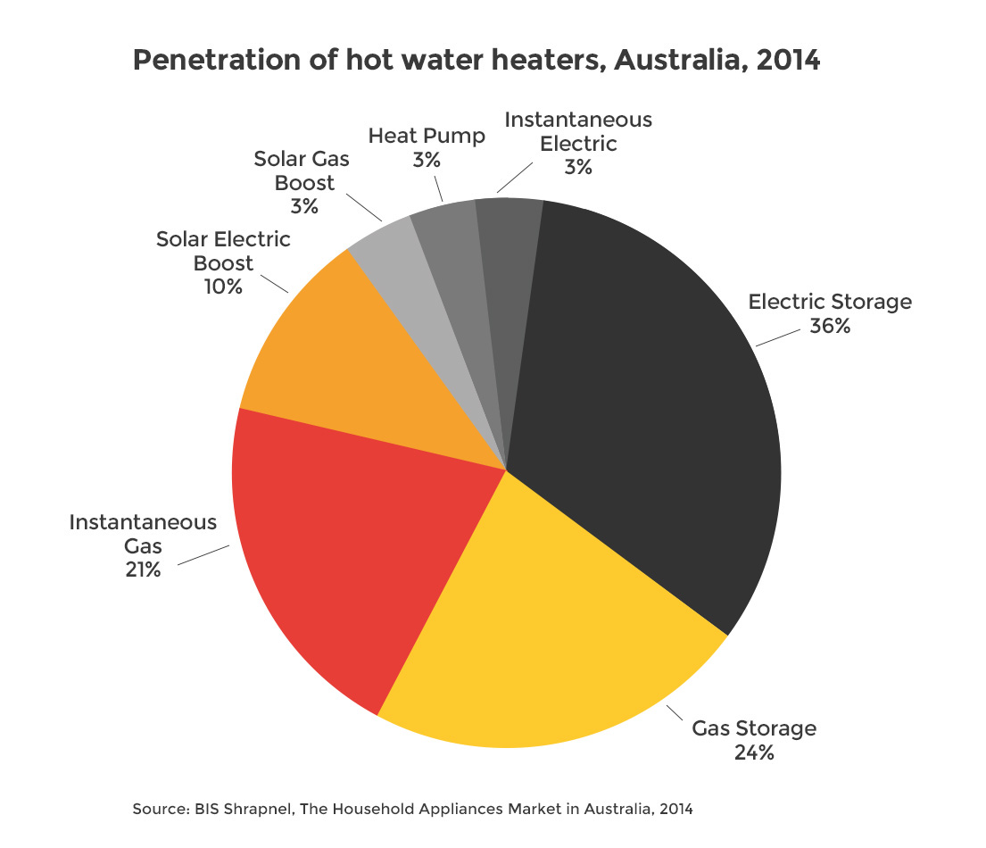
Figure 4.1: A typical pie chart (Energy Rating 2019).
Pie charts use angle to represent proportions or percentages. In Figure 4.2, the audience is forced to compare angle A to B. This is not an easy task to do accurately. Lucky for the value labels.
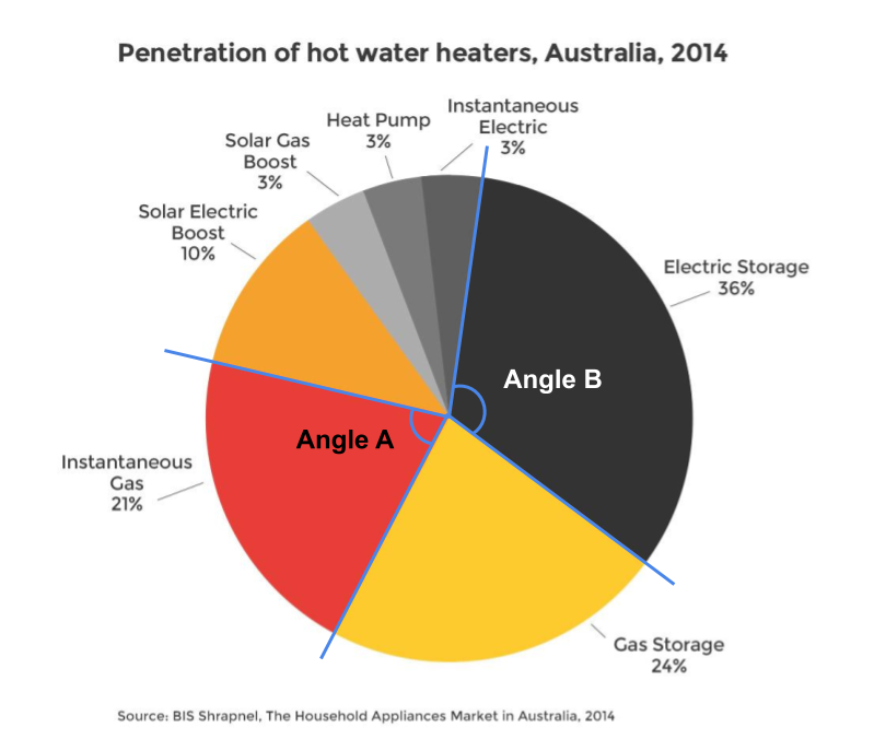
Figure 4.2: Pie charts require the comparison of angles (Energy Rating 2019).
Pie and doughnut charts also use area (see Figure 4.3). The viewer has to compare the area of each pie or doughnut slice. Skau and Kosara (2016) found that the most important aesthetic used in the interpretation of pie charts was area. So, the use of angle in pie charts isn’t the primary visual variable. Again, differences are easier to see when they are large, however, things get tricky when the proportions are similar.

Figure 4.3: Pie charts also require comparison of area (Energy Rating 2019).
Figure 4.4 shows another example by Stanton and Alcorn (2016) from The Citizen. The pie charts are used to compare Australian emissions by state and then by industry for Victoria. They use the same colour scale to represent both state and economic sector which makes looking back and forth between the legend and pie charts very time consuming.
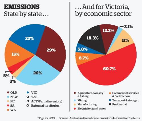
Figure 4.4: Pie charts rely on colour to differentiate categories (Stanton and Alcorn 2016).
Pie charts have spawned many variations. Wired Staff (2008) presented examples of doughnuts charts (pie charts with a hole in the middle) to visualise the changing caloric composition of diets across select countries (see Figure 4.5). The size of the doughnuts represents calories and each segment of the doughnuts represent the proportion of calories that come from major food groups. Each row represents a different three year interval, starting in 1969-1971 and comparing it to 2001-2003. Both size and the area of each segment are difficult to visually compare across countries and time. For example, is the proportional composition of sugar and sweeteners different across time for Brazil? It is very hard to tell with a reasonable degree of accuracy. While eye-catching, the visuals miss the mark.
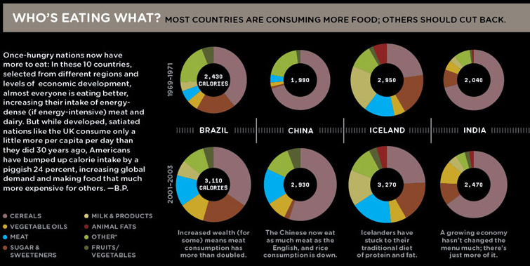
Figure 4.5: Doughnut charts are a variation of the pie chart (Wired Staff 2008).
Figure 4.6 shows another example from The Economist (The Economist Online 2011) comparing different countries on the proportion of time spent on major activity categories for 15-64 year olds. The visuals are mostly unhelpful. The audience if forced to read and compare the numeric values.
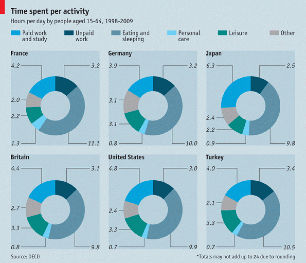
Figure 4.6: When visuals fail, the viewers are forced to read the values (The Economist Online 2011).
Are doughnut or pie charts better? Skau and Kosara (2016) found that pie and doughnuts charts are similar in terms of speed and accuracy. If pie and doughnuts charts were not enough, what about pill charts? Daly (2016) used 3D pie charts to show the proportion of drug related convictions in the UK by race (see Figure 4.7). Don’t be fooled. There is only one pie chart. It is just copied to appear like pills. Thankfully, I don’t think pill charts have, or ever will, catch on.
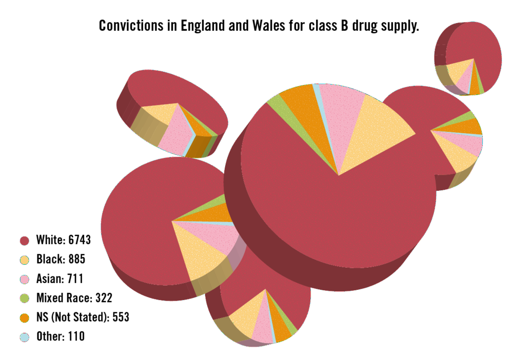
Figure 4.7: Are pill charts the next big thing in data visualisation? (Daly 2016).
So, what’s the issue? Pie charts are cool, right? No, and for very good reason. While pie chart apologists will claim that no other plot can show “parts of a whole” as well as a pie chart, we have already hinted at the main issue. Angle and area have low accuracy for representing numeric values as pointed out by Cleveland and McGill (1985). This makes the proportions represented in the pie chart a lot harder to judge compared to position on an x or y axis. The problem is very pronounced when the proportions are similar. Consider Figure 4.8.
Figure 4.8: When values in a pie chart are similar, fast, accurate comparisons become difficult.
You might be surprised to know that there is quite a bit of difference between some of the proportions in each pie chart. This is made painfully obvious in the bar charts below.
Figure 4.9
Figure 4.9: Bar charts are always more accurate than pie charts.
Empirical research hasn’t identified a clear winner. For example, Croxton and Stryker (1927) (Yes, pie charts have been controversial for a long time!) found evidence that pie and bar chart accuracy depends on the specific proportions being represented. This suggests that the accuracy of bar vs. pie depends on the data. Regardless of accuracy, there are still other reasons that pie charts are problematic. Here is list of the issues discussed so far as well as the other known issues:
- Area and angle lack visual accuracy compared to position (e.g. bar charts)
- Pie charts perform poorly when proportions are similar
- Pie charts rely on colour to differentiate between segments. Therefore, colour needs to be used with caution.
- Pie charts are limited in the number of categories they can present effectively.
- Pie charts with very small proportions are hard to see and label.
Why are pie charts, and its variations, ubiquitous despite these concerns (Spence 2005)? Gelman and Unwin (2013) differentiates between statistical data graphics and infographics, where the later focuses on grabbing attention and the former on facilitating understanding about patterns present in the data. For Gelman and Unwin (2013) pie charts are considered an info graph because they appear to readily grab peoples’ attention. Cawthon (2007) suggests that this may be explained by their findings which showed that people prefer the aesthetics of visualisations that exhibit organic qualities (smooth, continuous and natural forms) as opposed to the artificial qualities of straight lines, angles and equal spacing. Form and function are in constant tension in data visualisation. Balance is the key.
Simon Weller, a former student from the course that inspired this textbook, shows how the The Economist’s (The Economist Online 2011) doughnut chart can be visualised effectively using the “humble” bar chart (see Figure 4.6). While it might not be as visually striking at the original, function is restored. The audience can rapidly compare countries on where they are spending more or less time. A feat that could only be achieved in the original by reading the value labels.
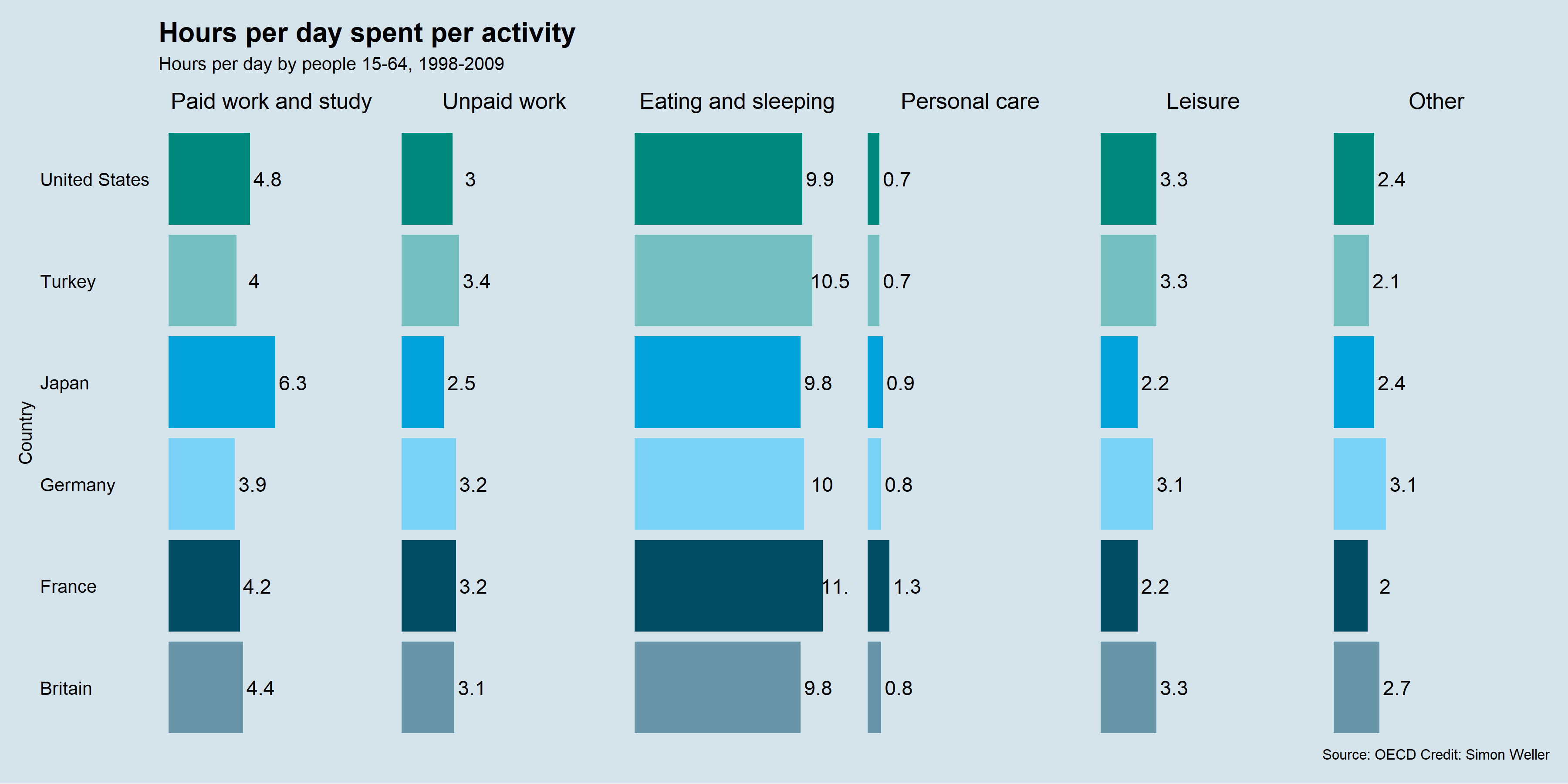
Figure 4.10: Simon Weller, a former student, fixed The Economist Online (2011)’s doughnut charts using faceted bar charts.
So, what is the take home message? Pies and doughnuts are for eating. Don’t be tempted to use them in data visualisation. Especially when the humble bar chart works very well. Figure 4.11 shows a nice gif from Joey Cherdarchuk (2014) from Darkhorse Analytics that captures the lesson well (only available online).
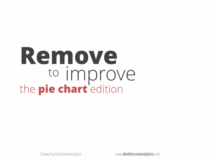
Figure 4.11: Devour the pie! (Cherdarchuk 2014).
4.3 Truncated Axis
When we have a count or ratio variable, truncating an axis, or shortening it, will distort the relative differences between groups (Pandey et al. 2015). This is commonly seen in bar charts such as Leo (2019) from The Economist (see Figure 4.12). In Leo (2019)’s exposé of bad data visualisations from The Economist, you can see the impact of truncating the axis in the original bar chart of Jeremy Corbyn’s likes per post on Facebook. The second bar chart removes the truncated axis which corrects the proportionality to other accounts. The second, more accurate, bar chart shows just how much more popular Jeremy’s posts are to other accounts.
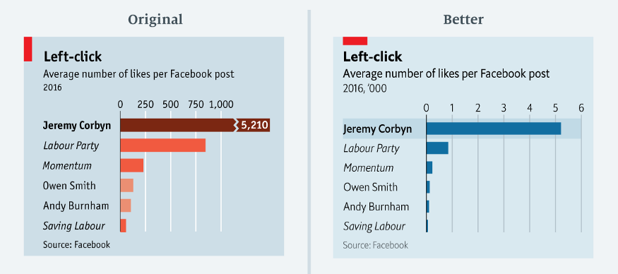
Figure 4.12: A truncated axis can severely distort a data visualisation (Leo 2019).
Here is another example of a strange truncated axis reported by Stafford and White (2018) from Car and Driver (see Figure 4.13). It is not clear from the plot where the x-axis starts. The assumption would be 0. This means the first half of the x-axis is equal to 30 miles per gallon (MPG), and the second half of the axis 100 MPG. Weird indeed.
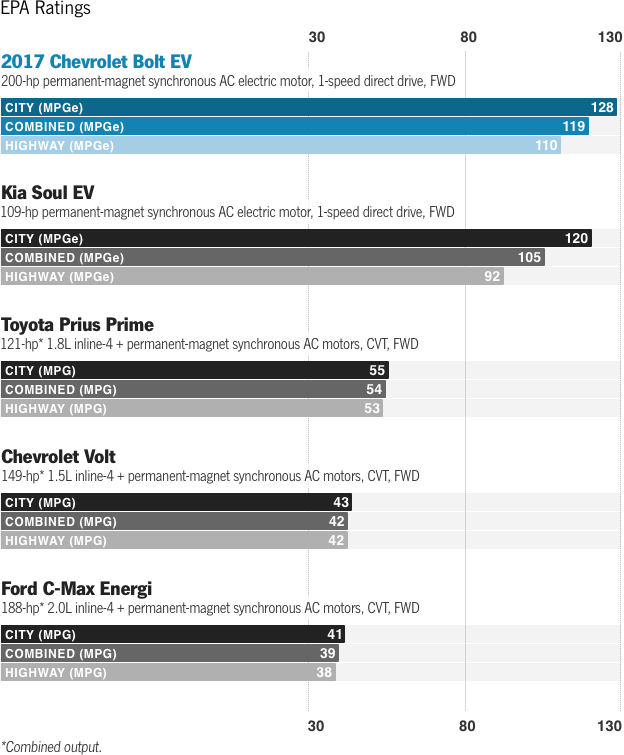
Figure 4.13: An unusual x-axis (Stafford and White 2018).
To see what effect this has on the visualisation, let’s do a simple bar chart for comparison. As you can see in Figure 4.14, the original visualisation underestimates the MPG difference of the Chevrolet Bolt and Kia Soul relative to the other cars.
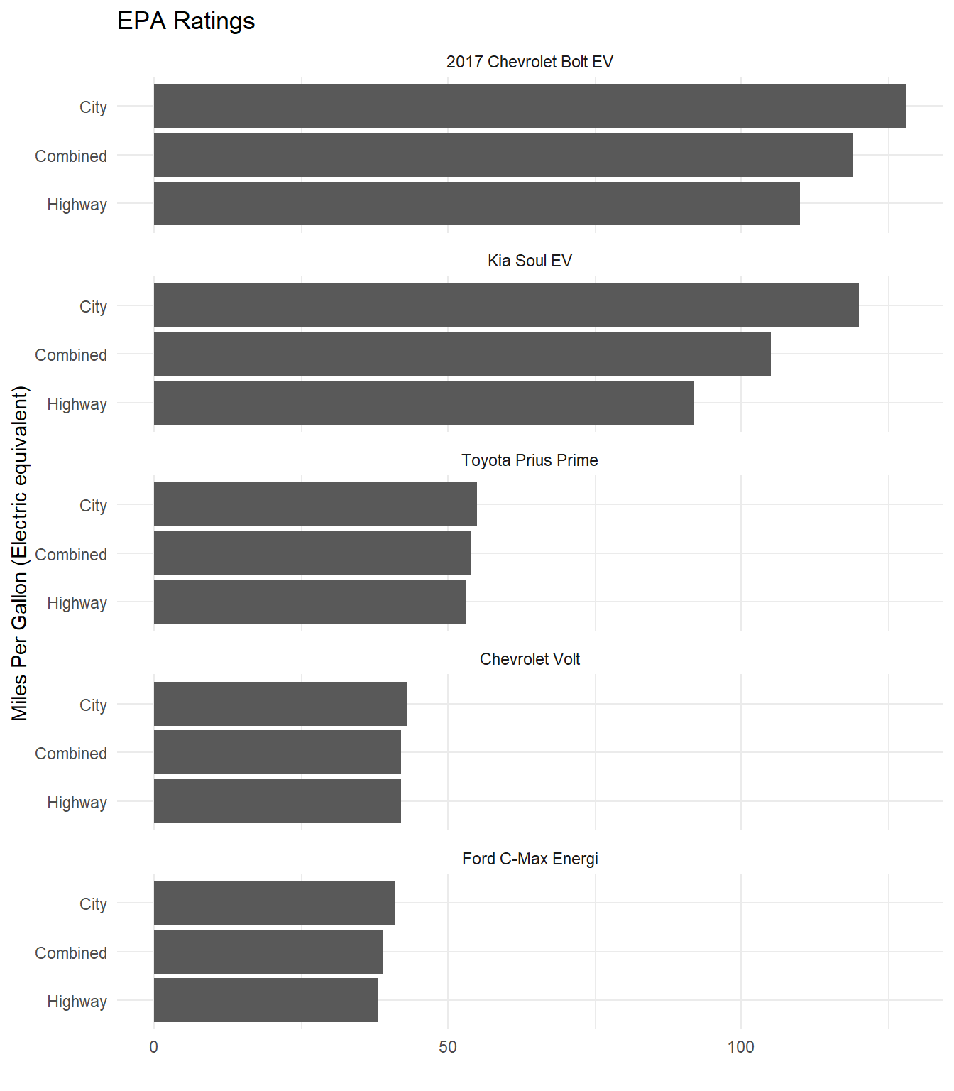
Figure 4.14: Fixing the unusual x-axis in Stafford and White (2018).
Parkinson (2013) presents a more typical example where the y-axis does not start at 0 (see Figure 4.15). This means our sense of the relative difference in British men’s average height at age 21 across time is grossly exaggerated.
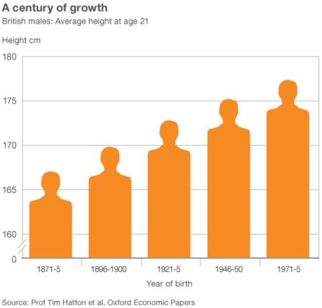
Figure 4.15: Notice the truncated y-axis (Parkinson 2013).
Look at Figure 4.16 which does not truncate the y-axis. Now this presents a very different picture and puts the height increase in perspective. Taller, yes, but not by the magnitude visually depicted in Parkinson (2013). Parkinson (2013) does include a visual cue to alert the reader to the truncated axis. You will notice two small slashes that break the axis. However, this visual cue is not strong enough and many readers will miss it.
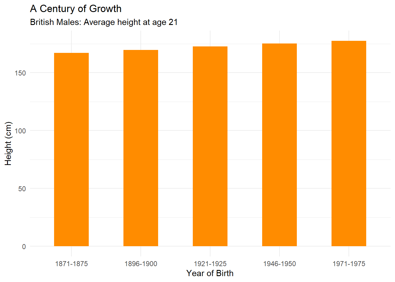
Figure 4.16: Fixing the y-axis of Parkinson (2013).
4.4 Area and Size as Quantity
Cleveland and McGill (1985) have already shown that area and size rank lower than position in terms of accuracy when visualising a quantitative variable. Pie charts are one example of this issue. However, the way in which area and size are scaled can also be problematic. Take the bar chart from ACMA Research and Analysis Section (2015) for example (see Figure 4.17). It is not clear what the y-axis represents. Is it the number of mobile-only phone users or the percentage of the Australian population who are mobile-only phone users? Both are reported, but they are not the same thing. As the population size grows each year, looking at the total number of users can be misleading. The percentages are more useful. The bars also have a width value which creates an area/size for each bar depicted as a mobile phone. It appears the aspect ratio of each bar is fixed, so the “bars” appear like an iPhone. There is little information provided that explains how the area or size of each phone was scaled.
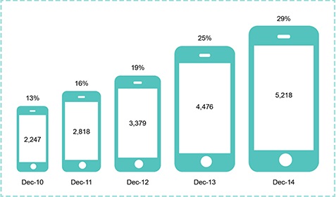
Figure 4.17: Growth of the mobile-only phone user, December 2010 to December 2014 (ACMA Research and Analysis Section 2015).
Let’s figure out if this unusual bar chart has deceived us. First, let’s do some image manipulation. If you take 13% and double it, you get 26%. Therefore, the Dec-13 area should be about twice the area of Dec-10. According to Figure 4.18, it is not. Dec-13 appears close to four times larger. This suggests that the size of each phone might be scaled as Area = Length * Width.
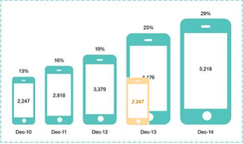
Figure 4.18: Area is not scaled correctly (ACMA Research and Analysis Section 2015).
Figure 4.19 shows the issue that this presents. Area and size needs to be treated carefully as it can easily deceive (Pandey et al. 2015). Pandey et al. (2015) state that best practice with area is using a 1:1 mapping between a quantitative variable and the area depicted visually. We checked this by superimposing the phones from Dec-10 and Dec-13 and found the mapping to be approximately 1:4.
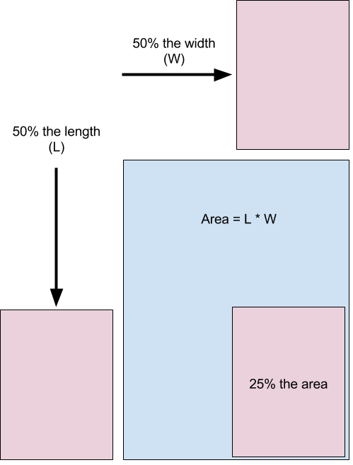
Figure 4.19: When using area, use a 1:1 mapping to avoid distortion (Pandey et al. 2015).
How do you fix this? The best option is to use position on a y-axis. This is time series data, so you should use a connected line graph. The result is clearer and more accurate (see Figure 4.20).
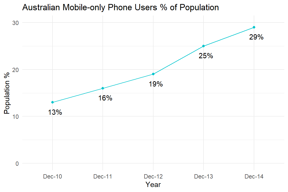
Figure 4.20: Fixing the mobile phone bar chart using a time-series plot.
How would a 1:1 mapping appear if we stuck to size? This is shown in Figure 4.21. The areas are now accurate, but the connected line plot’s use of position on the y-axis is far more accurate. Using this corrected size chart, look back to 4.17 which drastically exaggerates the change across time.
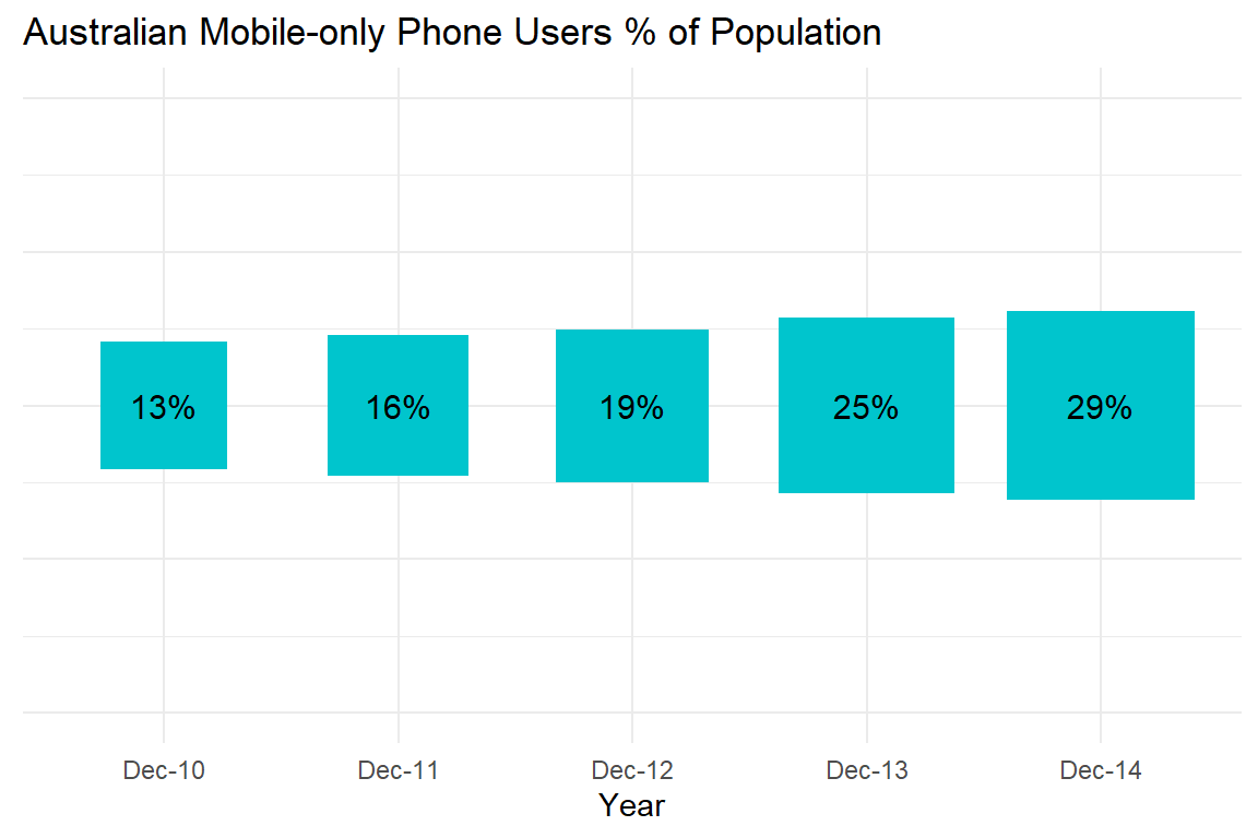
Figure 4.21: 1:1 size mapping for the mobile phone bar chart.
4.5 Aspect Ratio
Changing the aspect ratio of a plot can also deceive (Pandey et al. 2015). The aspect ratio refers to the ratio of a plot’s width:height. This is explained in Figure 4.22.
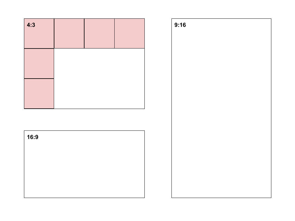
Figure 4.22: Aspect ratio explained.
Plots that rely on showing a change across time, such as a time-series plots, are sensitive to this issue because the aspect ratio directly impacts the perceived rate of change. Let’s take a look at how easy it is to manipulate. The time series plot of Average temperative anomaly, Global by Ritchie and Roser (2017) from Our World in Data will be used as an example (see Figure 4.23).
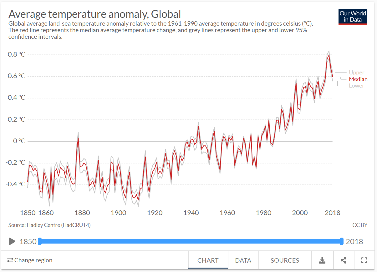
Figure 4.23: Average temperature anomaly time series plot by Ritchie and Roser (2017).
The original is reproduced closely in Figure 4.24. We will use this to manipulate the aspect ratio.
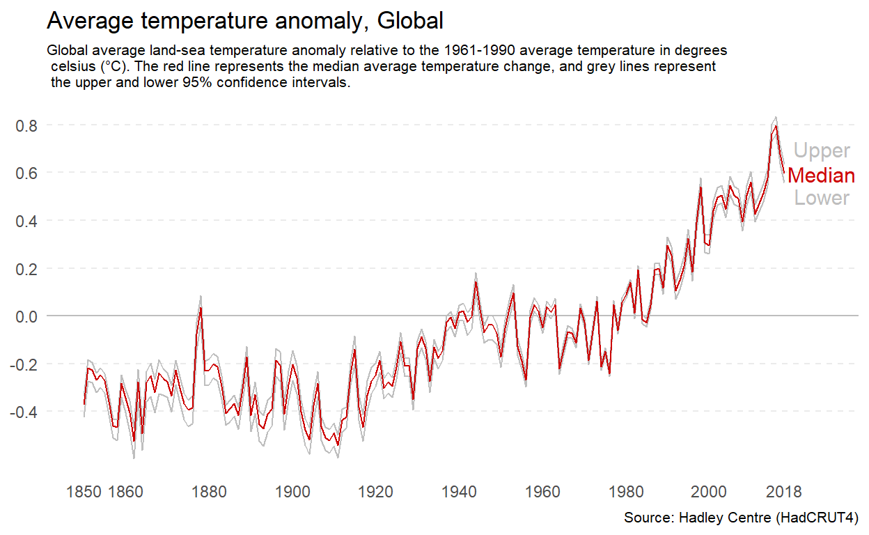
Figure 4.24: A reproduction of the temperature anomaly time series plot by Ritchie and Roser (2017).
If you want to minimise the perceived change, you can increase the width of the plot relative to the height. Figure 4.25 has an aspect ratio of 3:1. This makes the rate of change across time appear more gradual.
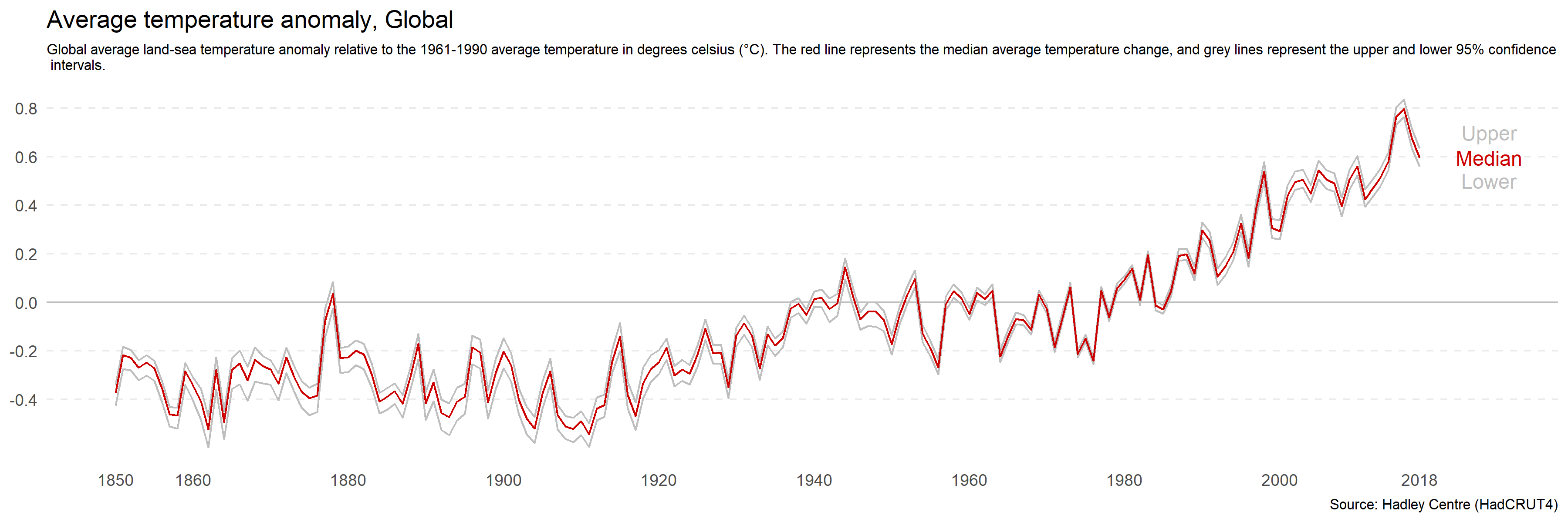
Figure 4.25: Increasing the width of a plot relative to height minimise perceived differences.
You can do the opposite to make the rate of change appear more rapid by increasing the height of the plot relative to the width. Figure 4.26 has an aspect ratio of 3:5. The change appears sudden and drastic.
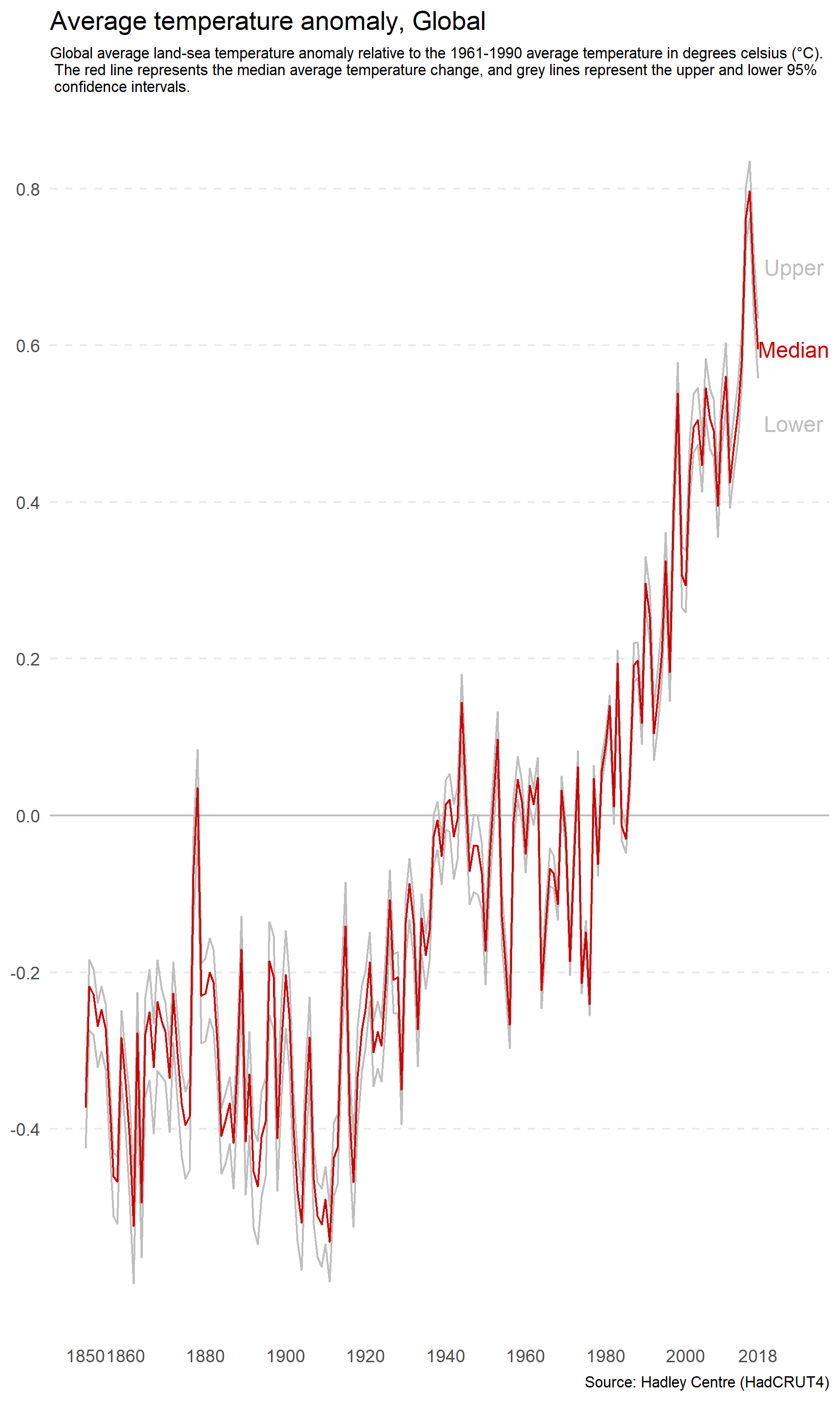
Figure 4.26: Increasing the height of a plot relative to width increases perceived differences.
Beware of this distortion when setting the size of your plots. You do not want to unwittingly mislead your audience. There is no magic ratio. Use common sense and avoid extreme ratios. This issue is more relevant than ever with the widespread use of responsive web design, which means that websites and web-based data visualisations are capable of re-scaling based on screen size and viewing device. This means it is important to check the appearance of your plots on different devices and fix the aspect ratio if distortions are likely to occur.
4.6 Ignoring Convention
There are many conventions in data visualisation. For example, the horizontal axis is referred to as x. Time is presented as progressing from left to right and growth moving from the bottom of plot to the top. There are historical, cultural and educational reasons underlying these conventions. Convention is important because it allows you to make assumptions about your audience. The audiences’ prior experiences and expectations determine much about how they will perceive a data visualisation.
When you ignore these conventions, you risk misleading or confusing your audience. For example, Chan (2014), as cited in Engel (2014), presents a time series plot of gun-related deaths in Florida before and after the enactment of the “Stand Your Ground” law in 2005 (see Figure 4.27). This law made it legal to use deadly force for self-defense or the self-defense of others. If you take a quick glance at the plot, you would be forgiven for thinking that the act corresponded to a drastic decrease in gun-related deaths. However, you would be wrong. Notice the inversion of the y-axis.
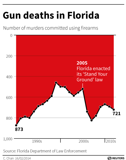
Figure 4.27: The infamous Gun Deaths in Florida plot by Chan (2014) as cited in Engel (2014).
Flipping the plot upside down fixes the problem (see Figure 4.28).
Figure 4.28: Inverting the Gun Deaths in Florida plot by Chan (2014) as cited in Engel (2014).
This visualisation drew a lot of criticism for being deceptive. However, not everyone agreed. For example, Kirk (2014) argued it was not deceptive and depended on how it was interpreted. Kirk (2014) reasoned that the area coloured red was what visually corresponded to total deaths. The original designer, Christine Chan, explained that they drew inspiration from a similar visualisation named Iraq’s bloody toll by Scarr (2011) (see Figure 4.29). Red is associated with blood and violence, and inverting the axis made it appear like dripping blood. Regardless, ignoring conventions can be used to deceive, confuse and ignite the internet against you. Stick to conventions.
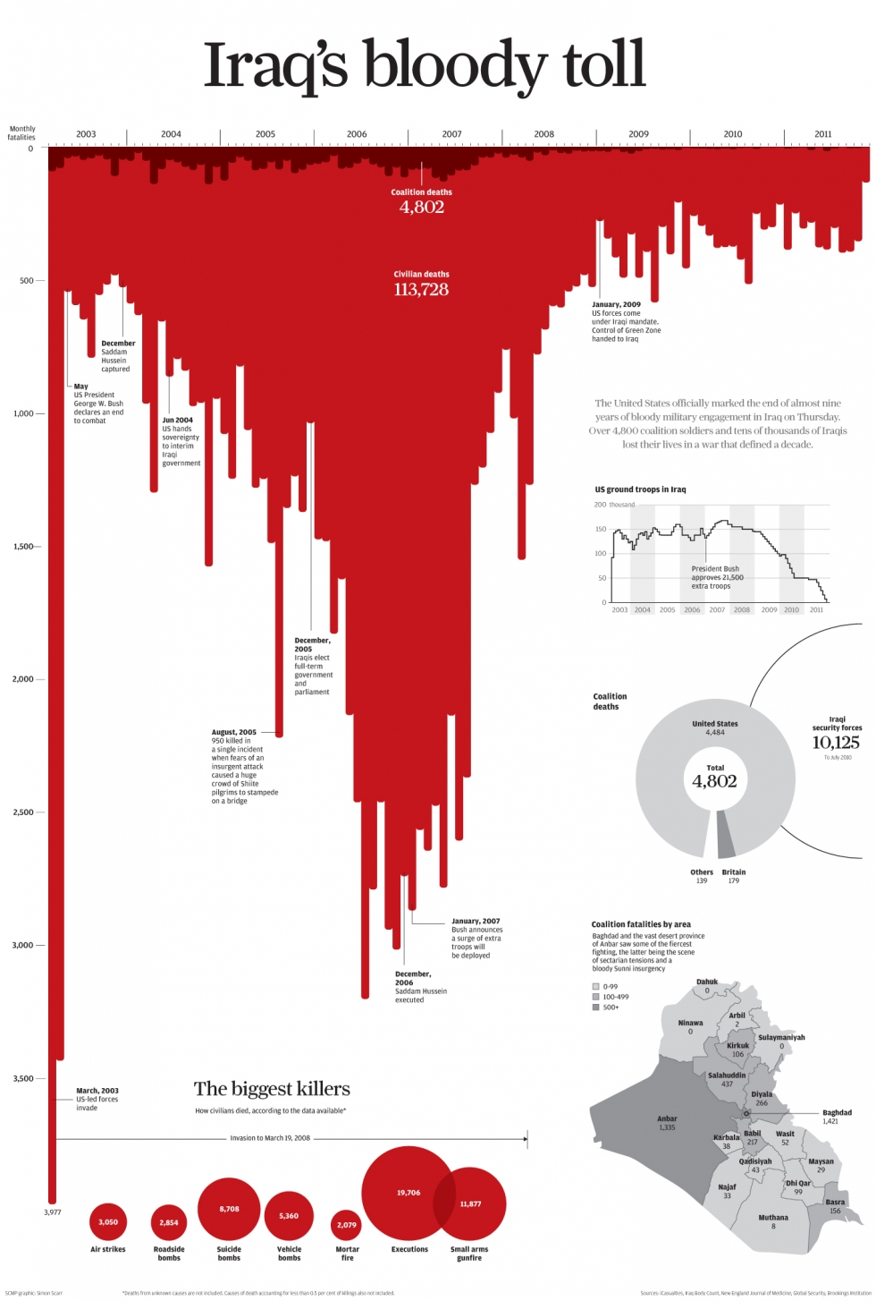
Figure 4.29: Iraq’s bloody toll by Scarr (2011).
4.7 Dual Axes
The use of dual axes in data visualisation isn’t uncommon. This means that instead of one variable being positioned on the y-axis, two variables are plotted instead, one on the left and one on the right. Look Figure 4.30 from The Economist (2016) showing how the weight and neck size of dogs in the UK have shrunk overtime in what appears to be a perfect relationship.
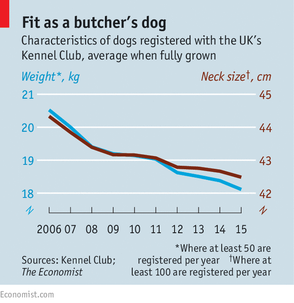
Figure 4.30: Dual axes in The Ecconomist (The Economist 2016).
However, Leo (2019) was critical of this orginal plot:
In the original chart, both scales decrease by three units (from 21 to 18 on the left; from 45 to 42 on the right). In percentage terms, the left scale decreases by 14% while the right goes down by 7%.”
In, other words, while both neck and weight go down, weight has decreased quicker than neck size. Leo corrects this visualisation by adjusting the scales so that each year shows a proportional change (see Figure 4.31).
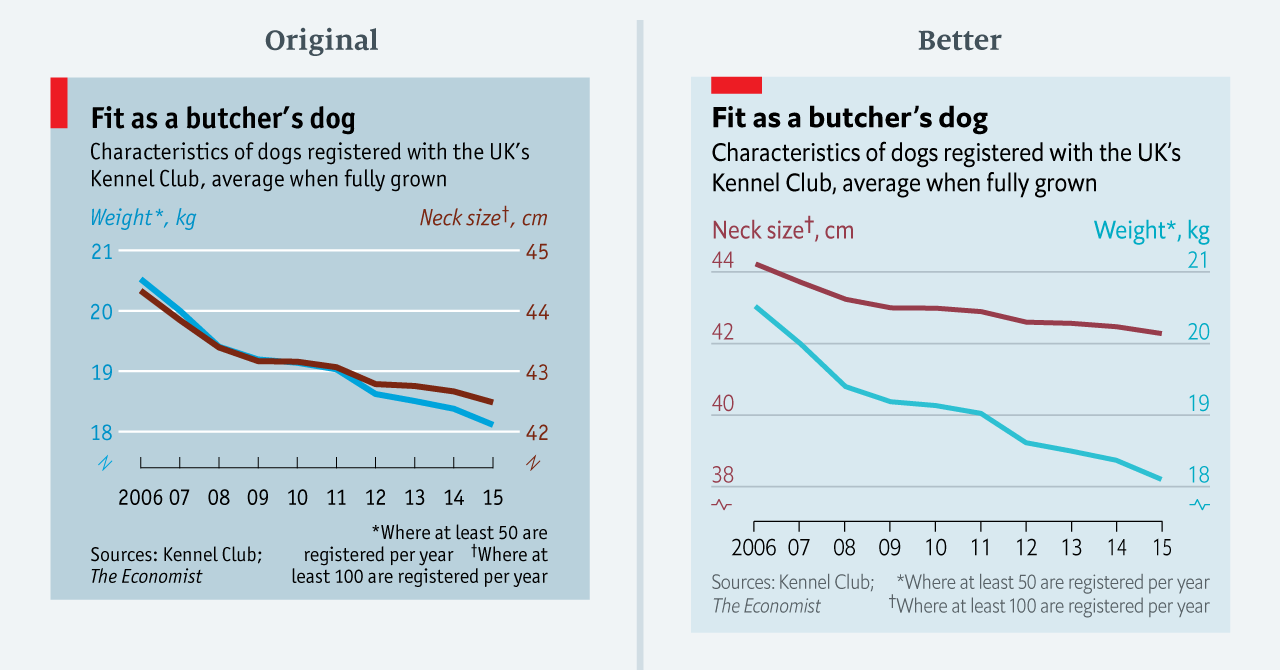
Figure 4.31: Improving a dual axes plot (Leo 2019).
In general, dual axis plots should be avoided because they are easy to manipulate and, even when done well, are prone to misinterpretation. The secondary scale can often go unnoticed and are generally difficult to understand. Just how easy are they to manipulate? Let’s take a look. Figure 4.32 was adapted from Reddit user Buckbuckyyy (2019). The data were taken from the City of New York website (NYC OpenData 2019). The plot shows that despite the NYC population increasing, water use has declined.
Figure 4.32: NYC Water Consumption and Population 1979 - 2017.
The important thing to keep in mind when thinking about dual axes is that the scaling of the secondary axis is completely arbitrary and has to be carefully set by the designer so that the superimposition of the two variables is accurately presented. This is difficult to get right and prone to deception. Figure 4.33 presents an alternative scaling. It appears water consumption has plummeted.
Figure 4.33: It is easy to manipulate a dual axes plot by manipulating the scale. Water use has plummeted!
It is not hard to show something different. For example, that the population has exploded (see Figure 4.34). While extreme, you get the point.
Figure 4.34: Population has exploded!
User experiments by Isenberg et al. (2011) have shed light on the issues of interpreting dual axis plots. Isenberg et al. (2011) used superimposed charts for dual “scale” plots. The second axis was used to “focus” or “zoom” in on a specific region of a plot to facilitate comparisons to other regions. While not directly related to the use of dual “axis” plots for the purpose of visualising two variables on the same axis, the findings of the paper are still relevant. Participants from the study reported that the superimposed charts were the most confusing and time consuming to interpret. They were also the least accurate in terms of other methods tested in the experiment. What other methods are appropriate? Few (2008), Evergreen (2020) and Rost (2018), recommend aligning multiple plots (side-by-side or bottom and top) as they are easier to implement and easy to understand (see Figure 4.35).
Figure 4.35: Aligning individual plots is a preferred alternative to dual axes plots (Few 2008; Evergreen 2020; Rost 2018).
Another approach suggested by Few (2008) and Rost (2018) would be to plot indexed values. For example, convert each variable to a percentage change based on a reference year. This standardises the two variables to a common scale. However, there are issues if the magnitude of the change is drastically different between the variables. Converting two variables into a single ratio variable is also sometimes possible. For example, you can use the ratio for water use per person per day (see Figure 4.36).
Figure 4.36: A ratio of two quantitative variables avoids dual axes.
Connected line plots might also be a useful alternative as demonstrated in Figure 4.37, although they are likely to be unfamiliar and time-consuming for the audience (Rost 2018; Evergreen 2020).
Figure 4.37: Connecting points by time allows the viewer to correlate two time-based variables.
As a general rule, avoid using dual axis plots. There are too many issues to confidently deal with and better alternatives are available.
4.8 Other Poor Scaling Methods
You have already considered a number of deceptive methods related to poor scaling - truncated axes, inverted axes and dual axes. Let’s consider a few more. Cleverland, Diaconis, and McGill (1982) conducted a seminal experiment where they manipulated the scale of a scatter plot in order to determine its effect on judgement of correlation. In one scatter plot, the scale was set to the range of the bivariate data (see plot A in Figure 4.38) and in the second, the scale on both the x and y axis were increased (see plot B in Figure 4.38). This had the effect of “zooming out” on the data. The data are the same in both Plot A and B and the correlation is \(r=\) 0.89.
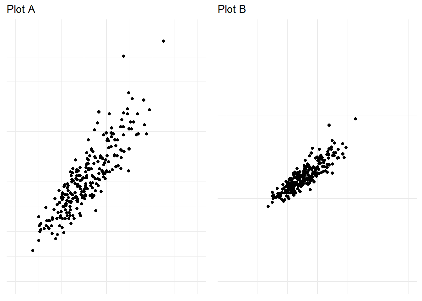
Figure 4.38: Zooming out in a scatter plot can exaggerate trends.
When asked to judge the correlation of the bivariate data across 19 different scatter plots where the scale and correlation were manipulated. Participants were found to rate the correlation in the plots with an increased scale (Plot B above) significantly higher than plots with a smaller scale. This was the first experiment to show empirically how the scale of a plot impacts interpretation.
Yanofsky (2015) explains poor scaling on the y-axis in time-series plots can render them useless. For example, truncating the axis in bar charts that aim to facilitate proportional comparison across categories is considered bad practice. However, this rule does not apply well to many time-series plots. Take Yanofsky (2015)’s example of US Gross Domestic Product (GDP) over time shown in Figure 4.39. Including 0 in the plot hides the impact of the Global Financial Crisis (GFC) due to the scale of GDP being in the trillions.
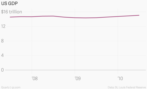
Figure 4.39: US GDP across time by Yanofsky (2015). Because the y-axis scale starts at 0, the time series trend is barely noticable.
Plotting the data starting at 14 billion on the y-axis solves this issue and allows the reader to see the clear slump characterised by the GFC (see Figure 4.40).
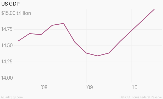
Figure 4.40: Scaling the y-axis to start at 14bn ensures the sump of Global Financial Crisis can be seen (Yanofsky 2015).
When manipulating the scale of your data visualisation keep examples like these in mind. Poor scaling can easily exaggerate or understate trends in the data. Scale your visualisations accurately and in a way that communicates the right message.
4.9 Visual Bombardment
If you want to say anything about your data, make a data visualisation that overwhelms your audience and distracts them from the real message in the data. Use heaps of colour, groups, data etc. to paint a really complex visual message. You want your audience to give up making any sense of the visuals and then rely on text/narration/video to tell them the story or leave them completely confused. Echelon Insights (2014) provide a great example in Figure 4.41. Echelon Insights visualised 184.5 million 2014 Twitter mentions of news stories and presented the following stacked and filled time series plots.
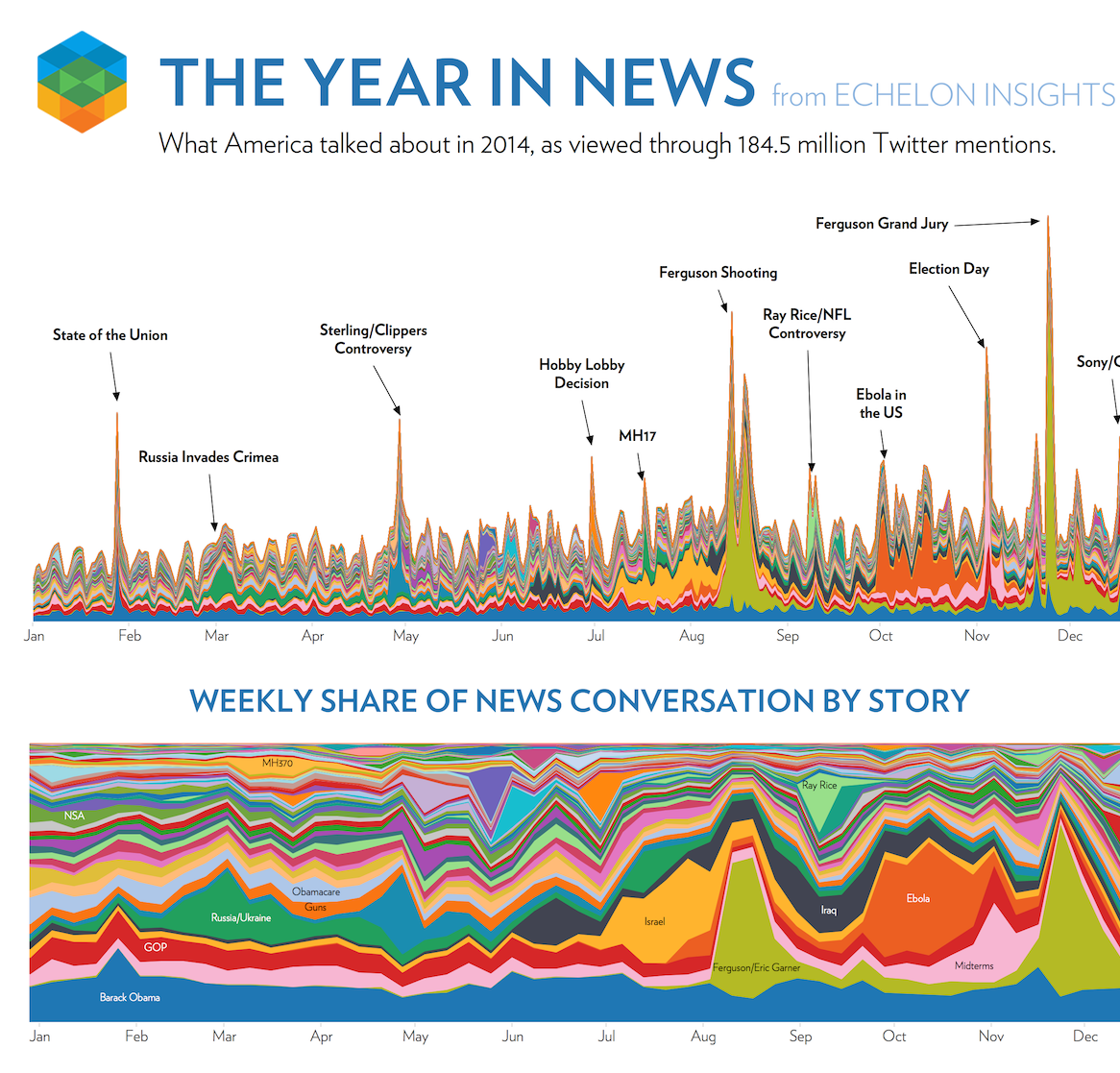
Figure 4.41: Visual bombardment confuses your audience (Echelon Insights 2014).
Many people would look at these visualisations and be impressed. 184.5 million Tweets! Yah, data science! Echelon Insights are overwhelming their audience to flex their big data muscle. Once you see past that, the visuals are lacking. You simply cannot see, nor do you need to see so many news topics depicted by countless colours. The annotations corresponding to spikes in the Twittersphere are the only redeeming feature. Visual bombardment is a common side-effect of big data.
Let’s take a look at another example. A Bird’s Eye View of Pharmaceutical Research and Development by Aero Data Lab (2019) exhibits an impressive range of strategies to bombard the audience (see Figure 4.42, the full screen version is available here). Despite good intentions, the plot is largely incomprehensible. There are far too many disease/conditions (800) that require the viewer to scroll down and lose sight of other diseases (click on the image below to see the full visualisation), inclusion of several variables (y = disease, x = time, colour = company, size = number of clinical trial subjects, shape = status of clinical trial) and extensive overplotting of bubbles.
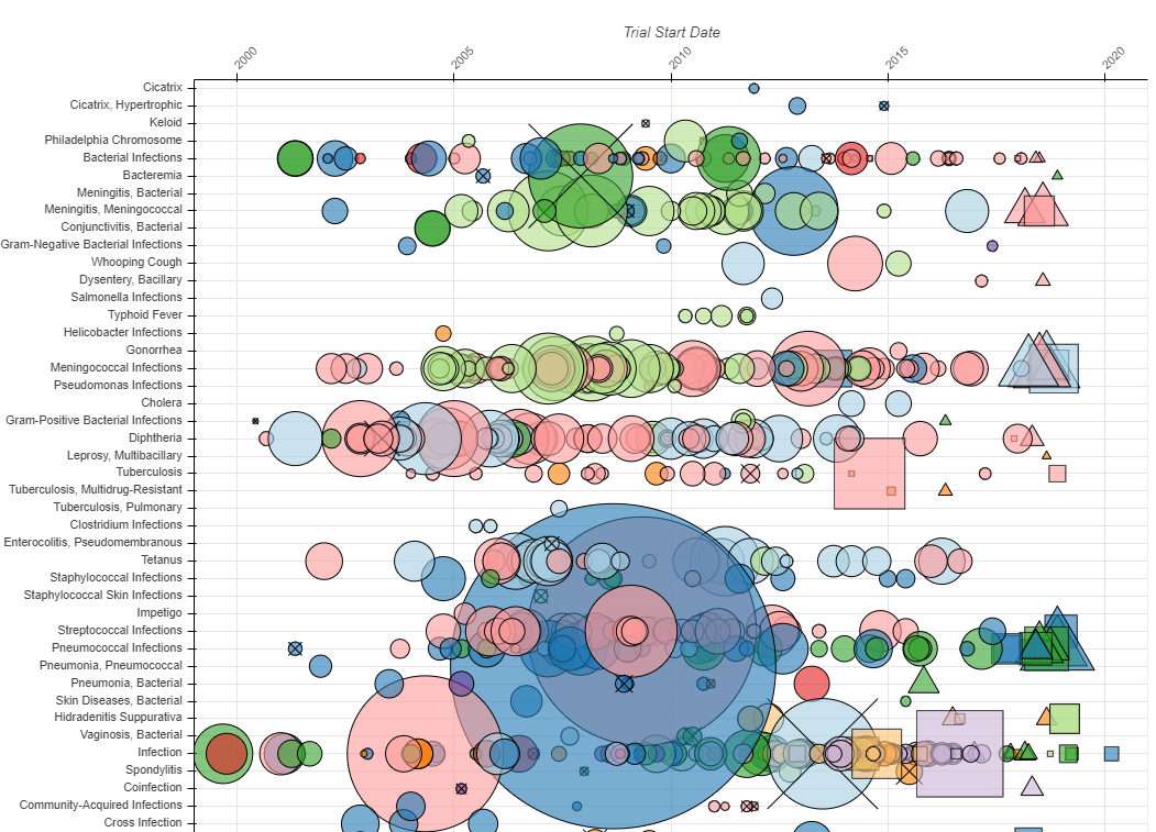
Figure 4.42: To many variables! (Aero Data Lab 2019).
Remember Kirk (2012)’s third guiding principle, Creating accessibility through intuitive design. Data visualisation is based on human visual communication. Whilst the computers you have access to today are more than capable of creating big, complex plots, keep in mind that a human brain will need to interpret it. Respect the cognitive and perceptual limits of your audience. It is your job to make the data visualisation accessible.
4.10 Concluding Thoughts
This chapter has taken a close look at some of the common methods used in data visualisation than can potentially deceive your audience. You also considered strategies for avoiding similar deception in your own work. These are some of the most common issues, but, keep in mind, there are many other examples and many yet to be discovered. You must always take reasonable steps to avoid deception. Otherwise you will fail in your obligations to the audience.