Chapter 5 Grammar and Vocabulary
5.1 Summary
In this chapter you will be introduced to the Layered Grammar of Graphics proposed by Hadley Wickham. This powerful idea allows almost any data visualisation to be described (or created) succinctly using a series of layers. After understanding this idea you will be introduced to the ggplot2 package in R, which was created by Hadley Wickham. This package makes it easy to create and modify a wide range of data visualisations using an efficient and powerful framework. This chapter will also include notes on using colour and colour scales in ggplot2. The second half of the chapter will build your data visualisation vocabulary. You will explore the range of common data visualisation methods for visualising one or two variables.
5.1.1 Learning Objectives
The learning objectives for this chapter are as follows:
- Define and differentiate between terms and components related to the Layered Grammar of Graphics used by
ggplot2including the following:- data
- geometric objects
- statistical transformations
- scales
- coordinate systems
- faceting
- aesthetics
- position adjustments
- layers
- Use the
qplot()function ofggplot2to create quick data visualisations - Use the
ggplot()function ofggplot2to create layered data visualisations - Assign colours in R using R’s inbuilt list of 657 colour names and colour hex codes.
- Assign colour scales appropriately to the colour and fill aesthetics in
ggplot2including ColourBrewer palettes - Identify and apply common methods used to visualise univariate and bivariate data using
ggplot2including the following combinations of variables:- one quantitative variable
- one qualitative variable
- two qualitative variables
- two quantitative variables
- one qualitative and one quantitative variable
- Use
ggplot2to:- manipulate and summarise data into a structured data frame needed prior to visualisation.
- enhance univariate and bivariate data visualisations by adding markers, annotations, statistical summaries and error bars to represent statistical uncertainty.
- Overlay and juxtapose plots
- Critically appraise the advantages and disadvantages of common univariate and bivariate visualisations and exercise judicious choice when selecting an appropriate display of the data.
5.2 R & RStudio
This course will make use of the very powerful ggplot2 package implemented in R. As such, this course assumes you have a good understanding of using R and the RStudio integrated development environment. If you need to brush up on the basics, I encourage you to work through the R Bootcamp modules from Introduction to Statistics before continuing. The R Bootcamp pages also provide useful links to resources to help with learning R.
You might be wondering why we are using R for data visualisation. The answer is simple. It’s free and powerful. It will give you access to a tool with almost unlimited capabilities. R provides you with the three pillars of statistics: data manipulation, visualisation and modelling. The ggplot2 package is feature-rich, elegant and based on a theory of graphics. It will help you to learn about and understand data visualisation and will see you through most data visualisation tasks. If you continue on within the data visualisation domain, the ability to use R will allow you to create your own visualisations and share these with others. So, let’s get started.
5.3 ggplot2
ggplot2 is a high-level R package, developed by Hadley Wickham and Winston Chang (Wickham 2009), ggplot2 is based on the Layered Grammar of Graphics (Wickham 2010), which built upon the originally work by Wilkinson (2005). By learning ggplot2, we will learn to understand a basic, yet powerful syntax (or grammar), for building data visualisations. There will be a bit to learn whilst getting started but we will get plenty of practice throughout the course. To assist with your learning, I have compiled a list of useful resources:
- A Layered Grammar of Graphics by Hadley Wickham published in the Journal of Computational and Graphical Statistics (pre-print available at http://vita.had.co.nz/papers/layered-grammar.html) - This is a must read article.
ggplot2Documentation - all the information you could ever need and heaps of great examples explaining the code.- ggplot 2: Elegant Graphics for Data Analysis - An excellent book to have on hand and written by Hadley Wickham, the co-author of
ggplot2. - Data Visualisation with
ggplot2Cheat Sheet - print it out and stick it on your wall. We cannot possibly cover all there is to learn aboutggplot2in one chapter For now, we will focus on the big ideas and later chapters will be used to dig deeper and introduce different features.
5.4 Installing ggplot2
Before you continue, ensure ggplot2 is installed and loaded in RStudio.
install.packages("ggplot2")
library(ggplot2)
5.5 A Layered Grammar of Graphics
Wickham (2010) proposed the layered grammar of graphics, which built upon the original grammar of graphics first proposed by Wilkinson (2005). Grammar can be defined as a set of rules that underlie the structure of written and verbal language. A grammar of graphics aims to describe any data visualisation as succinctly as possible. This is actually a really big idea because it allows us to move away from a narrow list of methods and into unlimited possibilities. Wickham proposed that a graphic is a series of layers consisting of…
- a default dataset and set of mappings from variables to aesthetics,
- one or more layers, with each layer having
- one geometric object
- one statistical transformation,
- one position adjustment,
- and optionally, one dataset and set of aesthetic mappings
- one scale for each aesthetic mapping used
- a coordinate system
- a facet specification.
Let’s have a closer look at each component.
5.5.1 Data
The following example uses the ggplot2::airquality dataset. The dataset is loaded when you load the ggplot2 library. You also need to create a date variable using the lubridate package ready for the time series.
library(ggplot2)
library(lubridate)
airquality$date = dmy(paste(airquality$Day,airquality$Month,1973,sep = "/"))
5.5.2 Layers
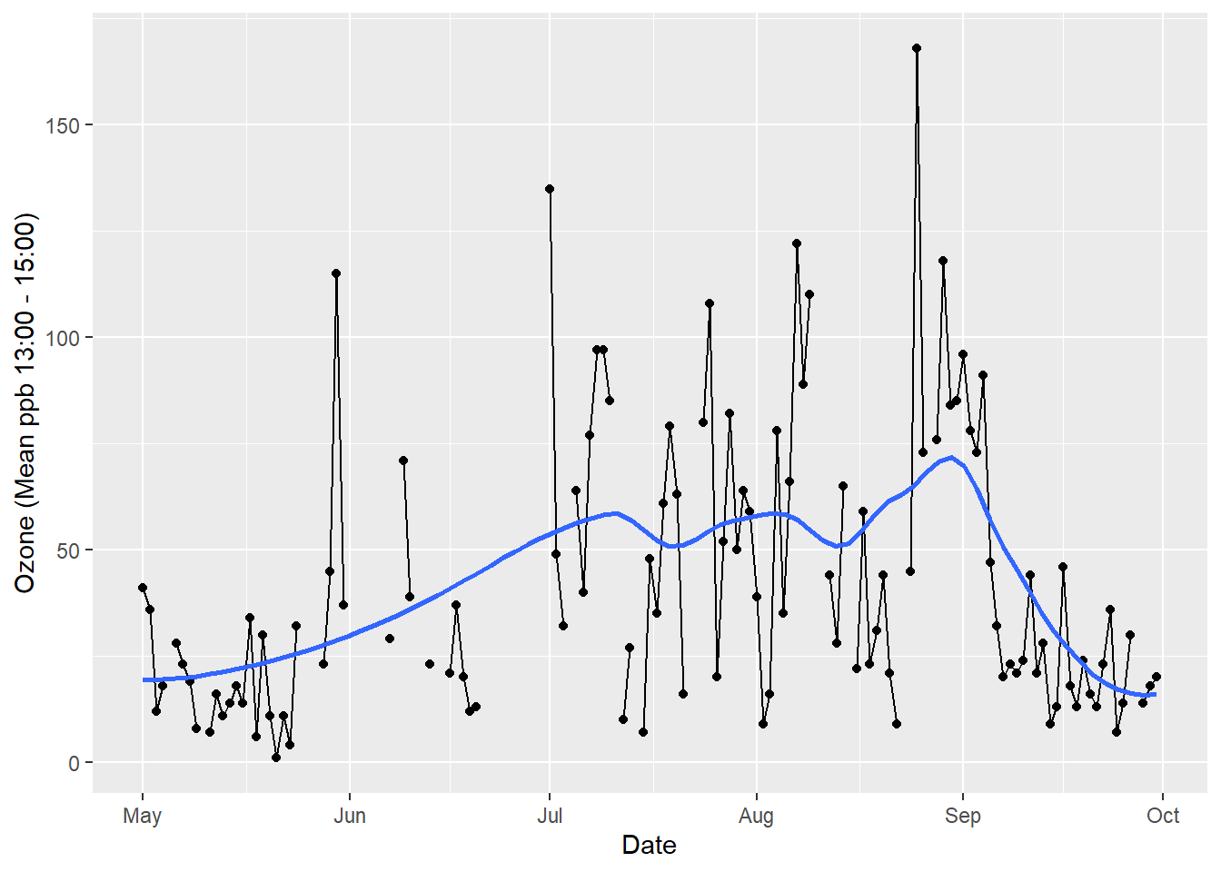
Any graphic can be thought of as a series of layers. In the following example looking at air quality data taken from New York in 1973, there are three layers: points, lines and a smoothed trend line (see Figure 5.1).
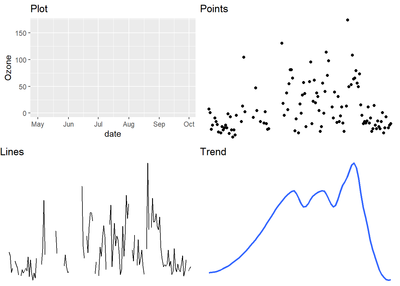
Figure 5.1: Any graphic can be thought of as a series of layers..
Put them together and we create a graph (see Figure 5.2)

Figure 5.2: Putting layers together produces a graph.
5.5.3 Data
Layers are composed of data, aesthetic mappings, statistical transformations, geometric objects and optional position adjustments. The use of data goes without saying. Without data, a visualisation is not a data visualisation. Most of the work behind a visualisation goes into the data. The data must be carefully collected and prepared prior to visualisation. This includes checking the accuracy of the data, screening and cleaning, merging variables and other data sources, computing new variables from existing variables and dealing with missing data. You often have to go back to your data even after you start your visualisation as you often find problems along the way.
##   Ozone Solar.R Wind Temp Month Day       date
## 1    41     190  7.4   67     5   1 1973-05-01
## 2    36     118  8.0   72     5   2 1973-05-02
## 3    12     149 12.6   74     5   3 1973-05-03
## 4    18     313 11.5   62     5   4 1973-05-04
## 5    NA      NA 14.3   56     5   5 1973-05-05
## 6    28      NA 14.9   66     5   6 1973-05-06
5.5.4 Aesthetic Mapping
Aesthetics are visual properties that are used to display our variables. Aesthetics can include position on an x or y axis, line type, colours, shapes etc. The process of assigning variables from a dataset to an aesthetic is known as mapping. For example, in the air quality visualisation, x = Date and y = Ozone. Here is a list of common aesthetics:
- Position: x, y
- Size
- Colour/Fill
- Shape
- Width
- Line type
- Alpha/Transparency
5.5.5 Geoms
ggplot2 refers to geometric objects as “geoms” for short. Geoms are simple geometric objects used to represent data. In the air quality example, points and lines were used to represent date and ozone levels, which were mapped to x and y aesthetics. You will already be familiar with many common geoms. These include things like bar charts, dot plots, histograms, box plots, etc, to name a few.
5.5.6 Stats
Stats is short for statistical transformations. Often, visualisations are based on statistical summaries of the raw data rather than the raw data itself. An excellent example of a visualisation of raw data versus transformed data is to compare the scatter plot versus a histogram. A scatter plot maps bivariate data points, \(x_i\) and \(y_i\), to a two-dimensional Cartesian plane. By contrast, a histogram groups intervals of continuous data into equally spaced “bins”. The counts of observations falling within each bin are visualised using a bar. The binning of the data is an example of a statistical transformation that takes place prior to creating the visualisation.
In relation to the air quality data visualisation, the line and point layers are based on non-transformed data. However, the smoothed trend line was estimated using a non-parametric, locally weighted regression model.
Examples of other common statistical transformations include quartiles used in boxplots, density estimates for probability distributions, a line of best fit from a linear regression, statistical summaries (means, medians, error bars etc), and counts (frequencies, proportions and percentages).
5.5.7 Scales
Scales are used to control the mapping between a variable and an aesthetic. Often we need to adjust our scales in order to improve our visualisation. ggplot2 is good at starting with sensible defaults (educated guessing), but it does assume that the designer will need to make adjustments. ggplot2 makes it easy to access and adjust every scale used in a data visualisation. For example, you might want to adjust the lower and upper limits on the x axis scale. Another common scale you will adjust is the colour scale. You might want to change the colour palette to better differentiate between groups. Figure 5.3 shows different examples of scales and aesthetics including colour, shape and size.
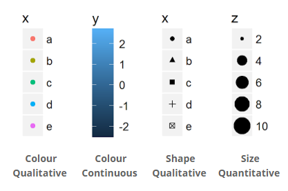
Figure 5.3: Examples of ggplot2 scales.
5.5.8 Position Adjustment
Each layer in a data visualisation can have a position adjustment. Position adjustments aim to avoid overlapping elements by either dodging, filling, jittering, nudging or stacking. Layers can incorporate multiple position adjustments. Figure 5.4 summarises each type of position adjustment.
- Dodge: Elements are arranged side-by-side
- Fill: Elements are stacked, but height is normalised (e.g. % or proportion)
- Jitter: Random noise added to x and y position to minimise overplotting
- Nudge: Labels are positioned a small distance away from data points to avoid overlapping.
- Stack: Elements are stacked on top of each other
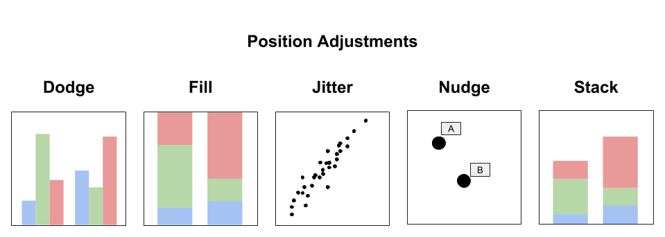
Figure 5.4: Position adjustments deal with overlapping elements.
5.5.9 Coord
ggplot2 includes a number of coordinate systems. The coordinate system is used to define the plane to which the data or stats are mapped. By far the most common coordinate system is the Cartesian system, however, ggplot2 also includes polar, transformed (Log, Sqrt etc.) and map-based systems (see Figure 5.5).
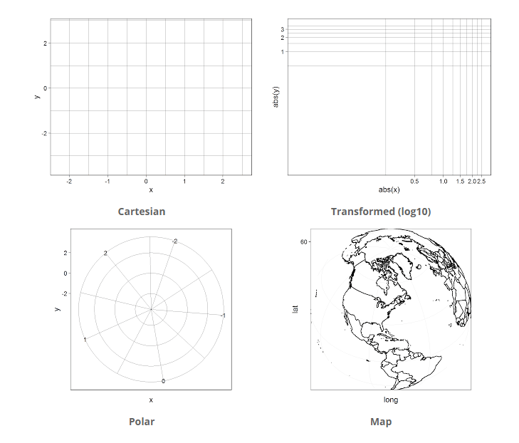
Figure 5.5: The four coordinate systems used by ggplot2.
5.5.10 Facet
Faceting is the process of breaking a visualisation into subsets and displaying the subsets as small multiples (see Figure 5.6). This process is also known as latticing or trellising Facetting the data is a great way to avoid overplotting, facilitate comparisons and effectively organise multiple data visualisations that share common aesthetics and scales.

Figure 5.6: A example of facetting by Plotly Blog (2015).
5.6 A Verbose Example
We will introduce ggplot2 code using a verbose example. The idea will be to show the close relationship between the layered grammar of graphics and the ggplot 2 package. We begin by creating a ggplot2 object, defining a coordinate system and selecting our scales. Note how we defined the x axis scale as a date format.
ggplot() +
  coord_cartesian() +
  scale_x_date(name = "Date") +
  scale_y_continuous(name = "Ozone (Mean ppb 13:00 - 15:00)")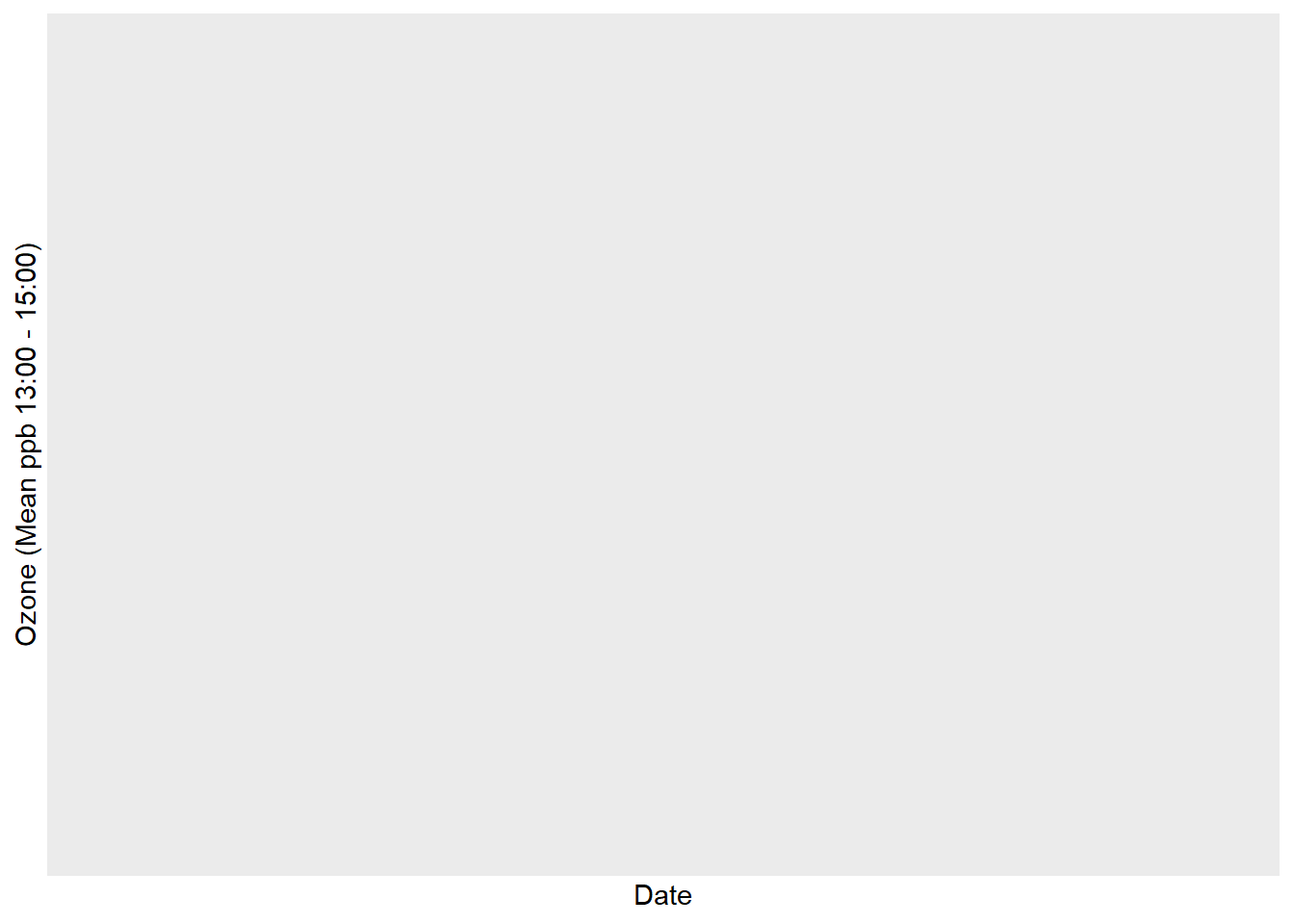
This code doesn’t plot anything because it does not have a layer just yet. Now let’s add a points layer.
library(lubridate)
ggplot() +
  coord_cartesian() +
  scale_x_date(name = "Date") +
  scale_y_continuous(name = "Ozone (Mean ppb 13:00 - 15:00)") +
  layer(
    data=airquality,
    mapping=aes(x=date, y=Ozone),
    stat="identity",
    geom="point",
    position = position_identity()
  )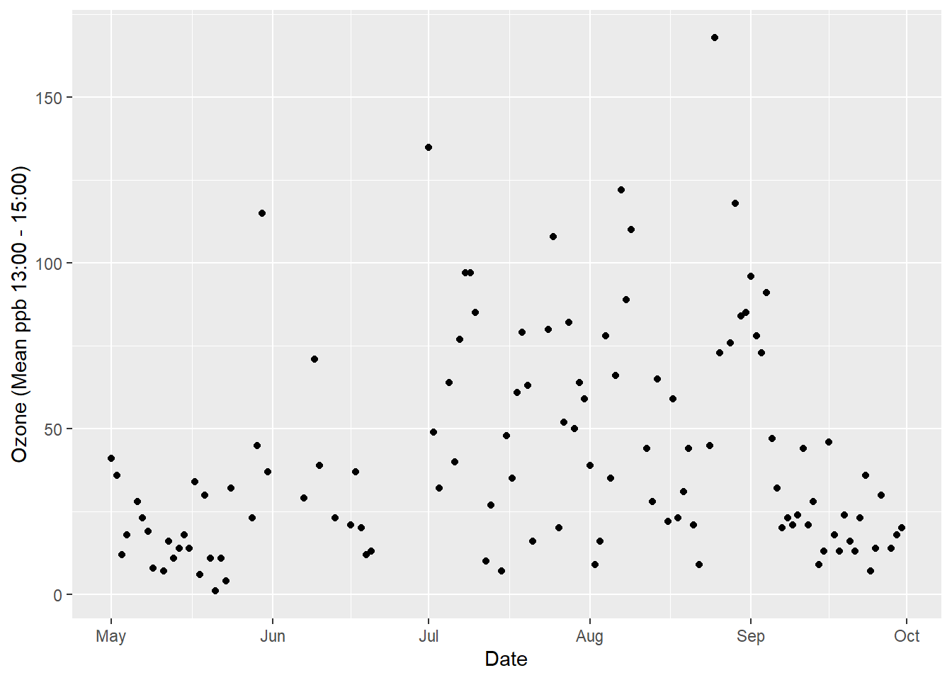
The data are defined and aesthetic mapping is specified. Stat “identity” means that no statistical transformations are performed. We select the point geom to represent our individual data points. The position “identity” makes no position adjustment to the points. Points are plotted at their corresponding x and y coordinates. If we had a lot of points that overlapped, we could try changing this to “jitter”. Next we add the lines.
ggplot() +
  coord_cartesian() +
  scale_x_date(name = "Date") +
  scale_y_continuous(name = "Ozone (Mean ppb 13:00 - 15:00)") +
  layer(
    data = airquality,
    mapping = aes(x = date, y = Ozone),
    stat = "identity",
    geom = "point",
    position = position_identity()
  ) +
  layer(
    data = airquality,
    mapping = aes(x = date, y = Ozone),
    stat ="identity",
    geom ="line",
    position = position_identity()
  )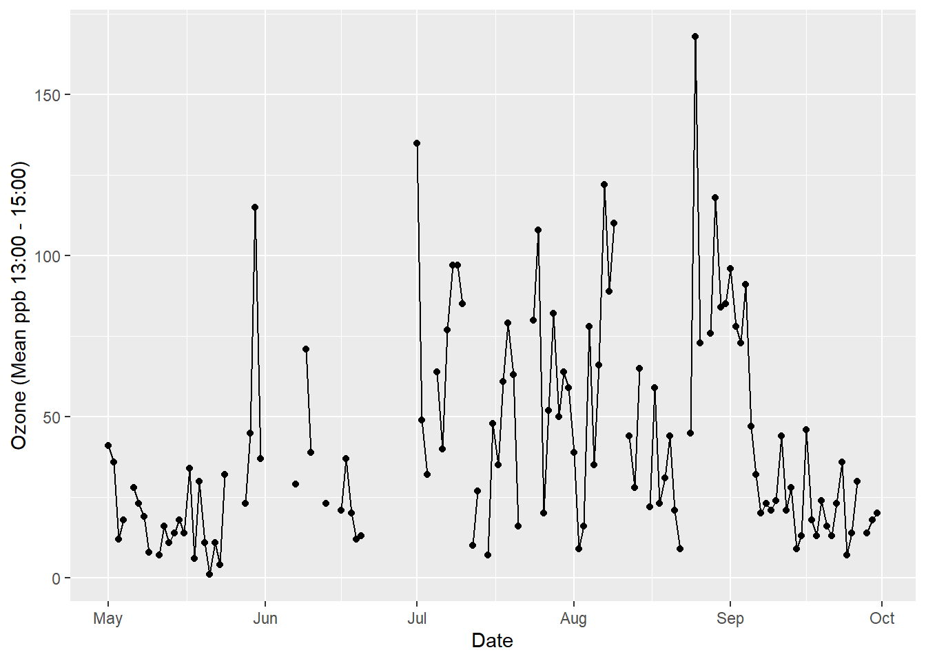
The only thing we changed in this layer was the geom to “line”. Now for the trend line.
ggplot() +
  coord_cartesian() +
  scale_x_date(name = "Date") +
  scale_y_continuous(name = "Ozone (Mean ppb 13:00 - 15:00)") +
  layer(
    data = airquality,
    mapping = aes(x = date, y = Ozone),
    stat = "identity",
    geom = "point",
    position = position_identity()
  ) +
  layer(
    data = airquality,
    mapping = aes(x = date, y = Ozone),
    stat = "identity",
    geom = "line",
    position = position_identity()
  ) +
  layer(
    data = airquality,
    mapping = aes(x = date, y = Ozone),
    stat ="smooth",
    params =list(method ="loess", span = 0.4, se = FALSE),
    geom ="smooth",
    position = position_identity()
  )
We have used stat = "smooth" and set parameters to use a locally weighted regression line with a smoothing span of 0.4. Confidence interval for the trend line is turned off, se = FALSE. We also set geom = "smooth". Adding a title will finish the data visualisation.
As you have seen, the above code example is verbose. This is not how we use ggplot2 in practice. In practice, we use ggplot2’s inbuilt geoms to visualise data quickly and then customise the appearance of default plots as needed. ggplot2 achieves this by using sensible defaults. In other words, ggplot2 will make sensible decisions about scales, colour palettes, etc out of the box. Here is the code you would use in practice to reproduce the plot above.
p <- ggplot(data = airquality, aes(x = date, y = Ozone))
p + geom_point() +
  geom_line(aes(group = 1)) +
  geom_smooth(se = FALSE, span = 0.4) +
  labs(
    title = "Air Quality - New York 1973 (Roosevelt Island)",
    x = "Date",
    y = "Ozone (Mean ppb 13:00 - 15:00)"
    )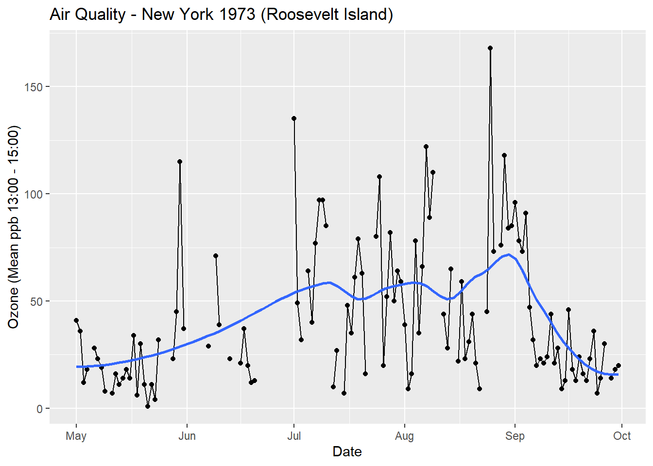
This code is much more succinct and readable. In the next section we will look at another example and introduce a more practical way to code with ggplot2.
5.7 Cars Data
Before we continue, download the Cars.csv dataset. This dataset contains data from over 400 vehicles from 2003. We will use this dataset to start learning ggplot2. The following variables, along with their coding, are included:
- Vehicle_name: Model Name
- Sports: Sports car? (1 = ‘yes’, 0 =‘no’)
- Sport_utility: Sports utility vehicle? (1 = ‘yes’, 0 =‘no’)
- Wagon: Wagon? (1 = ‘yes’, 0 =‘no’)
- Minivan: Minivan? (1 = ‘yes’, 0 =‘no’)
- Pickup: Pickup? (1 = ‘yes’, 0 =‘no’)
- All_wheel_drive: All wheel drive? (1 = ‘yes’, 0 =‘no’)
- Rear_wheel_drive: Rear wheel drive? (1 = ‘yes’, 0 =‘no’)
- Retail_price: The recommended retail price ($)
- Dealer_cost: The cost price for a car dealer ($)
- Engine_size: Engine size in litres
- Cylinders: Number of cylinders (-1 = Rotary engine)
- Kilowatts: Power of the engine in kilowatts
- Economy_city: Kilometres per litre for city driving
- Economy_highway: Kilometres per litre for highway driving
- Weight: Curb weight of car (kg)
- Wheel_base: Wheel base of car (cm)
- Length: Length of car (cm)
- Width: Width of car (cm)
Load this dataset into RStudio. Name the dataset Cars. Ensure factors are defined correctly. Run the following code to define the correct labels.
Cars$Sports <- Cars$Sports %>% factor(levels=c(0,1),
                                      labels=c('No','Yes'), ordered=TRUE)

Cars$Sport_utility <- Cars$Sport_utility %>% factor(levels=c(0,1),
                                                    labels=c('No','Yes'), ordered=TRUE)

Cars$Wagon <- Cars$Wagon %>% factor(levels=c(0,1),
                                    labels=c('No','Yes'), ordered=TRUE)

Cars$Minivan <- Cars$Minivan %>% factor(levels=c(0,1),
                                        labels=c('No','Yes'), ordered=TRUE)

Cars$Pickup <- Cars$Pickup %>% factor(levels=c(0,1),
                                      labels=c('No','Yes'), ordered=TRUE)

Cars$All_wheel_drive <- Cars$All_wheel_drive %>% factor(levels=c(0,1),
                                                        labels=c('No','Yes'), ordered=TRUE)

Cars$Rear_wheel_drive <- Cars$Rear_wheel_drive %>% factor(levels=c(0,1),
                                                          labels=c('No','Yes'), ordered=TRUE)

Cars$Cylinders <- Cars$Cylinders %>% as.factor()
5.8 qplot - Quick Plots
The qplot() function in ggplot2 is a quick method to develop basic data visualisations. Many of the aesthetics, scales and other plot features are set by default, meaning you can get under way quicker, but without the fine-tuned control of using a layered approach (covered in the following section). Let’s jump right in and produce a bar chart showing the counts of cars for the different number of cylinders. (Note. -1 = rotary engine).
qplot(x = Cylinders,data = Cars, geom = "bar")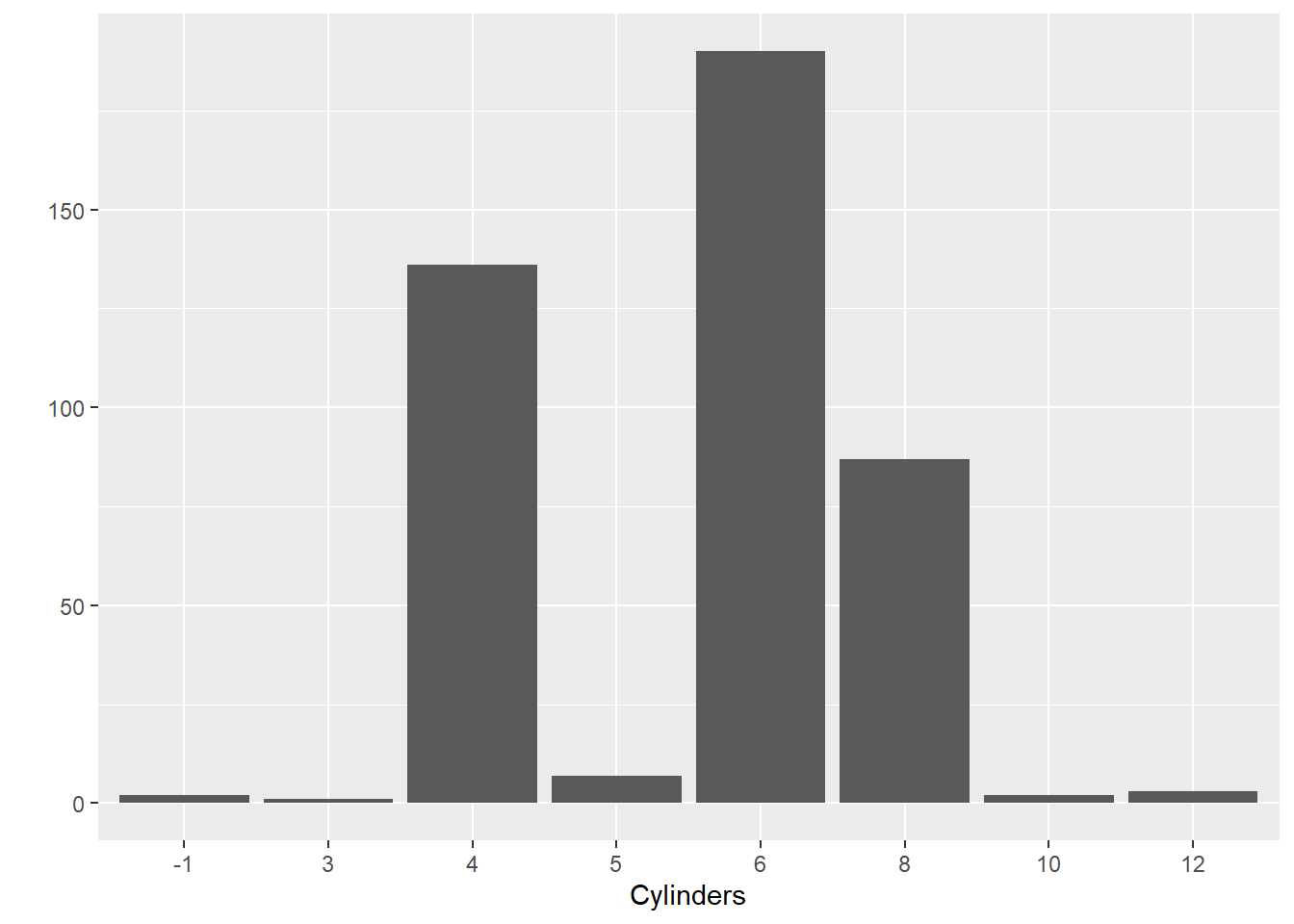
Let’s break down the logic of the code. The first part of code was used to “map” each variable to be represented in the plot to a particular plot element. For example, we will place the Cylinders factor along the x axis. The Cylinders variable is mapped to the Cars data object. Next we select the "bar" geom. This defaults to counting the number of observations in each category of the cylinder variable and then presenting the frequency as a bar. The height of the bar is the aesthetic and will be mapped to the y axis.
Now let’s look at a box plot comparing kilowatts (a measure of a car’s power) across cylinders:
qplot(x = Cylinders, y = Kilowatts, data = Cars,
      geom = "boxplot")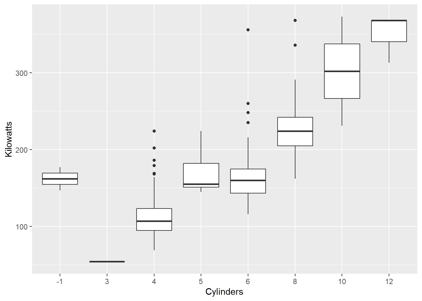
This time we mapped Kilowatts directly to the y axis and changed the geom to "boxplot". We can also add layers. For example, let’s overlay the mean as a red dot:
qplot(x = Cylinders,y = Kilowatts, data = Cars,
      geom = "boxplot") +
  stat_summary(fun.y=mean, colour="red", geom="point")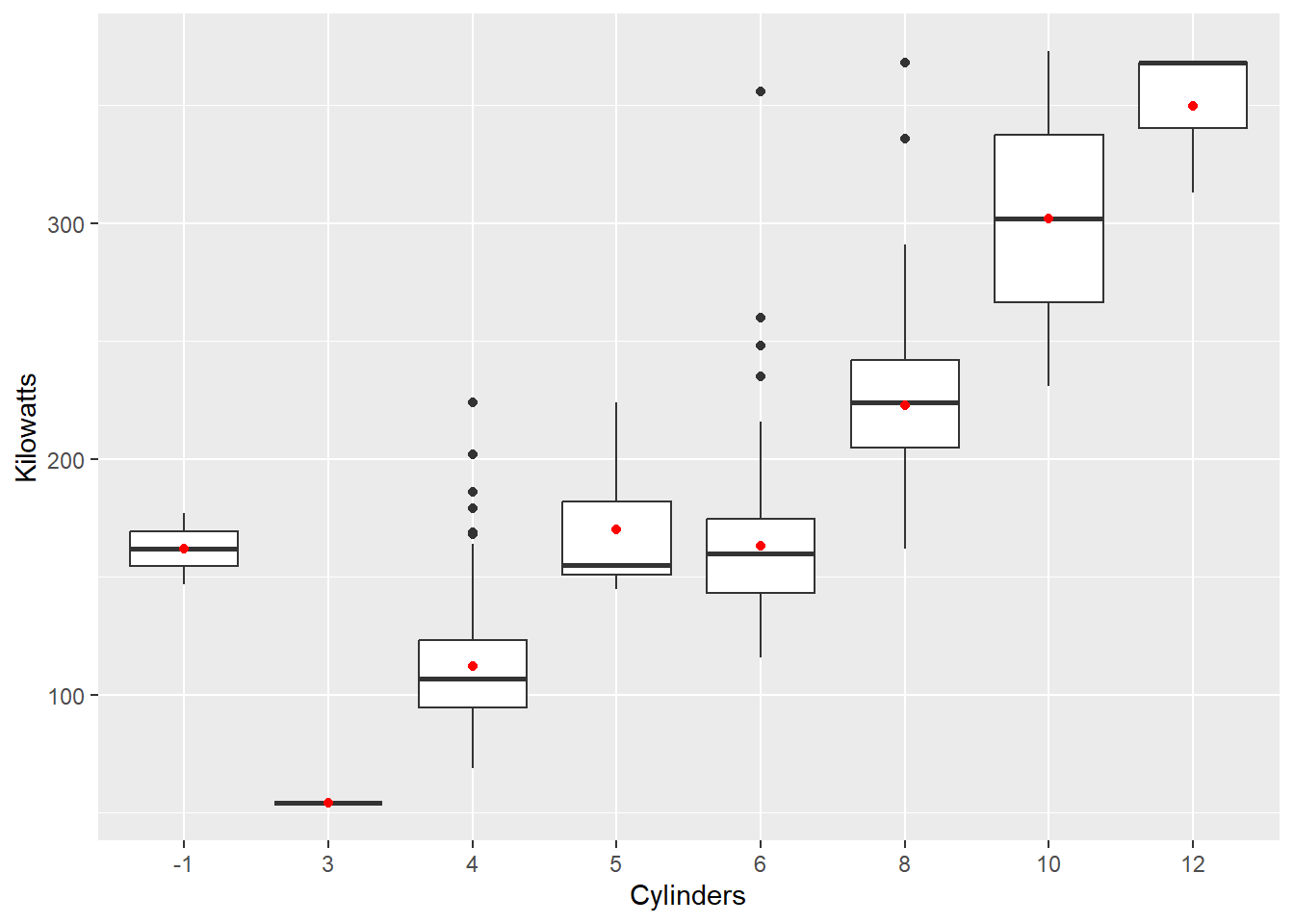
We use the + and add a new layer using the stat_summary() function. This calculates the mean kilowatts for each cylinder category and maps the mean to the y axis. We can select the option to colour the points red to help contrast the mean from the medians and select the "point" geom to visualise the mean.
Now, a scatter plot showing the relationship between a car’s weight at its estimated city fuel economy (km/L):
qplot(x = Weight,y = Economy_city, data = Cars,
      geom = "point")
## Warning: Removed 16 rows containing missing values (`geom_point()`).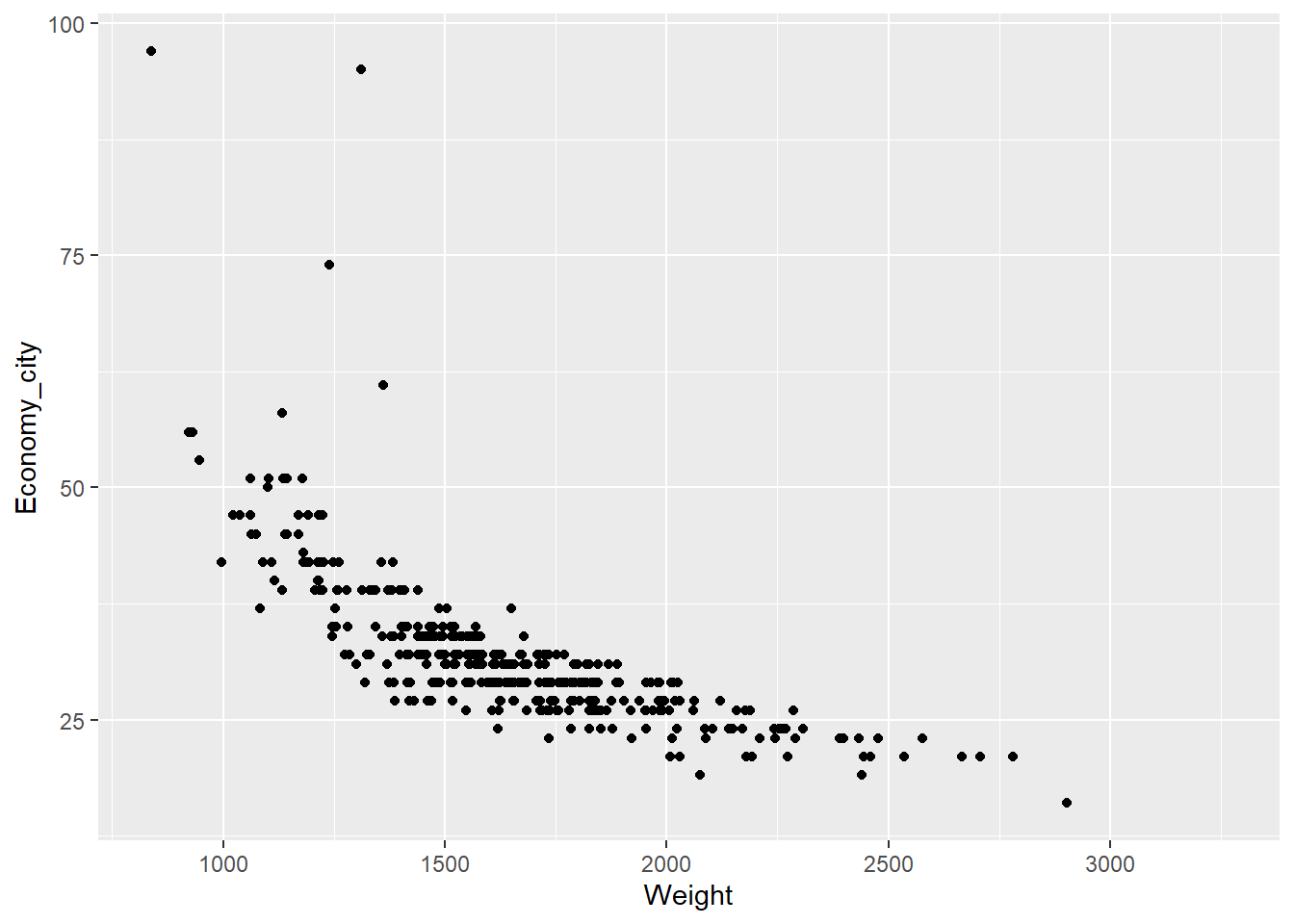
R reports that we have 16 missing values which is handy to note. Also note how we carefully mapped each variable to the x and y axis. We change the geom type to "point" for a scatter plot. Now let’s try something a little trickier.
The relationship between weight and economy looks curvilinear. Often we can apply log transformations to variables to straighten the relationship. Linear relationships are always easier to model and understand. We can use the log = "xy" option to apply a logarithmic scale to the plot.
qplot(x = Weight,y = Economy_city, data = Cars,
      geom = "point", log = "xy")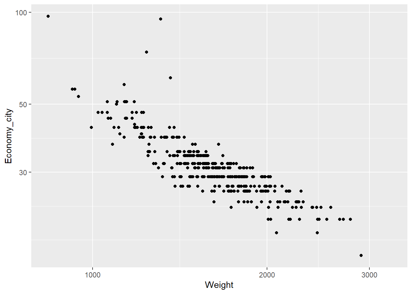
The relationship looks more linear, but the axes are poorly scaled. In fact, log transformed scales are prone to misinterpretations. Instead, we can transform the variables directly.
qplot(x = log(Weight),y = log(Economy_city), data = Cars,
      geom = "point")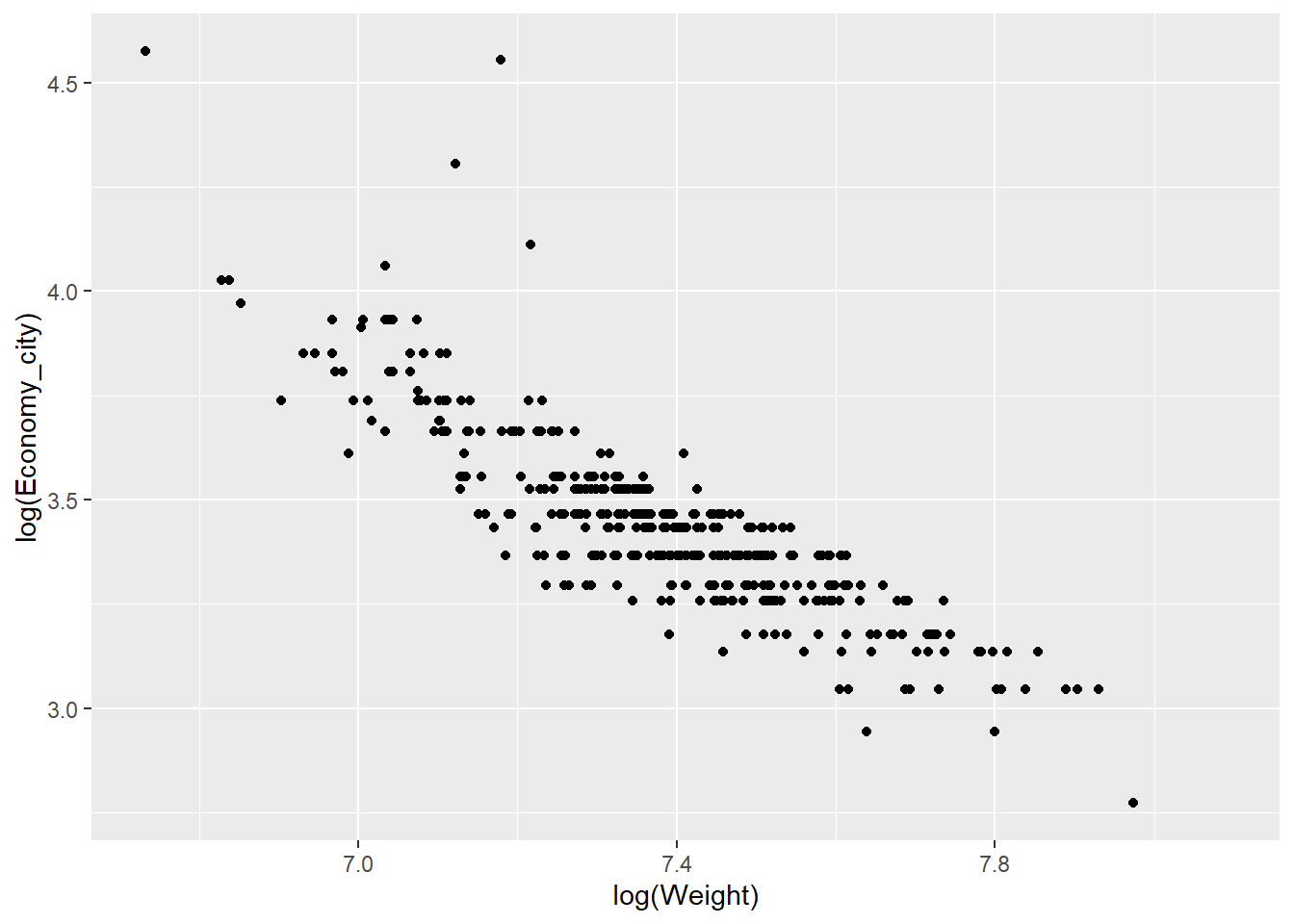
Now the scale of the axis looks much better.
We can also map other aesthetics to reflect additional variables in the plot.
Suppose we want to compare the relationship between city and highway fuel economy for cars with different numbers of cylinders.
qplot(x = log(Weight),y = log(Economy_city), data = Cars,
      geom = "point",colour = Cylinders)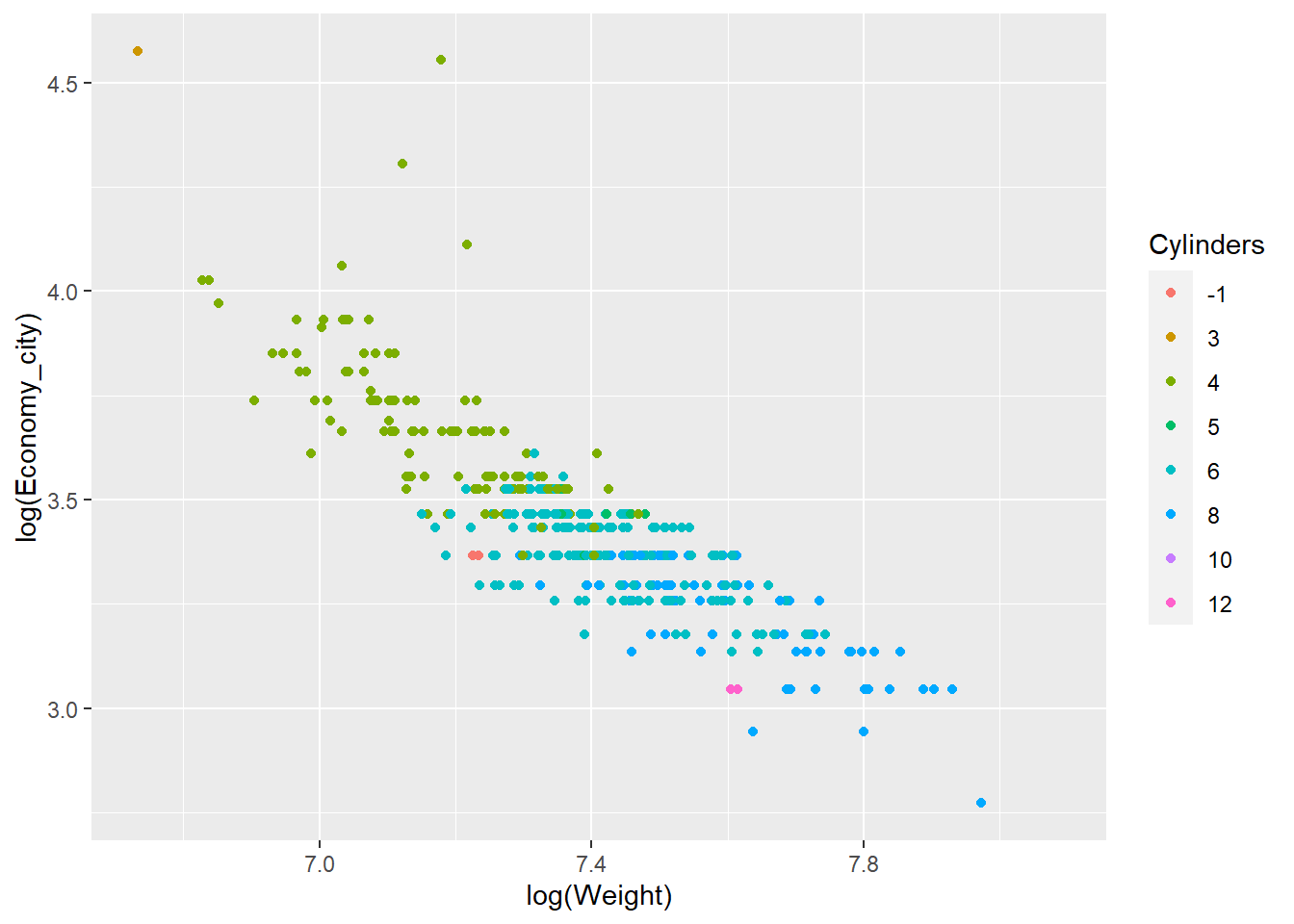
You can see how we can assign the colour aesthetic to the Cylinder factor. Helpfully, ggplot2 automatically creates a nice legend.
We can also use shape…
qplot(x = log(Weight),y = log(Economy_city), data = Cars,
      geom = "point",shape = Cylinders)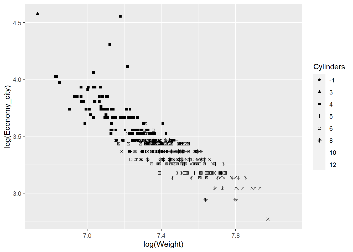
However, the colour aesthetic works better than shapes with so many categories.
We can also add trend lines using very simple code. For example, let’s fit a linear regression line:
qplot(x = log(Weight),y = log(Economy_city), data = Cars,
      geom = "point") +
  stat_smooth(method="lm")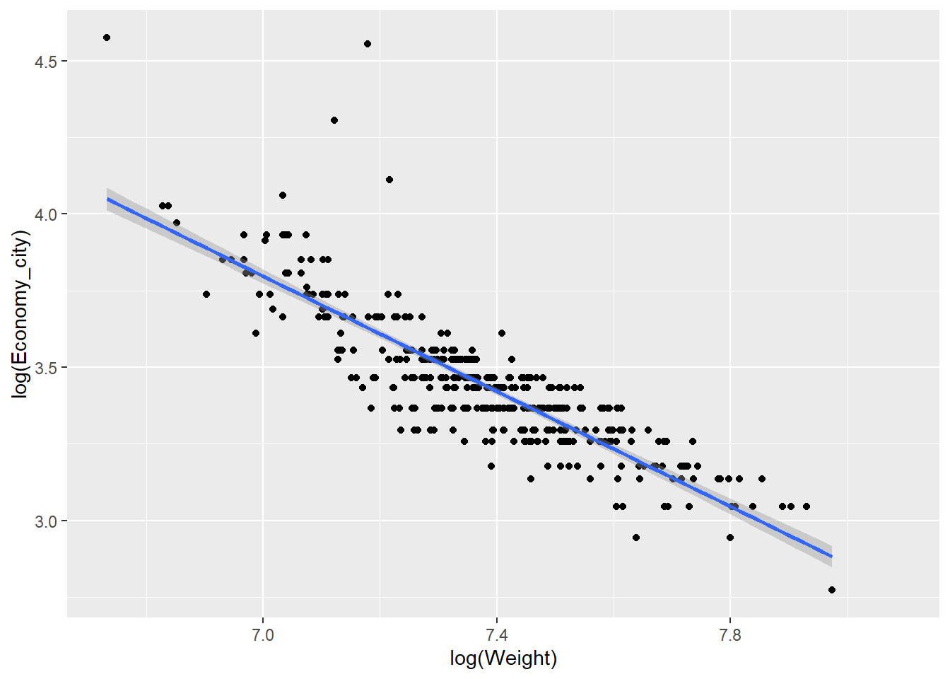
Or perhaps a non-parametric smoother…
qplot(x = log(Weight),y = log(Economy_city), data = Cars,geom = "point") +
  stat_smooth()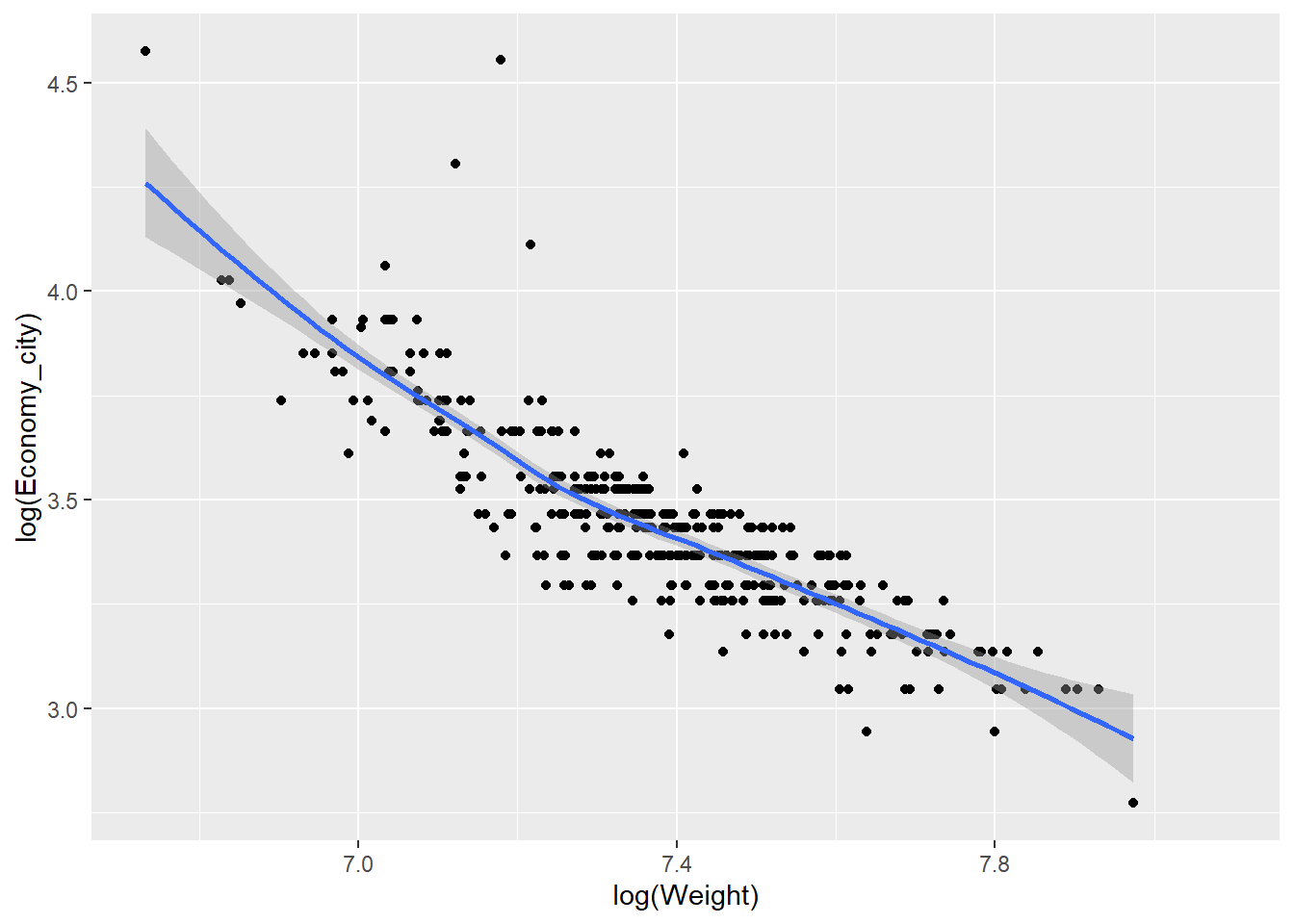
Now let’s get a quick taste of the raw power of ggplot2. Suppose we want to compare the relationship between a car’s power (measured using kilowatts) and its retail price. However, we want to look at this relationship based on the number of cylinders in a car. We will filter the data to only consider 4, 6 and 8 cylinder cars to ensure we have sufficient data.
library(dplyr) # Install and load this package to filter data

Cars_filter <- Cars %>% filter(Cylinders %in% c("4","6","8"))

qplot(x = Kilowatts,y = Retail_price, data = Cars_filter,
      geom = "point",colour = Cylinders) +
  stat_smooth()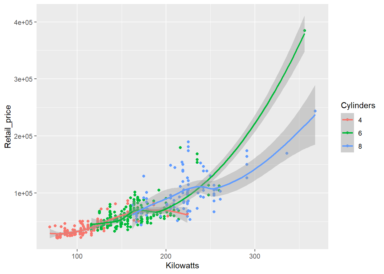
Pretty simple code for a sophisticated visualisation. However, the scatter plot is a little crowded as the relationships overlap. We can use the facet function to subset the data and display the relationship as small multiples.
qplot(x = Kilowatts,y = Retail_price, data = Cars_filter,
      geom = "point", facets = Cylinders ~.) +
  stat_smooth()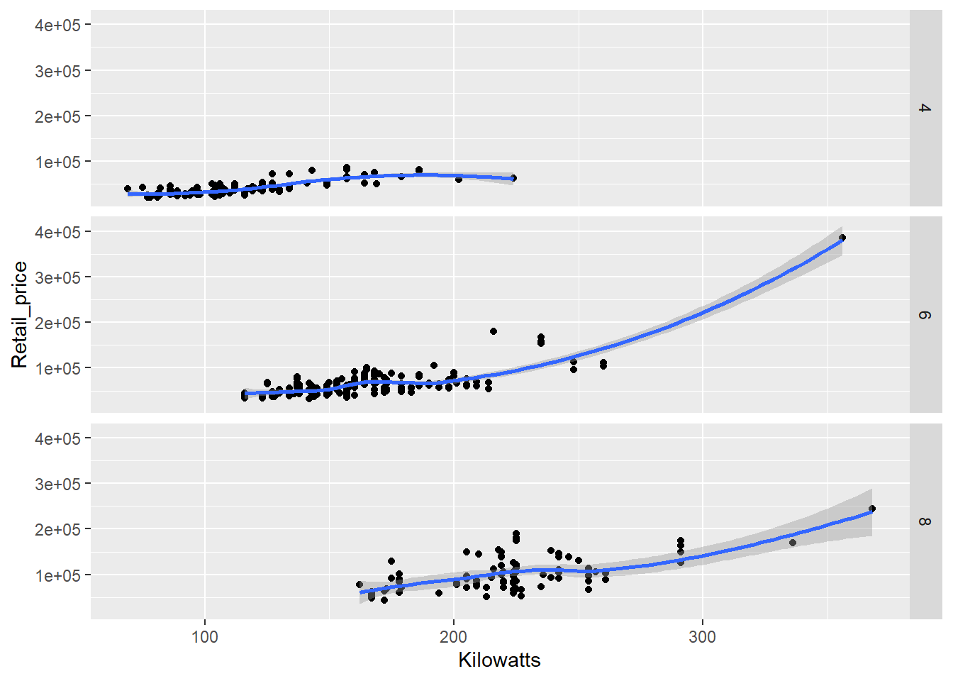
Faceting can come in very handy when exploring multidimensional datasets. Note how we specified the facets using a formula, Cylinders ~.. The left-hand side of the tilde symbol refers to rows and the right hand side to columns. The . signifies that no facets will appear on that dimension. In other words, split Cylinders across rows. If we wanted to move to columns, we would use .~Cylinders or just ~Cylinders. We could also just specify this as a vector, facets = "Cylinders", but we lose the ability to choose rows or columns.
There are many qplots() available. Try the following for fun:
qplot(x = Economy_city,data = Cars,geom = "histogram")
qplot(x = Economy_city,data = Cars,geom = "density")
qplot(x = Economy_city,data = Cars,geom = "dotplot")
qplot(x = Cylinders, y = Economy_city,data = Cars,geom = "violin")
Hopefully by now you’re starting to get a sense of the power behind ggplot2 and we have only just begun to scratch the surface. qplot() is a great function for getting started, but to really use the true power of ggplot2 we need to learn how to use the ggplot() function. This will allow us to build a visualisation, layer-by-layer, with almost unlimited customisation.
5.9 ggplot - A Layered Approach
ggplot() has a number of advantages over qplot() including the following:
- Provides access to a wider range of plots
- Allows multiple sources of data to be combined
- Allows almost unlimited customisation
The only drawback is the added code that you must use for ggplot() to function. It’s not as quick as qplot(). We will learn many features of ggplot() throughout the course, but for now, we will stick to a few examples.
Let’s first create a box plot of city economy for 4, 6 and 8 cylinder cars, but instead of only having the data summarised as quartiles, we will also overlay the data points. Additionally, we will add some points to show the means. This is not a trivial visualisation, but ggplot() will help us build the visualisation, layer by layer. First, we ensure we filter the data (you will need the dplyr package installed and loaded).
Cars_filter <- Cars %>% filter(Cylinders %in% c("4","6","8"))Next, we assign a ggplot() object named p using the following code:
p <- ggplot(data = Cars_filter, aes(x = Cylinders, y = Economy_city))Now, we can add layers to p. For example, a box plot:
p + geom_boxplot()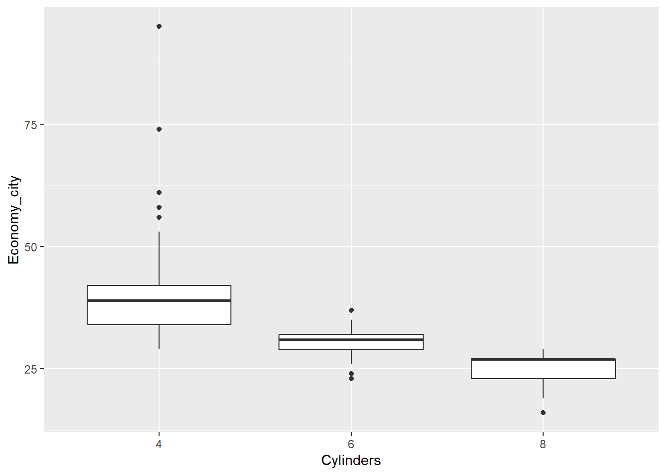
Now let’s add the data points over the top of the box plots. However, we need to avoid the points from overlapping. We can prevent this by adding some random noise and spreading the data within each category outwards across the horizontal axis. This is known as “jittering”. We have to also add outlier.shape = NA to prevent the box plot from plotting outliers, which are already plotted by geom_point.
p <- ggplot(data = Cars_filter,aes(x = Cylinders, y = Economy_city))
p + geom_boxplot(outlier.shape = NA) + geom_jitter()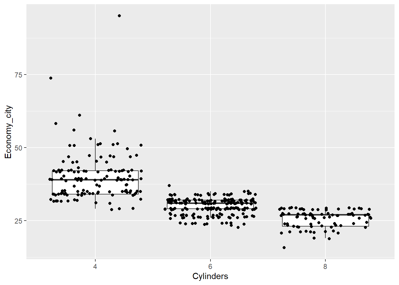
Now the data points are obscuring the box plots. We can add some transparency to the dots, using the alpha parameter, to prevent this.
p <- ggplot(data = Cars_filter,aes(x = Cylinders, y = Economy_city))
p + geom_boxplot(outlier.shape = NA) + geom_jitter(alpha = 1/5)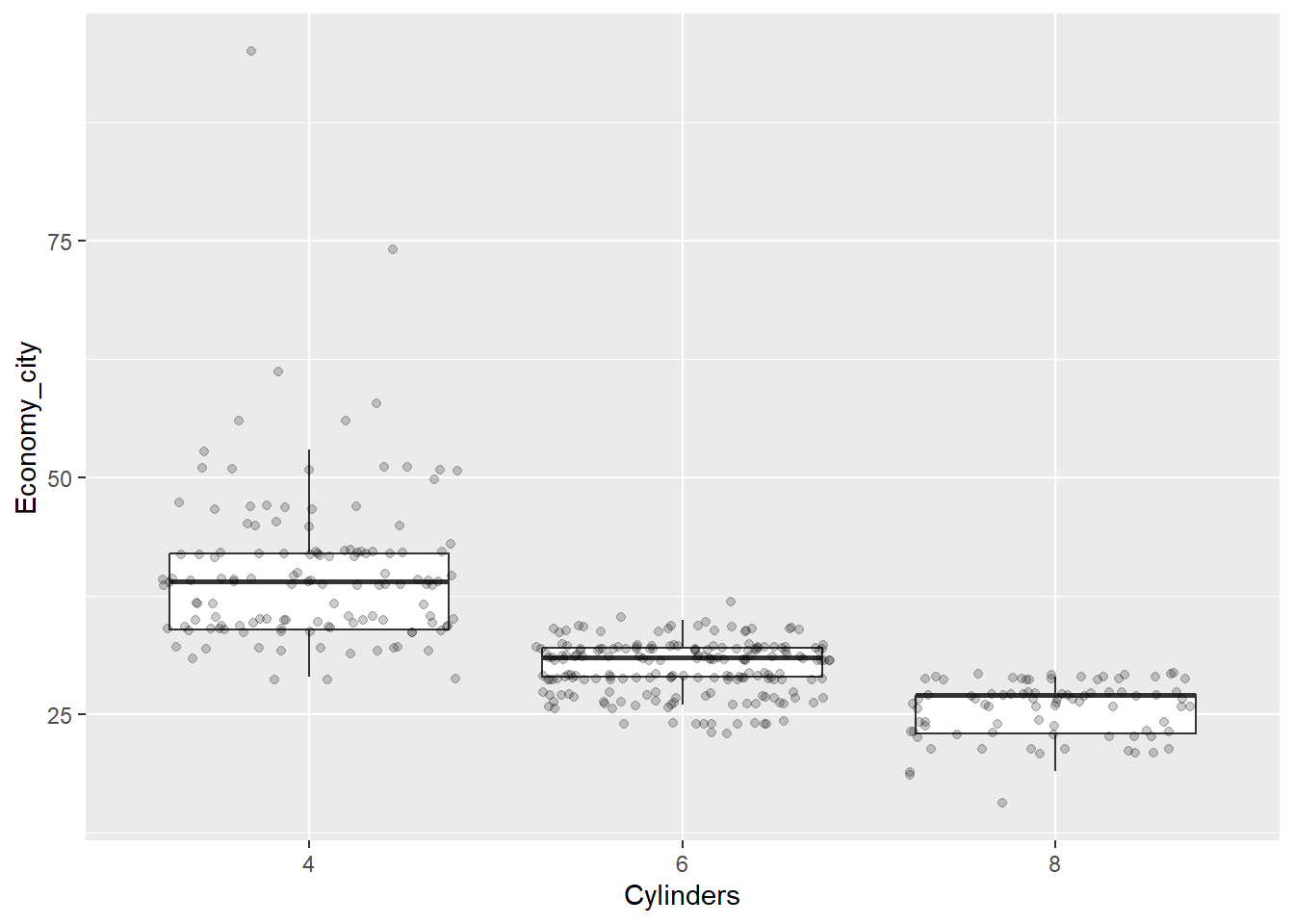
Nice. Now we can see the relationship between the data and the box plot summary of the quartiles. We should also clean up the y axis label and add a title.
p <- ggplot(data = Cars_filter,aes(x = Cylinders, y = Economy_city))
p + geom_boxplot(outlier.shape = NA) + geom_jitter(alpha = 1/5) +
  ylab("City Fuel Economy (km/L)") +
  ggtitle("Smaller engines have better city fuel economy")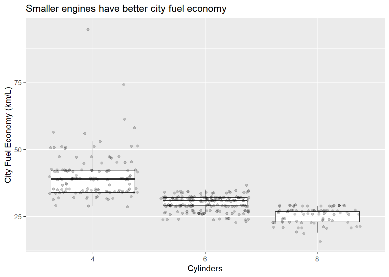
Next, let’s add the means.
p <- ggplot(data = Cars_filter,aes(x = Cylinders, y = Economy_city))
p + geom_boxplot(outlier.shape = NA) + geom_jitter(alpha = 1/5) +
  ylab("City Fuel Economy (km/L)") +
  ggtitle("Smaller engines have better city fuel economy") +
  stat_summary(fun.y=mean, colour="red", geom="point",shape = 17)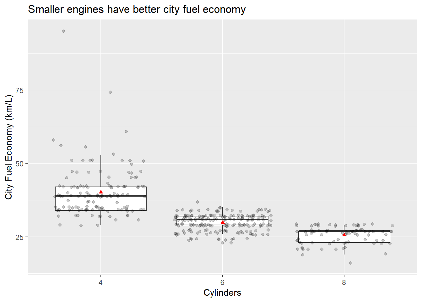
You can also play around with the themes and general appearance. You can change essentially anything if you know how. Let’s change the theme to black and white.
p <- ggplot(data = Cars_filter,aes(x = Cylinders, y = Economy_city))
p + geom_boxplot(outlier.shape = NA) + geom_jitter(alpha = 1/5) +
  ylab("City Fuel Economy (km/L)") +
  ggtitle("Smaller engines have better city fuel economy") +
  stat_summary(fun.y=mean, colour="red", geom="point",shape = 17) +
  theme_bw()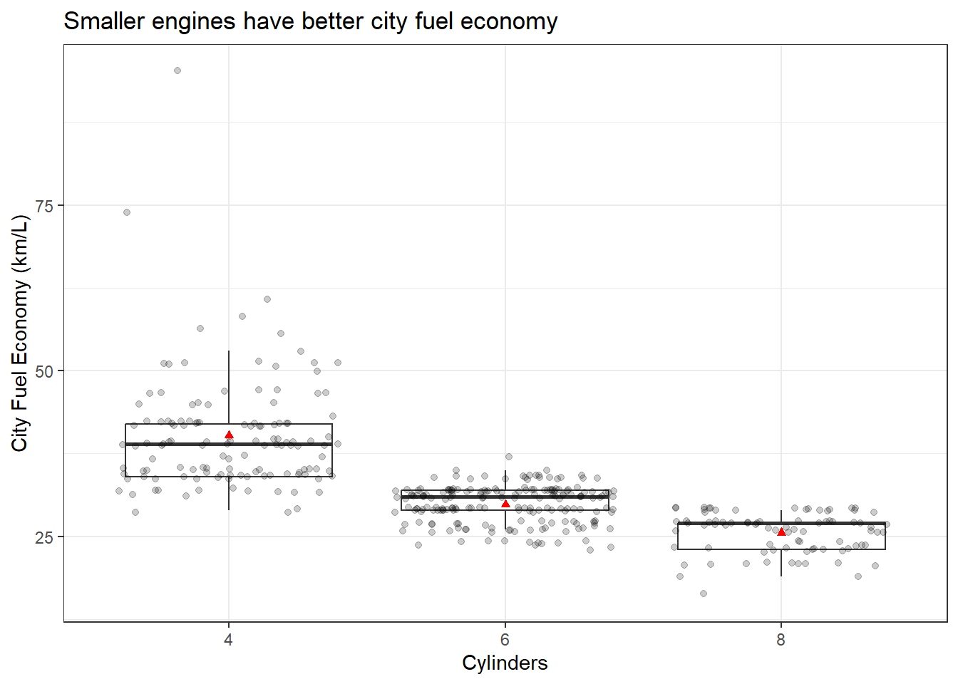
Or minimal…
p <- ggplot(data = Cars_filter,aes(x = Cylinders, y = Economy_city))
p + geom_boxplot(outlier.shape = NA) + geom_jitter(alpha = 1/5) +
  ylab("City Fuel Economy (km/L)") +
  ggtitle("Smaller engines have better city fuel economy") +
  stat_summary(fun.y=mean, colour="red", geom="point",shape = 17) +
  theme_minimal()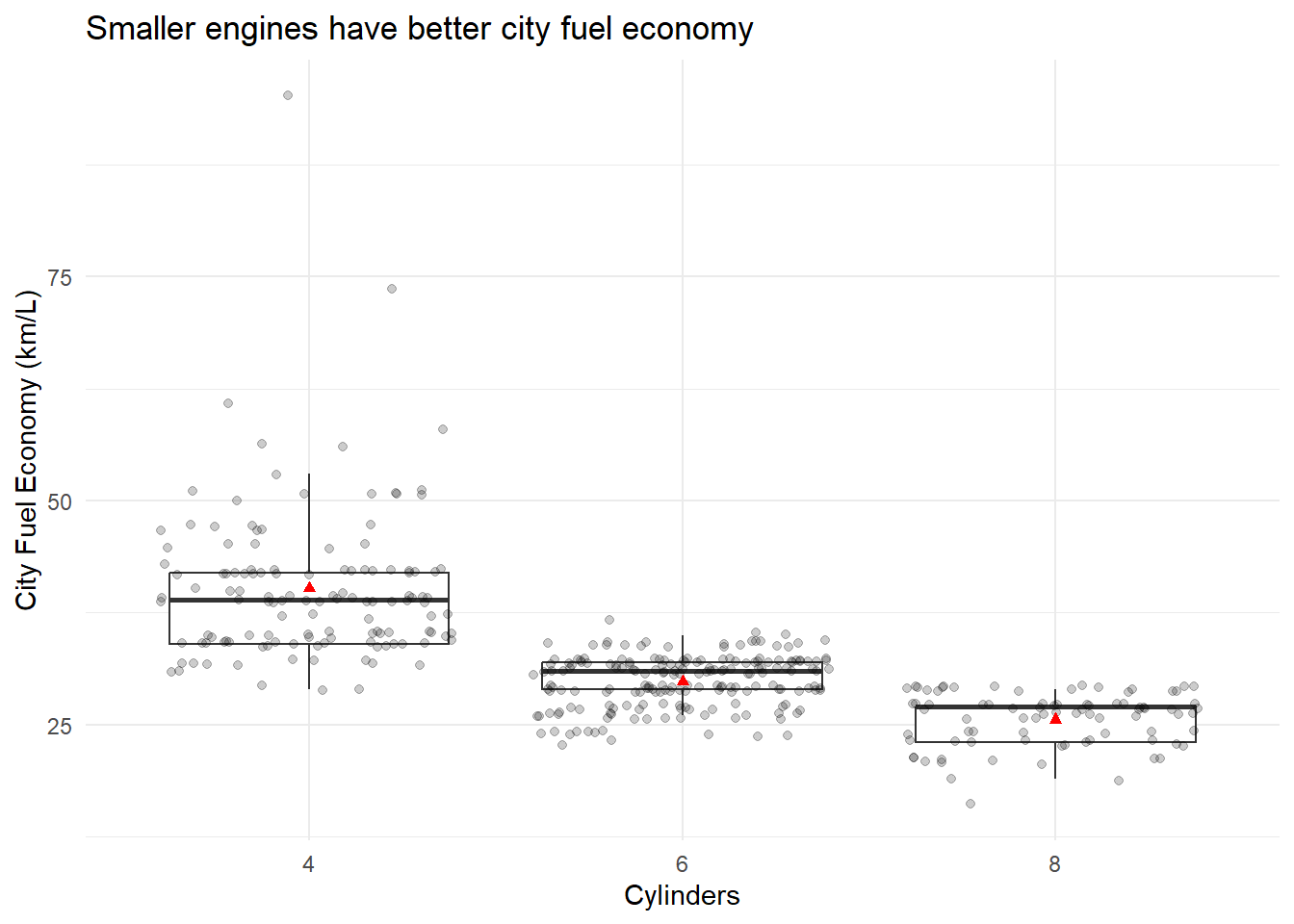
With only a simple line of code, themes can be used to manage the overall appearance of your plots and keep the appearance consistent across multiple plots. You can also create your own themes if you dare. You can read more here.
We will look at one more example that highlights the use of ggplot(). We will create a series of scatter plots that explore the relationship between kilowatts (power) and fuel economy. We will do so across cars with 4, 6 and 8 cylinders. We will also add a linear regression line to the groups to get a sense of how the relationship changes. We start with a sample scatter plot and colour the points based on cylinder number.
p <- ggplot(data = Cars_filter,
            aes(x = log(Kilowatts),
                y = log(Economy_city),
                colour = Cylinders))
p + geom_point()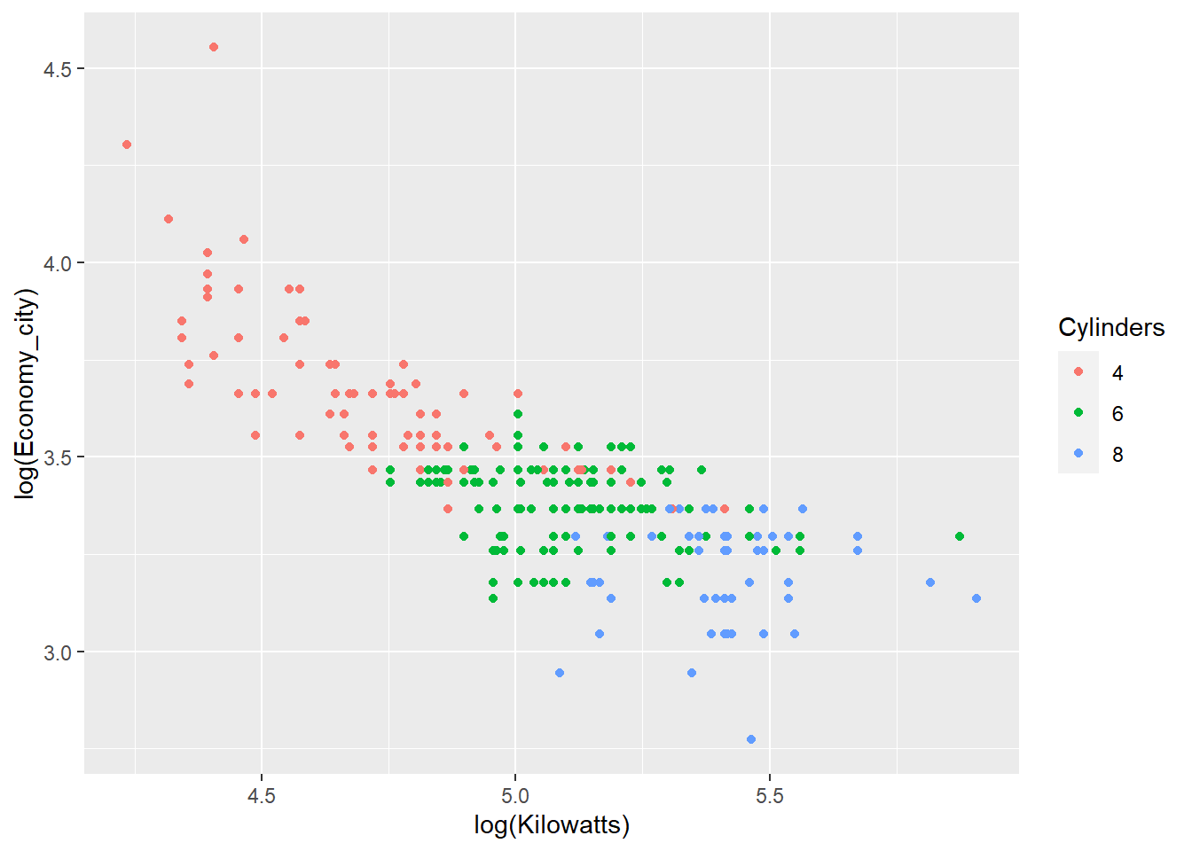
We can facet the groups to avoid overlapping and to focus on the trend within each group.
p <- ggplot(data = Cars_filter,
            aes(x = log(Kilowatts),
                y = log(Economy_city),
                colour = Cylinders))
p + geom_point() + facet_grid(~ Cylinders)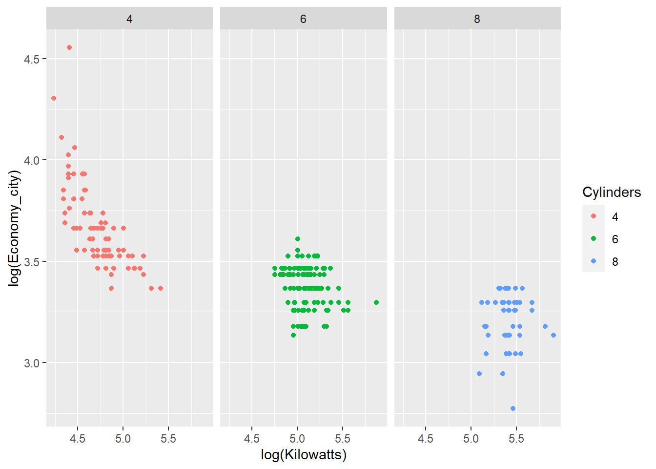
Now we add the trend lines based on linear regression.
p <- ggplot(data = Cars_filter,
            aes(x = log(Kilowatts),
                y = log(Economy_city),
                colour = Cylinders))
p + geom_point() + facet_grid(~ Cylinders) + geom_smooth(method = "lm")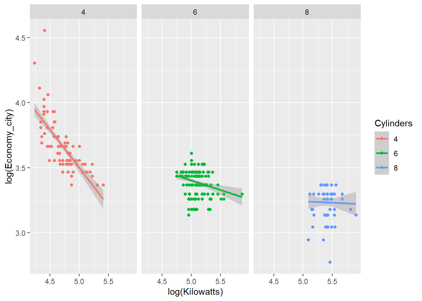
The relationship between engine power and fuel economy weakens as the number of car cylinders increase.
In the following section we will look back at Chapter 3 Colour and go through the basics of using colour in ggplot2. The following examples will be based on the Diamonds dataset.
5.10 Diamonds Data
The Diamonds dataset includes the prices and other attributes of almost 54,000 diamonds. The variables are as follows:
- price. price in US dollars ($326 - $18,823)
- carat. weight of the diamond (0.2 - 5.01)
- cut. quality of the cut (Fair, Good, Very Good, Premium, Ideal)
- color. diamond colour, from J (worst) to D (best)
- clarity. a measurement of how clear the diamond is (I1 (worst), SI2, SI1, VS2, VS1, VVS2, VVS1, IF (best))
- x. length in mm (0–10.74)
- y. width in mm (0–58.9)
- z. depth in mm (0–31.8)
- depth. total depth percentage = z / mean(x, y) = 2 * z / (x + y) (43–79)
- table. width of top of diamond relative to widest point (43–95)
To correctly define your factors, use the following code:
Diamonds$cut<- factor(Diamonds$cut,
                      levels=c('Fair','Good','Very Good','Premium','Ideal'),
                      ordered=TRUE)

Diamonds$color<- factor(Diamonds$color,
                        levels=c('J','I','H','G','F','E','D'),
                        ordered=TRUE)

Diamonds$clarity<- factor(Diamonds$clarity,
                          levels=c('I1','SI2','SI1','VS2','VS1','VVS2','VVS1','IF'),
                          ordered=TRUE)
Now, before we move on, keep in mind that ggplot2’s default colour schemes are based on good colour design principles. Do not be tempted to change them without good justification and always ensure your changes adhere to good colour use principles. We will learn more about selecting colours in later sections. For now, we will explore how to assign colours in R and ggplot2.
5.11 Basic Colour in R and ggplot2
Let’s start with a histogram of diamond carat.
p1 <- ggplot(data = Diamonds, aes(carat))
p1 + geom_histogram()
This results in dark gray bars on a light gray background. We might decide that this is a little bland and the bins are a bit difficult to visualise. Let’s add some colour.
p1 + geom_histogram(colour = "#FFFFFF")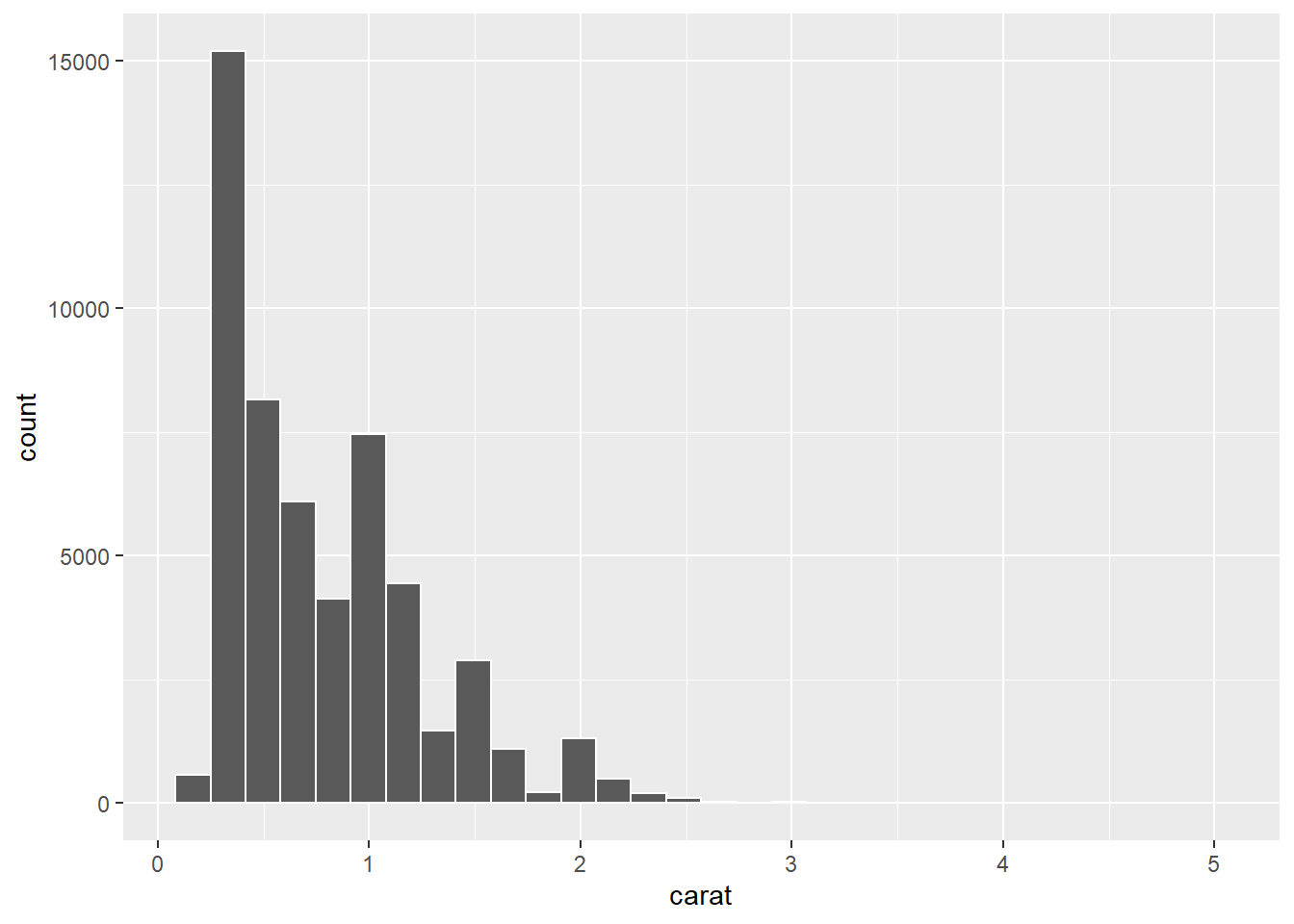
Ok, this only changed the bars’ outline. It provides a nice contrast so that the bars, which represent the data bins, are more visible. Now, let’s change the fill.
p1 + geom_histogram(colour = "#FFFFFF", fill = "#FF0000")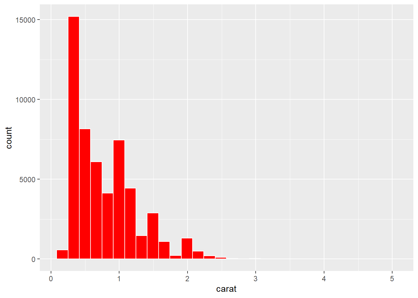
Ouch. That’s very saturated and bright. We should always avoid strong colour when we can. Saturated and bright colours can strain our eyes and even create after images. We can fix this by reducing the saturation:
p1 + geom_histogram(colour = "#FFFFFF", fill = "#FFAAAA")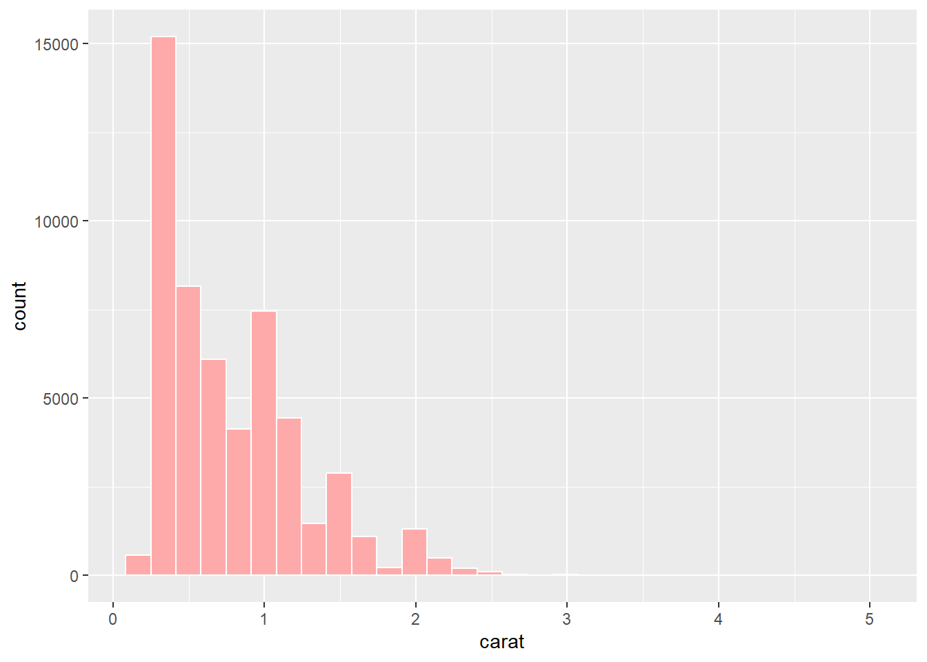
If we have overlapping elements, we can use the alpha option to introduce transparency. For example, if we wanted an overlaid density plot of diamond carat by cut, we can make the density plots semi-transparent to help visualise each cuts’ distribution.
p2 <- ggplot(data = Diamonds, aes(carat,fill = cut))
p2 + geom_density(alpha = .2)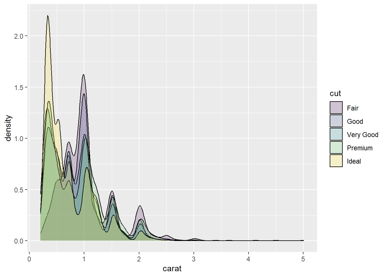
However, be wary of overlapping this many categories. As you can see, it’s a little difficult to distinguish each category.
5.11.1 R Colour Names
R also includes a list of 657 different colour names. (Don’t worry as you won’t need to memorise them!). A list of all the colour names taken from SAPE (2019) is shown in Figure 5.7.
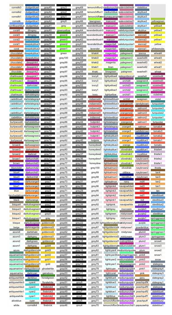
Figure 5.7: R colour names (SAPE 2019).
This allows you to specify colours using intuitive names instead of a hex code:
p1 + geom_histogram(colour = "white",fill = "darkolivegreen3")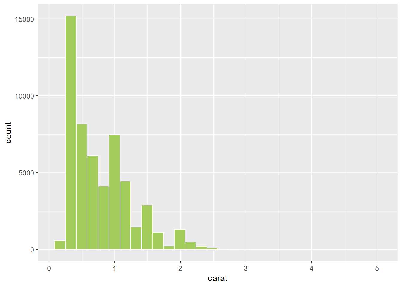
Colour names are quick (you can easily remember your favourites!), but obviously lack fine tune control.
5.11.2 colourpicker
The colourpicker package provides ggplot2 with a very useful interface for colour picking and exploration.
First, install the package.
install.packages("colourpicker")Now, load the package.
library(colourpicker)To use colourpicker, the best way is to use the plotHelper() function. Put the code required to produce the plot into the function and ensure CPCOLS is included as an option for the values of the colour scale you wish to customise. p2, from our earlier code, used the fill colour aesthetic. Therefore, we map CPCOLS to scale_fill_manual:
plotHelper(p2 + geom_density(alpha = .2) +
             scale_fill_manual(values = CPCOLS))
Highlight the code and then select Plot Colour Helper in the Addins drop-down menu in RStudio (see Figure 5.8).
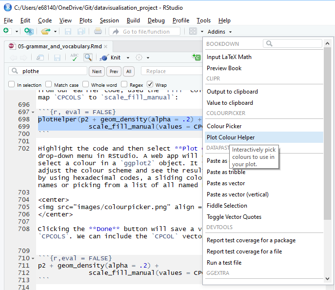
Figure 5.8: Accessing the plot colour helper in RStudio.
A web app will open that will allow you to select a colour in a ggplot2 object (see Figure 5.9). It then allows you to manually adjust the colour scheme and see the resulting plot. You can pick colours by using hexadecimal codes, a sliding colour picker, searching R colour names or picking from a list of all named R colours.
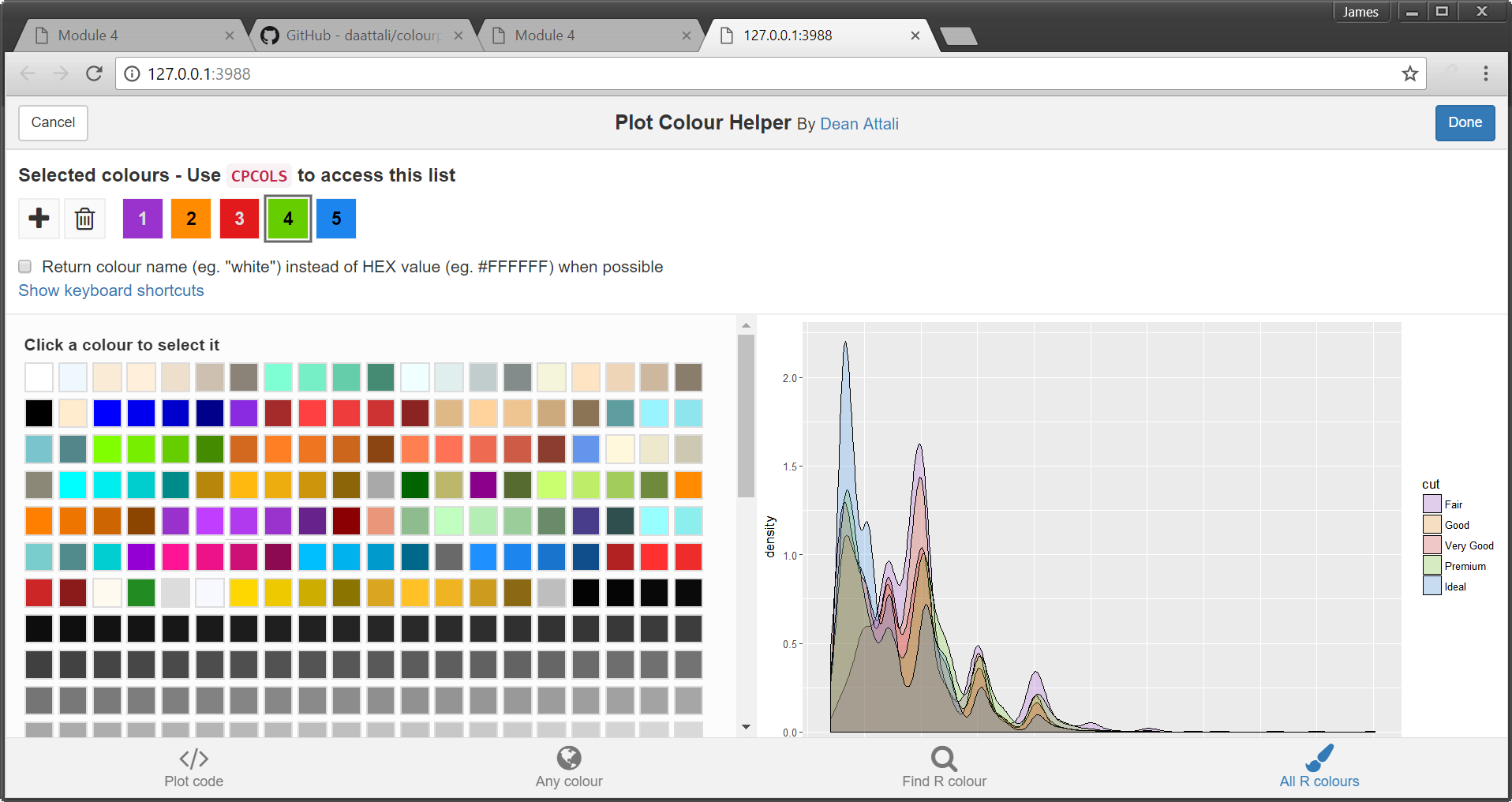
Figure 5.9: Plot colour helper window.
Clicking the Done button will save a vector of colour codes back to CPCOLS. We can include the CPCOLS vector to define our custom colours.
p2 + geom_density(alpha = .2) +
             scale_fill_manual(values = CPCOLS)
p2 + geom_density(alpha = .2) +
scale_fill_manual(
values = c("#9A32CD","#FF8C00","#e31a1c","#66CD00","#1C86EE"))
A vector of the colour codes will also be reported. You can save these codes into a vector. This is helpful if you want to use the same colours across multiple sessions of R or share your colour scheme with others.
p2 + geom_density(alpha = .2) +
             scale_fill_manual(
values = c("#9A32CD","#FF8C00","#e31a1c","#66CD00","#1C86EE"))5.11.3 Colour Scales in ggplot2
Colour scales are a powerful way to map a variable to different aesthetics. ggplot2 does this seamlessly as you are about to see in the following examples. Refer back to Chapter 3 Colour Scales and Data Types to review common colour scales for different data types. Note that ggplot2 refers to qualitative colour scales as a discrete scale. This means that ggplot2 will use discrete colours to map to an aesthetic, not a discrete variable. Complicated semantics, I know, but you will get used to it.
5.11.3.1 Discrete Colour Scales
Let’s take a look at some examples of mapping colour scales to the aesthetics of a plot. First we will look at the qualitative scales - referred to as discrete scales in ggplot2. The Diamonds data set contains three qualitative ordinal variables - cut, colour and clarity. We will map ggplot2’s discrete colour scales to this variable. We will create a visualisation showing the relationship between a diamond’s price, colour and cut. We can use side-by-side clustered box plots for this purpose. There are two ways to map a variable to a colour aesthetic. We can use colour or fill (ggplot2 accepts both English and United States spelling of colour or color, respectively). If we assign a variable to the colour aesthetic, ggplot2 will assign different colours to the outline of a geom. This is great for lines and points. However, for box plots, the colour of the fill within each box will be more prominent. That’s why we will use thefill option to assign colour to the plot.
p3 <- ggplot(data = Diamonds, aes(x = color,y = price,fill=cut))
p3 + geom_boxplot()
ggplot2 will use its default colour palette to optimise group comparison using a complementary colour scheme. As you can see, mapping a diamond’s cut to fill the aesthetic allows comparison within and between colour. The default discrete colour palette used by ggplot2 is purely qualitative. Different hues are used to represent the different levels of the cut factor.
5.11.3.2 ColorBrewer
Cut is more precisely an ordinal variable as there is a clear ordering of the cut quality, ranging from fair to ideal. Therefore, it is more accurate to have the fill reflect an ordinal or sequential colour scale. We can make use of the ColorBrewer scales (Harrower and Brewer (2003); http://colorbrewer2.org/) described previously in Chapter 3. ggplot2 has a built in ColorBrewer option.
p3 + geom_boxplot() + scale_fill_brewer()
The sequential change in blue provides a better representation of the ordinal nature of the cut factor. We can select a different ColorBrewer scheme based on the following options shown in Figure 5.10.
Figure 5.10: R colour Brewer options.
For example, we might want to use a green hue:
p3 + geom_boxplot() + scale_fill_brewer(palette = "Greens")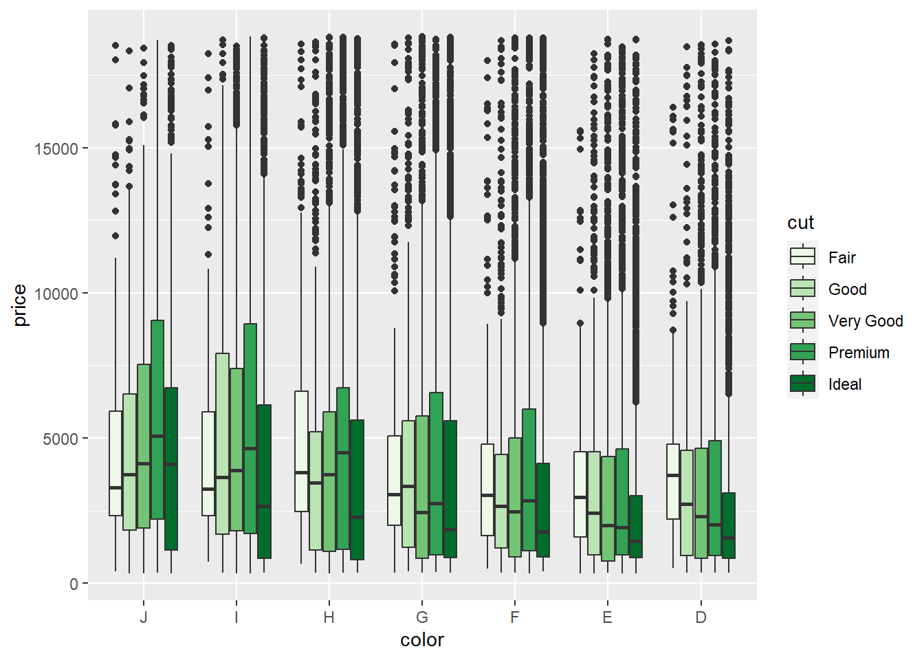
To assign a manual ColorBrewer scheme from the webtool, we can use the scale_fill_manual() option. First we select the colour scheme. I have gone for a colour-blind and print friendly scheme (see Figure 5.11). Click on the export tab and you can copy the hex codes as a single line of code.
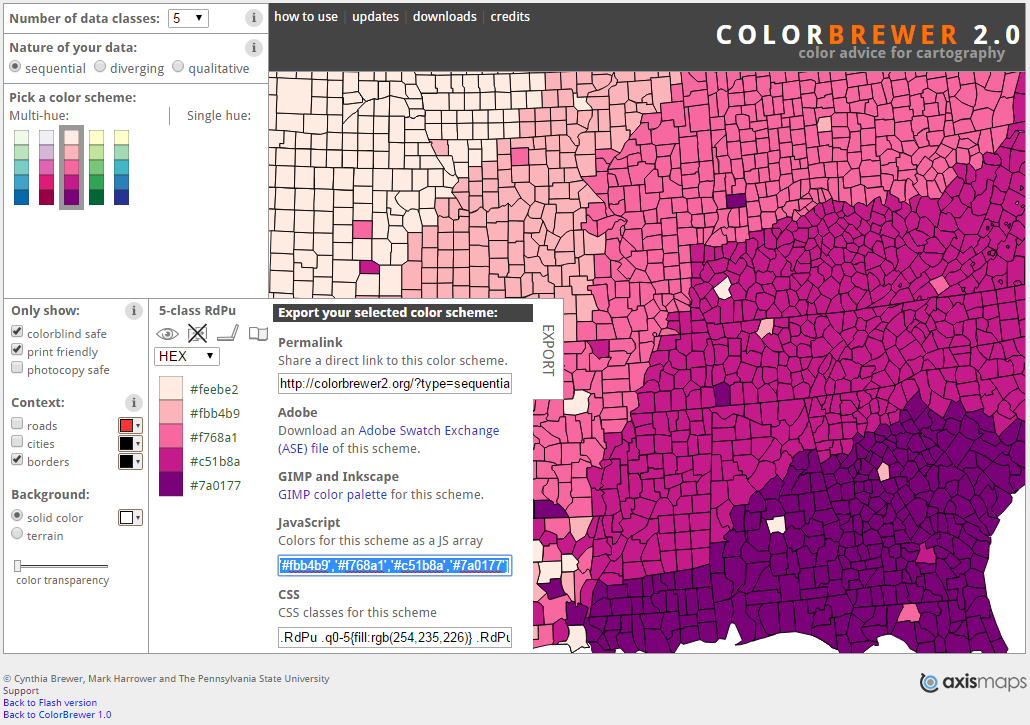
Figure 5.11: A colour-blind and print friendly colour scheme selected from Brewer and Harrower (2019).
With a quick edit, we can define a manual ColorBrewer scheme as a vector of values. (Note that this is equivalent to scale_fill_brewer(palette = "PuRd"):
p3 + geom_boxplot() + scale_fill_manual(values =c('#feebe2','#fbb4b9','#f768a1','#c51b8a','#7a0177'))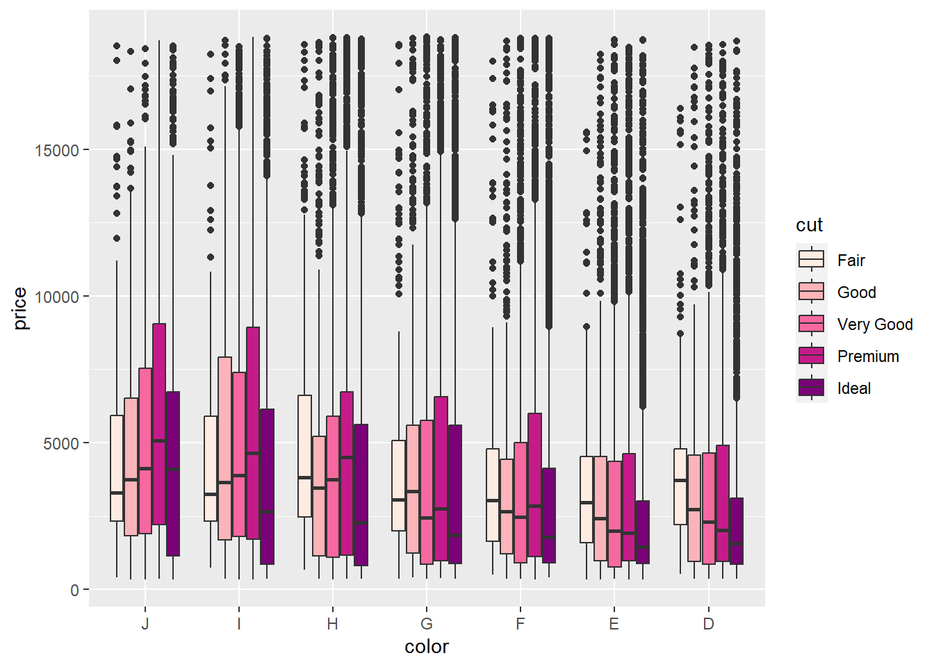
5.11.3.3 Continuous Colour Scales
Now let’s turn our attention to the continuous colour scales in ggplot2. We will re-use the Cars dataset. We will create a scatter plot representing three variables. On the x-axis, we will look at a car’s weight and on the y-axis, its city economy. We will also map a car’s price to a colour aesthetic.
p4 <- ggplot(data = Cars, aes(x = Kilowatts, y = Retail_price, colour = Economy_highway))
p4 + geom_point()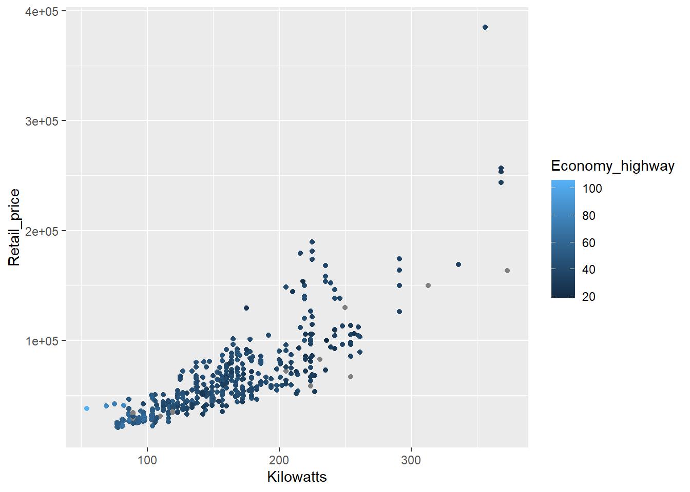
The colour is poorly scaled. It’s really difficult to detect the changes in colour. We can try a diverging scheme instead.
p4 + geom_point() + scale_colour_gradient(low="blue",high="red")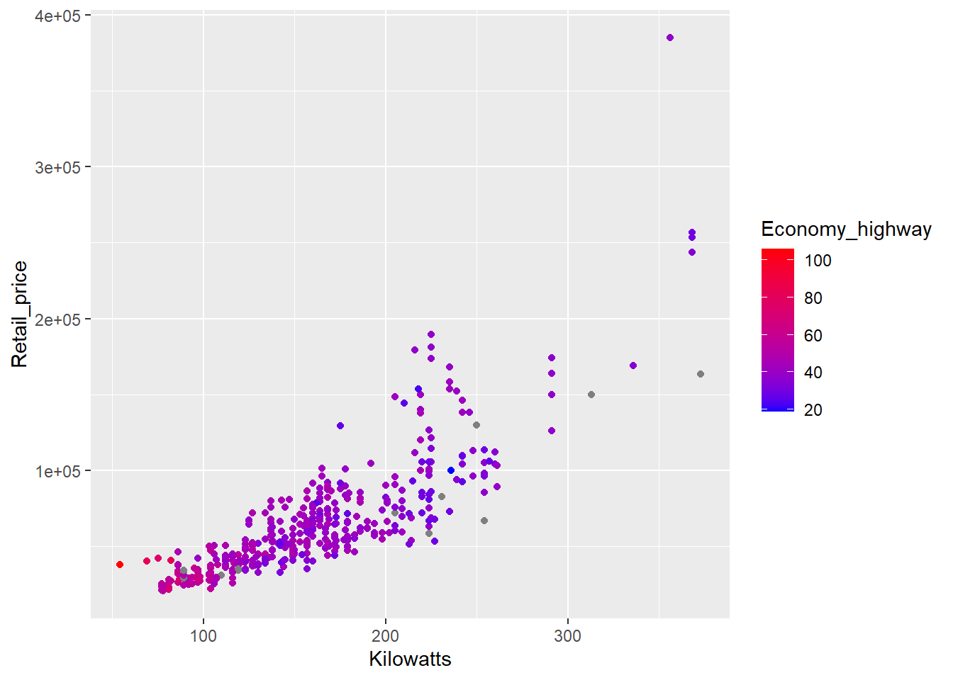
That’s better. Now we can see a trend. Power (kilowatts) and prices tend to increase together, but at the cost of reduced fuel efficiency. You might also note the grey points. These points are grey because they are missing highway fuel economy data. You can specify a missing colour using the na.value option.
p4 + geom_point() + scale_colour_gradient(low="blue",high="red", na.value = "green")
Green is not a good choice (colour blind people have trouble distinguishing between red and green), but the example demonstrates how the colour assigned to missing values can be modified.
ggplot2 provides a number of useful default continuous scales that can be assigned using scale_colour_gradientn(). Try these out:
p4 + geom_point() + scale_color_gradientn(colours = terrain.colors(6))
p4 + geom_point() + scale_color_gradientn(colours = rainbow(6))
p4 + geom_point() + scale_color_gradientn(colours = heat.colors(6))
p4 + geom_point() + scale_color_gradientn(colours = topo.colors(6))
p4 + geom_point() + scale_color_gradientn(colours = cm.colors(6))
p4 + geom_point() + scale_color_gradientn(colours = c('#feebe2','#fcc5c0','#fa9fb5',
                                                      '#f768a1','#c51b8a','#7a0177'))
Note, you can change the “sensitivity” of the gradient using the n option, e.g. terrain.colors(6) vs. terrain.colors(9). The higher n, the greater the range of colours displayed, i.e. increased sensitivity.
5.11.4 colourblindr
The colorblindr package is useful for testing a colour scheme for common forms of colour blindness. colorblindr takes your visualisation and provides a simulated output for common forms of color blindness. Let’s take a look at an example.
First, install the colorblindr package. This package depends on the development versions of colorspace and cowplot. Ensure these packages are installed first. To install the development versions of these packages you must use the devtools package.
First, install devtools, load it and then use the install_github function to load the following dev versions:
install.packages("devtools")

library(devtools)

devtools::install_github("wilkelab/cowplot")

install.packages("colorspace", repos = "http://R-Forge.R-project.org")

devtools::install_github("clauswilke/colorblindr")
Then load the colorblindr package:
library(colorblindr)First, we build a visualisation to test.
p5 <- ggplot(Diamonds, aes(x = log(price), fill = cut))
p5 <- p5 + geom_density(alpha = .5)
p5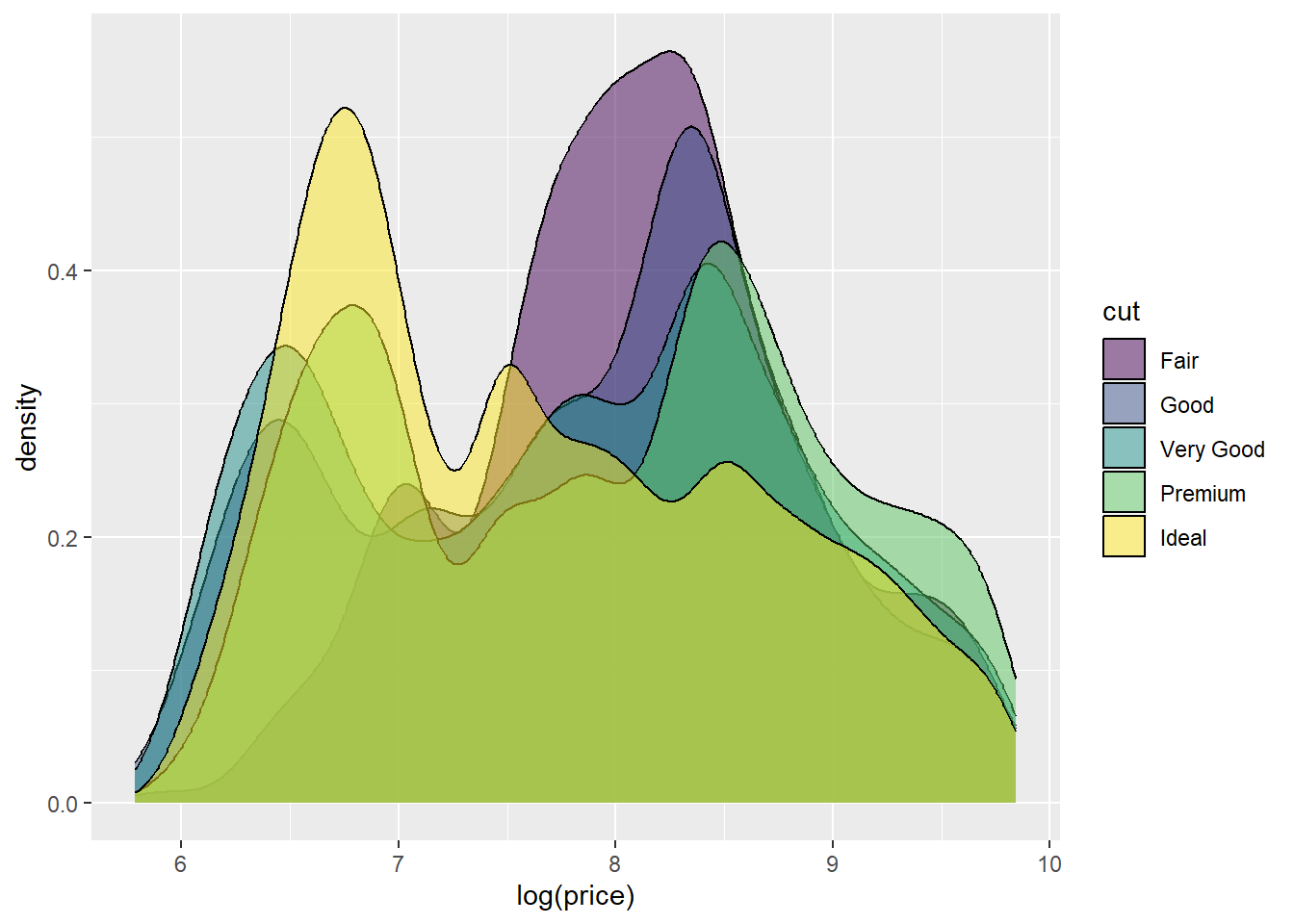
Now let’s simulate common forms of colour blindness.
cvd_grid(p5)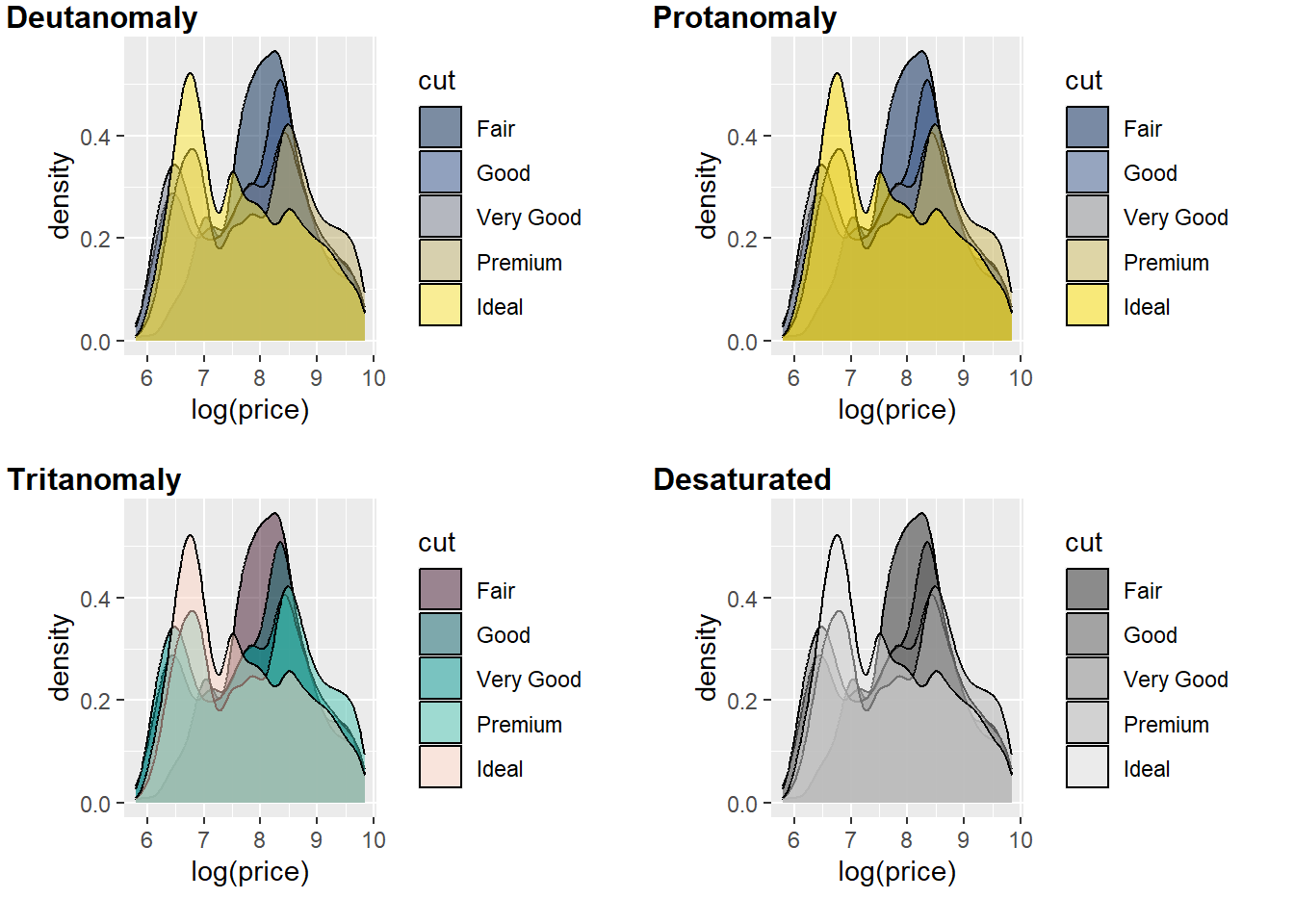
You can quickly see the issue with red (cut = fair) and green (cut = very good) for Deutanomaly.
5.12 Visualising One and Two Variables
In the remainder of this chapter we will shift our focus to a vocabulary for data visualisation. Vocabulary can be defined as “a body of words used in a particular language” according to the Oxford Dictionary. Like language, data visualisation has a body of common data visualisation methods from which all other methods stem from. You must be familiar with this vocabulary because it forms a foundation that allows you to deploy a range of methods that generalise to a wide range of contexts and variables. You will start with the most simple cases of visualising one and two variables, both qualitative and quantitative. As you will discover, there is much more to simple data visualisations than you would think. The following sections will discuss the advantages and disadvantages of common approaches, the related statistical methods that can be used to analyse trends in the data, and provide detailed code for creating these visualisations using ggplot2 and other R packages. The vocabulary presented is not exhaustive. There are many other approaches, or variations thereof, that can be used to visualise your data. These sections will focus on the most useful and accurate methods. You will also continue to practice ggplot2 and dig deeper into its capabilities.
5.13 Qualitative Data
For the qualitative section of this chapter, we will make use of the MSNBC.com web dataset available from the UCI Machine Learning Repository. You can download a copy here. This dataset contains the sequence of page view categories for over 1 million unique visitors to the MSNBC.com website logged on the 28th of September, 1999. The categories, or different landing pages, included: “frontpage”, “news”, “tech”, “local”, “opinion”, “on-air”, “misc”, “weather”, “health”, “living”, “business”, “sports”, “summary”, “bbs” (bulletin board service), “travel”, “msn-news”, and “msn-sports”. The dataset may be old, but the application of web analytics is still very relevant. For example, MSNBC might want to understand how visitors are landing on their site. Are they accessing the front page, or are they using more direct links to specific content areas? A data visualisation can help answer this question very quickly and can aid MSNBC.com in understanding their website traffic. Load the msnbc.csv data into your R session and name the object msnbc.
5.14 Qualitative Univariate Visualisations
5.14.1 Bar Charts
Bar charts are a ubiquitous data visualisation for qualitative (nominal and ordinal) data. They use length and position to exploit our visual perception system’s ability to rapidly compare different groups and categories in terms of counts/tallies, proportions and percentages, or, in other words, parts of a whole. Bar charts are a natural choice for comparing the traffic between different landing pages on the MSNBC.com website. However, before we do so, we need to a do a little bit of data wrangling in R. Bar charts are much easier to work with in ggplot2 when we summarise the data beforehand. Look at the following printout of a random sample of 100 visits from the msnbc.csv dataset.
Notice how each row represents a unique visitor and the landing pages visited. As you can see, each visitor can visit multiple landing pages. We will restrict our interest to the first page visited to get a general overview. Therefore, we are only interested in the First variable. To ensure we can use ggplot2 most effectively, we can summarise this data into a table using the awesome dplyr package. Here’s the code:
library(dplyr)
msnbc_sum <-msnbc %>% group_by(First) %>% summarise(count = n())
This code tells R to summarise the msnbc data object according to the First variable by counting the number of occurrences in the data, count = n(). The result is saved to an object called msnbc_sum.
And here is the result:
msnbc_sum## # A tibble: 17 × 2
## First count
## <chr> <int>
## 1 bbs 68605
## 2 business 17270
## 3 frontpage 306151
## 4 health 68897
## 5 living 18898
## 6 local 69999
## 7 misc 19143
## 8 msn-news 2598
## 9 msn-sports 2182
## 10 news 93067
## 11 on-air 173170
## 12 opinion 15225
## 13 sports 65471
## 14 summary 66798
## 15 tech 70973
## 16 travel 9477
## 17 weather 85828So, there were 68,605 people that landed first on the bbs page, 17,270 people that landed first on the business page etc…
This will make the data much quicker and easier to work with. To create our bar charts, we can refer to the summarised msnbc_sum data object. We can also transform the counts to percentages and proportions by adding variables to the data object:
msnbc_sum$Proportion <- msnbc_sum$count/nrow(msnbc)
msnbc_sum$Percent <- msnbc_sum$Proportion*100
Here is the result:
msnbc_sum## # A tibble: 17 × 4
## First count Proportion Percent
## <chr> <int> <dbl> <dbl>
## 1 bbs 68605 0.0595 5.95
## 2 business 17270 0.0150 1.50
## 3 frontpage 306151 0.265 26.5
## 4 health 68897 0.0597 5.97
## 5 living 18898 0.0164 1.64
## 6 local 69999 0.0607 6.07
## 7 misc 19143 0.0166 1.66
## 8 msn-news 2598 0.00225 0.225
## 9 msn-sports 2182 0.00189 0.189
## 10 news 93067 0.0807 8.07
## 11 on-air 173170 0.150 15.0
## 12 opinion 15225 0.0132 1.32
## 13 sports 65471 0.0567 5.67
## 14 summary 66798 0.0579 5.79
## 15 tech 70973 0.0615 6.15
## 16 travel 9477 0.00821 0.821
## 17 weather 85828 0.0744 7.44Now we are ready to construct our first bar chart.
p1 <- ggplot(msnbc_sum, aes(x = First, y = count))
p1 + geom_bar(stat = "identity")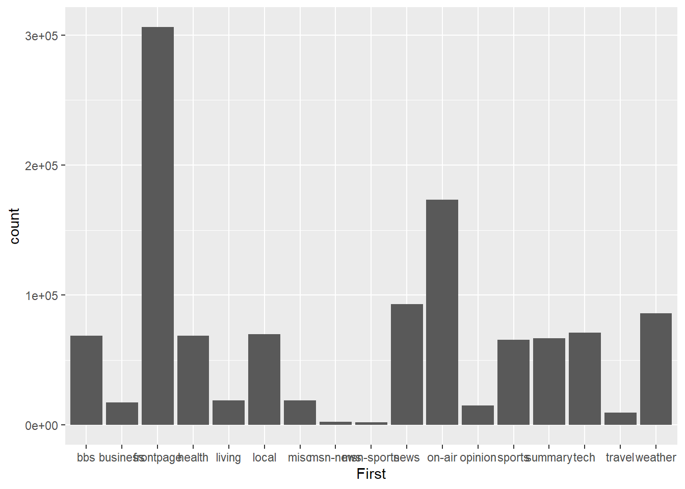
It’s a start, but it isn’t pretty. You should understand the stat = "identity" option we used in the code. This is a very powerful option that we need to use when we are dealing with already summarised data. ggplot2 has been built to automatically perform statistical transformation, e.g. calculate quartiles for box plots, bins for histograms and tallies for bar charts. When we supply a data object with already pre-summarised data (e.g. msnbc_sum) we need to tell ggplot2 to skip the default transformations and base the plot on the already computed statistics. That’s what we mean when we use stat = "identity".
With that out of the way, you will notice a few other issues. The categories are arranged based on alphabetical order, which makes it slow to rank the landing pages from highest to lowest. You also notice that the labels overlap on the x-axis. Let’s fix up the ordering. To achieve this, we need to change the properties of the First factor.
msnbc_sum$First <- msnbc_sum$First %>%
  factor(levels = msnbc_sum$First[order(-msnbc_sum$count)])
This code reorders the levels within the First factor based on the counts. We use the - sign in front of msnbc_sum$count to indicate descending order. To check the results, re-run the bar chart.
p1<-ggplot(msnbc_sum,aes(x = First, y = count))
p1 + geom_bar(stat="identity")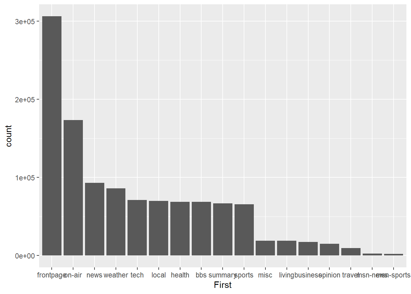
Much better. Now the viewer can quickly assess the descending frequency of page landing sites by reading across the x-axis. We can also change count to percentage by adjusting the y aesthetic.
p2<-ggplot(msnbc_sum,aes(x = First, y = Percent))
p2 + geom_bar(stat="identity")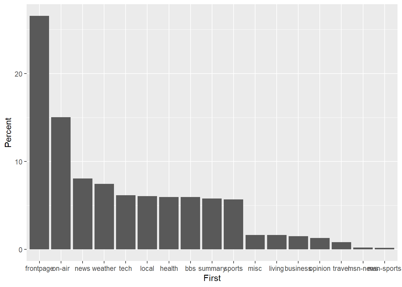
Next, let’s fix the x-axis tick mark labels and add descriptive axis labels to assist the viewer with interpreting the plot.
p2 + geom_bar(stat="identity") + theme(axis.text.x=element_text(angle=45,hjust=1)) +
  labs(title = "Unique Visits to Different MSNBC.com Landing Pages \n 28/09/1999",
       y = "Percentage of Unique Visitors",
       x = "Landing Page within MSNBC.com Domain")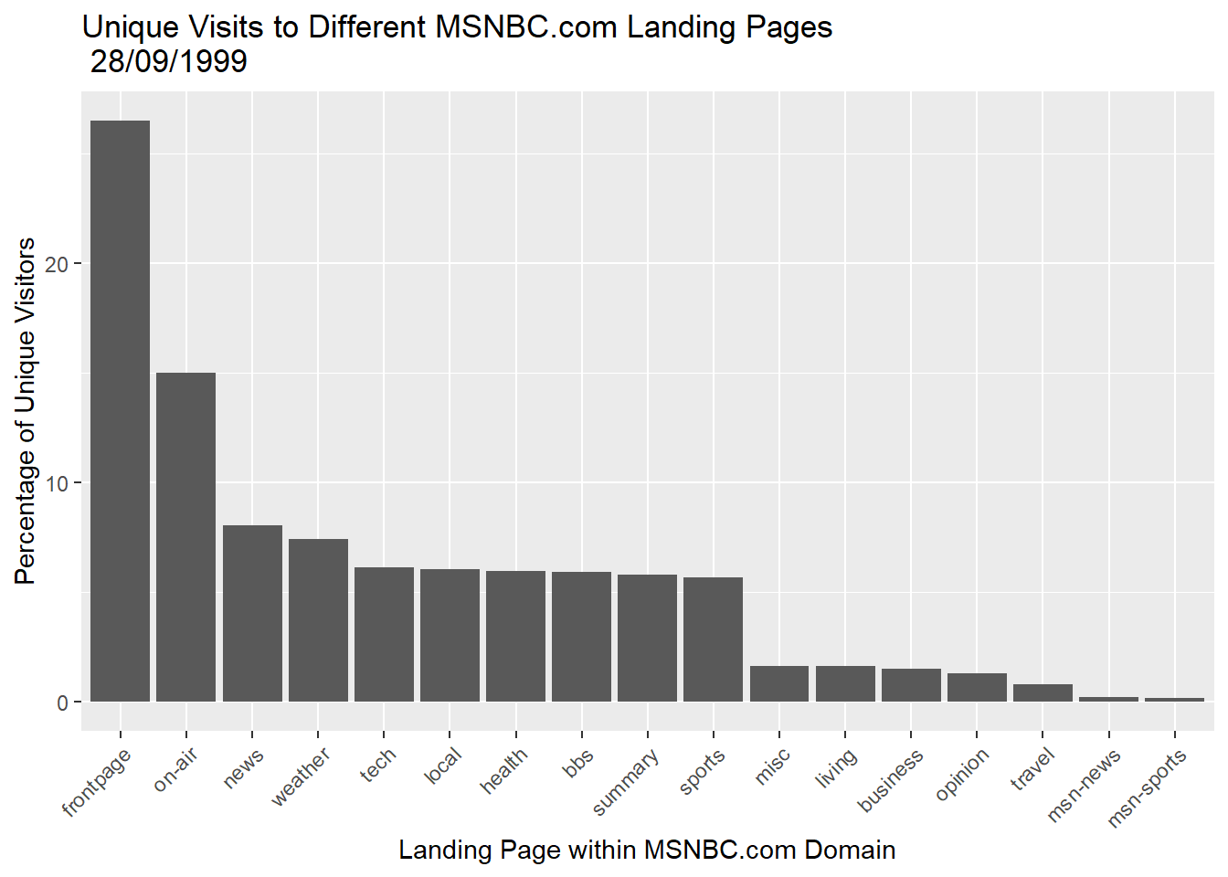
Notice how we carefully adjusted the orientation of the x-axis tick labels using the theme() option.
We can also add useful annotations. Let’s add the actual data values above the bars.
p2 + geom_bar(stat="identity") + theme(axis.text.x=element_text(angle=45,hjust=1)) +
  labs(title = "Unique Visits to Different MSNBC.com Landing Pages \n 28/09/1999",
       y = "Percentage of Unique Visitors",
       x = "Landing Page within MSNBC.com Domain") +
  geom_text(aes(label=round(Percent,2)), vjust = -0.5,size = 3)
We could also change the theme and colour if we needed it to follow a particular colour scheme, e.g. for a report or webpage.
p2 + geom_bar(stat="identity",fill = "dodgerblue3" ) +  theme_minimal() +
  theme(axis.text.x=element_text(angle=45,hjust=1)) +
  labs(title = "Unique Visits to Different MSNBC.com Landing Pages \n 28/09/1999",
       y = "Percentage of Unique Visitors",
       x = "Landing Page within MSNBC.com Domain") +
  geom_text(aes(label=round(Percent,2)), vjust = -0.5,size = 3)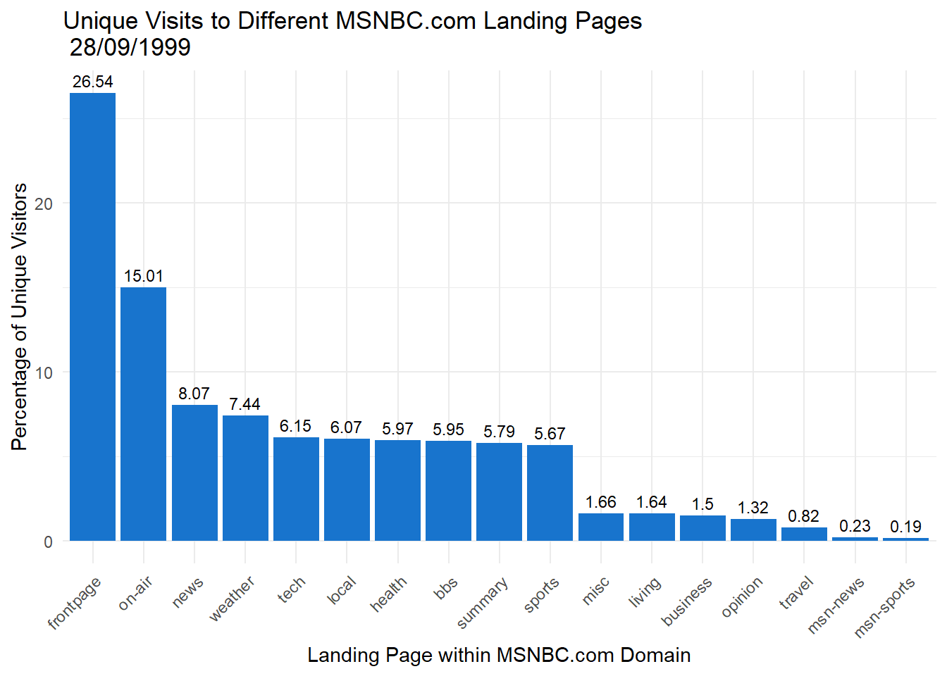
5.14.2 Check Your Scales
You can grossly misrepresent the data in bar charts by adjusting the scale. Let’s zoom in on the tech, local, health, bbs, summary and sports pages, which all share a similar percentage of visitors. However, we will do something naughty with the scale. First we define a ggplot object using a filtered data object.
msnbc_sum_filt <- msnbc_sum %>%
  filter(First %in% c("tech", "local", "health", "bbs", "summary", "sports"))

p2.2 <- ggplot(msnbc_sum_filt, aes(x = First, y = Percent))
This code selects only the relevant pages.
Now we play with the y-axis scale.
p2.2 + geom_bar(stat = "identity") + coord_cartesian(ylim=c(5.5,6.25))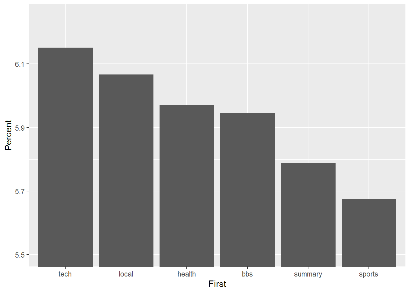
Wow! The differences appear huge. However, closer inspection of the y-axis suggests a different story. Now look what happens when we anchor the y-axis correctly at 0, which you should do if you have count/ratio data.
p2.2 + geom_bar(stat = "identity")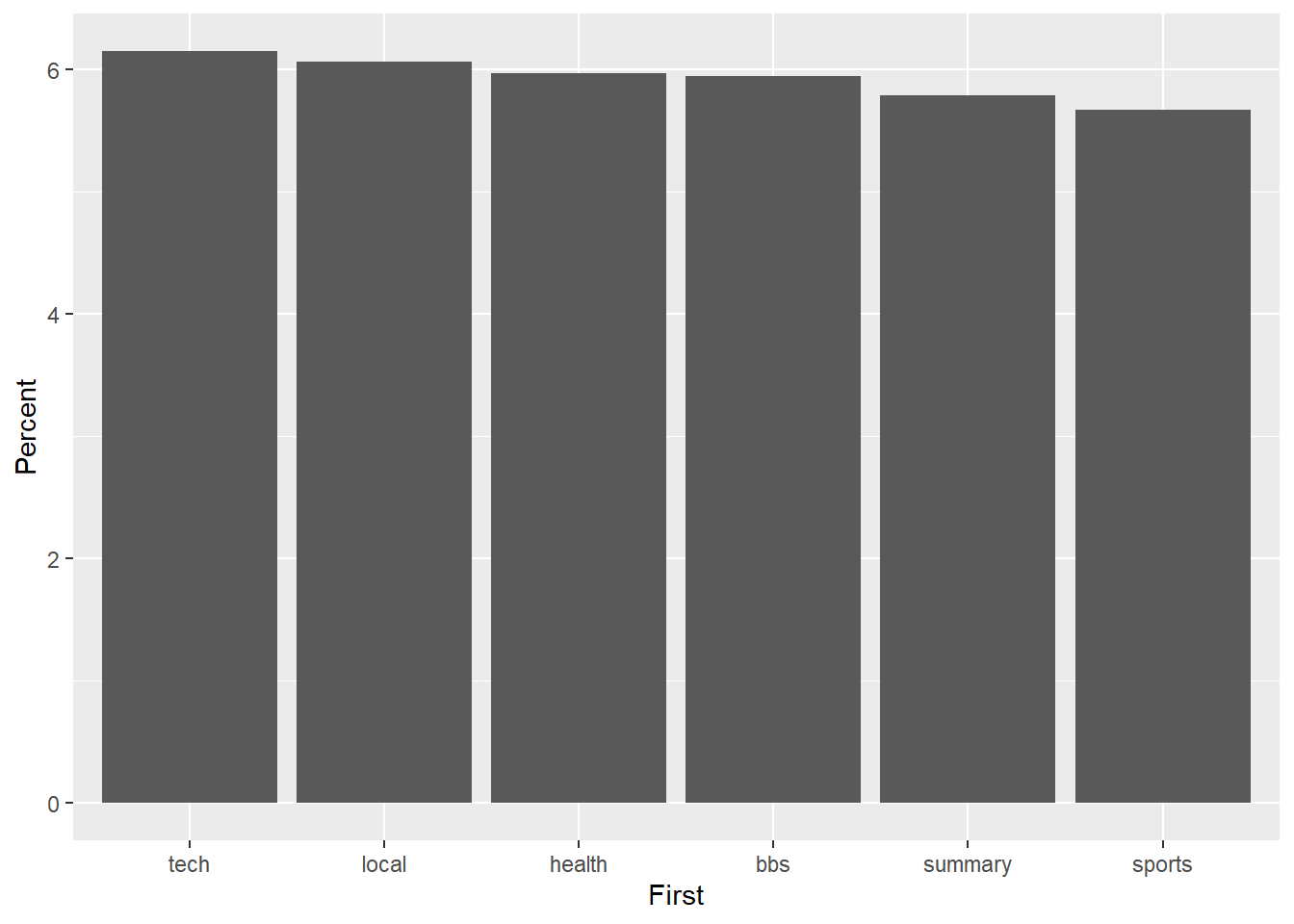
The difference is not so big any more. Don’t deceive the receiver!
5.14.3 Dot Plot
Bar charts are highly accurate but can be space hungry. Let’s experiment with a dot plot and the orientation of the plot to reduce the overall size, but without diminishing accuracy.
p3 <- ggplot(msnbc_sum, aes(y = First, x = count))
p3 + geom_point()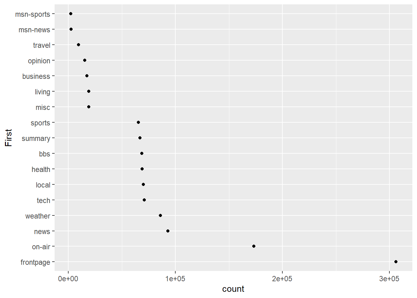
It doesn’t look right to have the highest category at the bottom, so we can reverse the ordering.
msnbc_sum$First <- factor(msnbc_sum$First, levels = msnbc_sum$First[order(msnbc_sum$count)])

p3 <- ggplot(msnbc_sum, aes(y = First, x = count))
p3 + geom_point()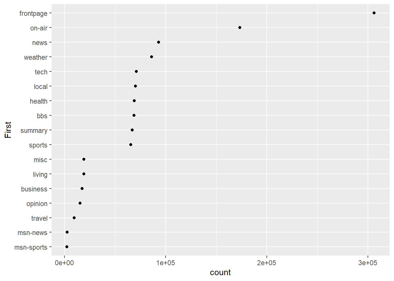
That looks better. Now let’s add some trailing lines to help connect the dot with each y-axis tick mark label.
p3 <- ggplot(msnbc_sum, aes(y = First, x = count))
p3 + geom_point() + geom_segment(aes(x = 0, y = First, xend = count,yend=First),linetype = 2)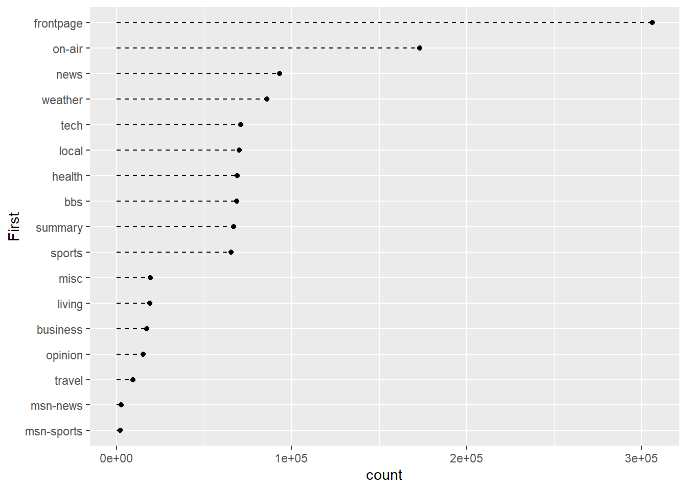
The geom_segment() layer allows us to add lines to the plot. We use the options, x, y, xend, and yend to determine the start and finish of each line. We use the linetype = 2 to draw a dashed lined.
Finally, we can change colour and assign data labels if needed. This is helpful in this situation because many of the values are very similar. We also have spaces and introducing labels won’t overlap other elements.
p3 <- ggplot(msnbc_sum, aes(y = First, x = count))
p3 + geom_point(colour = "dodgerblue3") +
  geom_segment(aes(x = 0, y = First, xend = count,yend=First),linetype = 2) +
  labs(title = "Unique Visits to Different MSNBC.com \n Landing Pages \n 28/09/1999",
       x = "No. of Unique Visitors",
       y = "Landing Page within MSNBC.com Domain") +
  geom_text(aes(label=round(count,2)), hjust = -.2,size = 3) +
  scale_x_continuous(limits = c(0,350000))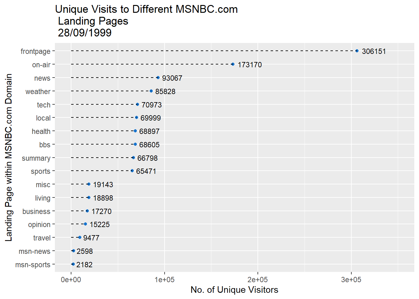
Notice how the scale of the x-axis and offset of the data point values had to be adjusted to fit within the plot. As you can see, the dot plot is a lot more compact but doesn’t sacrifice accuracy. The only difference between the dot plot and bar chart is the geometric object used to represent count. Switching from a greedy bar to a small point saves a lot of space.
5.14.4 Pie Charts
There are many perceptual challenges associated with pie charts. Comparing angles and area of segments of the pie is less accurate than comparison using bar charts and dot plots. Also, comparing the relative sizes of segments gets difficult as they do not share an aligned baseline. Pie charts are also limited in terms of the number of categories they can display. Having too many makes the visualisation cramped and difficult to discern different categories. Therefore, pie charts or any chart with polar coordinates should be avoided. Regardless, for some reason they are really good at grabbing attention. Maybe it’s because we all love a good pie, savoury or sweet! You may be required to create one for some strange reason, so I will show you quickly how to do so. Let’s take a look at an example in ggplot2.
Pie charts are a little tricky in ggplot2. We need to use the coord_polar() option. Here’s an example:
p4 <- ggplot(msnbc_sum, aes(x = factor(1), y = count, fill = First))
p4 + geom_bar(stat="identity",width = 1) + coord_polar(theta = "y")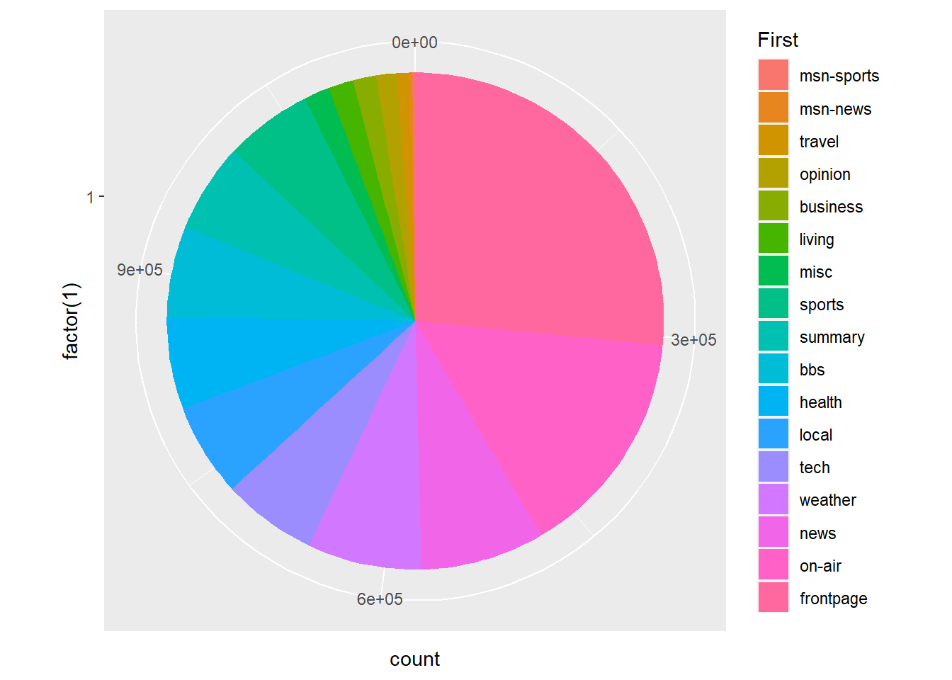
Not a bad start, but you can see the issue of having so many categories! Some sources say no more than 12 colours should be used (Buts 2012), while other sources advise 5 to 7 [based on short-term memory; MacDonald (1999)]. Seventeen is certainly too much.
So let’s filter the data a little to consider only the top five landing pages.
msnbc_sum_top_five <- msnbc_sum %>% filter(rank(count) > 12)We also need to recalculate the proportions and percentages based on the top five plots:
msnbc_sum_top_five$Proportion <- msnbc_sum_top_five$count/sum(msnbc_sum_top_five$count)
msnbc_sum_top_five$Percent <- msnbc_sum_top_five$Proportion*100
msnbc_sum_top_five<-msnbc_sum_top_five %>% arrange(desc(count))
Now we re-run the pie chart using the top five filtered data set.
p5 <- ggplot(msnbc_sum_top_five, aes(x = factor(1), y = count, fill = First))
p5 + geom_bar(stat="identity", width = 1) + coord_polar(theta = "y")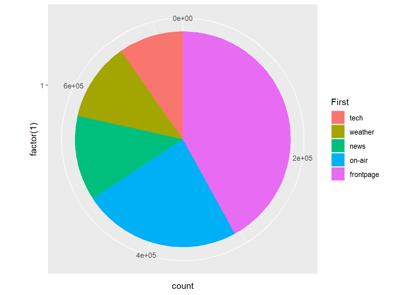
It is now much easier to associate the colour with the categories. Let’s clean up the plot a little to make it look more like a classic pie chart and add some data value labels to overcome some of the perceptual issues with comparing angles and area. (Note the interesting code required to properly align the text labels in geom_text()!).
p5 + geom_bar(stat="identity",width = 1) + coord_polar(theta = "y") +
  theme(axis.ticks=element_blank(),
        axis.title=element_blank(),
        axis.text.y=element_blank(),
        axis.text.x=element_blank(),
        panel.grid.major = element_blank(),
        panel.grid.minor = element_blank(),
        panel.border = element_blank()) +
  labs(fill = "Top Five Landing Pages") +
  geom_text(aes(y = (cumsum(count)-count) +
                  (count/2),
                label=round(Percent,2), angle = 0))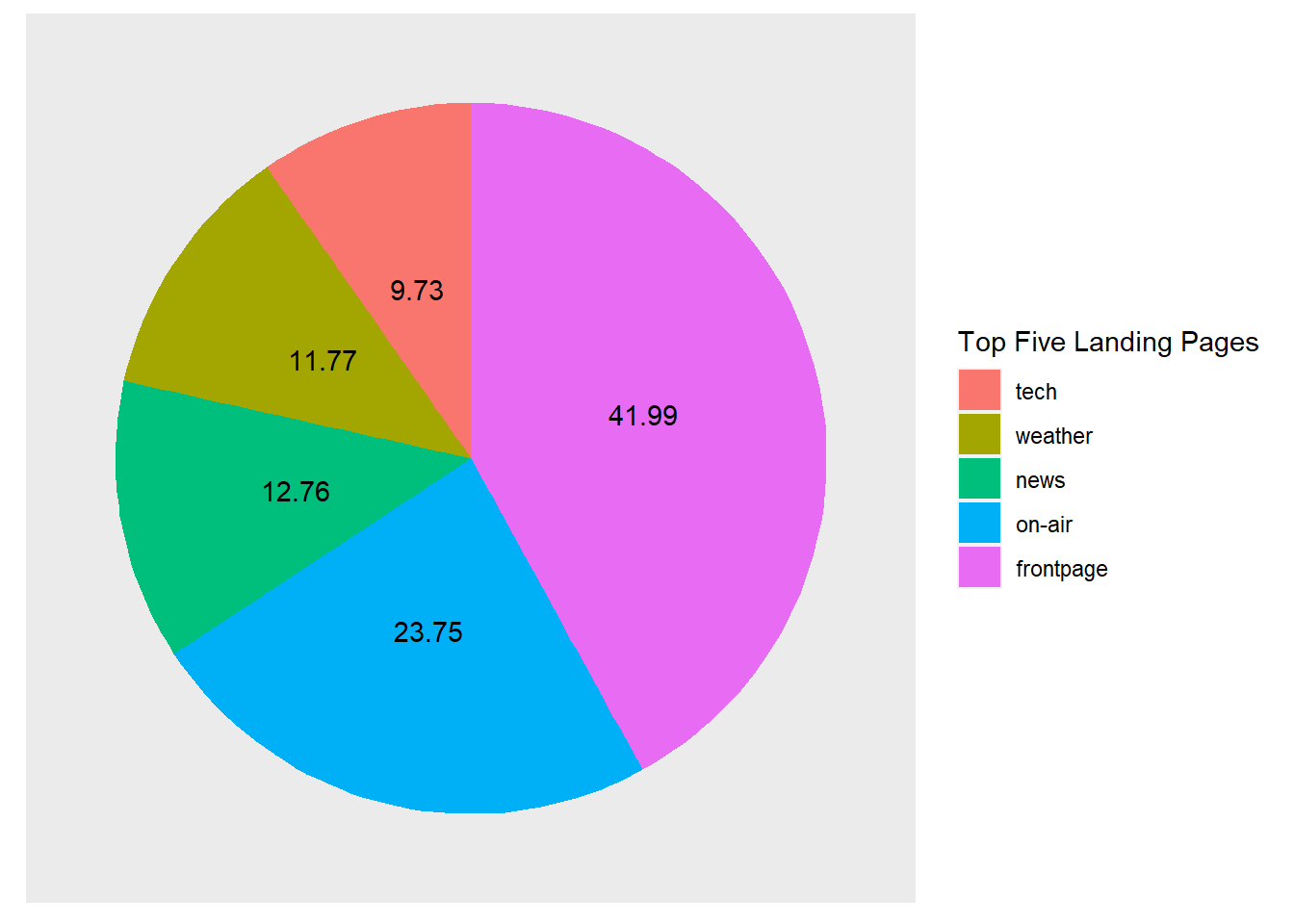
5.14.5 Coxcomb Diagram (Polar Area Diagram)
Coxcomb diagrams or polar area diagrams, which are believed to have been first introduced by Florence Nightingale, are similar to pie charts but use area instead of angles for comparisons. Each category or segment of the diagram has an equal angle, but the area or the extending length of the segments vary.
p6 <- ggplot(msnbc_sum_top_five, aes(x = First,y=count,fill=First))
p6 + geom_bar(stat="identity",width = 1) + coord_polar()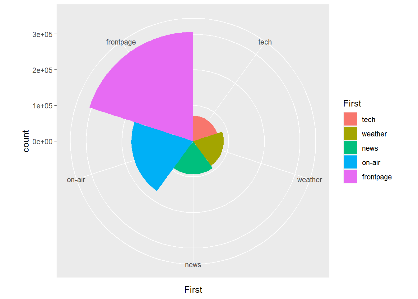
According to Cleveland and McGill (1985), the angle and area represented using pie charts should be more accurate than area alone. Therefore, pie charts, if you have to use them, might be the better choice.
These are some interesting examples of polar coordinate systems, but always remember, use pie charts and other variations with caution. They do sacrifice a lot of accuracy.
5.15 Quantitative Variables
5.15.1 YouTube Data
In this section, we will cover methods for visualising univariate quantitative variables (interval and ratio). We will use the Youtube.csv data which was also taken from the UCI Machine Learning Repository. A .csv version of the dataset is available here. The dataset contains the video characteristics of over 24,000 YouTube clips. Suppose we want to visualise the distribution of YouTube video duration. Understanding the distribution of quantitative variables can help us to understand the spread of the data, describe its distribution to others, identify appropriate descriptive methods, check for the presence of outliers, and test assumptions about the underlying population distribution. Visualising the distribution of a quantitative variable is an important first step in exploratory data analysis.
5.15.2 Histograms
Let’s start with a basic histogram. Histograms order and count quantitative variables into equal interval ranges, called bins. The relative height of bars are used to represent the frequency of data points that fit within each bin. Histograms are a useful and quick way to explore the distribution of a quantitative variable. However, they do have a number of limitations. Histograms are not suited to small samples and the bin width or number of bins used to create a histogram can have a major impact on the appearance of the distribution. Check out my Shiny Histogram app (see Figure 5.12, only available online) to see what I mean. (If it doesn’t appear, make sure your browser isn’t blocking it)
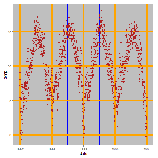
Figure 5.12: Histogram app (Only available online).
Let’s make a start:
p6 <- ggplot(Youtube, aes(x = duration))
p6 + geom_histogram()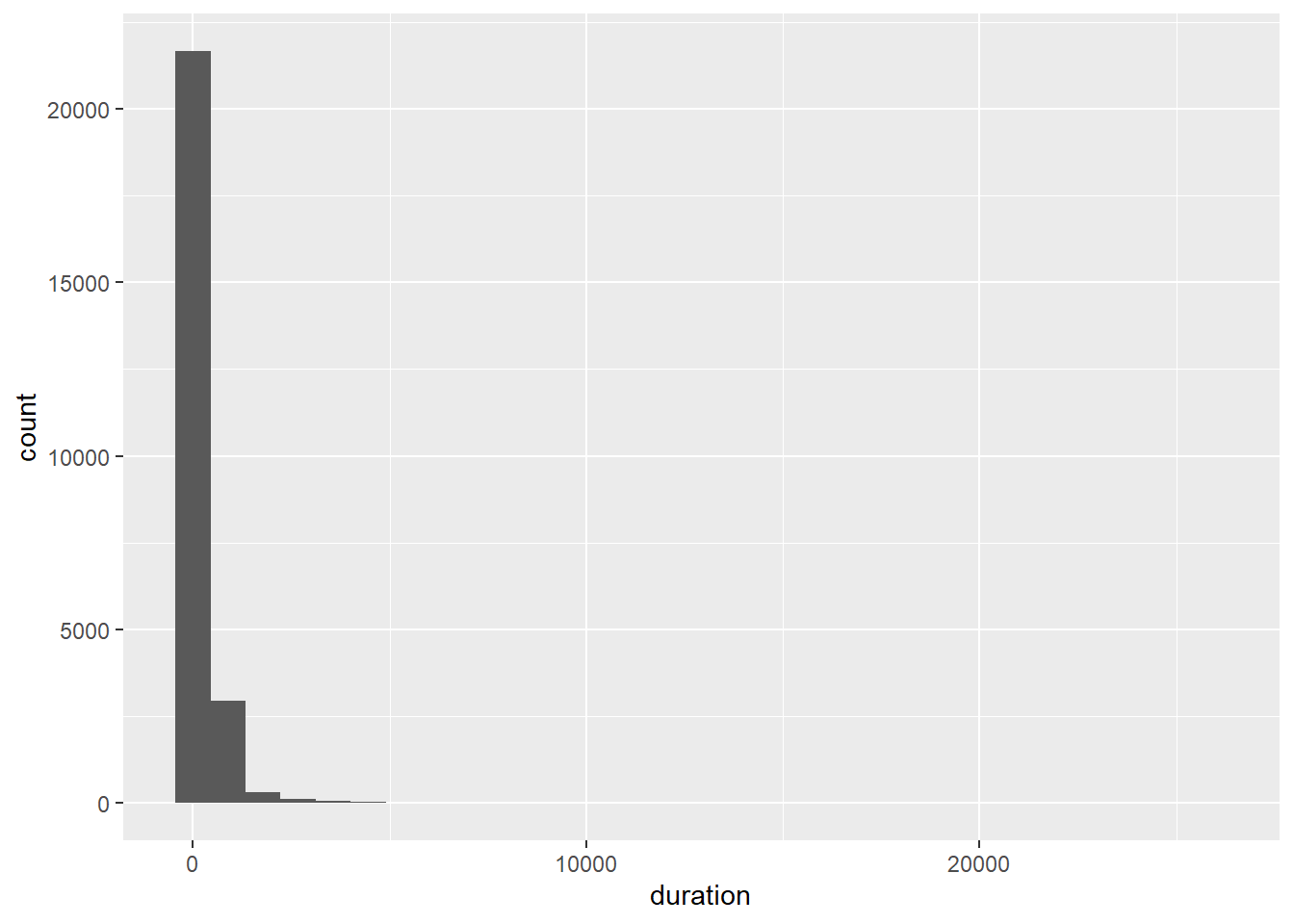
As the number of bins is set arbitrarily at 30, let’s try adjusting the number of bins to see if we can improve the histogram.
p6 + geom_histogram(bins=100)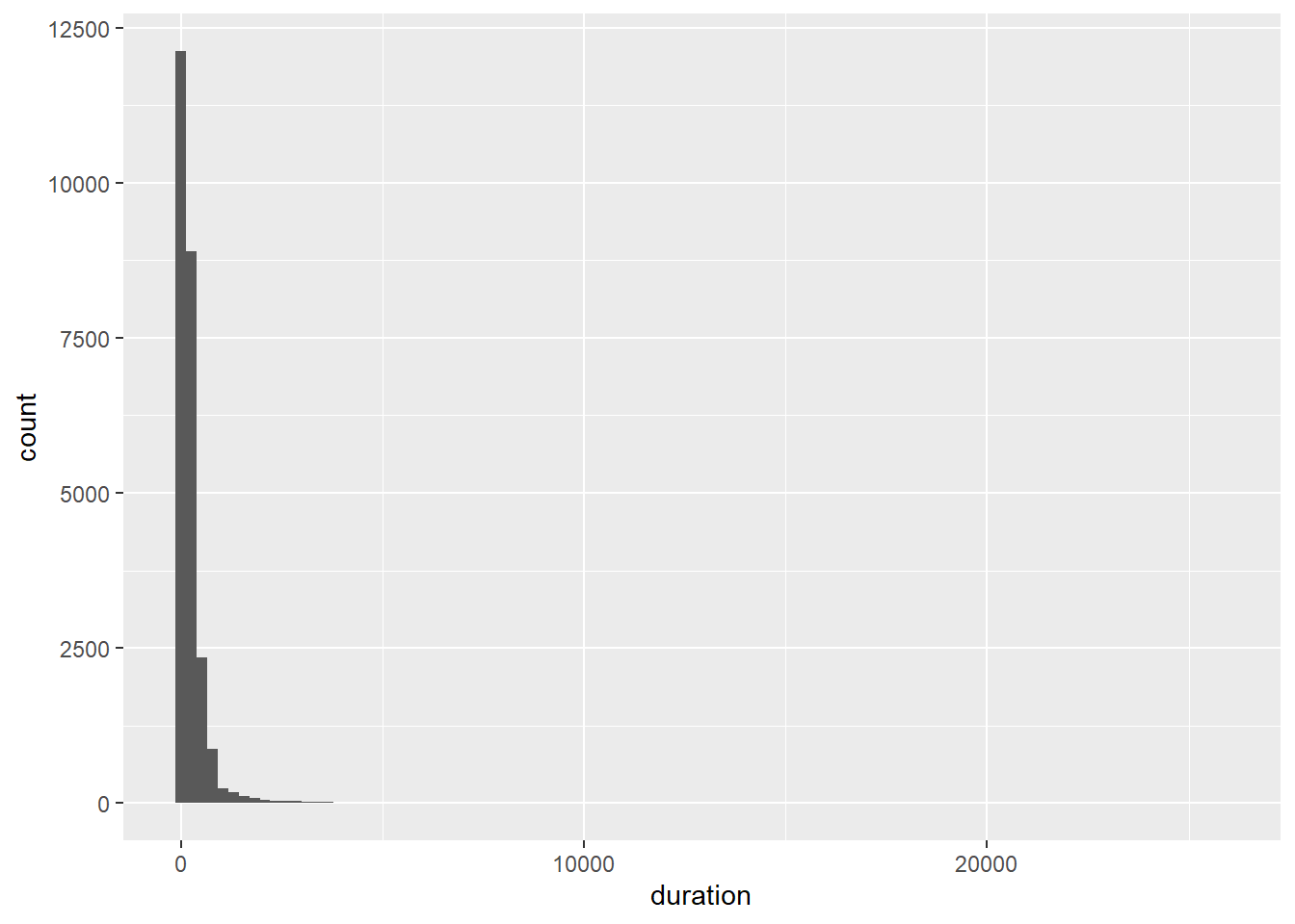
That didn’t do much!
You might be wondering what the actual bin widths and counts are for each bin. You can find them using ggplot_build() function:
p6 <- p6 + geom_histogram()
hist <- ggplot_build(p6)
hist$data
Now you can see the limits which define the bins, xmin and xmax and the actual counts of each bar plotted on the y-axis.
5.15.3 Boxplot
There might be some outliers that are creating an issue with the scale. Let’s check using a box plot:
p7 <- ggplot(Youtube, aes(x = factor(1), y = duration))
p7 + geom_boxplot(width = .25)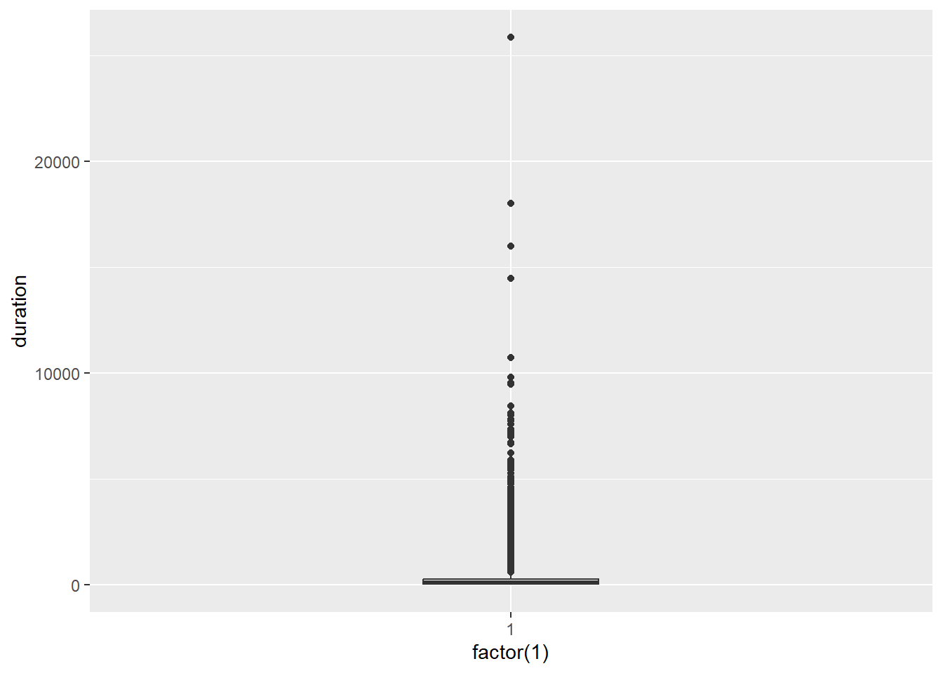
As suspected, there are heaps of outliers. You cannot discern the box plot!
Let’s clean the data by removing the outliers. We will filter out the cases that are considered to be extreme outliers according to the following rules:
where Q1 and Q3 refer to the 1st and 3rd quartiles of the data and IQR is the inter-quartile range.
We can use the ggplot_build function to identify where these fences were located.
p7 <- p7 + geom_boxplot(width = .25)
box <- ggplot_build(p7)
box$data[[1]][1:5]
## ymin lower middle upper ymax
## 1 1 52 139 281 624ymin and ymax refer to the lower and upper outlier fences respectively. It appears the outlier fences are located < 1 and > 624. Now we can use dplyr to filter the outliers.
Youtube_clean<-filter(Youtube, duration > 1 & duration < 624)Now we re-run the box plot.
p8 <- ggplot(Youtube_clean, aes(x = factor(1), y = duration))
p8 + geom_boxplot(width = .25)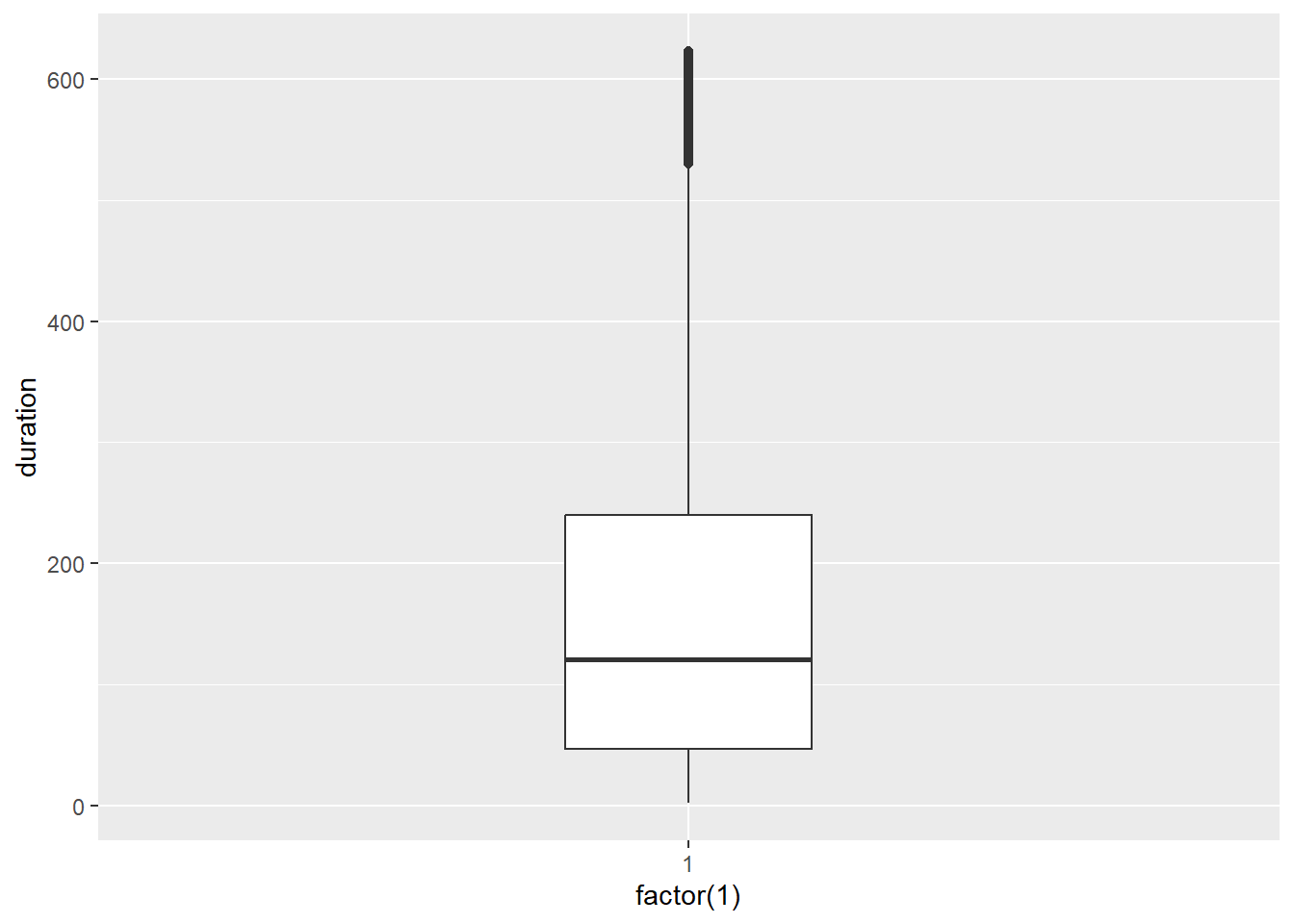
Looking good. Now for the histogram:
p9 <- ggplot(Youtube_clean, aes(x = duration))
p9 + geom_histogram()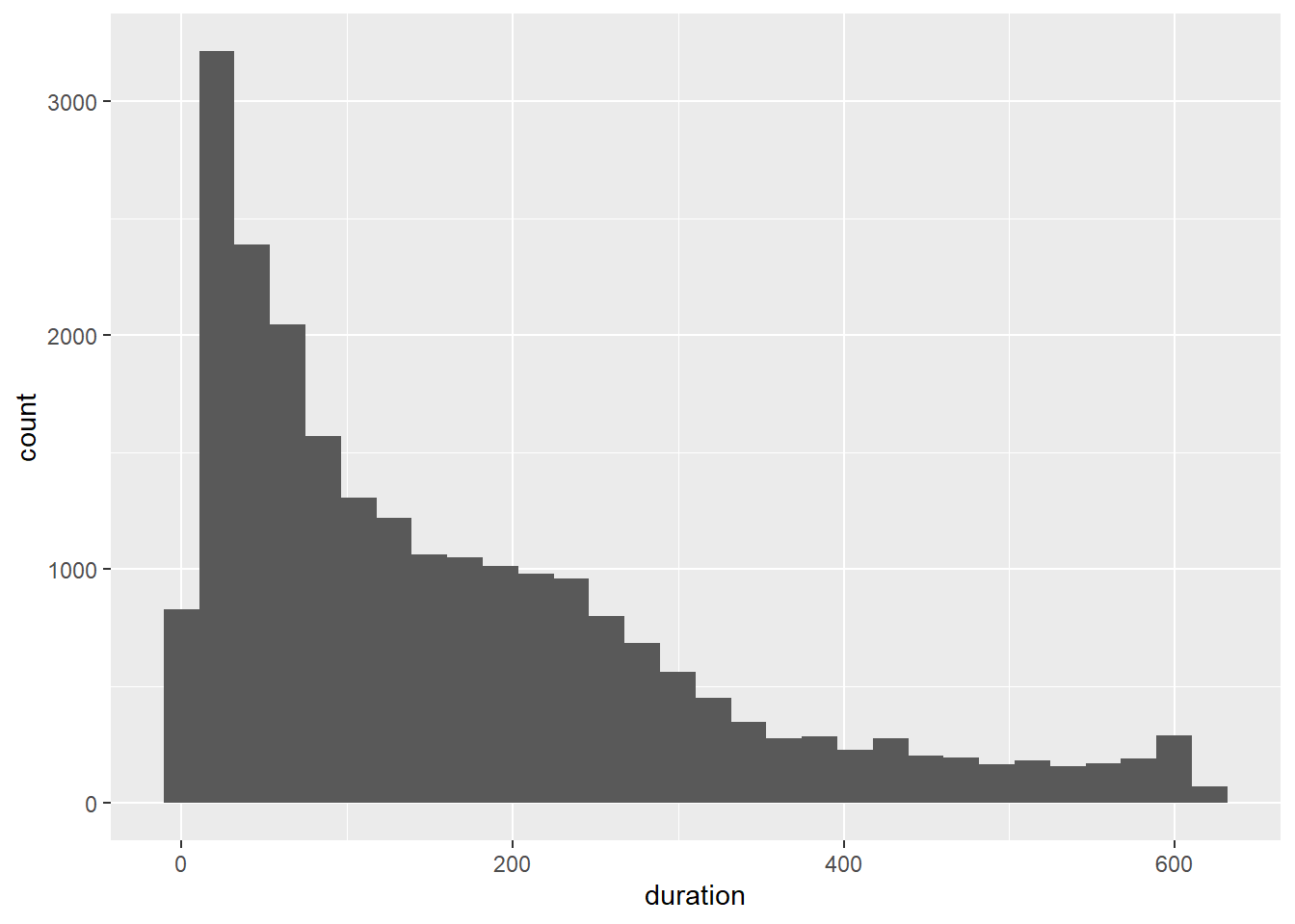
Much better. The scale has been fixed and we can start to get a much better picture of the nature of the distribution. We can add some colour and experiment with the number of bins. We have a lot of data, so the histogram should be able to support many bins.
p9 + geom_histogram(colour = "white", bins = 100)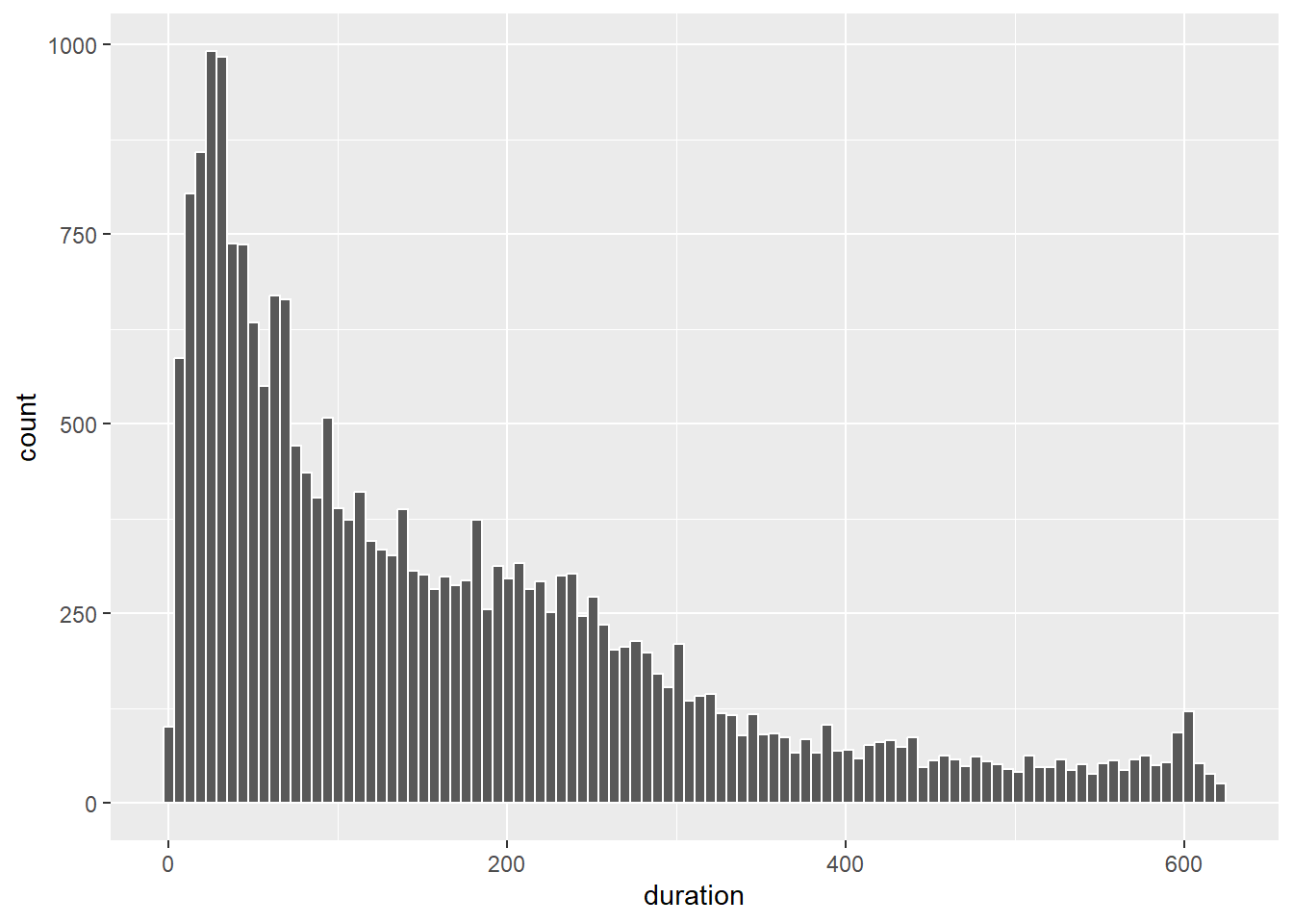
How would you describe the shape of this distribution? Figure 5.13 explains how to do so.
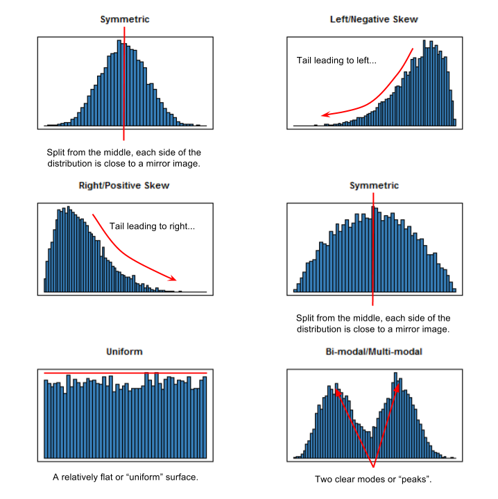
Figure 5.13: Describing the shape of different distributions.
5.15.4 Density Plot
We can also plot a density estimate when our sample sizes are large.
p9 + geom_density(fill = "grey")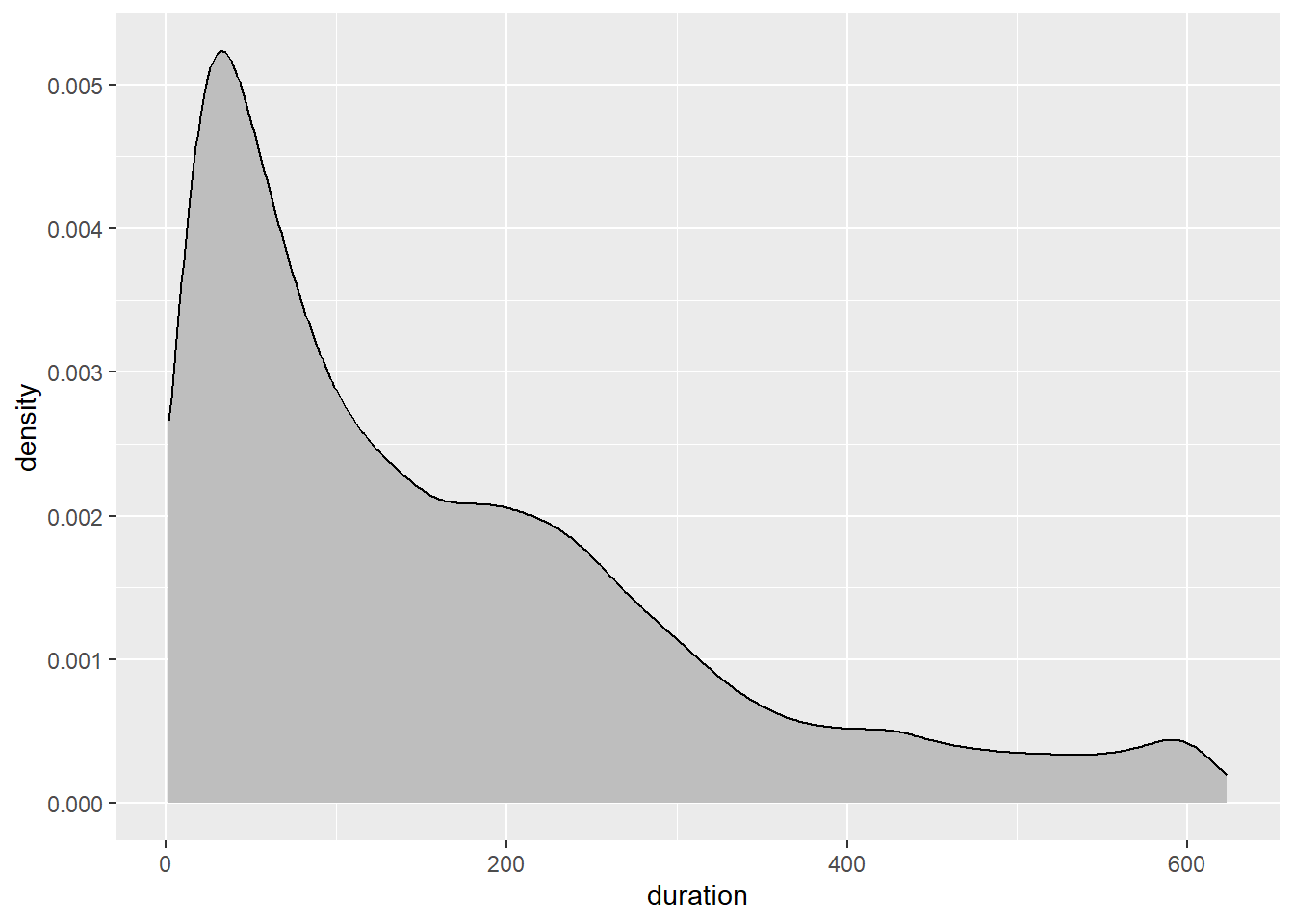
The density estimate is based on the generic kernel density function from the base stats package. Kernel density estimation uses a nonparametric smoothing algorithm to estimate the underlying population probability density function. Be wary. These visualisations are also susceptible to greater sampling variability in small samples.
5.15.5 Overlaying Univariate Plots
Let’s overlay the histogram and density plot to see how they compare.
p9 + geom_density(fill = "grey") +
  geom_histogram(colour="white",aes(duration,..density..),
                 alpha = 1/2,bins=100)
To ensure the histogram and density plot share the same scale, we use the ..density.. aesthetic option in geom_histogram(). We also use the alpha option to make the histogram transparent. As you can see, the density estimate smooths out the minor peaks and troughs that are apparent in the histogram. We can add some additional transparency and colour to help differentiate the two plot types.
p9 + geom_density(fill = "dodgerblue", alpha = 1/2) +
  geom_histogram(colour="white",aes(duration,..density..),
                 alpha = 1/2,bins = 100)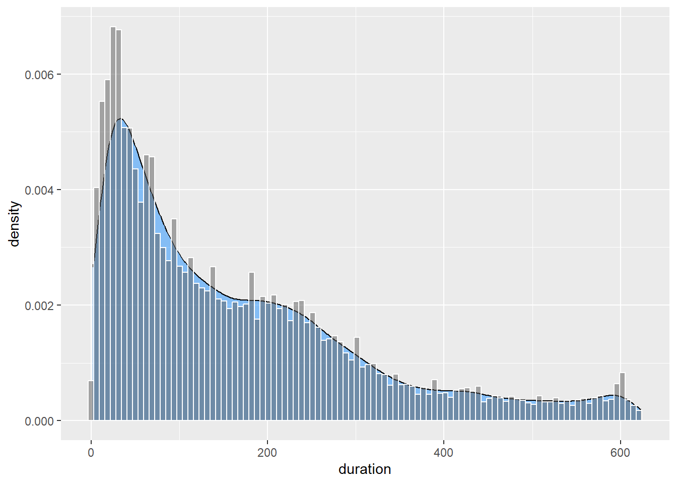
5.15.6 Adding Markers and Annotations
You can add markers and annotations for the mean and median using geom_vline() and annotate():
p9 <- p9 + geom_density(fill = "dodgerblue", alpha = 1/2) +
  geom_histogram(colour="white",aes(duration,..density..),
                 alpha = 1/2,bins = 100) +
  geom_vline(xintercept= median(Youtube_clean$duration)) +
  annotate("text",label = "Median",x = 190, y = 0.006) +
  geom_vline(xintercept= mean(Youtube_clean$duration),linetype=2) +
  annotate("text",label = "Mean",x = 240, y = 0.004)
p9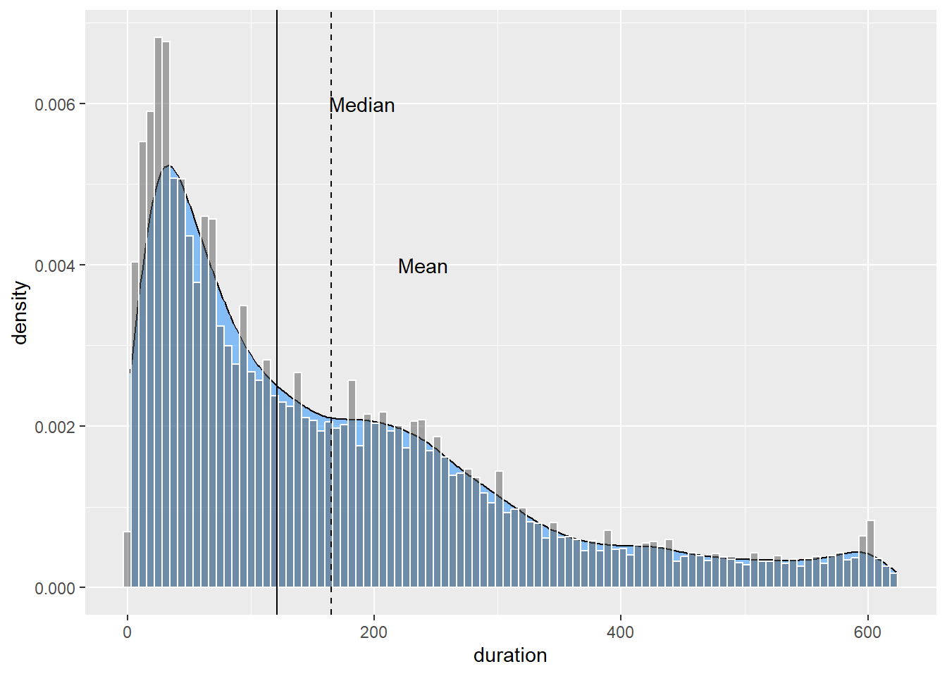
You will need to play around with the placement of the annotations. This plot shows a clear positively skewed distribution. The tail of the distribution pulls the mean duration to the right of the median.
5.15.7 Violin Plot
Violin plots are similar to a box plot but convey the density estimate instead of quartiles.
p10 <- ggplot(Youtube_clean,aes(x=factor(1),y = duration))
p10 + geom_violin(width = .25,fill="grey")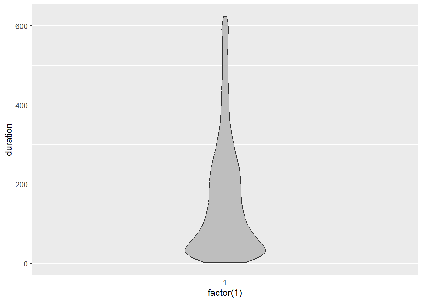
Be wary. Each side of the violin plot is a mirror image. It does not represent an additional variable. If we overlap a box plot, you can see how each offer a different perspective to the data.
p10 <- ggplot(Youtube_clean,aes(x=factor(1),y = duration))
p10 + geom_violin(width = .25, fill="grey") + geom_boxplot(width = .25, alpha = .25)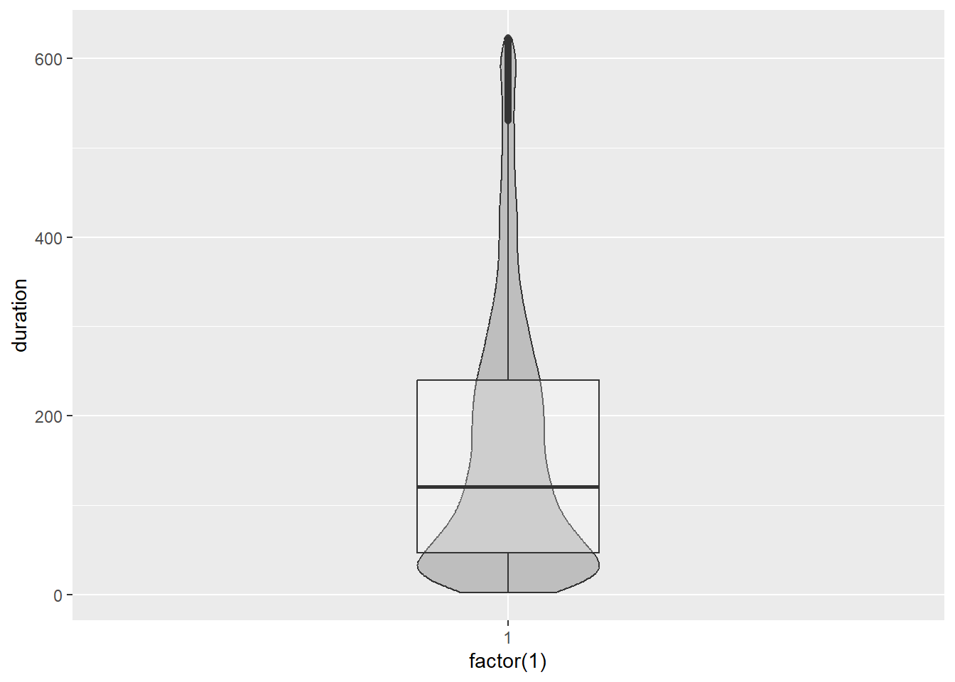
Box plots and violin plots are great for comparing the distribution of a quantitative variable across many groups as we will see in the bivariate section. Histograms and density plots are far more effective when considering a univariate distribution.
5.15.8 Stacked Dot Plots
We have already taken a look at one type of dot plot used to summarise and compare the frequency of categories for a qualitative variable. Dot plots are also used to summarise the distribution of a quantitative variable. The dots, which usually represent a data value, are stacked on top of each other based on pre-defined bins. They appear to be a very detailed histogram. For small samples, as you will see, they are ideal because the sample can be counted. However, for large datasets, you should opt for histograms and density plots. Let’s consider an example using the YouTube data.
p11 <- ggplot(Youtube_clean,aes(x = duration))
p11 + geom_dotplot()
Ignore the arbitrary y-axis. We should suppress this axis as it is misleading. We know that each dot represents an observation, so it serves no purpose. However, there is a bigger issue. Something doesn’t look right! Let’s try adjusting the bins.
p11 <- ggplot(Youtube_clean,aes(x = duration))
p11 + geom_dotplot(binwidth = 10) +
  theme(axis.text.y= element_blank(),
        axis.title.y = element_blank(),
        axis.ticks.y = element_blank())
That’s a bit better, but it’s clear the sample size is too large to support the use of a dot plot. You couldn’t count all the dots even if we increased the bin width.
However, if the sample was smaller, dot plots are a great choice. Let’s take a random sample of n = 50 and plot the sample’s distribution of duration.
set.seed(462243) #Set the random seed to replicate the plot below
p11 <- ggplot(sample_n(Youtube_clean,50),aes(x = duration))
p11 + geom_dotplot() +
  theme(axis.text.y= element_blank(),
        axis.title.y = element_blank(),
        axis.ticks.y = element_blank())
Now that looks much better. Notice how the dots represent individual values, so the viewer has a sense of sample size.
5.16 Juxtaposing
Juxtaposing is the method of aligning multiple plots together in order to facilitate comparison. In later chapters we will explore this in greater depth when we take a closer look at the method of faceting. For now, we will focus on a simple example. As we have discovered, different data visualisations can portray different features of the data. Sometimes it is helpful to look at multiple representations of the same data. When we do this, it’s important to align the visualisations to facilitate comparison and ensure the relationship between the visualisations’ data are maintained.
The following example shows you how to use the cowplot package to align multiple ggplots together. The complete code is shown as it is important to assign all the layers to the plotting object before calling the plot_grid() function from the cowplot package. The exercise will juxtapose the box plot from p8 and the histogram and density plot from p9.
First we ensure the plotting layers are all assigned correctly to the p8 and p9 ggplot objects.
p8 <- ggplot(Youtube_clean, aes(x = factor(1), y = duration)) +
  geom_boxplot(width = .50) + scale_y_continuous(limits = c(0, 800))

p9 <- ggplot(Youtube_clean, aes(x = duration)) +
  geom_density(fill = "dodgerblue", alpha = 1/2) +
  geom_histogram(colour="white",aes(duration,..density..),
                 alpha = 1/2,bins = 100) +
  geom_vline(xintercept= median(Youtube_clean$duration)) +
  annotate("text",label = "Median",x = 180, y = 0.006) +
  geom_vline(xintercept= mean(Youtube_clean$duration),linetype=2) +
  annotate("text",label = "Mean",x = 240, y = 0.004) +
  scale_x_continuous(limits = c(0, 800))
Notice how we set the scale limits to scale_x_continuous(limits = c(0, 800)) for the density plot and and scale_y_continuous(limits = c(0, 800)) for the box plot. This ensures the plots are perfectly aligned by sharing a common scale. Next we install (if required) and load cowplot.
install.packages("cowplot")
library(cowplot)
cowplot may change the default ggplot grey theme. If you want to retain the grey theme in your plots then place the following code before you use the plot_grid function.
theme_set(theme_gray())Now we juxtapose the plots:
plot_grid(p9, p8 + coord_flip() + theme(axis.title.y=element_blank(),
                                        axis.text.y=element_blank(),
                                        axis.ticks.y = element_blank()), ncol=1, align="v",
          rel_heights = c(2,1))
We had to flip the box plot to run horizontally using coord_flip(). We also set a number of layout parameters to juxtapose correctly. ncol sets the number of columns to use in the grid, align sets the alignment, vertical or horizontal, and rel_heights sets the relative heights of each plot. In the code above, we set p9 to be twice the size of p8, the box plot.
Also, notice how the y-axis label for the box plot was suppressed. This is a nice example of juxtaposing visualisations of the same data. Sometimes this can lead to surprising findings and also a greater understanding behind the nature of different methods.
5.17 Two Qualitative Variables
5.17.1 Colour Data
Can we predict a person’s eye colour based on their hair colour? This is an example of a statistical question based on two qualitative or nominal variables. Chi-square tests of association are the most common way to formally test these types of associations. The Hair_Eye_Colour dataset, available here, contains the gender, hair colour and eye colour of 592 college students. Importing into RStudio, we can run the str() function to summarise the data frame:
str(Hair_Eye_Colour)## 'data.frame': 592 obs. of 3 variables:
## $ Hair : chr "Black" "Black" "Black" "Black" ...
## $ Eyes : chr "Brown" "Brown" "Brown" "Brown" ...
## $ Gender: chr "Male" "Male" "Male" "Male" ...As you can see, the Hair and Eyes factors each have four levels.
We can summarise the two qualitative variables as follows:
crosstab1 <- table(Hair_Eye_Colour$Hair,Hair_Eye_Colour$Eyes, dnn = c("Hair","Eyes"))
crosstab1
## Eyes
## Hair Blue Brown Green Hazel
## Black 20 68 5 15
## Blonde 94 7 16 10
## Brown 84 119 29 54
## Red 17 26 14 14margin.table(crosstab1,1) #Row marginals## Hair
## Black Blonde Brown Red
## 108 127 286 71margin.table(crosstab1,2) #Column marginals## Eyes
## Blue Brown Green Hazel
## 215 220 64 93We use the table() function to create a cross-tabulation. It’s hard to look at the raw table frequencies to explore the association. Let’s start with a simple and effective approach to visualising the association between hair and eye colour - a bar chart.
5.17.2 Bar Chart
p12 <- ggplot(data = Hair_Eye_Colour, aes(x = Hair, fill = Eyes))
p12 + geom_bar()
Not bad, however, the stacked nature of the plot has some perceptual issues. The first issue relates to sample size. As there were fewer people with red and the sample was dominated by people with brown hair, it’s difficult to compare the relative proportions of different eye colours between the hair colour categories. For example, is the proportion of green eyed individuals with blonde hair the same as people with brown hair? Hard to say. We can fix this by using the position = "fill" option.
p12 + geom_bar(position = "fill")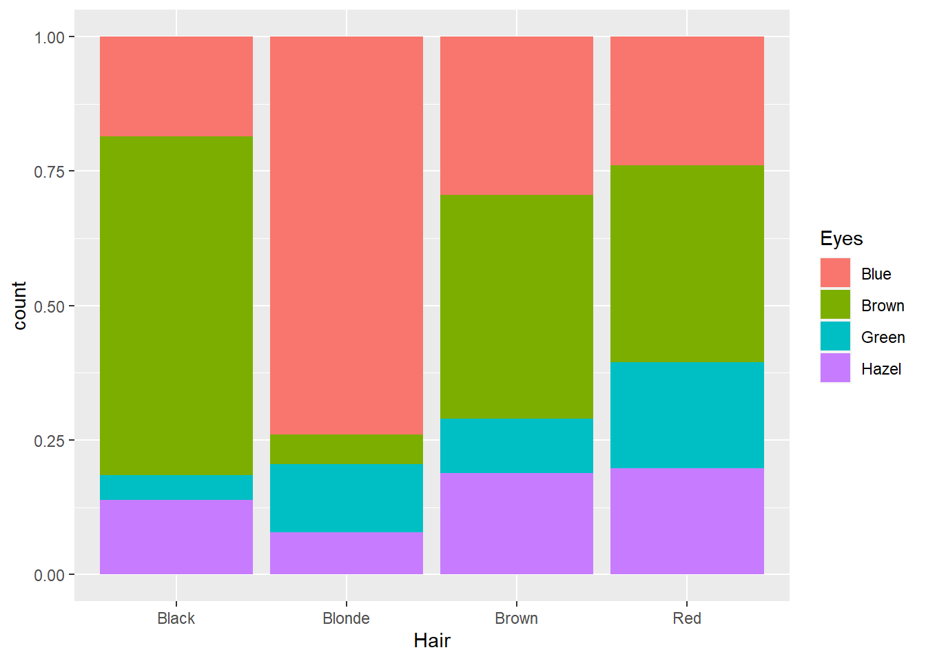
This option converts the counts to proportions within Hair colour categories. Now we can see that there is a higher proportion of people with blonde hair and green eyes than brown haired people with blue eyes. However, we still face the challenge of comparing different stacked bar lengths that don’t share a common baseline. For example, is the proportion of people with brown hair and brown eyes the same as people with red hair and brown eyes? It’s difficult to accurately comment. We should cluster the eye colour bars within each hair colour so they share the same baseline. We can do this using the position = "dodge" option.
p12 + geom_bar(position = "dodge")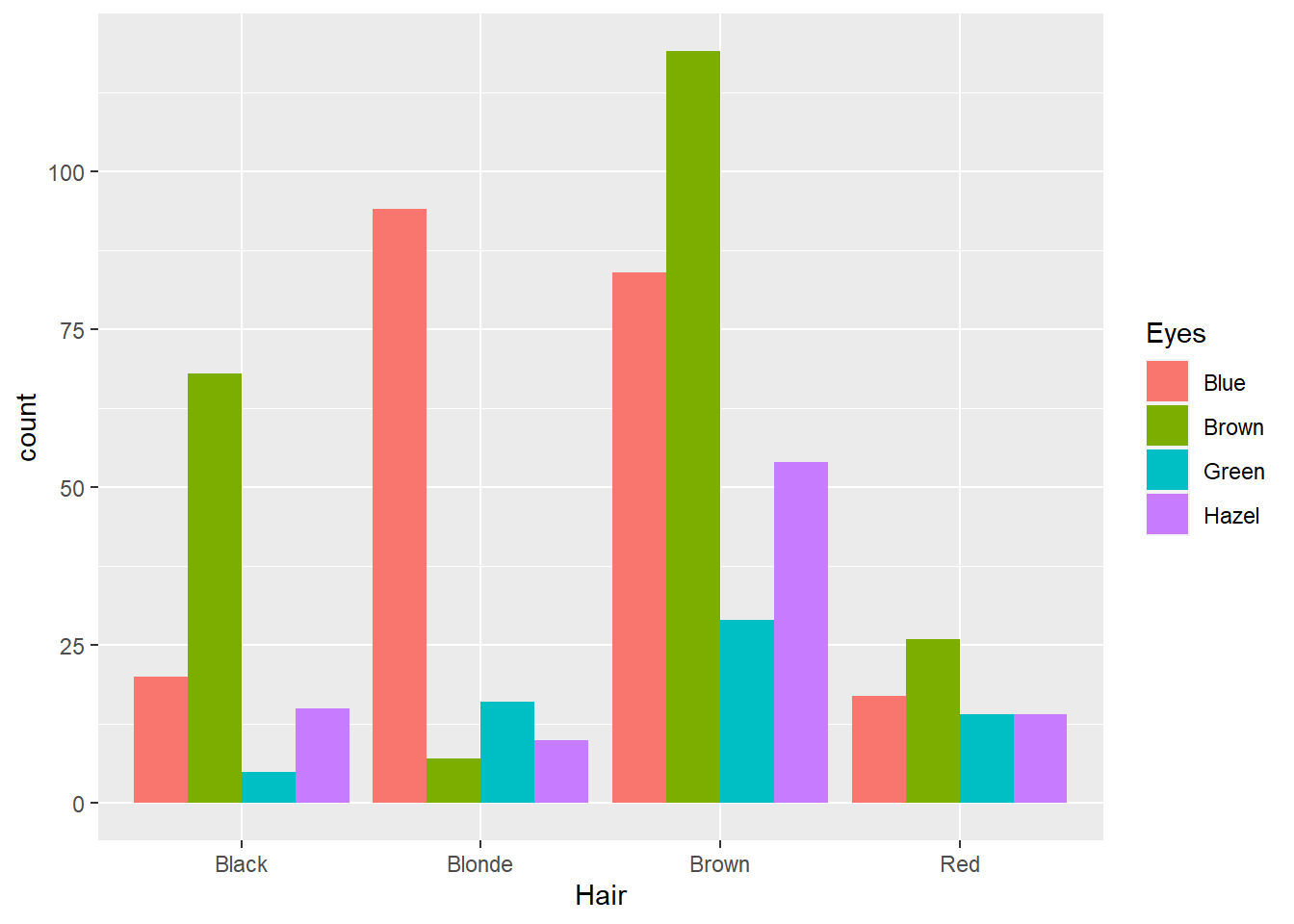
Better, but now we are back to comparing raw counts. To compare proportions, we need to create a table of conditional proportions. First we create a cross-tabulation table and then use that table to report conditional proportions.
#Create crosstabulation
crosstab1<-table(Hair_Eye_Colour$Hair,Hair_Eye_Colour$Eyes, dnn = c("Hair","Eyes"))

prop.table(crosstab1, 1) #Row proportions
## Eyes
## Hair Blue Brown Green Hazel
## Black 0.18518519 0.62962963 0.04629630 0.13888889
## Blonde 0.74015748 0.05511811 0.12598425 0.07874016
## Brown 0.29370629 0.41608392 0.10139860 0.18881119
## Red 0.23943662 0.36619718 0.19718310 0.19718310This table is easy to read. Say we are comparing the probability of different eye colours given a person has black hair. We note:
- \(Pr(\text{Blue Eyes}|\text{Black Hair}) = 0.18\)
- \(Pr(\text{Brown Eyes}|\text{Black Hair}) = 0.63\)
- \(Pr(\text{Green Eyes}|\text{Black Hair}) = 0.05\)
- \(Pr(\text{Hazel Eyes}|\text{Black Hair}) = 0.14\)
We can see that people with black hair are most likely to have brown eyes. We can also look at column proportions. For example, given a person has brown eyes, what is their most likely hair colour:
prop.table(crosstab1, 2) #Column proportions## Eyes
## Hair Blue Brown Green Hazel
## Black 0.09302326 0.30909091 0.07812500 0.16129032
## Blonde 0.43720930 0.03181818 0.25000000 0.10752688
## Brown 0.39069767 0.54090909 0.45312500 0.58064516
## Red 0.07906977 0.11818182 0.21875000 0.15053763We can see:
- \(Pr(\text{Black Hair}|\text{Brown Eyes}) = 0.31\)
- \(Pr(\text{Blonde Hair}|\text{Brown Eyes}) = 0.03\)
- \(Pr(\text{Brown Hair}|\text{Brown Eyes}) = 0.54\)
- \(Pr(\text{Red Hair}|\text{Brown Eyes}) = 0.12\)
People with brown eyes are most likely to have brown hair.
Now think about the data. We are most likely to be able to see a person’s hair colour (assuming it’s not colour treated!) before their eye colour. Therefore, it makes most sense to base the visualisation on the conditional probability Pr(Eye Colour|Hair Colour). This refers to the previously reported row proportions. If we can get these proportions into a data frame, we can plot them using ggplot2. Here’s how.
crosstab1 <- data.frame(prop.table(crosstab1, 1)) #Convert proportion table to df
str(crosstab1) #Data frame summary
## 'data.frame': 16 obs. of 3 variables:
## $ Hair: Factor w/ 4 levels "Black","Blonde",..: 1 2 3 4 1 2 3 4 1 2 ...
## $ Eyes: Factor w/ 4 levels "Blue","Brown",..: 1 1 1 1 2 2 2 2 3 3 ...
## $ Freq: num 0.185 0.74 0.294 0.239 0.63 ...colnames(crosstab1) <- c("Hair","Eyes","Proportion") #Fix variable names
str(crosstab1)## 'data.frame': 16 obs. of 3 variables:
## $ Hair : Factor w/ 4 levels "Black","Blonde",..: 1 2 3 4 1 2 3 4 1 2 ...
## $ Eyes : Factor w/ 4 levels "Blue","Brown",..: 1 1 1 1 2 2 2 2 3 3 ...
## $ Proportion: num 0.185 0.74 0.294 0.239 0.63 ...Now to the bar chart…
p13 <- ggplot(data = crosstab1, aes(x = Hair, y = Proportion, fill = Eyes))
p13 + geom_bar(stat = "identity",position = "dodge") +
  labs(y = "Proportion within Hair Colour")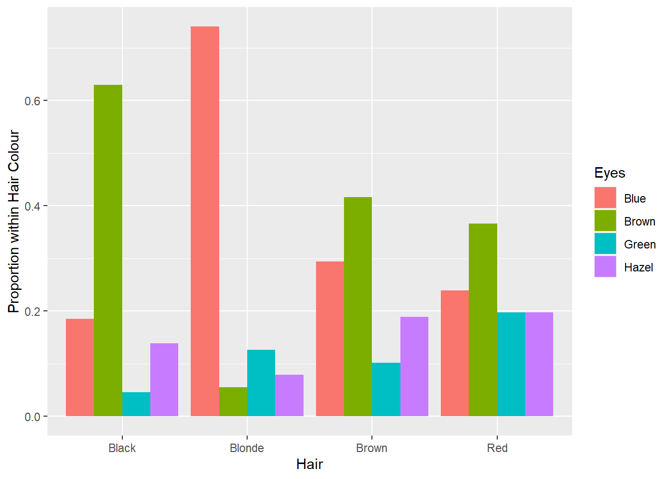
Lovely. Now we can use this visualisation to rapidly answer questions. Say your significant other puts your attention (and love) to the test and asks you “What colour are my eyes?” Realising you have never actually taken much notice (because beauty is holistic, right?), you can use the plot above to make a statistical guess… sorry, I mean prediction. If your partner has red hair, it will be tough, but go with brown eyes. If your partner has brown hair, again, it’s tough, but go with brown. If your partner has black or blonde hair the odds are in your favour. Go with brown and blue, respectively. Whoever said statistics wasn’t useful…
You might also want to change the colour scheme to enhance readability of the eye colour legend. Here’s my attempt… Not sure if it looks good. Let me know if you come up with better colours.
p13 + geom_bar(stat = "identity",position = "dodge") +
  labs(y = "Proportion within Hair Colour") +
  scale_fill_manual(values = c("#1569C7","#94703D","#566638","#6B7E47"))
Clustered bar charts are an excellent and accurate method for visualising the association between two qualitative variables. However, when we focus on a conditional proportion for eyes given hair colour, we lose information on the relative proportion of different hair colours in the sample. For example, the plot above does not tell us that there were more than twice as many people with brown hair than any of the other colours. It would be useful if the visualisation could represent both proportions. This is where mosaic plots can come in handy.
5.17.3 Mosaic Plots
Let’s produce a mosaic plot using the vcd package (ensure you install it first). The code is simple.
library(vcd)
vcd::mosaic(~ Hair + Eyes, data = Hair_Eye_Colour, dnn = c("Hair","Eyes"),
       shade=TRUE, pop = FALSE)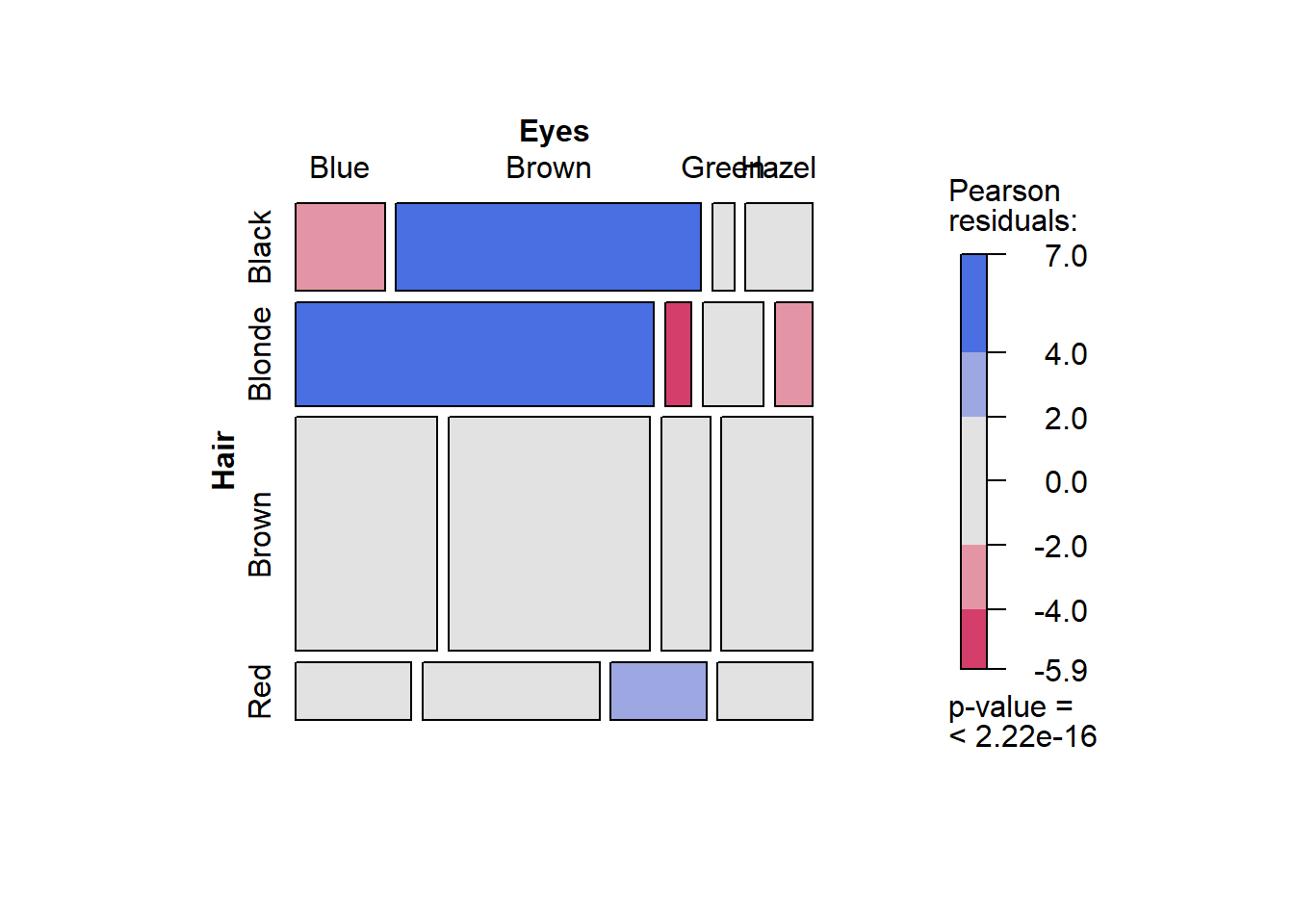
The first part of the code, ~ Hair + Eyes, is a statistical model expression. It is read as “by hair and eye colour”. In other words, the mosaic plot will plot the conditional proportions, y, using the hair and eye colour variables.
This is a very information-rich visualisation. The x axis is the conditional probability Pr(Eye Colour| Hair Colour) while the y axis reflects the proportional representation of different hair colours in the sample. For example, we can see that over half the sample had brown hair. The colour scale relates to Pearson residuals calculated from the cross-tabulation and Chi-square test of association. Essentially, they are a measure of discrepancy between the observed counts and the expected counts based on the assumption of independence (see Chi-square tests of association for further details). Blue reflects over-representation, and red, under-representation. The legend also contains a p-value from the Chi-square test. The p-value is < .0001, therefore, the Chi-square test was statistically significant. There was statistically significant evidence of an association between hair and eye colour.
The colours make it really easy to explain the association. Let’s list the main points:
- People with black hair are over-represented by people with brown eyes and under-represented by people with blue eyes.
- People with blonde hair are over-represented by people with blue eyes, and under-represented by people with brown and hazel eyes.
- People with red hair are over-represented by people with green eyes.
We might also find it useful to add the conditional proportions to the plot. To do this, we need to create a table of labels.
crosstab1<-table(Hair_Eye_Colour$Hair,Hair_Eye_Colour$Eyes, dnn = c("Hair","Eyes"))
labs<-round(prop.table(crosstab1,1),2)
labs
## Eyes
## Hair Blue Brown Green Hazel
## Black 0.19 0.63 0.05 0.14
## Blonde 0.74 0.06 0.13 0.08
## Brown 0.29 0.42 0.10 0.19
## Red 0.24 0.37 0.20 0.20Then we create the mosaic plot and add the labels:
vcd::mosaic(crosstab1, pop = FALSE, legend=TRUE,shade=TRUE)
labeling_cells(text = labs, margin=0)(crosstab1)
It’s not perfect because some cells in the plot are not big enough for the label.
The ggmoasic package is an extension of the ggplot2 framework that was recently published in 2017. Install (if required) and load the package:
install.packages("ggmosaic")
library(ggmosaic)
Now we can access geom_mosaic. This package assumes you are using a frequency cross tabulation:
tb <- table(Hair_Eye_Colour$Hair, Hair_Eye_Colour$Eyes)
tb <- data.frame(tb)
colnames(tb) <- c("Hair", "Eyes", "Freq")
tb
## Hair Eyes Freq
## 1 Black Blue 20
## 2 Blonde Blue 94
## 3 Brown Blue 84
## 4 Red Blue 17
## 5 Black Brown 68
## 6 Blonde Brown 7
## 7 Brown Brown 119
## 8 Red Brown 26
## 9 Black Green 5
## 10 Blonde Green 16
## 11 Brown Green 29
## 12 Red Green 14
## 13 Black Hazel 15
## 14 Blonde Hazel 10
## 15 Brown Hazel 54
## 16 Red Hazel 14Now for the ggplot…
p14 <- ggplot(tb)
p14 + geom_mosaic(aes(x = product(Hair), weight = Freq, fill = Eyes)) + labs(x = "Hair Colour")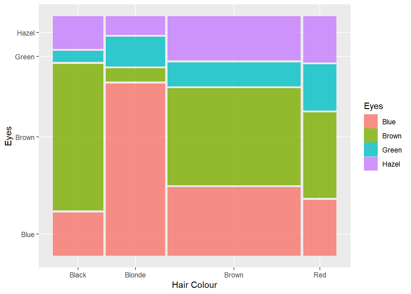
How do you add value labels in the center of each stacked bar? You might wish you never asked!
levVar1 <- length(levels(Hair_Eye_Colour$Hair))

jointTable <- prop.table(table(Hair_Eye_Colour$Hair, Hair_Eye_Colour$Eyes))
plotData <- as.data.frame(jointTable)
plotData$marginVar1 <- prop.table(table(Hair_Eye_Colour$Hair))
plotData$var2Height <- plotData$Freq / plotData$marginVar1
plotData$var1Center <- c(0, cumsum(plotData$marginVar1)[1:levVar1 -1]) +
  plotData$marginVar1 / 2
df<-data.frame(prop.table(table(Hair_Eye_Colour$Hair,Hair_Eye_Colour$Eyes),1))
df<-group_by(df,Var1)
df<-transmute(df,
              csum = (cumsum(Freq)-Freq)+(Freq/2))
plotData$centerlab <- df$csum

p14 + geom_mosaic(aes(x = product(Hair), weight = Freq, fill = Eyes)) +
  labs(x = "Hair Colour", y = "Eye Colour Proportion within Hair Colour") +
  geom_text(data = plotData, aes(x = var1Center, y = centerlab,label=round(var2Height,2)),
            inherit.aes = FALSE)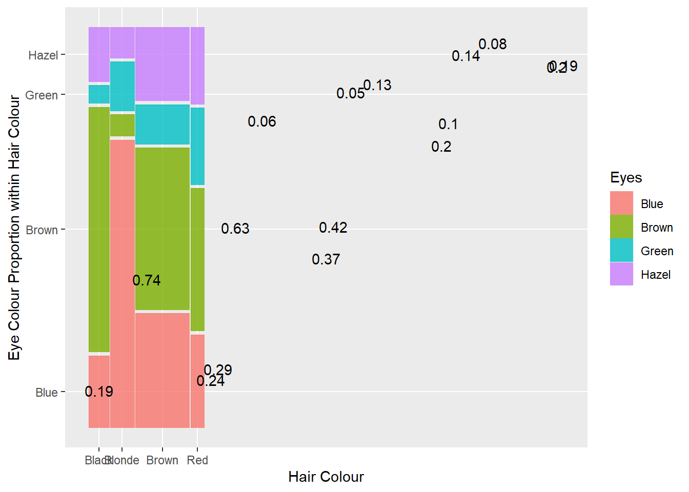
Thanks to Edwin on StackExchange for the hard work on this code.
5.18 Two Quantitative Variables
5.18.1 Body Data
To explore the visualisation of two quantitative variables, we will use the Body.csv dataset, available here. The dataset contains the percentage of body fat, age, weight, height, and 10 body circumference measurements (e.g., abdomen) for a sample of 252 men.
Variables
- Case: Case Number
- BFP_Brozek: Percent body fat using Brozek’s equation, 457/Density - 414.2
- BFP_Siri: Percent body fat using Siri’s equation, 495/Density - 450
- Density: Density (gm/cm3)
- Age: Age (yrs)
- Weight: Weight (lbs)
- Height: Height (inches)
- Adiposity_index: Adiposity index = Weight/Height2 (kg/m2)
- Fat_free: Fat Free Weight = (1 - fraction of body fat) * Weight, using Brozek’s formula (lbs)
- Neck: Neck circumference (cm)
- Chest: Chest circumference (cm)
- Abdomen: Abdomen circumference (cm) “at the umbilicus and level with the iliac crest”
- Hip: Hip circumference (cm)
- Thigh: Thigh circumference (cm)
- Knee: Knee circumference (cm)
- Ankle: Ankle circumference (cm)
- Biceps: Extended biceps circumference (cm)
- Forearm: Forearm circumference (cm)
- Wrist: Wrist circumference (cm) “distal to the styloid processes”
5.18.2 Scatter Plots
Let’s find the strongest associations quickly by using a scatterplot matrix. We need to use the GGally package.
library(GGally)
ggpairs(Body, columns = c(3,6,7,10:19),axisLabels = "internal")
You might need to open this visualisation in a separate tab and zoom in. The columns option tells R which variables to include in the matrix. Columns 3, 6, 7, and 10 - 19 refer to BFP_Siri, Weight, Height, Neck, Chest, Abdomen, Hip, Thigh, Knee, Ankle, Biceps, Forearm and Wrist variables.
We can use this visualisation to quickly scan for the strongest relationship between BFP_Siri and body measurements. We can also perceive the types of trends in the data and identify outliers. You will notice the outliers for the height variable (some very low values considering these are adult males). You will also notice the most linearly correlated variable with BFP_Siri was abdomen. If you look at the off diagonal cells, the ggpairs visualisation reports the Pearson correlation value. We can see that r = .813 for BFP_Siri and abdomen.
We will now take a closer look at this relationship.
p3 <- ggplot(data = Body, aes(x = Abdomen, y = BFP_Siri))
p3 + geom_point()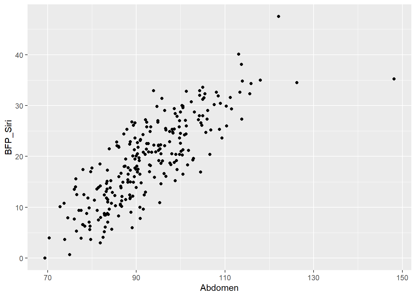
The trend is mostly linear, except for an unusual case in the upper right. We can compare a linear and smoothed trend line to explore the relationship.
p3 + geom_point() + geom_smooth(method = "lm") + geom_smooth(colour = "red")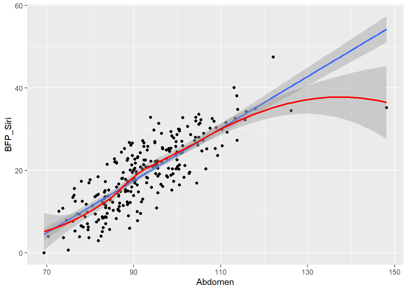
Note that the grey band surrounding each trend line refers to a 95% confidence interval (CI). The unusual case is really having an impact on the smoothed trend line and will probably influence the linear regression parameters. It would pay to investigate this case further to determine if it is valid.
We can also do cool things like add rug plots to help visualise the univariate distributions of the two variables in the plot.
p3 + geom_point() + geom_smooth(method = "lm") + geom_smooth(colour = "red") +
  geom_rug(alpha = 1/2)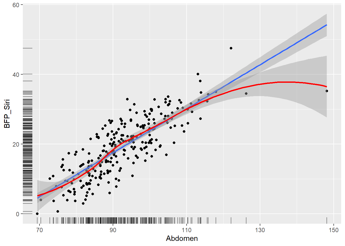
You can get a sense of each variable’s distribution and the potential outlying abdomen measurement. If you have really dense data, you can represent bivariate density using contours.
p3 + geom_point() + geom_density2d()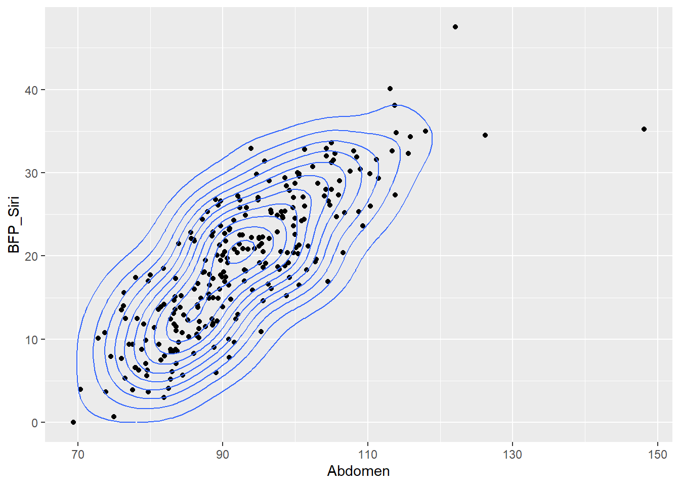
The contours produce a 3D effect to visually represent the 2-dimensional density of the bivariate data. After you have investigated the outlier, you would follow this visualisation up with regression, most likely linear, to test the statistical significance of the regression model and estimate its parameters.
5.18.3 Economics Data
The economics.csv data (available through ggplot2 or here) tracks the following US economic data between 1967 and 2015. If you import the dataset ensure you define the date variable as.Date(). Otherwise R will treat the variable as a factor.
economics$date <- as.Date(economics$date, format = "%d/%m/%Y")- date: month of data collection
- psavert: personal savings rate
- pce: personal consumption expenditures, in billions of dollars
- unemploy: number of unemployed in thousands
- uempmed: median duration of unemployment, in week
- pop: total population, in thousands
The date variable means that these are time series data. Line plots are the best method to visualise these types of data. A line running across dates on the x-axis and connecting temporal variation in a y-axis variable provides a powerful sense of time. For example, let’s look at the steady growth of the US population.
5.18.4 Time Series Plots (Line plots)
p4 <-ggplot(data = economics, aes(x = date, pop))
p4 + geom_line() + labs(title = "US Population Growth 1967 - 2015")
We usually want to compare multiple indicators across time. If we convert the dataset to long format, we can use faceting to arrange the series for easy comparison. Initially the data are in a wide format. Different variables are in different columns:
economicsWe can stack all the variables and their values into two columns. This is known as a long dataset format. This is easy using the tidyr() package. Here’s the code:
library(tidyr) #Load tidyr to access gather() function
economics_l <- gather(economics, # Data frame
                      Variable, # Name of the variable to contain the original variable names
                      Value, # Name of the variable to contain the variables' values
                      pce:unemploy) # The variables to be merged into long format

economics_l$Variable <- factor(economics_l$Variable, # Define and label variable factor
                               labels = c("PCE",
                                        "Population '000",
                                        "PSR",
                                        "Unemployed '000",
                                        "Unemployed Duration"
                                        ))
The pce:unemploy means all variables between pce and umemply, inclusive. What does the data frame look like now?
economics_lNotice how all the variables are stacked into the Variable column and all their values into the Value column.
Now for the plot:
p4 <-ggplot(data = economics_l, aes(x = date, y = Value))
p4 + geom_line() + facet_grid(Variable ~ ., scales = "free",
                              labeller = label_value) +
  labs(title = "US Economic Data 1967 - 2015", y = "")
Nice. Now we can compare how different times series might be moving or changing together. The data are very high resolution. Measurements are taken at every month since 1967. Let’s adjust the resolution to help smooth out the series and overall trend. We can do this by using quarterly data instead of monthly data. Here’s how:
#Reduce resolution
#Add a month and year variable to the wide economics dataset
economics <- mutate(economics,
                    quarter = quarters(date),
                    year = format(economics$date, "%Y"))

#Group the data by year and quarter
economics_ag<-group_by(economics, year, quarter)

#Create a summarised dataset with mean values for yearly quarters
#Save the date for the last day of each quarter
economics_ag <- summarise(economics_ag,
                          pce = mean(pce),
                          pop = mean(pop),
                          psavert = mean(psavert),
                          uempmed = mean(uempmed),
                          unemploy = mean(unemploy),
                          date = max(date))

#Restructure data to long format
economics_ag_l <- gather(economics_ag,
                         Variable,
                         Value,
                         pce:unemploy)

#Assign factor and labels
economics_ag_l$Variable <- factor(economics_ag_l$Variable, #Define and label variable factor
                                  labels = c("PCE",
                                             "Population '000",
                                             "PSR",
                                             "Unemployed '000",
                                             "Unemployed Duration"))
The code is long. It can be shortened, but I wanted to take you through the steps in order to see how it works. What do the data look like now?
economics_ag_lNotice how the dates are based on the last day of each quarter. Now we reproduce the plot using the quarterly data.
p5<-ggplot(data = economics_ag_l, aes(x = date, y = Value))
p5 + geom_line() + facet_grid(Variable ~ ., scales = "free",
                              labeller = label_value) +
  labs(title = "US Economic Quarterly Data 1967 - 2015 ", y = "")
Much smoother!
5.18.5 One Quantitative and One Qualitative Variable
To explore data visualisations used for one qualitative and quantitative variable, we will use the mpg.csv dataset (also available from the ggplot2 package in R). This dataset contains the data from 234 cars released in 1999 and 2008.
- manufacturer: Self-explanatory
- model: Self-explanatory
- displ: Engine displacement, in litres
- year: Year of production
- cyl: Number of cylinders
- trans: Type of transmission
- drv: f = front-wheel drive, r = rear wheel drive, 4 = 4wd
- cty: City miles per gallon
- hwy: Highway miles per gallon
- fl: Fuel type
- class: “Type” of car
5.18.6 Side-by-side Box Plots
Side-by-side box plots are a great way to compare a quantitative variable’s quartiles and medians across a categorical variable. The following box plot compares the city mileage of different car classes.
p6 <- ggplot(data = mpg, aes(x = class, y = cty))
p6 + geom_boxplot()
Always a good idea to order categories from lowest to highest (or vice versa), to aid in ranking.
mpg_rank <- mpg %>% group_by(class) %>% summarise(med = median(cty))

mpg$class <- mpg$class %>% factor(levels = mpg_rank$class[order(-mpg_rank$med)])

p6 <- ggplot(data = mpg, aes(x = class, y = cty))
p6 + geom_boxplot()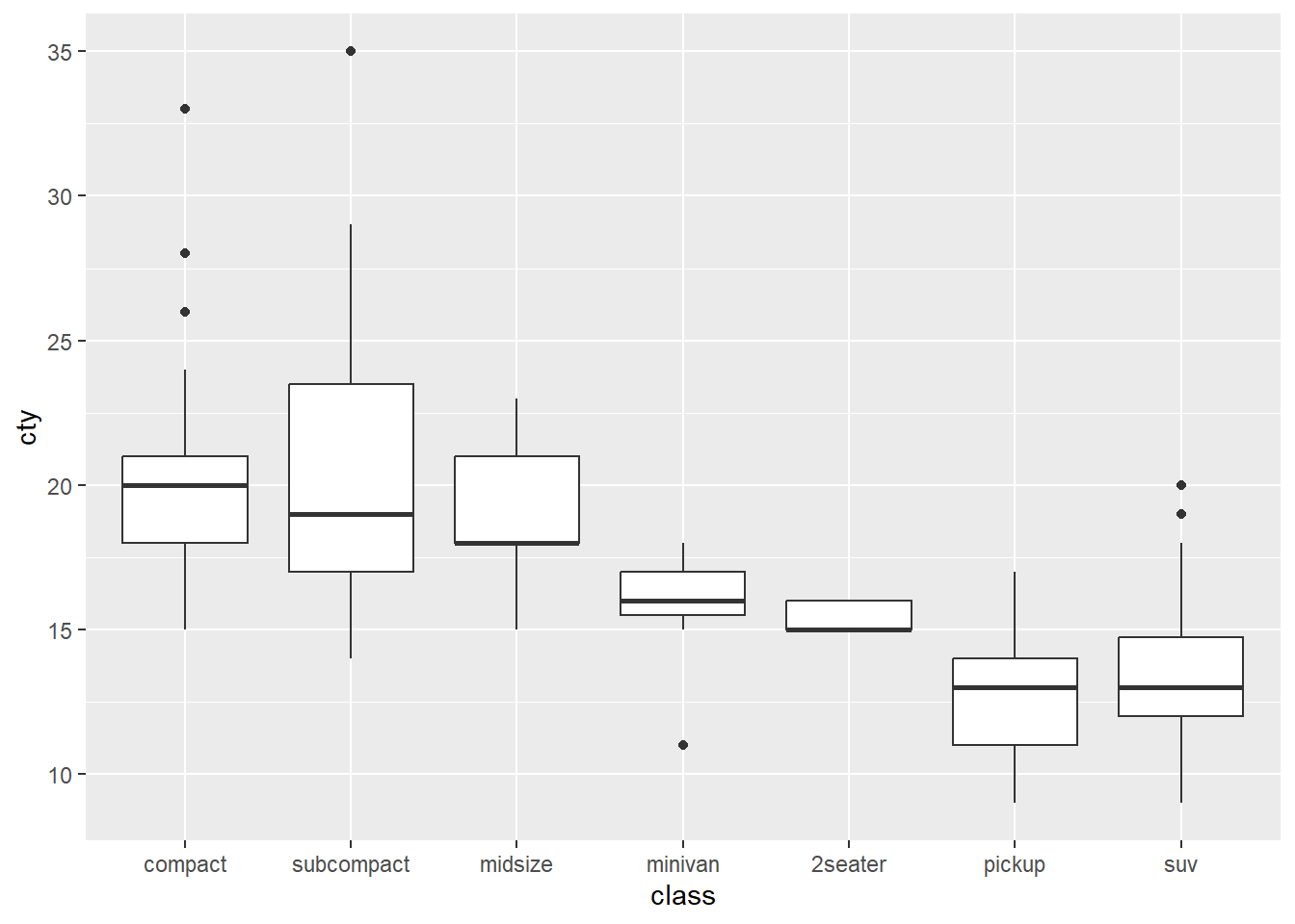
We can quickly see that compact, midsize and subcompact classes are the best. Pickups and SUVs are among the worst for city driving. You can also present these horizontally…
p6 + geom_boxplot() + coord_flip()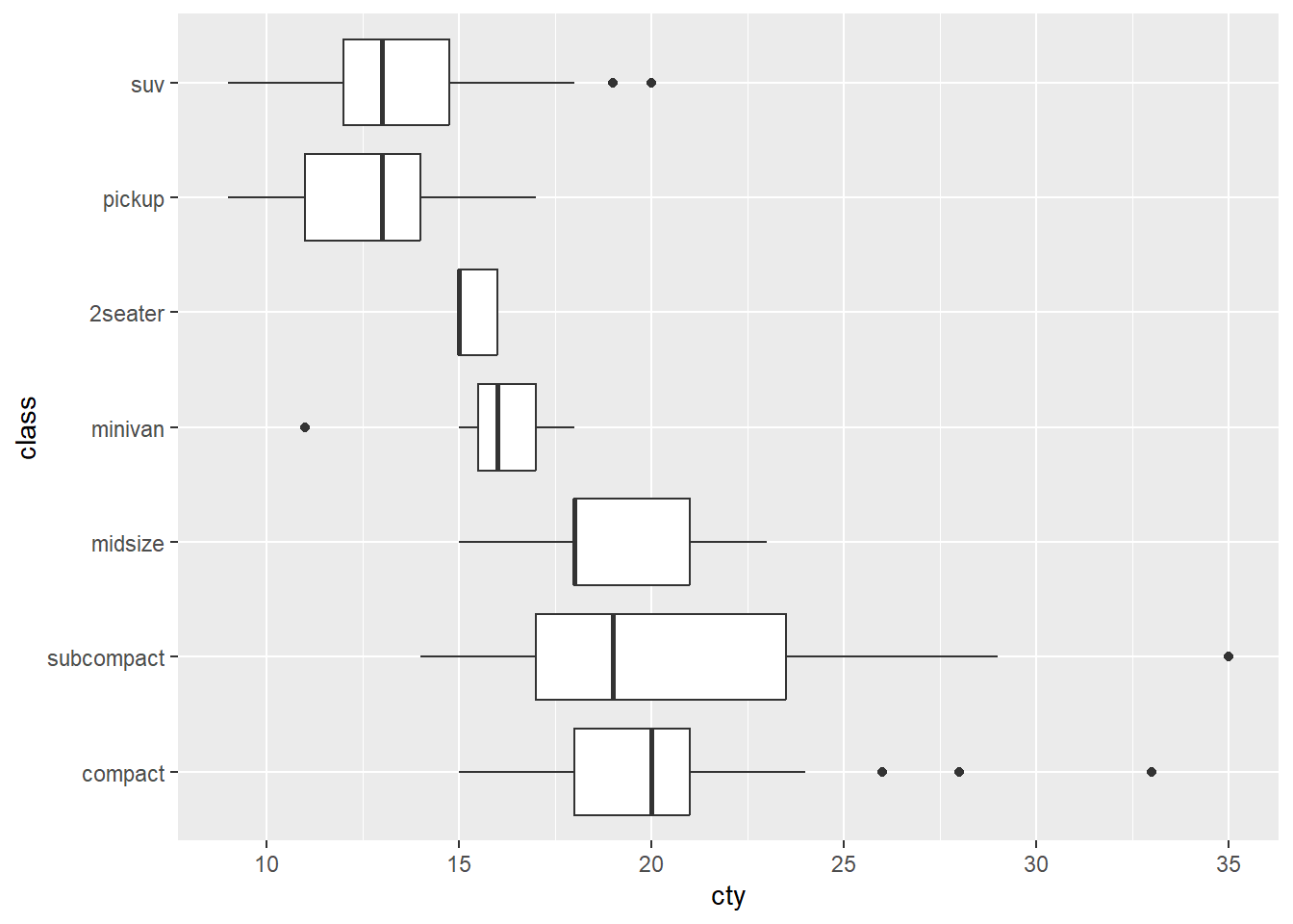
5.18.7 Side-by-side Variations
There are also heaps of side-by-side variations for comparing one quantitative and qualitative variable. For example, we can use violin plots with overlaid means.
p6 + geom_violin() +
  stat_summary(fun.y = "mean", geom = "point", colour = "red")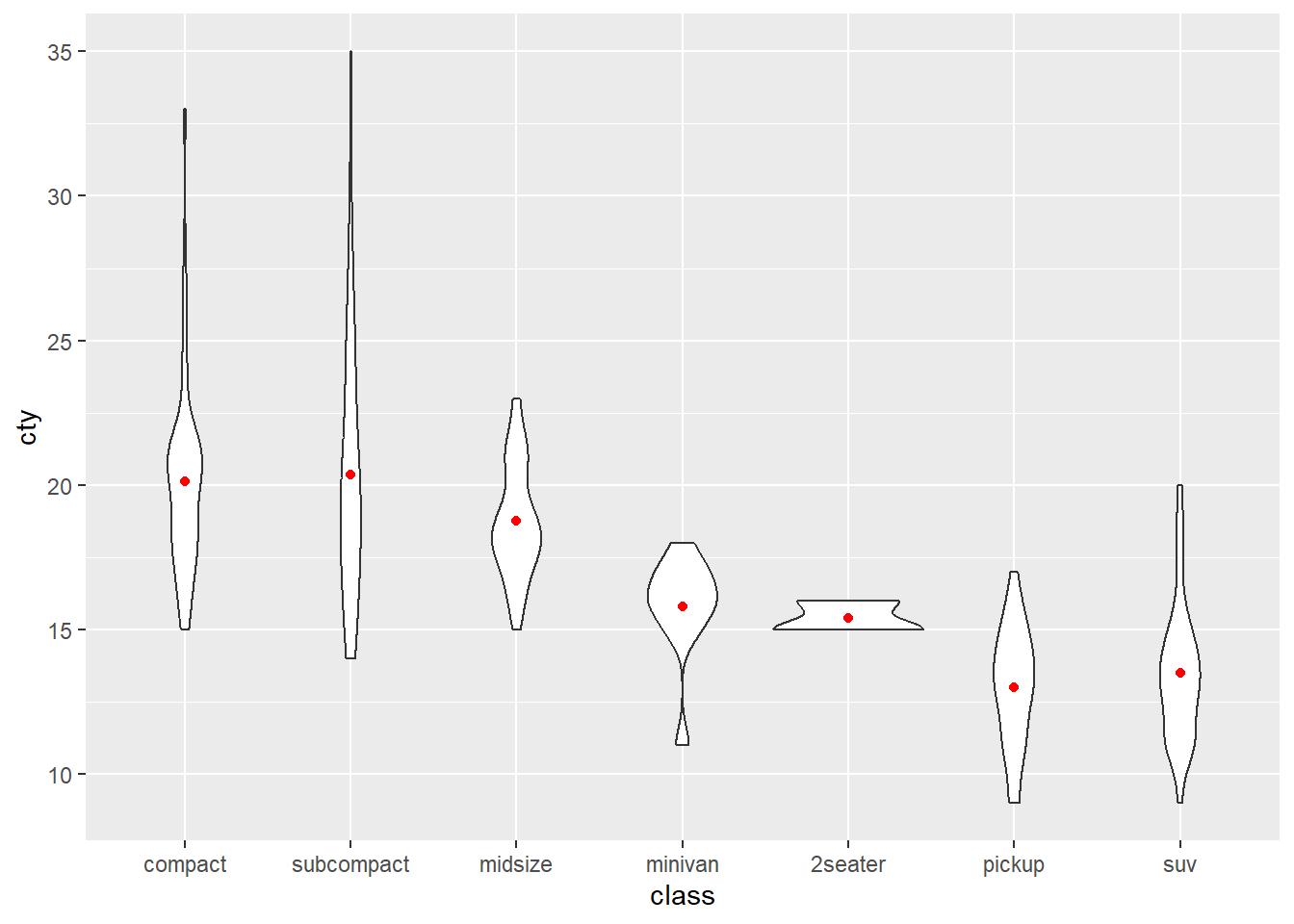
Jittered point plots with means…
p6 + geom_jitter(width = .2, alpha = .25) +
  stat_summary(fun.y = "mean", geom = "point", colour = "red")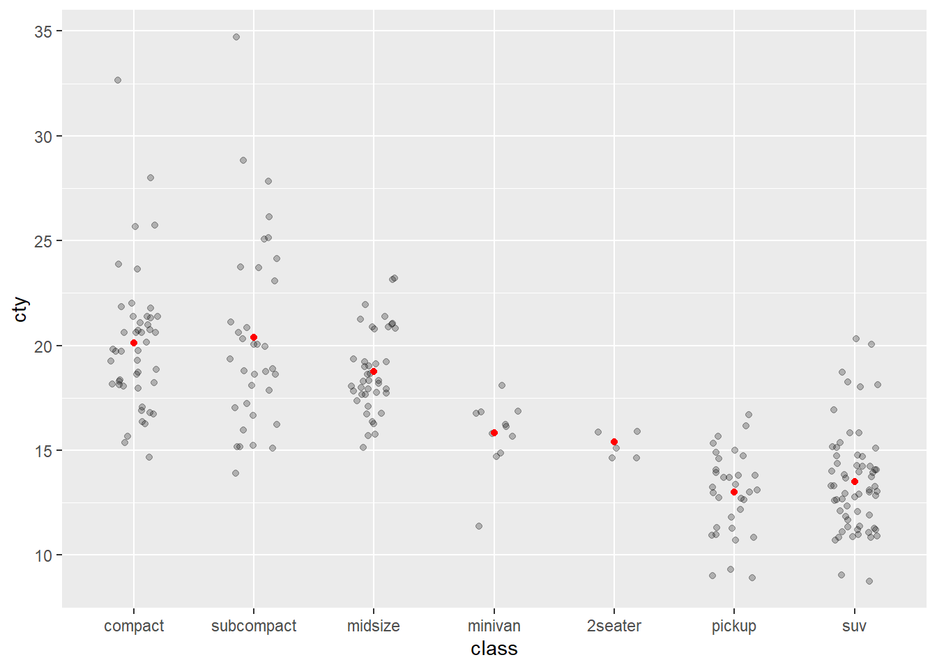
Note how some transparency was added so the mean points pop-out more.
Stacked dot plots with means…
p6 + geom_dotplot(binaxis = "y", stackdir = "center", dotsize = 1/2, alpha = .25) +
  stat_summary(fun.y = "mean", geom = "point", colour = "red")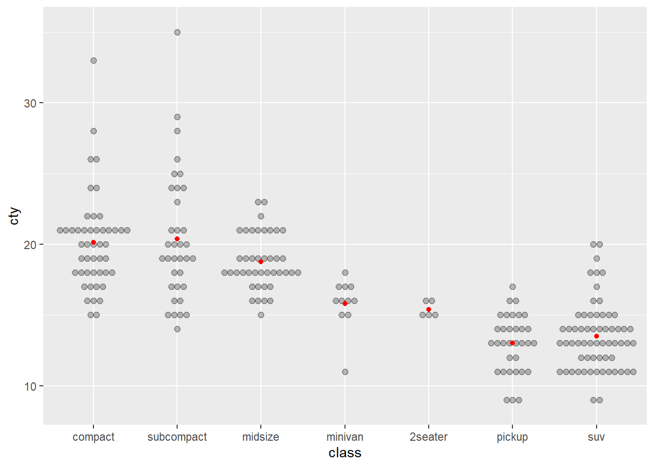
All these methods are a great way to compare variability and central tendency of a quantitative variable between categories of a qualitative variable. Use jittered point plots and dot plots when your sample size is small. Box plots and density plots are better when sample size is large.
5.18.8 Visualising Uncertainty
We have concentrated on visualising variability in the data. However, we might also want to add formal measures of uncertainty for a statistical estimate such as the mean. Let’s take a look at some examples of adding error bars representing 95% confidence intervals of the mean.
ggplot2 integrates nicely with the powerful Hmisc package. This provides access to easy-to-use functions for adding error bars that represent 95% CIs based on bootstrapping and normal theory. Let’s add some error bars representing 95% bootstrapped CIs for the side-by-side dot plot city mileage by vehicle class.
p6 + geom_dotplot(binaxis = "y", stackdir = "center", dotsize = 1/2, alpha = .25 ) +
  stat_summary(fun.y = "mean", geom = "point", colour = "red") +
  stat_summary(fun.data = "mean_cl_boot", colour = "red",
               geom = "errorbar", width = .2)
The fun.data = "mean_cl_boot" calls the boot function from the Hmisc package. However, bootstrapped intervals are only approximate and should be interpreted with caution in small samples (\(n < 100\)). We can change to normal theory intervals if need be.
p6 + geom_dotplot(binaxis = "y", stackdir = "center", dotsize = 1/2, alpha = .25) +
  stat_summary(fun.y = "mean", geom = "point", colour = "red") +
  stat_summary(fun.data = "mean_cl_normal", colour = "red",
               geom = "errorbar", width = .2)
Normal based CIs for small samples (\(n < 30\)) are only accurate if the data are normally distributed in the population. You need to be careful with these intervals if this assumption is not met and you have small samples.
You can also layer the error bars using a separate data frame that summarises the lower and upper bounds of the 95% CIs. The following code creates such a data frame (note that it assumes you have dplyr loaded).
cis <- summarise(group_by(mpg, class), #Group by class
                 mean = mean(cty), #Summarise groups - mean
                 sd = sd(cty), #Standard deviation
                 n = n(), #Sample size
                 lb = mean - (qt(.975, n - 1)*(sd/sqrt(n))), #Calculate lower bound
                 ub = mean + (qt(.975, n - 1)*(sd/sqrt(n))), #Calculate upper bound
                 cty = mean(cty))
cis
## # A tibble: 7 × 7
## class mean sd n lb ub cty
## <fct> <dbl> <dbl> <int> <dbl> <dbl> <dbl>
## 1 compact 20.1 3.39 47 19.1 21.1 20.1
## 2 subcompact 20.4 4.60 35 18.8 22.0 20.4
## 3 midsize 18.8 1.95 41 18.1 19.4 18.8
## 4 minivan 15.8 1.83 11 14.6 17.1 15.8
## 5 2seater 15.4 0.548 5 14.7 16.1 15.4
## 6 pickup 13 2.05 33 12.3 13.7 13
## 7 suv 13.5 2.42 62 12.9 14.1 13.5We will pull the lb and ub values from the data frame into the geom_errorbar() layer.
p6 + geom_dotplot(binaxis = "y", stackdir = "center", dotsize = 1/2, alpha = .25) +
  stat_summary(fun.y = "mean", geom = "point", colour = "red") +
  geom_errorbar(data = cis, aes(ymin = lb, ymax = ub),width = .2,colour = "red")
This plot is identical to the 95% CIs produced using the Hmisc summary function.
5.19 Concluding Thoughts
This chapter has introduced the Layered Grammar of Graphics, ggplot2, colour assignment in ggplot2 and univariate and bivariate data visualisation in ggplot2. You now have the foundation of data visualisation grammar and vocabulary. You have only scratched the surface of ggplot2. As you progresses you will continue to build your knowledge of using this powerful package.